Pods embed error: Pod not found

Truthful Movie Poster for HP7pt2

Face it, if you followed Harry Potter from movie 1, you were going to watch the rest of them. I fully support the fact of splitting the movie into two parts because some of the other movies seemed crammed for time, but it’s still fun to give the directors a little grief. They know by splitting the movie in two, they squeaked more money out of out pockets, which is okay. I used Photoshop and found a font that was close to the Harry Potter font, and edited the font so that it blended well with the movie poster. I used the words that the poster provided, and added to it. This is what resuted.
Harry Potter 7 poster

Truthful Movie Poster… 3 Stars!

I chose to do a truthful movie poster about Magic Mike, a movie about Channing Tatum’s career as a stripper before he became the most gorgeous actor on the market. It’s definitely a girls movie, granted I’ve never seen it. But who wouldn’t want to see Channing Tatum take his clothes off!?

Magic Mike

It’s so truthful it hurts.

Truthful Movie Poster

Imagine if movie posters told the REAL story about the fillm they’re advertising. Redesign an existing movie poster by changing the text/images to tell us the real story. More examples at http://www.holytaco.com/classic-taco-if-movie-posters-were-honest.

Psycho Animated Movie Poster

Phew! This poster is done!

It was harder to make than the previous four Hitchcock posters to date, but the real problem was that other efforts became a distraction over the past few weeks (good stuff honestly). But I was able to lock in over the past couple of days and I spent most of it studying Janet Leigh’s facial expressions trying to find a way to make something for the main image of her in this poster. I think it’s interesting to think about this in the context of Leigh’s description of her working with Hitchcock while filming Psycho. She described how Hitchcock made clear that his camera was ‘the focal point,’ and she was to move with it. She mentioned how other actors might have been constrained by his blocking, but she took it as a challenge. And she does make the most of it, working the camera with her fabulous expressions throughout the film.

The original poster makes room for John Gavin, but I felt that the house over looking the Bates Motel deserved better treatment. And be sure to look closely, I think mother is watching!

The Seventh Seal: Mindful, Minimalist Movie Poster

3 little stars 
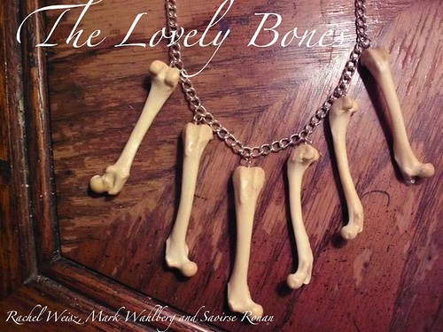
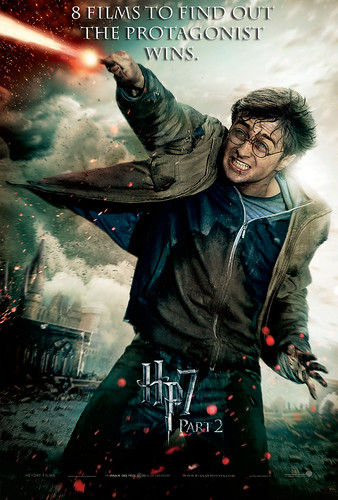
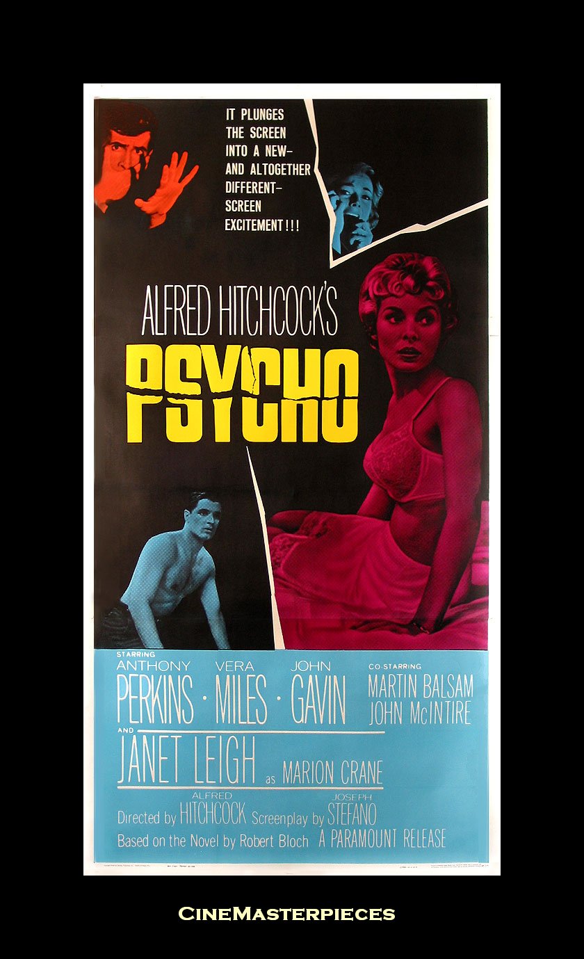
Design Assignment 43: Create a tv/movie poster that captures the essence of the story through the use of minimalist design/iconography.

Inspiration
I’m no Bergman connoisseur nor real film buff for that matter, but Bergman’s The Seventh Seal has a scene that is pure poetry, verbal and visual. To set up the scene, a knight, Antonious Block, returning from the Crusades, challenges the devil to a game of chess believing this to be a clever ploy to stall for more time, life. Delaying the inevitable, the knight along the journey back to his castle meets a juggler, Jof, and his wife, Mia, and young child, Mikael. The wife shares the family’s meal, strawberries and milk, and Block remarks:

I shall remember this hour of peace: the strawberries, the bowl of milk, your faces in the dusk. Mikael asleep, Jof with his lute. I shall remember our words, and shall bear this memory between my hands as carefully as a bowl of fresh milk.
[He drinks from the bowl.]

Block’s comments really resonate with me and remind me of my constant quest to live in the moment or hour and make the most of the rich yet simple encounters that make up a life. I think that for all of the pleasures and opportunities that the digital world brings that it also antes up the challenge to live mindfully.

You can watch this scene on YouTube and if you’re as intrigued by Bergman’s work as I am then you’ll enjoy this retrospective on his work by Woody Allen. Allen was seriously influenced by Bergman’s work and work ethic and believes that Bergman’s films will stand the test of time and still be enjoyed and studied when the trendy films are long forgotten. It is both the soul and the technique of Bergman’s work that inspires Allen.

Process and Reflections

A minimalist poster seemed quite appropriate for Bergman’s metaphor-rich film.

Bowl of strawberries on chessboard

I knew immediately that I would integrate a nod to chess and to the bowl of strawberries in my poster. The simple black and white squares I think conjures up a chess board and hints at the good/evil dichotomy of the story. I placed the bowl of strawberries on a diagonal to draw the eye immediately there. The one red strawberry adds a touch of the surreal and lets the viewer know that all is not as it seems. Finally, I used the Google Languages tool to translate the title into Swedish, Bergman’s native language.

Aspirations
I cut the bowl of strawberries from clipart and made some effort in GIMP to smooth the edges. I’d really like to learn to use a program like Illustrator that I’ve heard others mention to draw an abstract bowl of strawberries in black and white. Then I’d colorize the one strawberry for effect.

Or I’ve seen Giulia Forsyth create amazing drawings on her iPad. I’d wonder if that would be a good approach to create drawings. I love to draw.

It just occurred to me that my friend Norm always closes with “That’s my story. Any questions?” and I always seem to end with a question to help me tell my story better. An appropriate sign-off for me.

Movie Poster for My DS106 Website

This design assignment to make a movie poster for your website appealed to me on many levels (not least of which is the many years I spent working in movie theatres and collecting movie posters).

Having titled my site a DS106 Odyssey, I started looking for sailing ships, thinking of the original tale by Homer.  I realized that for the right look I needed an older photograph, something for which it was unlikely to have CC-licensed images available.

So, I turned again to the Flickr Commons, that great collections of images from archives and museums.  This image of a 19th-century yacht came from the Powerhouse Museum in Sydney, Australia.


The subtitle is a reference to my own goals in this course, to push myself out of my comfort zone.


DS106 Odyssey Poster


Thoughts?  Comments?  Suggestions?

Master of the Flying Guillotine Animated Movie Poster

When I saw the Master of the Flying Guillotine movie poster, I knew I had to animate it for this ds106 design assignment. This is a very rough first draft, and I only got this far thanks to Tim Owens’ seemingly boundless patience with my idiotic Photoshop questions (it was a good refresher of the details I learned for the animated Hulk comic book cover I did). Like I said, it is a very rough first draft, but I have a sense of what I need to do to fix it up now. The difficulty with this one was getting the elliptical movement of the guillotine to be convincing and somewhat centered, on my next run through on this work-in-progress I’m gonna see if I can’t master that. Any and all future versions of this draft will added as an update to this post.

Minimalist TV/Movie Poster

For the Minimalist TV/Movie Poster design assignment we were to Create a tv/movie poster that captures the essence of the story through the use of minimalist design/iconography. Here i chose a couple of my favorite movies.This assignment was fairly simple i just added text to pictures that convey the idea of the movie.

The first movie i chose was I Am Sam,
child hand with paper plane

In the movie Sam who had a mental disability, was a kid at heart. With a kid of his own, he found ways to entertain her by teaching her how to make origami and paper planes. I found the simplest picture of a hand holding a plane against a blue sky to show that although he has a disorder he could not be stopped. He was above all the negativity, criticism and judgement and just lived to make his daughter happy.


My second selection was my alltime favorite movie Man On Fire,

man on fire

here i found an image of a burning stick figure which has no relation to the movie at all but i figured that it is clever because technically most people in that  movie did get burned.


My final choice was The Lovely Bones, alothougth the movie made me cry, my creation made me laugh.

lovely bones

ENJOY!

If Movie Posters Told The Truth

should be poster

I chose the Harry Potter Part 2 poster for the assignment If Movie Posters Told The Truth.

First, I opened the movie Poster with Photoshop. I then selected the text tool and typed in my “phrase”. The font I used was Charlemagne St and I made the font size to 50. I then dragged the text layer to the top of the poster with the move tool.

Next, I went to the layers box on the side. I double clicked on the text layer but made sure I was NOT clicking on the name of the layer. This opened up a Layer Style box. I checked the boxes for the Drop Shadow effect and the Bevel and Emboss effect under Blending Options. Under the Bevel and Emboss box, I also checked the Contour box. I saved the Project and It was complete.

Rear Window Animated Movie Poster

Alan Levine’s post about watching cool flick’s with Jim Groom finally got me to get of the snide and finish this animated movie poster for the amazing Hitchcock classic Rear Window. I have an older post with animated GIFs from Rear Window, but all things GIF need to ratcheted up a notch every few weeks.

This poster is was created for the limited theatrical re-realease of the movie in 1999 after an extensive restoration. I am a little disappointed with myself as if I were to really make something truly awesome, it would have been modeled after the original theatrical poster, which showcases all the happenings in the many neighbors windows. *Note to self, amazing summer project might include creating a number of Hitchcock animated movie poster GIFs.

To make this poster, I used the James Stewart GIF from the previous post, as well as made a new one for Grace Kelly. The work on Grace Kelly’s GIF was a lot tougher as it required the erasing of the background on ten separate frames (not fun). Here’s what one of the frames looked like beforehand:

To create the animation, I used the animation timeline in Photoshop in which you basically turn on and off different layers per frame. This is also a bit tedious, but it allows you to create some interesting timing options. Each frame can be assigned its own amount of time, which is how the pauses work. Here’s a look at a few frames of the animation timeline:

And here’s a look at the layers:

Since Alan’s post refers to Blow-Up as well as Rear Window, looks like I still have more work to do.