Highland Corporation Annual Charity Benefit

For my third design assignment this week I decided to do the “You’re Invited” assignment and dedicate it to my character Jack Spencer. This assignment is worth three and a half points out of the six required character points. For the event I created I decided to draw from Jack’s history with cancer and use it to create an annual charity benefit for his company, The Highland Corporation.

The first step I took in designing the invitation, after deciding on an appropriate event, was to conceptualize what the invitation should look like. I decided it should be an understated elegance, much like my character Spence. I began playing around with this on Word and Photoshop but I couldn’t really get what I was looking for on there. I decided to do a google search on invitation templates to see if I could work off one of those to better get the design I was envisioning. This is when I came across http://www.psprint.com/. This website had a ton of templates that you could easily customize on their website. After I found a template I liked and customized it, I took a screen shot of the front and back view and further edited it in photoshop to get the final product.

highlandcorpinvitation

While I was editing the invitation I got the idea to include the company’s logo on the back of the invitation. I used photoshop to make the logo and then added it as another layer on the backside of the invitation. Here is the logo on its own…

highlandcorplogo

Here is the link to the original assignment: http://assignments.ds106.us/assignments/youre-invited/


Layla Arkwood’s Wedding

I have to be honest here, I actually intend for my two main character, Marcus and Layla, to get married one day. It won’t be that easy of course but I had to indulge myself in this one assignment. We had to create an invitation to something and I decided on Layla’s wedding. She would become Layla Arkwood-Harvard of course. She has to maintain the family name.

Layla's Wedding


Who’s Invited…YOU ARE!

You’re Invited!
3.5 Stars
Design Assignment

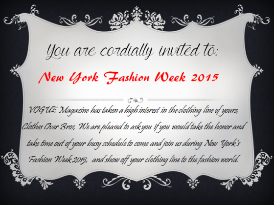
After reminiscing on the postcard from here past, I thought it was a great idea to have an invitation in the mail a few days later that would change Brooke’s life…forever. I created an invitation  to none other than the world famous New York Fashion Week. The thought of Brooke being invited to New York’s Fashion Week, not just as a guest, but to show off her very own clothing line would be the game changer in her life. When deciding on the design of the invitation, I knew it had to be black and white and nothing to bright or obnoxious because that is not what fashion week is all about.

To create the invitation, I also used MS PowerPoint because I have templates saved in the program that I thought would be a perfect for a classy invitation like this one. It has the small details that I was imagining and is mostly black and white. I wanted the words “New York Fashion Week 2015″ to stand out from the rest to bring the immediate attention to that. After the attention was brought to that, I then went out and typed up the rest of the invitation and put it into a cursive font to make it fancier than original font, and also used just the right amount of words to not lose interest while reading, but to give enough information out. This invitation would lead to the creation of Brooke getting ready for her big day!


Invitation

It’s A…

Design Assignment #3: You’re Invited… (3 stars)

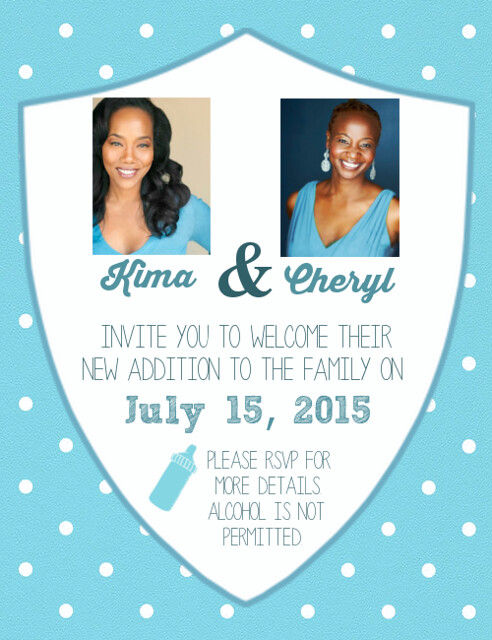
After watching Season 2, Episode 10 of The Wire, I felt like Kima and Cheryl needed a baby shower invitation. This assignment reminded me of my high school days of Photojournalism, where I would play with colors, fonts, and design. Using DaFont I downloaded hand-written and sketchy fonts that would complement the card. I used a light blue to match the blouses of the women in the pictures and made the white foreground the shape of a police badge, as Kima is passionate about her job. The “RSVP” section has a special note for the rest of the officers!

KimaCherylBabyShower

You’re Invited!

This assignment (3 stars) was fun and very relevant. My LLC is actually participating in the Out of the Darkness Walk, which is a suicide prevention and awareness walk.

Screen Shot 2014-10-04 at 6.41.01 PM

Screen Shot 2014-10-04 at 7.01.27 PM


Process

I was thinking about something coming up important, and I thought of the walk we are participating in. I created two different styles of invitations. One is more upbeat with the design and the other one is more symbolic of the event.

I used word to create both of the invitations.

  • First, I searched for a background image.
    • The first invite, I found it online.
    • The second invite, I used a template in word.
  • Then I added the important information to it
  • In the second one, I added the ribbons associated with suicide.


You’re invited!

Screen Shot 2014-10-03 at 11.56.33 PM


For as long I can remember my mother has been wonder woman. She was the chef, party planner, and keeper of the house. Because she is a graphic designer things like invitations have always been done by her. She taught me a lot of the basics. Some of the basics she taught me were the ins and outs that are on an invitation and a basic design for the invitation.

I was always taught that less is more. Keep things vague. That is why I chose this design for my invitation assignment. My inspiration is my nephew.

The basic of every invitation is a title for the event, the date, a sort description of the event, and the address. I think that the story is best told in five simple words: with bouncy houses and Games. This paints the picture of a child’s birthday party. With those five simple words I feel like I have told a story within an invitation. I think this tells what kind of event it will be.

I love that the focal point of the picture is my nephew. It is his birthday so I feel like he should be the focal point. I chose to keep this simple because my style is very style. I think that there is good balance with simplicity and creativity.

Assignment:

Screen Shot 2014-10-03 at 11.33.40 PM

Tying the Knot

You’re Invited

Slide1 Slide2

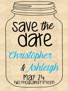
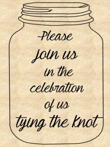
I am more on the short, sweet and to the point type of person, so I decided to create a save the date invitation! I am a southern girl so I decided to play along with the southern theme. I’ve always loved everything about weddings and the decorations  of them, so this assignment seemed to fit me just right. I know the above pictures aren’t “all that” but relating them to who I am as a person, they fit me perfectly… Southern, sweet, and simple.

I actually used PowerPoint to create the invitations, I am not a fancy Photoshop or any site like that user, so I stick to what I know typically. Bad habit? Yes, I know I need to work my way out of that because there is millions of opportunities I can have and put my creativity to the test. I will get there this semester, that is one goal I do have.

I found a clip art picture of a mason jar on Google, and inserted into the first and second slides of PowerPoint as the outline if the invitation. I then decided to change the background color/image to a texture that PowerPoint has built in called Stationary. After the background and the mason jar picture were set and stone, I started inserting text and increasing/decreasing the font size, interchanging font styles and changing out text color. As I said before, I wanted to keep it simple, yet get the point across.


After Thoughts…

Next time, I am definitely going to look into the other fancy picture editors other than the one that I use daily Aviary. (That wouldn’t have helped too much in this exercise). I was also even thinking of maybe creating an invitation by hand sometime this week if I have time before the Sunday deadline, and post it on this blog as well, as an after product of what I could have changed/done differently if I did it by hand instead of the computer.

3.5 stars

The 95% Silent Meeting

For the first day of Design Week in #DS106 I decided to try my first DS106 Assignment. I chose Design Assignment #1048, which was to ” Make an invitation for any event, whether it occur or not.”

I created an invitation to a meeting that I was trapped in last week. We were invited to join a colleague who was participating in a board meeting at a remote site via Video Conference, but there must have been a problem with the connection because we kept loosing the audio. During the two and a half hour meeting we only heard about 5% of what was said.

In keeping with the theme of Design I kept my invitation very simple, creating a mood with lines and my choice of font that contrasted with the details about the event itself. Fortunately there was a Wi-Fi connection so I was able to clear a lot of messages out of both of my inboxes; I just added that detail to add to the mood of the invitation.

The 95% Silent Meeting

The 95% Silent Meeting

Wedding Palooza!

For my next assignment for my final project, I created a new assignment (yet again) which calls for creating an invitation to an event. I’m surprised that this wasn’t a design assignment already, but it doesn’t hurt to make a new one.

*I suggest reading this post after you read the final blog post*

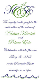
So the event that the invitation was created for is a wedding! I am in serious wedding mode because my sister is getting married this weekend! I am so excited, but that is why I am up so late working on my final, because I need to be in South Carolina by Thursday and I want to be able to focus on it entirely. However, my sister’s wedding came in handy when making this assignment. My sister was very impressed with all of the work I had been doing for ds106 that she asked for me to make her wedding programs while I was home for spring break. It was actually an honor, my art was going to be part of her special day. After many drafts and emailing back and forth, we finally got a whole design (including a monogram and I made myself). Since I still had the monogram saved, I decided to just use that for my wedding. This made my planning stage so much easier. I had all of my fonts figured out and I had all the colors worked out as well.

Using Gimp I simply just added some more text describing the details of the wedding. However it still looked a bit bland to me, so since the wedding is taking place on the water, I decided to freestyle draw some waves on the bottom in blue with an accent color of green. I have a tablet laptop which means that I have a stylus that goes with it, so drawing things freehand is a bit easier than using a touch pad. I thought it came out nicely. What do you think?

Invitation


Thanks for reading,

Princess Karissa

You’re Invited!

Creating invitations for different events says a lot about what is going to happen. Make an invitation for either any event, whether it occur or not. Pick an event from a movie even! What does the invitation say about the event? Get creative