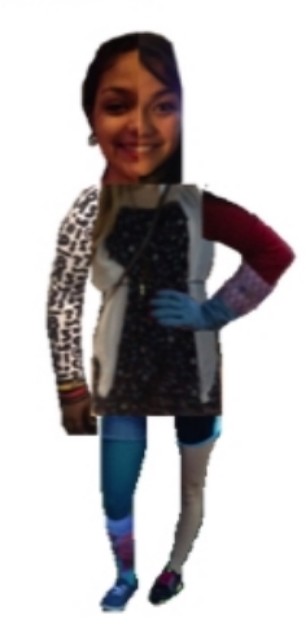
Creating Frankenstein

Exquisite Corpse (4pts):

-The purpose of this assignment was to create a person out of different body parts. I create this person using a combination of 7 people’s body parts: including my sister (Karina’s face), friends (Corrie’s torso, Teagan’s arm, and Brittany’s leg), teammates (Purity’s arm and Jenna’s leg), and myself (half my face). I created this in Paint on my laptop using Paint which lowered the quality of the pictures themselves so I apologize for that it was the only way I could think to do this assignment.

Exquisite Corpse

Design Assignment 2: Exquisite Corpse

The official description of the assignment can be found here, but I’ll give you a summary:  take images of people (friends, family, celebrities, etc.) and put them into editing software with layer capability, and create a new person with an interesting body (i.e. “exquisite corpse”).

Here is my first run of this assignment.

These are all of my lovely roomies combined into a long person with lots of eyes.  I was obsessed with having everyone’s eyes in the picture, so that everyone would be represented.

I started by Facebook stalking all of my roommates.  Found some nice pictures, and then I put them in photoshop (one canvas with 5 layers).  I went through and adjusted the opacity of each layer, and rearranged until I was pleased.  I felt like this image that I came up with was very linear, and I wanted to try it but make a corpse that had more “movement.”

And this is what I got (try #2):

They are pretty similar, I just wanted to explore a little bit and try to add some dimension.  I thought this assignment was pretty fun.  I liked the idea of getting to make a body with all of the people I live with, and I felt like I could find a metaphor in this assignment, and this metaphor will be my inspiration for this assignment, as follows:

 I love my roomies, but sometimes we are a big, chaotic mess of dirty dishes, dirty carpets, sticky kitchen floors, broken dryers and lights that need new bulbs.  We are rarely all at home at the same time, but we are still a unit (I know, that sounds tacky).  We bake for each other, we do each other’s dishes, we listen to each other, and we care about each other (so sappy, I knowwwwww).  So to me, this is a photo representing the corpse of my house, in human form (if that makes any sense at all).  And by corpse of this house, I mean it’s all of my roommates, and we are a mess and all over the place, but we are still sort of connected.

Assignment worth 4 stars.

Exquisite Corpse

_cokwr: This description of the exquisite corpse parlor game is taken from Chapter 9 of the open source textbook "Digital Foundations: Intro to Media Design with adobe Creative Suite" - link: http://is.gd/0KDvsj "Exquisite corpse” is a parlor game that the Surrealists developed in 1925. In this game, each player submits images (drawings, paintings, photographs) of heads, torsos, and legs, and they are combined to produce surprising new bodies. We have played this game with students using images of each other that we captured in class on a digital camera, as well as by using images from pop culture, found on the web. Collaging celebrity and politician body parts can provoke thoughtful discussion. Images of students are on the wiki, but it's more fun to try this with pictures of your friends or family! For this assignment you can work with friends, family or just yourself. Make photos of body parts like face, hands, ears, arms, legs, torso (front or back), etc. Use an image editor with layers to combine the separate parts into a surprising new body. If you need help you can follow the tutorial here - http://is.gd/0KDvsj - which includes example files you can practice with, but afterward make your own Exquisite Corpse and share it on your blog., _cpzh4: Design, _cre1l: http://art100scc.blogspot.com/search/label/exquisite%20corpse, _chk2m: Cheryl Colan, _ciyn3: 147, _ckd7g: , _clrrx: , _cztg3:

Design Assignment – Exquisite Corpse – tips?

Grabbing some pics from friends and using their different body parts together, I came up with this using photoshop. Tried to fit the pieces together and scale everything to look more accurate. Here’s what I’ve done so far but I was wondering if anyone could provide tips for how to make it look better:

First, just put everything together:

Merged all layers and tried adjusting the hue, saturation, changing to linear light and adjusting opacity in the adjustment layer I made:

Then just added a low-opacity background to see what it would look like, not sure if I should keep it or not or maybe move it around or something: