Event Poster Round 2

This my attempt and remaking an event poster. The last one I made was more focused on the dog and not the adoption event itself. So I completely scrapped the only image and started from scratch. For this redo I went in Canva and choose a background that would fit with the theme of the event. From there I found eye catching text and put in all of the information. To complete the whole poster I downloaded some images of Boomer (on the right) and Archie (on the left), cropped them to show mainly the dog, and put the images in the middle to showcase some of the dogs that are available for adoption. I went for simple and sweet.

Tea Time!

I attempted the Promotional Flyer Assignment. I decided to promote a tea gathering for tea lovers. To create my flyer, I used Canva! I selected a template that was cute and easy to fool around with. Please ket me know if you will be attending!

cafe de introverti – promotional flyer design tutorial –

I feel so much pressure with finals, it’s ridiculous.

So, here’s a quickie tutorial on how I designed my promotional flyer for my final project, Long Awaiting.

This was actually a relatively fun and quick design for me. I wanted to create a cute, aesthetically pleasing, and yet mildly sarcastic cafe. I think the cat with a cup of coffee was honestly the best way to capture that. Add in a sarcastic looking old guy and a wi-fi logo…BOOM. I’m sure business will be booming.

All images were found via Google Search, but DANG SON. I WANNA GO TO THIS CAFE. Too bad there lacks an address…which I purposely did, don’t go telling people I made a mistake.

cafe de introverti

If you have any questions in regards to what images I used or just anything in general, feel free to ask! I’m happy to help but I also hope the video is helpful!

Taylor

– long awaiting –

long awaiting

It’s barely morning when she wakes up. The sounds of the outdoor world penetrating through her windows softly. She finds comfort within the confines of her house, away from the rustle and bustle of the city she sees from her window. Her daily routine she finds safety in all of it’s perfection:

make my day p1

She prefers to wake up in the afternoon surrounded by the technology she dedicates her life to. She will lay there for what feels like hours before a nagging voice in her head tells her to get up and showered. She takes a peak outside and graciously greets the day before making a cup of milk tea and a breakfast of only a Nutella covered bagel. She takes what’s left of her tea back to her cave.

make my day p2

She turns on her PS4; the dominant system in her opinion. Some days she feels like divulging in 10…or maybe 12 hours of Final Fantasy X, other days it’s Dynasty Warriors. A quick look at the window and she realizes it’s dark and she’s forgotten to stuff her face. A microwaved Hot Pocket, cup of sweet tea, and some quality time with the humble folks of Tumblr is honestly a great ending to any evening…but what if there’s more to life? She looks outside once more and her mind begins to soar. Anxiety grows. Is it really that awful to go outside and partake in mild interactions? Maybe…not? She then decides. Tomorrow.

– long awaiting –

The morning comes. She lays in bed though not as long as she would prefer. She dresses, rather quickly with what she figures is anticipation. Or was it anxiety? She’s not sure at this point. Shoes on and keys in hand, she walks out of her comfort zone into an unknowing world. She plays off the fear well; humming to keep herself sane. At some point she stops and looks up. She’s found herself at a rather sarcastic yet adorable café with the most obvious name: Cafe de Introverti.

cafe de introverti

She walks in and holy crap, it’s busy. She disregards the chatter and heads straight to the register as she mentally prepares her order in her head and repeats it over and over and over…until the cashier greets her warmly. She orders the same drink she makes at home, a London Fog Latte along with her favorite pastry, a simple donut. With the painful yet pleasant exchange, she pays silently and immediately heads towards a nearby table to await her goods. There’s an aesthetically pleasing magazine conveniently placed on the table of her choice and she flips through looking for an article that catches her eye. She stops for a moment. This isn’t home. This is everything she feared and more. She’s done it. An anxious breath and and a pair of headphones later, she maneuvers her phone to create a playlist for this experience which she calls “Long Awaited.”


Tutorial List

long awaiting (sound effects story) | cafe de introverti (promotional flyer) | cafe de introverti – long awaiting – (mixtape)

Taylor

The Burgeron Bard Arrives

The children at the Bovine County Fairy Tale festival have been wonderfully entertained with Nanalou and other #Burgeron106 community sharing stories over at Dr. M’s treehouse.  For those at the festival looking for more adult fare I’ve been in charge of programming and … Continue reading

We need to advertise our new Agency

This is a 2 star design assignment- Create a promotional flier.  I used PowerPoint to create this flier.  I am very happy with how it turned out.  This flier is to promote our new Agency, the Noir Illusions Agency (NIA)


Poster

According to Vine (Promotional Flyer)

Create a promotional flyer of your choose! It can be for an event, product, or anything. It can be crazy and colorful or simply and clean. (Promotional Flyer)

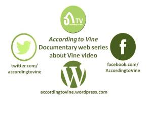
This is a flyer for a group student project that I am leading. We are making a documentary web series about Vine video called According to Vine. It should be launching in the next couple of weeks. We are learning to make social media by making social media about social media. The video episodes (3-5 minutes) will be hosted on YouTube and featured on  a WordPress website. We will then use Twitter and Facebook to create interest in the series and allow discussion about it.

flyer

This flyer is designed to promote the project and features the three main platforms used in the project and the logo designed for the project by students Annie and Jade. I decided to take a very minimal approach with a balance of the four circular icons arranged in a diamond formation with the web address underneath. The icons were sourced from the web and recoloured in various green tones to reflect the green and white colours used by Vine. The design was created in PowerPoint and exported as a JPG.

Charity Benefit

For my last collaborative character assignment I chose to do the “Promotional Flyer” assignment worth two points. For this assignment I decided to bring the worlds of Jack Spencer and Sebastian Crane together by having a charity event sponsored by Jack’s company, The Highland Corporation, for Sebastian’s disabled brother, Donovan. The Highland Corporation usually does their annual charity banquet for the American Cancer Society to honor Spence’s mother, but they decided to switch it up a little this year. This year The Highland Corporation will be holding their annual banquet to raise money for a new experimental surgery, which might be able to help Donovan walk again. I made my poster in a word document.

Here is my finished product.

Screen Shot 2015-03-15 at 8.14.01 PM

Here is a link to the original assignment: http://assignments.ds106.us/assignments/promotional-flyer/


pretty poster project

Okay so in high school I did this project for a yard sale that the school was doing so for the promotional flyer assignment I picked up that old file, dusted it off, spruced up the font choices and here we are.

yard sale booth poster

It’s all done in illustrator and the fonts used are from dafont. I choose to keep the colors at a minimum and to keep a lot of white space for printing purposes. I tried to keep a hierarchy by making the most important words larger and darker. The two logos are for the school and then the math-sci specialty program that was hosting the sale. The pta member that asked us to make the posters gave a a facebook link for the sale, but I was the only one in the class that used a qr code in my design to make things easier and to make it seem a bit more professional than spelling out the url. When we did critiques the pta member gave me some slack because I just said ‘clover hill’ and not ‘clover hill high school,’ but I didn’t change it cause it would throw off my hierarchy, and everybody would know what it meant and if they didn’t they’d find out when they went to the facebook page for more details.

Promotional Flyer- 2 Stars

This design assignment was something I used to do on a weekly basis. I just did not want to over do it on the graphics. I also wanted it to look simple, like someone with some knowledge of publications did the flyer.

This is to promote a craft fair for my character’s shop. Her shop was supposed to be a craft and occult store, so I figured this would be something that she would do.

assignment flyer