Novel Noir

I created a cover for what I think could be a very compelling noir pulp fiction novel about a woman in the early twentieth century taking revenge on a series of past acquaintances scattered in different cities across the U.S. who she feels are responsible for the tragedy of her daughter’s death. Will the authorities catch up to her before she reaches them all, or will she be able to…………. Cut and Run?

The background image is a city alley from Unsplash.com. In Krita I placed the silhouette of a woman above it in a separate layer, cut away some excess, and used the color balancer to give the whole image this orange tint-it had been black and white. I had to add the text in Microsoft Paint because Krita wouldn’t let the text be big enough. I placed a black box for the title to sit on so it stood out enough from the background to be legible and chose an old-timey font for the text. My biggest inspirations for the cover were This Gun for Hire by Graham Greene and In a Lonely Place by Dorothy B. Hughes.

Dime-Store Noir Book Cover I’m Really Proud Of

The prompt

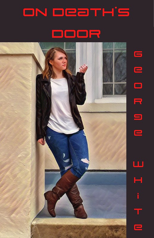
On Death's Door

Ok, I’m really happy with how this turned out. I love those cheap, predictable-as-all-get-out mysteries and action books, so I was immediately drawn to the prompt. Also I love this outfit and maybe I wanted to show it off?

This may or may not be inspired by the cover that is the thumbnail for the assignment. My friend took this photo of me on the steps of Monroe Hall. I made a cigarette out of an index card since I’m too young to get a real one but they look cool and old-fashioned. I put the photo in Canva and used the Windel effect to make it look like paint. I also straightened up the photo a little and added black bars on the top and side. I made up the title and author, I don’t know if they exist or not but I’m assuming not. The title was a phrase people say, but it’s also got “death,” and honestly, that seems like it’s the two requirements for the title based on all the examples I’ve found. The name just sounded like a fifties author. I’m really proud of how it turned out, it looks really cool and I feel really cool both from making it and from the photo.

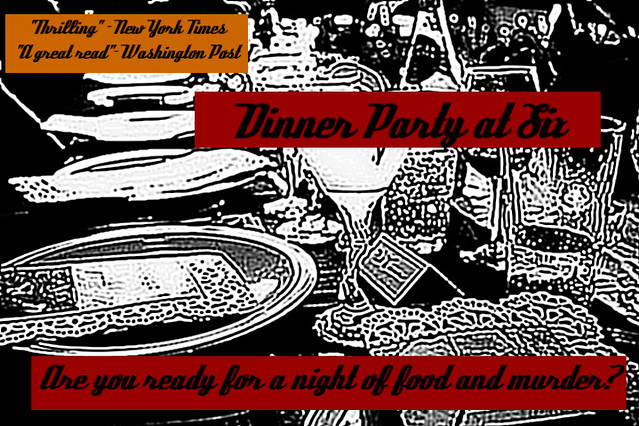
Dinner Party at Six Book Cover

Dinner Party at Six

Lukas had been so bored for the last couple days. Mack’s gang hadn’t been as active as they had been the previous weeks and there were no other notes detailing new missions. So, what could he do? The local bookstore was open and he decided he would read some book from the 1940s. Maybe he would become better acquainted with the time period he has thrust into. He explored the store. He picked up a book with a wine glass and plates on the cover. It was called “Dinner Party at Six”.
…Back of Book Summary…
Five Stranger are invited to a dinner party that will change their lives forever. The party ensues and characters start dying. They’re all strangers with secrets that will be revealed in this thrilling tales of who done it?
…End of Book Summary…
He stared at the book for a few seconds. It seemed to be interesting. It reminded him of the detective work he was doing. He decided to pick it up. It was only twenty five cents. What could go wrong?

Background
This assignment was the Noir/ Pulp Book Cover assignment that is 3 points. I wanted to make something that had to do with the Dinner Party at Six radio show that my group produced. My character was the butler and I wanted to tie things together with the butler version of Lukas and the future detective version of Lukas. This is the first part of another assignments I did that can be found here.

Rigged for Pleasure

Victoire Absinthe glared at the paper back she held in her hands. It was her newest romance novel, “Rigged for Pleasure”- it was trashy and terrible but housewives bought it up like hot cakes and kept the money rolling in. She was so glad she went by the pen name Scarlet Divine. She shuddered…. what would her mother think?!? Robbing banks and killing people is one thing, but impropriety?!

The package was delivered to her at her hotel earlier that morning, while she was finishing her coffee and preparing to go on a walk around the city. She took the package from the poor boy, (who still couldn’t meet here eyes) and went upstairs to her room to see what the stupid ladies at the publishing company had done for a cover.

The book was a rip roaring sexy adventure, complete with a dastardly villain who turned to be a reluctant hero with a crazy libido and hard on for the damsel. Victoire designed a cover accordingly. But instead of her beef cake cover, the publishing company decided to go with a pedestrian version showcasing a pirate ship and fluttery banner. Disgusted, she threw the paper back aside and sat at the tiny desk under the window.

She watched a couple cross the street to the bakery on the corner. The woman doubled over in what appeared to be giggles, clutching the arm of the man whose erect posture reminded her of a proud showman. Victoria’s lip curled. She hated men who showcased their dates but she hated the women who allowed themselves to be showcased even more. She closed the blinds. Stupid. Love was stupid.  Her eyes fell upon the note that was shoved under her door that earlier that morning.

“You.Me.Dinner.7.Tonight.” it was signed, “L”.

The note had been read and re-read. She didn’t know how she felt. Lawrence was certainly a man but what kind of man was he? She had no time for romantic pitfalls or screw ups. But the sex was good, so she supposed she could make the time for dinner.

He had to have a motive. Or did he? And, more importantly, what did she want in return?

(AUTHORS NOTE: ok so I am working with Tiffany Yowell’s character Lawrence in this scene. She’s written some great stuff about how Lawrence secretly loves Victoire, and I am building off that to create a cool narrative. At this point, Victoire is used to calculating events and how they transpire, and not really into relationships without a reason. Including good sex. For this assignment, we were supposed to create a book cover. I know that the book covers themselves don’t play a HUGE part in this story, but I know I have mentioned that Victoire was a trashy romance novelist in the past, and wanted to incorporate what she wrote into this post as well as her relationship with Lawrence. It is undeveloped at this point, but as time continues, motives and feelings become clearer as Victoire becomes closer with Lawrence. For the images, the ship in the first image is one of my own, and the buff dude is from the huffington post)

Noir/pulp book cover

The last assignment I did this week was the noir/pulp book cover. This assignment was worth 3 stars, and its instructions can be found here.

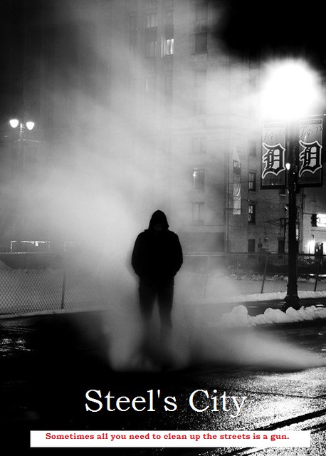
For my book cover, I again used my character, Billy “Saw” Steel, as inspiration. This book would detail his story, and how he lives a vigilante lifestyle in the tough streets of Detroit. The picture that I found for this cover is actually perfect, because it is actually a picture of Detroit. The only drawback is that the man appears to be wearing a hoodie sweatshirt, which were probably not around in Saw’s time. Well here is my book cover, let me know what you think of it!

Book cover

Noir/Pulp Book Cover

Design and execute a Noir106/Pulp dime-store novel book cover. Capture the feel and look of an old paperback set back in the noir times. in case you need some inspiration, here’s what a simple Google Images search has to say on the matter.  

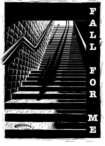
Fall for Me

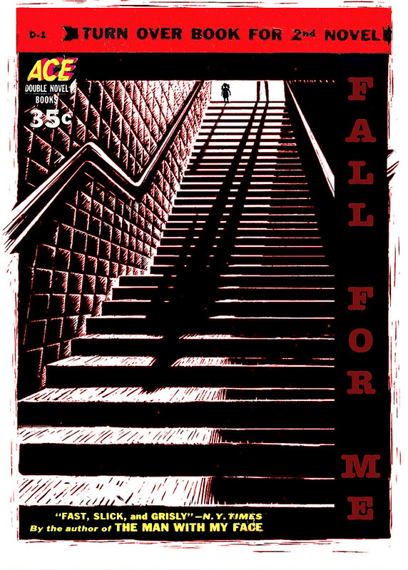
“‘Fall for Me’Book Cover,” by Talky Tina, on Flickr

Well, The Daily Create tdc1113 on January 25th, 2015 said to make a Word Art picture. So I did. It looked the black and white one below with the bird and the fish. I added the words “Fall for Me” to make it into a word art one. It just came from an idea that I had.

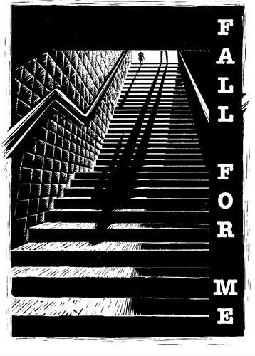
“Fall For Me,” by Talky Tina, on Flickr

Then I thought it would be better without the bird and the fishbone, and with me, instead. So I did a little editing of it. See below? If you look closely, you can see that the bird (originally the source of the smaller shadow on the stairs) has been replaced by ME!

I think that this makes for a much stronger piece of Art, don’t you?

“Fall for Me, Revised” by Talky Tina, on Flickr

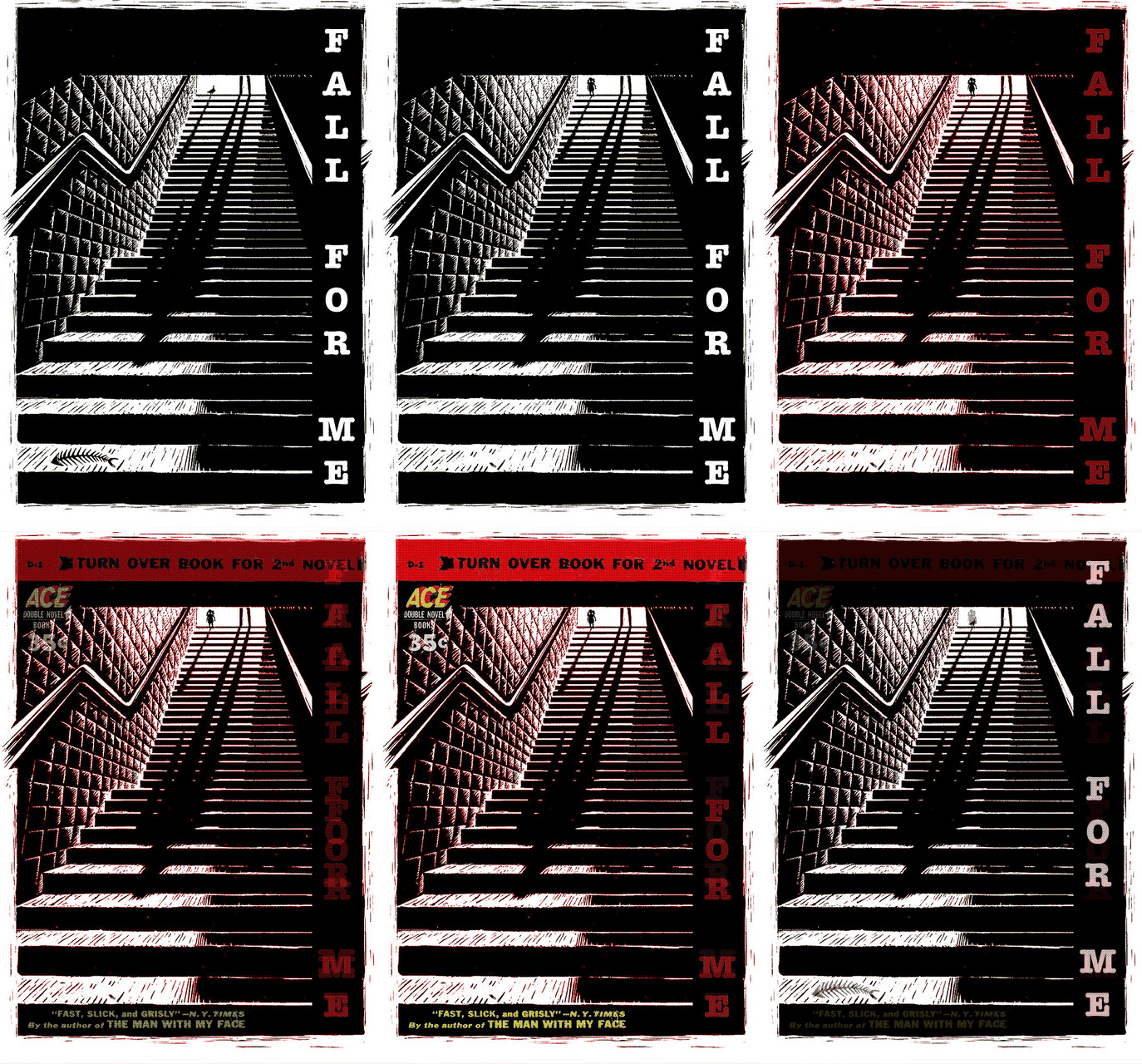
Then, I was thinking that a bit of colour would make it a bit more interesting. So I did. Plus, it could be for a Valentine one.  I think you can see how this little change of adding the colour of love brings just that much more depth to the image.  Imagine, the things that one does for love!

“Fall for Me, Valentine!” by Talky Tina, on Flickr

Then, it made sense to do a Book Cover version of it, and so that is what you can see up at the top of here.

Down below is a GIF that shows the evolution of it, so that you can appreciate the steps in the making of the Art of it.

"Fall For Me Evolution," animated GIF by @iamTalkyTina

The book cover elements were borrowed from the cover of “The Grinning Gismo” (1952) by Samuel W. Taylor, found on Pulp Cover Art. But I put them in some slightly different spots because it made it look better than before.

So it is nice when a simple The Daily Create makes for some inspiration and for making more and more changes until you get a real piece of Art. Plus, it can be for an assignment, too. And so I made a new one, because there wasn’t one for Noir/Pulp Book Cover.  Now there is! It is now Design Assignment 1618: Noir/Pulp Book Cover, by me, @iamTalkyTina!

So do it! Make some Art! You know you want to!