My Wedding Invitation

I have no real desire to get married. Even if I do get married one day, I have absolutely no desire to plan a wedding. My plan is to get eloped in a courthouse, have a nice meal after, and then go on a lavish honeymoon. That being said, I do love graphic design.

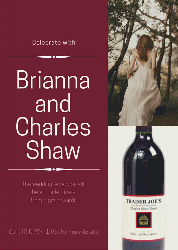
I used Canva to create my wedding invitation. I choose a minimalist design with some art deco elements. I found a picture of a bride from behind with brown hair so that I didn’t have to find a way to take a picture of myself in a wedding dress. Next was to figure out who I would be marrying. As I swirled the wine in my glass, a realization hit me. The most popular product at Trader Joe’s is their three-dollar wine, also known as “Three-Buck Chuck”. The official name for the brand is Charles Shaw. Unless someone knew off the top of their head that it is the name of a wine, they would think that it was the name of an actual person. Thus, my husband to be was chosen.

Our wedding reception will take place at Trader Joe’s in Charlottesville, VA. For more information, please call the number on the invitation, which coincidently, is the store’s number.

Save The Date

I had so much fun making this wedding invite. It was a really cool idea and a great one to play around with to make something goofy. It was kinda relaxing to do and have fun with. It didn’t feel like work and it was really funny to come up with some ideas about who’s save the date would be created.

My roommate and I both loved the show Once Upon A Time and were totally obsessed with the character Hook. So, naturally, I had to make a save the date card for my roommate and Hook. I saved a photo of Hook and took a head shot of my roommate to make my invite.

This was the final outcome!

You’re Invited!

Parks and Recreation is one of my favorite sitcoms and so when I was trying to think of a fictional couple to create a wedding invitation for, Leslie and Ben came to mind. This design assignment is worth 3 stars and asks you to create a wedding invitation as if you were going to be married. I didn’t think that was as fun, so I decided to go another way and created invitations to Leslie and Ben’s wedding celebration instead.

Why wedding celebration rather than the wedding itself, you ask? Well, if you watched the show you will know that they get married spontaneusly, months before their planned wedding. Due to this, I imagined the happy couple celebrating with friends and family over waffles at Leslie’s favorite place, JJ’s Diner. I couldn’t figure out the date they actually said “I do”, so I decided to plan the party for 10 days after the air date of the episode and call it a day.

I used Canva to create the design, knowing waffles would be the central theme. I used colors based on the waffle design I settled on to complete the rest of the design, used the Float text feature to help the wording stand out more, and added texture to the white portion as it literally fell flat without it.

I think Leslie would approve.

Here Comes the Bride

For one of my projects from the assignment bank this week I chose to design my wedding invitation. I chose this assignment for many reasons. Mainly, like a lot of people I have dreamed about my wedding since a little girl. Pinterest boards, girl talk, watching weddings, and everything in between. I also chose this because I have a lot of experience using Canva as a design platform. I am also a lover of the bachelor so I’m marrying Ben Higgins (If you know, you know). I chose the geometric pattern and the flowers to draw attention to the middle words. I created it where the names were bigger and bolded so that the reader immediately knows who is getting married. I think that the colors are very inviting and fit the appropriate wedding theme with the flowers.

Marrying the Bachelor

For my first design assignment this week, I decided to do Wedding Invitation. One of my favorite things to think about is my wedding, so I was really excited to do this assignment!

Another thing that I am super obsessed with is the bachelor franchise. I have been watching it with my friends since freshman year and we never miss a week. On the last season of the Bachelorette, there was a guy on there named Tyler Cameron. When he was first introduced I fell in love with him. He did not end up winning which was really sad.

So when I was thinking about who I would put on this wedding invitation since I am not dating anyone at the moment, I decided to put Tyler Cameron. I was really excited to get started designing the wedding invitation.

I start by looking through all the templates on Canva to find the perfect one. I finally found one and start customizing it to my wedding. I also had to figure out when I wanted to get married and where. The where was pretty easy, I love the Silk Mill downtown and would love to get married there one day. It is very rustic and so beautiful! The when was a little bit harder. I know that I wanted an early fall wedding so I decided to just look through my calendar and landed on September 26, 2020.

I love working on this assignment and I was really fun to be able to dream about my future wedding!

Wedding Invitation Assignment:

For my first design assignment this week I chose the wedding invite option. I chose this one for two reasons. The first being that wedding invitations are very much my aesthetic, and two because I was actually asked to design the facebook invites for family friends who are getting married in the Dominican Republic this May. (They also asked me to do the photography too!!) Their color scheme is different shades of blue because of the tropical location. I could have used illustrator, but am more familiar with Photoshop. I created the flowers in illustrator and then colored and arranged them in photoshop–along with the text and background. There are two different ones because the second skinner one is going to be a Facebook banner photo for the wedding and after party. Which is also why the location and further details are not listed. This was super cool to create because it will actually be used!!

Wedding Invitation

3.5 Stars

This assignment was harder than I thought. Canva has so many different styles to choose from. It took longer than I thought it would to choose a style. I’m really happened with how the final product looks!

You’re Invited!

For the 10-star-worth design assignments, I decided to do create my own wedding invitation. I used the computer applications paint and PicMonkey to do so. I created a pink-salmon color layout on paint, then transferred it to PicMonkey, where I added a “wedding style” banner and text. It was a difficult assignment in the sense that it was hard to choose exactly what I wanted on the invitation, but easy to create.

I then asked my boyfriend if it was fine to use him as my fiance for the assignment. He said it was a-okay!

Wedding Design

Here Comes the Bride

Wedding Invitation: We are currently in the middle of the wedding season. With this being said so many people out there are tying the knot! For this assignment, I would like you to create/design your own wedding invitation as if you were going to be getting married soon! What would it look like? You could include pictures, date, time, place, or anything else related to this topic that you think would be fun to incorporate! Use your imagination! Be creative! To create this assignment you should use Canva. Upload your invitation to Flickr and tag it DesignAssignments. (2.5 stars).

This is a tutorial on how to create a wedding invitation using Canva.com.

So, since you are looking into creating your very own wedding invitation, I have to guess that you are getting married and planning! First, Congratulations, and second, I hope my invitation tutorial helps your planning process go a little smoother!

I will make my own Wedding Invitation so it helps you too :)

First, I went to Canva. This is such an interesting site for anything you imagine. You are able to create a Facebook cover for your profile, or a presentation for your next class. The possibilities are endless.

So, once you have arrived at the site, take a look around. You are able to choose from so many options of layouts. Here is what you see:

Screen Shot 2015-12-03 at 11.17.57 PMScreen Shot 2015-12-03 at 11.26.03 PM

I scrolled down to “Events”. This is where you will find the Wedding Invitations icon! Click this card.

Now, a blank card will appear with a list of options on the side. This is your design deck basically, you will create your card here!

Screen Shot 2015-12-03 at 11.32.13 PM

The first button in your list of options (right-hand side) says “Search“. This button can do a multitude of things. I am hoping for a beachy feel for my wedding invitation that I will make today. So, I typed in the keyword, “beachy” into the Search box. As you can see, there are pictures and icons that match this search, and I can add them into my invitation. But, since I don’t exactly want a picture of a beach, I won’t do that today.

Screen Shot 2015-12-03 at 11.02.39 PM

The second option on your right says “Layout“. This is the most helpful  button in my opinion, and has many different pre-made wedding layouts for you to choose and alter! And, of course, you can make your own.

Screen Shot 2015-12-03 at 11.27.01 PM

I immediately see one I like. I clicked it, and it brought the card into the main area for me to work with.

Screen Shot 2015-12-03 at 11.45.33 PM

Of course, I have to change the colors, names and the locations, but I really do like the simplicity of the card. I will keep the font style. Hopefully you will find a style you like!

Screen Shot 2015-12-03 at 11.47.40 PM

I first clicked anywhere in the card where there isn’t text. This brought up a tool bar with options to change the color. I clicked the circle with the color inside, which represents the color of the card. I immediately go with a pretty shade of blue.

Also, if you want to change the font or the background color, click the side option “Text” and “Background“.  There are many other options you can choose from here!

Screen Shot 2015-12-03 at 11.02.19 PM Screen Shot 2015-12-03 at 11.02.27 PM


I forgot to also mention another awesome tool that Canva provides. You are able to upload photos from your computer or Facebook onto your invitation. How cool! To personalize it, pick a cute couple photo to add to your invitation. Click the “Upload your own images” button and there you go!

Screen Shot 2015-12-03 at 11.33.34 PM

Next, I am going to change the text to my personal text. Simply, just tap into the text box and write your name, location, date, and anything else for your invitation.

Screen Shot 2015-12-03 at 11.32.54 PM

As you can see, once you alter text, you are able to change the size and color here too. I will leave it as is.

Screen Shot 2015-12-03 at 11.45.19 PM

From here, I am basically done! Easy, right?

Wait…How will you save this invitation for you big day??

No problem. Canva has a Share and Download button for you! From here, you can put it on Facebook or simply save it for printing!

Screen Shot 2015-12-03 at 11.34.51 PM

Screen Shot 2015-12-03 at 11.54.08 PM

Here is my wedding invitation:

Miranda Skinner

How lovely!! I hope yours turn out just as well.

Again, Congratulations! Comment below with your own invitations!

—-SALTY SKINN
A wedding invitation

Okay my boyfriend would freak a little at this… But for my final design assignment I chose ‘Wedding Invitation‘, where you design a wedding invitation, and what girl doesn’t like planning their future wedding?!

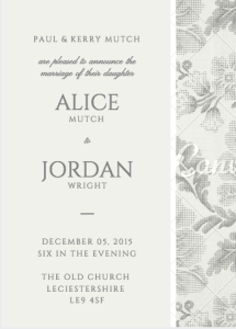
So using Canva, you can create millions of invitations for all sort of events, and theres hundreds of different styles and designs to chose from! After looking through all the designs for wedding invitations I decided classic and simple was a winner, and not very colourful… I really don’t know why I’m so drawn to grey. I then added in all my details and what not to make it look real, I think that looks very elegant if i do say so myself!

Screen Shot 2015-11-13 at 16.35.21