Being in an active long distance relationship myself, I felt that this assignment would have been a perfect topic for me to talk on and a great addition to my blog. The instructions for this assignment, worth 2.5 stars, was a little sparse in terms of what should be designed and along what parameters we should follow. However, there is a sample photo on the assignment page that gave me the inspiration and ideas I needed to complete this design assignment.
I had decided to create a collage using my drawings of my girlfriend and myself as a background and overlay that with some inspirational and descriptive text about our experience in our long distance relationship. I had made most of the pictures earlier last month and the others were from last year. And all of them were created using the Autodesk Sketchbook app on my Samsung Galaxy Tab S3. So, finding these images to create the background wasn’t all that difficult.

To create the collage, I had opened up the Line Camera app on my mobile tablet. I tried using the Autodesk Pixlr app for this step, but I didn’t like any of the templates for a 5-picture collage. Inside the Line Camera, I selected the template and photos I wanted to use. I then moved each picture around from the corners to the center to see where each one looked the best. Once all positioned, I added a color behind the photos so that it wouldn’t just be a bland white. With all of this done, I saved the collage and then returned onto the Autodesk Pixlr to finish up.
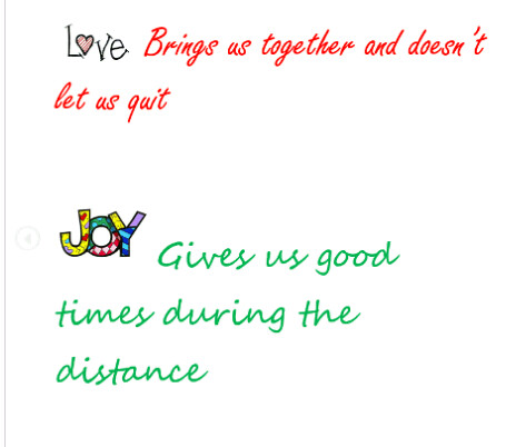
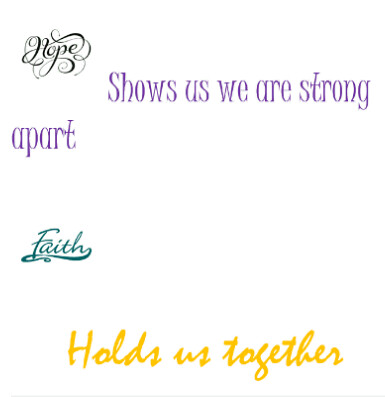
Here, I took the background photo and blurred it, as I thought it would help seperate the foreground, the text, a little better. I didn’t want to blur it too much, but just enough so it can easily be read. Finally, I went to add in the text. I already knew what I wanted to say for the most part and the rest it fell into place, where without thinking too much about it, I wrote what I had felt. I wanted to emphasize the final statement, so I left a space between “our” and a comma and continued on with “we are never”. I added a new text box, changed the style of the font and color and resized ti to fit in the blank space I created. I then added one final block and wrote “Seperated” to truly emphasize the power and meaning of this statement. I also wanted to make it a bit bigger and a nice warm color to contrast nicely with cooler colors behind it.
After I did this, I thought about changing a few of the contrast, brightness and sharpness settings to improve some aspects, but I decided not to as I didn’t think it would help the background image too well. All in all, I really enjoy how this turned out and I’m proud to be able to create something as nice as this. I definitely want to continue to play around a little more with photo editing and learn how to make more designs.


