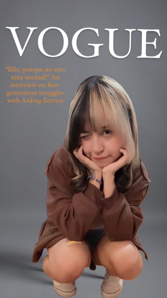
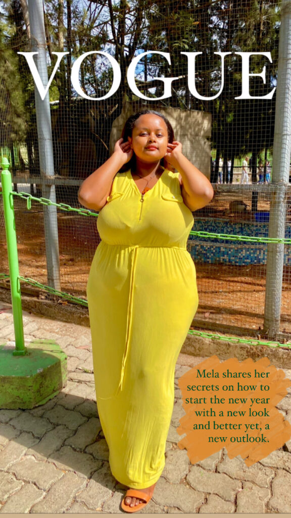
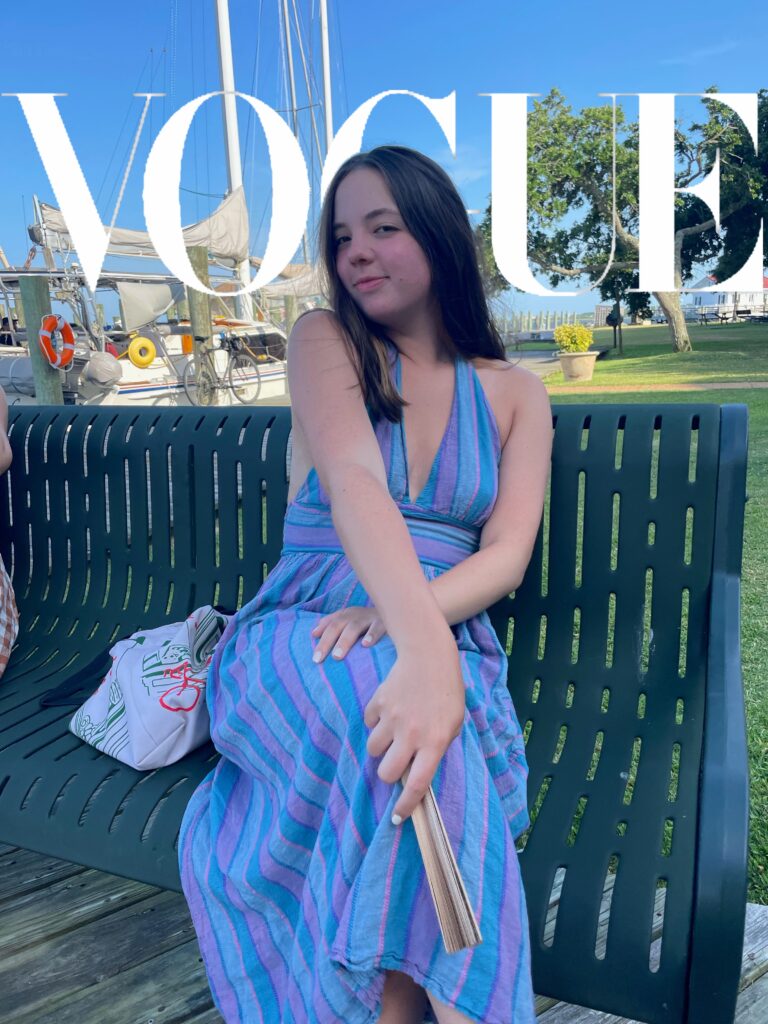
Earlier this week, I saw an inspiring post in the class Discord from someone else who had taken on this “Vogue Challenge” assignment. I loved the way they played around with the O, changing it to be a paw print to represent their dog. Unfortunately, I couldn’t find a way to do a similar trick that worked and looked good, so I had to keep mine pretty simple. Regardless, I feel that I captured the essence of Vogue in my attempt. I searched my archives for a photo of myself that would fit the aesthetic well and came across one from around 4 or 5 years ago. To help create a narrative for my piece, I figured the theoretical story on me in the magazine could be about my journey since then and how far I’ve come, hence the caption/tagline.

For the “Vogue” at the top, I wanted to have it match a color in the photo, but I didn’t want it to be too light or too dark. I was able to use the eyedropper tool to grab the color from my right shoulder and it ended up working really well. Then, I felt that I should use a lighter color for the caption to stand out against my clothes. The design for the front cover of Vogue is generally pretty simplistic, but I think that’s one of the great things about it. There isn’t too much pulling you away, distracting you, or confusing you. Instead, it has a purpose and I feel that my final result achieves that.


