Animated Comic Book Cover

hawkeyecovergif

It’s been a long time since I made something for this site, but Sarah put forth the challenge on twitter so here we go.
For as much as I love the Marvel movies I have not read that many comic books (I know… shaaaaame. Though I just moved and my house is within walking distance of a comic book store so we shall see). However, I have read Matt Fraction’s Hawkeye and it is amazing. When I found the comic book gif challenge my first thought was this cover. It is simple but a beautiful peace of work.

It was pretty simple to make it into a gif, as well. In photoshop I took the cover and removed the arrow from the picture. Then I duplicated the arrow-less layer 6 times. Then on each layer I pasted the arrow moving across the page. And voila. My first gif to jump back into making things for this site.

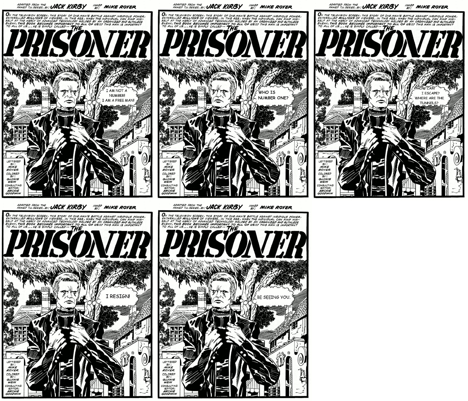
Animated The Prisoner Comic Book Cover

For my first project in Design Week, I chose to animate the comic book cover of Jack Kirby’s draft of The Prisoner. It is a Design Assignment (number 306) and worth an unbelievable four credit units.

Prisoner

My main method was to create duplicate layers, erase the text in the speech bubble, and add text. I also selected the head with the free select tool, flipped it, and anchored it back. I touched up a little bit with the pencil to close gaps created by rotating.

If I were to do it over (and I might), I would just have a background layer, with the speech cloud blank, and a right-facing head. Then I could use smaller layers for the wording and the flipped head. This would save file size.

Also, if this were to be a draft of a real cover, color would need to be added.

Watch me man

I have never been a fan of comics. I can’t say that I have ever read a single one. There was only really one that ever piqued my interest and it was Watchmen. There was something very poignant about the bleeding smiley face on the cover. Having never read the comic or seen the movies, I don’t really know the story behind that, so I have tried to create a little bit of a back story while animating the cover.

My main questions were how did the smiley get hurt? Was it a bullet? I am inclined to think that it was a bullet. How fast did the blood flow? I would like to imagine slowly since the shrapnel is blocking the blood flow.. Now of course I do know that the smiley isn’t actually a character in the comic book, just a symbol used in the comic. This is my vision:

cover2gifThe cover of the comic book is just a frozen moment of time, but now with motion is any additional feelings invoked? I’m inclined to think not.

It took me quite awhile to create this gif for this assignment. I started by importing the static cover into the Photoshop (the last frame of the gif). I then set to work to remove the blood stain. It took awhile to first select the bloodstain using the Magic Wand tool. Once I did that I used the expand selection option under the selection menu to grab some of the surrounding yellow/black. Then I pasted the blood stain onto a new frame. Then in that new frame I removed the extra material around the stain using the Magic Wand tool again. After that I went back to the background layer and filled in the missing space with the yellow color. The next thing I had to do was reconstruct the eye. This was one of the hardest parts. I used the ellipse selection tool and drew a circle around the eye, after that I used the Transform Selection tool to rotate and reshape the ellipse to the exact shape of the eye. Then I filled that in with the Black color.

Now its time to animate. I set the blood stain layer to 50% opacity as to be able to use it as a guide when using the brush tool to paint the blood. I would paint a little bit and then hit Ctrl-J to duplicate the layer and then paint a little more. I did this repeatedly until the whole blood stain was repainted.

Now I opened up the timeline window and selected Convert Layers to Frames. This then imported all of the layers into frames, but now the problem is that the background is just a frame that plays in the beginning, but we want it to stay in the background the whole time. So then I switched to the video timeline editor (still in the timeline window), and then I changed the duration of the background frame to stay for the whole duration of the animation. Next I switched back to the Frame view, and setup a two frame tween between the last blood frame I drew and the final blood frame. This created the nice stylized transition. After that I exported the gif! Wow that really was four stars fun :)

Shake things up

gothamacademy4

Shake things up? Cause it looks like things are shaking? get it? ahahahaha

This is my completed submission for this assignment ( 4 stars)
To start this assignment I made a list of all the comics I’ve been reading lately. Then I eventually narrowed it down to my current favorite, Gotham Academy.

Gotham Academy is basically about this Academy. In Gotham. Has something to do with Batman? Basically I’m just a sucker for magic teenage boarding school type stories. Plus the characters are awesome and incredibly diverse. Perfect combination.

Above we have Olive, Maps and Kyle pictured. On some shaky ground. I chose this cover because the idea for the gif/animation came to me as soon as I saw it. The motion in the image is already beautiful illustrated, I simply intensified it.

But…the actual action of intensifying the image and making the gif/animation was much more difficult than I thought it was going to be.
As usual, I started in photoshop. After loading up the image, I duplicated it. I then took the quick selection tool and selected the characters and the rock/ground they were standing on.

This is where my main issues were had. My selection skills were off tonight or something. I had to use the add and subtract selection tools to clean things up. A very back and forth, tedious process.

But eventually, I got things the way I wanted them. After everything was all selected I copy and pasted it to its own layer.

So then I had three layers all together. Two with the covers and one with the characters. I applied a filter to the layer with the characters to blur it, then arranged it on top of the second cover layer. When I was satisfied with how it looked, I merged the character layer to the second cover layer. This left me with two layers. One with blur and One without.

I put the two together and created an animation. Then went in and adjusted the frame time.

And finally saved and exported as a gif  (?´?`)

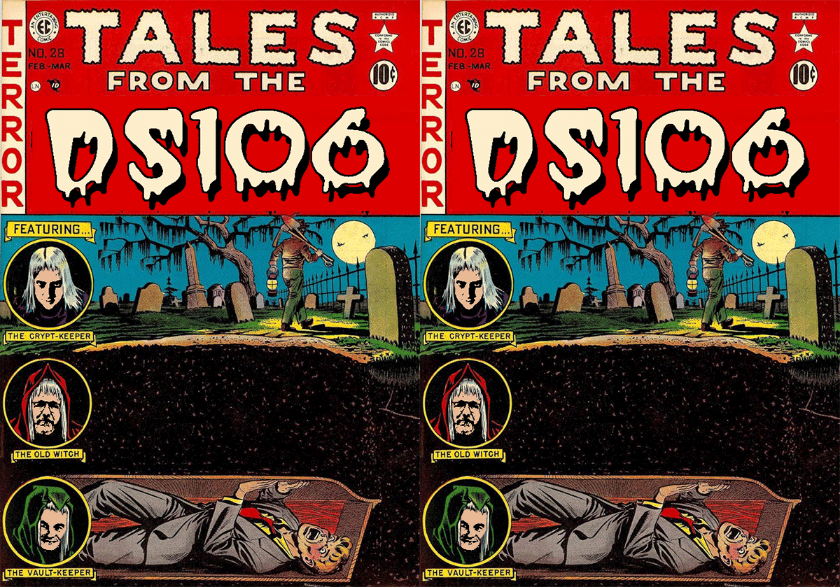
Tales from DS106

Jim wrote a bit about sharing comic books with his kids and talked about making an animated GIF out of one of the covers

I want to have the dude who is buried alive slamming on the coffin, need to talk to MBS about the best way to do this.

So I thought I’d give it a try. Making the arms pound didn’t seem like it would be too difficult – it’s just a matter of lassoing them and copying and pasting into a different layer. The one in the foreground I did in two parts, forearm and upper arm, and the other arm I did as a third layer. I used the move and rotate functions to shift the arm positions a little, and made my two animations frames – one as is and one with the arms moved. I decided his head should move as well, so I did a copy-paste-rotate job on that too. I copied some of the coffin behind his head and used it to cover up the background layer, so you wouldn’t see both when it moves. This is the hard thing about animating comic book covers – fixing the background bits. I didn’t do it with the hands because I was hoping the double image would contribute to the illusion of rapid beating. I was wrong though, so I had to work on it some more. Then I decided to follow John Johnston’s suggestion about the three hosts in the circles. After doing that, I couldn’t leave “Crypt” in the title. The problem there was finding the right typeface. I’ve seen one with wedge-shaped characters that I might be able to modify, but I don’t have it on my laptop. So instead I looked for a Tales from the Crypt font online and used what I found. It’s not even close, but it doesn’t really have to match anything so it sort of works.

talesfromds106

Flashing covers

Screen Shot 2015-01-26 at 7.37.16 PMScreen Shot 2015-01-26 at 7.37.16 PMScreen Shot 2015-01-26 at 7.37.16 PMScreen Shot 2015-01-26 at 7.37.16 PM


When this week’s noir106 assignment list said for us to challenge ourselves with a four star assignment, I never expected the challenge to be this hard. I knew that this would be a daunting assignment, but all the great examples made me think, hey, I can do this. I’ve worked with gimp a lot lately. I even made a gif once before. 

Well, this was not easy at all. This entire assignment took me a good 3 hours. I spent so much time trying to figure out which layer was where and what cutout was doing what and how to add animations and merge layers and delete colors and…

Yeah, it was a whirlwind, but eventually I got to a finished product. It’s not as cool as some of the other examples, but I still like my results. Plus, as I sort of mentioned above, I learned a lot about layers in this process. I figured out better how to work with different layers on a single picture, as well as how to work with foreground and background coloring and blending.

One thing I really wish was available were clearer tutorials for how to work with animation on gimp, specifically for this project. I think I might make one for one of my tutorial requirements, but I would love to see how a true expert would explain it. 

Cyclone Laser Beam

The design assignment “Animated Comic Book Covers” was challenging but a lot of fun. It really tested my rookie skills of photoshop and GIMP. First I had to choose a comic book cover to animate. I wanted something that would my photoshop ability but not be too challenging. This X-men cover is from 1991.


x-men1991series1


I chose to animate the laser that Cyclopes was shooting out. I did this in 3 separate layers. The process isn’t going to be as clear as I would like but a lot of figuring this out was trial and error. First, I photoshopped half of the laser out of the picture (half farthest to the right). I used the clone stamp too to fill in the area that the laser was at. This took some messing around with to try to make it look as least photoshopped as possible.

1st laser 3

You can see a clear line as to where the laser was. The reason for this is I used the magnetic laso to create a layer of the area around the photoshopped laser. So above and below it. I did this to try to keep the photoshop consistent between the different layers. There may be an easier way to do this but I just did the way that made sense to me. Thinking about it now that I am explaining it I probably should have photoshopped it and saved it as a picture. Then  on the same layer in photoshop take the other half of the laser out and then save that as a picture. I did save them as 3 seperate pictures but took longer steps. The next photoshop looked liked this:

no laser 3

Using the original image with a few photoshop corrections to make them consistent I opened the images as layers in gimp. I used the blend function to make the animation a smoother transition, if that makes sense. The reason I did half of the laser at a time is I was trying to make the effect of the laser shooting out. I think I achieved that slightly but maybe could have made some changes to the GIMP animation to better it. Here is my final animation:

Xmen


4 Stars

Riverdale Summers the BEST.

Archie-comic-cover


Ok So this here is my second attempt at the Animated Comic Book Covers challenge, from the DS106 Assignment Bank. I remember these small comic books that girls mostly used to read in the digest or double digest form. I Archie comics could be considered a true American since they have been around for so long(since 1939 actually) and the Archie brand has some spin-offs as seen on their website.

For this gif I used Photoshop instead of Gimp or Pixlr. What I did was to change the original image from a jpg to a psd layer. I then duplicated the original layer as a means of back up so I could work with my additional copied layers. So I started in my third copy where I decided to remove Archie’s bubble since I wanted to effect of the characters talking. So after removing the bubble I had to fill in the area to try to make it seemed as if the bubble was never there. So I used the clone stamp tool which was pretty efficient but rather tedious, but forces you to try to stick to detail. So after taking out Archie’s bubble and cleaning up the gap, I copied that image and repeated the same process for Josie’s bubble. I also proceeded to remove the and copy the music notes and place them on a new layer collectively, then individually with the birds. Then lastly the radio antenna. So after numerous copy and pasting of layers to get the different placements which really takes some time I ended up with nine different different layers for my animation. For the animation the layers had to be organized in order then for each layer I had to I time play ranging from 0.1, .0.2 or 0.5 seconds to make it seem somewhat legit. So here we have above the end product and below the original comic book cover.


archie213


Amazing Web Shooter

Spiderman

So what I have here is a comic book cover which I found on Google image search. This was one of a couple choices I made for this assignment so I will be attempting more. The idea to animate the comic cover came from the DS 106 bank and more specifically the, “Animated Comic Book Covers“. So what I did was to open the original image in Photoshop and resize it to about  500 x 750. Then I created four additional layers of this image. However for each added layer I erased half of the webbing starting on the left webbing till I had an image with no webbing. So to erase the webbing what I did was to use the quick selection tool on the areas I wanted to be gone, then edit to fill with the Content-Aware which does an ok job in this case in manipulating the background to edit out the selection. Then clean it up using the Clone Stamp Tool. So with my five layers I open the animation window and select all frames. In this window I arrange the layers as I want them to play out. I then assign a forever loop to the animation and give each frame a time frame of 0.1 seconds to play. Then save for web and devices as a GIF file.


Pick a Card, Any Card

From the X-men subseries on Gambit.