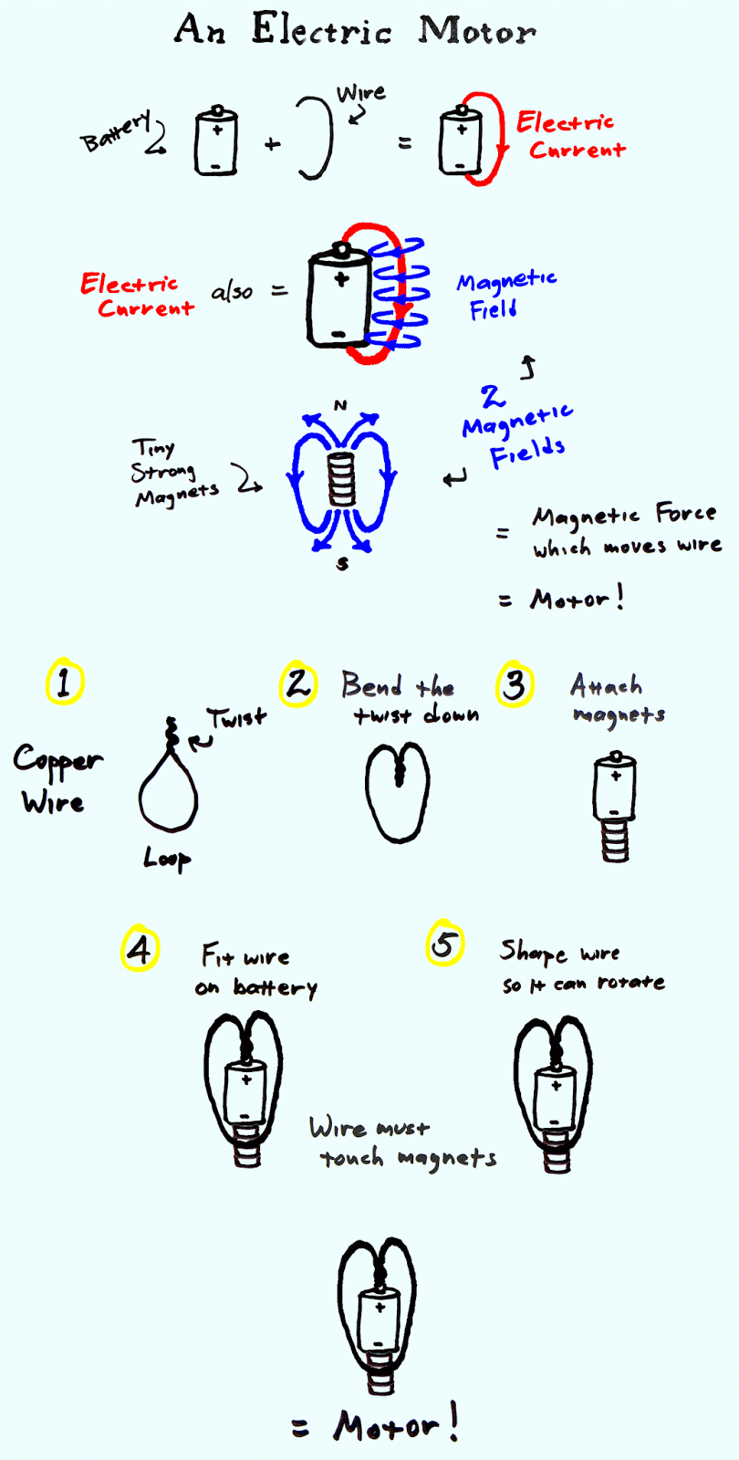
Well maybe I got too carried away, but this is a response to @giuliaforsythe’s design assignment Learning by Design at ds106. This is both an explanation of how an electric motor works and instructions on how to make a tiny one. I have my students do this in my physics classes every year, and it’s a favorite hands-on project.
If I had been at school, I would have done it all on the Smart Board, which is easier to draw on and manipulate. Instead I drew on several pieces of paper with a black marker. Then I photographed the pages, and used Photoshop to extract various images from the photos. I carefully built the image up, layer by layer, copying and manipulating many of the layers, and adding color. I designed the page to make the concept and instructions clear with minimal text. It’s a pure conceit that it looks like I drew it as a single page. I couldn’t resist creating a half-dozen frames for an animation of the little motor at the end, copying and manipulation just one single layer in each frame.
Visualize a blog post, TED Talk, Class lecture or even dense text from a book- through drawing. Use the pictures to symbolically represent & concretize abstract concepts, and to make connections between ideas. Try to use words sparingly and only to reinforce your imagery.
Doodle it in your notebook, use your tablet, or scribble it on the back of a napkin. Just be sure to digitize it and then blog about the process, including citing where your inspiration came from.
I decided to follow another ds106er path (that”s you @spencer_cscott) and take an assignment and tweak and create it into an assignment of my own. Learning by Design is creating a doodle or sketch of a complex topic and making it into a visual with design principles.
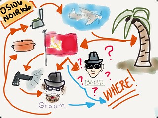
I have been interested in sketchnoting and been reading the work of Sylvia Duckworth. (Sketchnotes for Beginners) And for years now RSA style videos have fascinated and tempted me to discover how to create. The next thing that came into play was all the mystery around Dr. Groom this week. It is hard to not want to jump in as you are doing the assignments. The adventure actually creates a thread of connectedness in the community. (Probably designed that way don’tcha think!). As we each explore digital media and how to use it, a common thread helps as we approach our own content in learning new ways of creating and expression.
PROCESS
After reading about sketchnoting and downloading a few apps for my iPad. I settled on Paper 53. I liked the way it handled and the quality of the sketch. It makes scribbles, and bumps and jumps, look like a style and intended.
At first I thought I would use video and make it more of an RSA kind of presentation. I used an IPEVO document camera which captured my sketching in video format. It is cool and it worked and I will definitely go back to it for another assignment or creation. For my intent here, the distraction of my hand drawing (it looked HUGE) was not an example of thinking of design.
I refocused on the topic of the week – design and then decided to use photo shop instead, but add the audio and animation features as well. So here is the tweak – I did a design, of still images with audio to produce a video. To keep it manageable and an assignment not a project – I used only a part of the weekly videos to sketchnote. The reasons were that this was not to actually create a product of the content and it will be old in another few days. I wanted to understand the steps and process and create something short enough for feedback from others.
I downloaded the Groom Week 4 Video and the Intro to Week 5 video to extract audio. This was a good follow-up to week 4 and pushed me to stay with Audacity and audio editing. Another plus to continue with audio from last week and build.
I worked on the audio portions that I wanted to include in my story. From there I needed to now listen and do my sketchnote of those portions. I used the Paper 53 and created a full image just as the original assignment had suggested.
After saving as a JPEG I moved to Photoshop and opened the image.
The next steps:
Create 22 duplicate images and name each in sequence of sketchnote and context.
Create a first layer of a white background to act as the whiteboard.
Start with the first of the sequence and erase all but the one image.
Continue with the next 21 layers.
Export from Audacity and then Import the edited mp3 into Photoshop
Use the Timeline feature of PS and set all images at END of audio clip. I needed the story to stay within the audio so I worked backwards first to prevent running out of room at the end and having to continuously go back and move all the layers around.
Added transitions to layers when needed.
Created and added a last image for closure and identification, then added it to the timeline.
When satisfied with placements and flow I went to RENDER VIDEO and exported as mp4.
So sounds not too bad. BUT – I had to do this more than once – I stopped counting after #3. The first time I started on my desktop machine. As evening rolled around, I decided to switch to my laptop and at least be in the same room as my family and a little more comfortable. By this time it was mostly just the grunt work of moving layers a fraction of a space etc. Thought all was going great – it played in preview just great! I rendered and when I opened it NO AUDIO.
Okay – go back and try again. But then I found that after rendering and saving – the timeline turns into something flat and you really can’t go in and change much. So I had to get rid of the timeline and replace all the layers before rendering again.
Done – rendered – NOW IT HAS AUDIO BUT IMAGES ARE TWISTED! I needed to redo again! And this time I stressed out my laptop and it ran out of memory and froze up! Now I had to do machine maintenance and repair. Time for bed!
The next morning – I just went right to my desktop and worked there. I had saved some copies- but basically they had too many edits in them and it was faster to begin again. I had this down now – back to the Next steps above. Followed them and YEAH!!! It rendered and it came out fine!!!
LESSON LEARNED: Before exporting or doing a major change to the file – save at least 2 copies. This way I will have a master copy of a place in time to go back and not have to start completely over. I will need to remember to update that file as I go along as well. Next would be to get rid of all the copies that won’t make a difference anymore if you have to back so that I am not eating up memory and storage.
The original assignment was 3.5 stars. I am bumping it up to 5 stars on my chart – but I’m not tracking stars as an open course participant anyways.
I really wanted to try to make an infographic of some kind, so I decided to do the Learning By Design assignment worth 3.5 stars. Since I am not very good at drawing, I googled different infographic maker sites that let you make infographics for free. I came across Piktochart and really liked the different icons and fonts that were included in their free package, so I went away and registered and began making my infographic. I chose to do an infographic about upcycling because sustainability is very important to me, and although I am not a perfect environmentalist, I do try to at the very least recycle any of my paper, plastic, cardboard, or glass products. I also figured comparing upcycling to recycling and downcycling would be fairly straightforward without using a lot of text.
For the actual design of the infographic, I went with the wood panels background since I thought it conveyed a kind of rustic, earthy feel. I also went with the sketch-like typography since it also seemed to be a little more down to earth. The word upcycling definitely had to be green because it is the “greenest” option. Recycling had to be blue, because society has made recycling bins and the recycling symbol blue. Finally, downcycling had to be a dark grey because it’s the worst option, and objects that are downcycled are at the end of their lives. The design is also very literal when it comes to direction. The wine bottom getting downcycled into the trash is underneath the start point because it is going down in value and usefulness. The bottle getting recycled into glass ornaments, is somewhat of equal value and purpose so the recycle option is next to the start position. Upcycling the bottle into a cool lamp is increasing its purpose and value, since it can continue to be a lamp forever and so that option is above the start point. Overall, I enjoyed using Piktochart, and I think I accomplished my goal of making an infographic about upcycling.
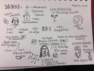
I have wanted to try visual note-taking for a while and have given it a couple of tries, but find that I drift to using mostly words. I bought Mike Rohde’s The Sketchnote Handbook last fall as inspiration. This week I attended a symposium on MOOCs and Libraries so decided to try visual note-taking in one of the sessions. I ran into quite a few problems. I didn’t allocate an appropriate amount of space for each of the three speakers. I rambled with the first speaker who ended up with 75% of the page real estate. My next problem was that I had ideas for things I wanted to draw but blanked out when trying to actually draw them. Luckily we had WiFi in the room so I could quickly Google for a couple of ideas. I used a black liquid gel pen and made a couple of mistakes that were hard to disguise as something else.
Next time I try this I think will follow a couple of Mike Rohde’s suggestions – prepare more ahead of time by doing a bit of background research, complete the title of the presentation before it starts and build up a stock of logos and frequently used images that can be trotted out when required.
For those of you in my classes, visual note taking will be an important skill for you to develop. It will increase your capacity for taking notes, it’s more fun, it makes your notes easier to study, and it will help you retain more information. I will also expect to see you taking notes like […]
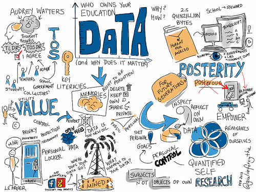
Another great #etmooc session this eve. Audrey Watters dropped some awesome thought bombs. She posed some challenging questions, as we move beyond the analog manilla envelope (like her mom collected of her school artefacts) into the digital realm and quintillions of bytes are collected daily.
How do students, teachers, administrators, schools, and governments decide who owns what, for what purpose.
Starting with the terms of service, which we admittedly all quickly click through without thoroughly inspecting who is giving and who is taking value. (TLDR= too long, didn’t read ~ TOSDR = terms of service, didn’t read!)
Issues of control, protection, privacy (anonymity, pseudonymity) are all factors. Now that so much of our learning is digital, it’s not only the data from our transcripts of our final grades that schools hold. Such good questions about the data that exists from our assignments, time on the LMS, time watching videos, number of attempts at quizzes, frequency of comments on blogs or discussion boards, chats, location and many more that boggled my mind thinking about.
Keeping something for future generations is the definition of posterity, which is deeply ironic given the announcement this week that the online blogging platform Posterous will be shut down next month. Again this highlights the importance of hosting one own’s data or at the very least maintaining your data in a format that is portable, mobile, in an open standard. This is intrinsically linked to the importance of keeping the web open so that our data can be machine and human readable on multiple platforms. We should be able to inspect and reflect on our own data, to be subjects not objects of our own research for our own purposes. In the matter of utility, we should be able to decide when to share our data and for what purpose.
Props were given to UMW’s Domain of One’s Own project, of which of course, I’m a big fan. Listening to Audrey discuss the issues, I’m ever more certain that even if you don’t want your data to be permanent, that agency is critical.
Audrey’s ideal solution is akin to a concept of the Personal Data Locker, where we have an open, standard login identity like OAuth. While Facebook and Google would love to hold the keys to our login identities, this control should belong to us so we are the masters of the many remnants of ourselves online. Managing your own data is a key literacy. Controlling your data is controlling your memories.
Shouldn’t we have the right to forget, delete, keep, own and share as we navigate the boundaries between private, public, and personal?
For more info, read Audrey’s post, watch the ETMOOC archive, and check out the Google Doc chock full of resources.
Learning By Design (*****) is an assignment in visual note taking. Because many of you expressed interest in the style of the Steven Johnson video form week 1, here is your opportunity to learn more about how this is done.