DS106, The Movie

DS106
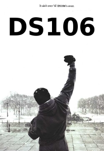
Instruction:”Take a movie poster and change it to depict a movie about DS106. It’s sort of like the DS106 propaganda poster, but this time, it’s DS106, the movie!!”

I chose Rocky’s poster.?

I used GIMP2 to change the title and catch copy.
first, paint the title and catch copy white and add new one.
Also I cut off the description under the original poster.
that’s all!!

They’re Here!

I loved Linda McKenna’s assignment to make a ds106-themed movie poster, so I started searching through some of the classic horror movie posters over the years. I didn’t have much time because I still have an Animated Comic Book Cover GIF to do, so I was looking for something quick. When I saw the movie poster for Poltergeist I figured why not just replace the hockey game on the TV screen with the ds106.us website? I did a quick screen shot of the ds106 website, but proceeded to spend about an hour messing with the layers anyway between tracing out the TV screen, cropping the added layer, messing up a few times, etc. In the end it’s still far from perfect, but I think the idea of ds106 as an alien that abducts your soul not unlike TV is made clear. What’s more, this little known alternative tagline for the film sums up my whole idea of the class :)

DS106 Movie Poster

Three Star Assignment

dark knight movie poster

Process

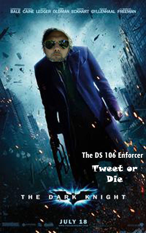
Okay by far this is the hardest and most difficult project I tried to do. I know this picture is not impressive at all but I did try my best to figure it out. The first difficulty I had with this project was finding a suitable picture of our professor Jim Groome. The shades picture was the only suitable candidate but even with skew and scaling the picture down it still didn’t seem to fit the picture right. I then used What the font to find the font used in the picture. For some reason I could not figure it out, it always gave me fonts that did not match my picture. After trial and error I found a similar font as the one used in the bottom of the picture. Even then I could not figure out a way to remove The Dark Knight without messing up the picture. I then decided to just put in the corner what I intended to more artfully craft into the picture.

Any advice anyone? How do I use whatthefont? How should I have incorporated Groomes face into the jokers face better?

Motivation

Now that I have explained the difficulties I had with this assignment I can hopefully articulate my intent. I basically tried to put Groomes face onto the Jokers face to imitate how serious our professor takes our course. I specifically wanted to mention something about the serious lack of tweeting and jamming of some of our students. Groome will come after people like us if we don’t taking serious the motto: ds106 for life.

Sucked into DS106

This poster represents the digital world in which we are studying and how it sucks up into another world.  I took the original movie poster and changed the words “the computer” to be Ds106.

Movie Poster 3 Stars

RAIDERS of the LOST ART

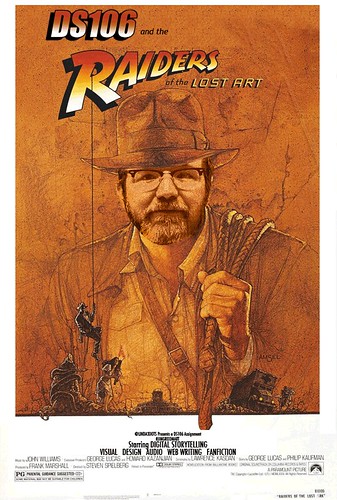
Inspired by Linda’s DS106, The Movie design assignment and the eerie but awesome Make Jim Groom Art, Damnit! visual assignment, I have attempted my own movie poster starring Professor Jim Groom, the intrepid explorer raiding the lost art!


cc licensed ( BY NC SD ) flickr photo shared by giulia.forsythe

I cannot begin to tell you how excited I was to see Noiseprofessor detail some of the steps he takes when he does his Photoshop Jams. I used many of his tips, like Render light source and keeping multiple files of Jim’s head.

As usual, when I do anything DS106, there was A LOT of futzing. It is not a science. There are many times I am glad I save often and there is an extensive HISTORY to undo my changes.

I also used the pen tool to do my selecting. There was a lot of use of the Edit-Image Adjustments-Replace Color in order to get the right match of yellow/orange/brown for Jim’s head. I used the gradient tool to do the DS106 and had to make a custom selection to go from red to yellow to white. I would have liked more yellow but I didn’t quite notice until I had already added the drop shadow and outline. By that time I’d already put in waaaaay too much time to go back and fix it.

DS106 Movie Poster – Design Assignment

I came up with this idea while working on the propaganda poster design assignment.

This didn’t quite fit in with any other assignments already there (please correct me if I’m wrong), so I decided to just submit it as another design idea.

Design Assignment 372:  Take a movie poster and change it to depict a movie about DS106. It’s sort of like the DS106 propaganda poster, but this time, it’s DS106, the movie!!

Here’s my submission:


I found the original poster HERE.


Here is a side by side view of before and after:


DS106, The Movie

Take a movie poster and change it to depict a movie about DS106. It’s sort of like the DS106 propaganda poster, but this time, it’s DS106, the movie!!