Fine, I will make some art dammit!

Assignment: Make some art, dammit!

Influenced by my friend, Sakura’s entry, I’ve decided to also submit for that assignment. For this assignment, I’ve wanted to draw something that I’ve been wanting to draw, and it was a pretty big drawing meme on tumblr.  Draw a gijinka of an eel, or eeljinka.

Now, gijinka is Japanese for personification, and yes, I did say eel.  The first thing you do is make your own eel by going to this website, where you can customize your eel by changing the eyes, mouth, body design, and color.  The eel above is what I’ve got.

This was pretty big in Tumblr, almost all of the art blogs that I’m following jumped on the bandwagon, and I wanted to as well.  But the process wasn’t so easy.  If you want to see my progress, come over to my video post, which should be the next post.

Note: CrystalSnow is my internet art username.

just my art

By watching the DS106, I fount the title called Make some art, dammit
so today, let me show my art about Fearow Gijinka!

As watching this blog, I guess you had know that I love Fearow.
Gijinka = personification, so I would like to draw my Fearow (from pokemon-Black) as a human.

First start from my dirty rough draft.
For my Fearow (normal color ver.) she has a big Ax so
I also have to draw this.
For the diffrent color version, It has a long spear
for its weapon.

Drawing more into the rough darft.
Don’t mind about the drawing in the top right,
I just wanted to draw something like that first.

I have finish drawing my rough draft.

Color in the whole thing brown for the layer top of the rough draft.
I have separate the weapon and the characers layer so
I could draw in to the character more first.

Put in some light color in the top of the brown one.
The layer hasn’t still change.

After coloring the body and feathers lightly
it would look like this.

Now drawing in the armors.
I want the mask to be an red armor because
it could represent the fearows head.

Drawing her legs and coloring in the armors more.
add a little bit colors for the feather.

I had also draw the color simply for the armor in her brest and head.
and smoothen up her skin for the body.

For the feathers in the leg, first i would draw some dark lines
so it would be easy for me to draw the shadows for it.

After blending the colors for the leg, it would look like this.

Drawing in to the armors for the head.
I love to draw metalic stuff but I usually don’t draw like this
so I thought it would be hard, but it was just fun to do it.

It said in Japanese.
Fearow is my wife!!

I have colored in the most of the part in the body
so next comes the wing.

Draw one line for the light colors first,
then add more lines to make it look like an feather.

Here, the feather is finished.

At last I have colored the weapon
and make the shadow for the other side of the feather.

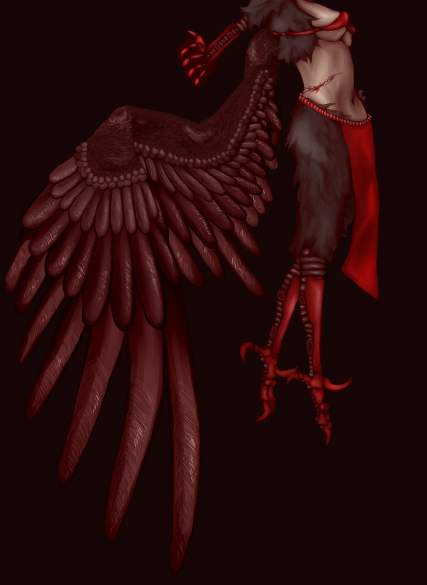
Here it goes! There is my Fearow.

Cinemagraph

Baraka Cinemagraph

A Cinemagraph from a scene in the movie "Baraka"

I decided that with all of the animated GIFs being posted to DS106, I would try my hand at creating a Cinemagraph, which is a specific form of animated GIF, described as “somewhere between a still photograph, and a video”.

My inspiration came from this collection of movie Cinemagraphs, and I used this tutorial to get the general idea.

This scene in particular comes from the film “Baraka”, during the portion of the film titled “The Hard Side Of Life“. For those not familiar with the film, it is a sort-of documentary, but explaining it in any detail is hard. I highly recommend it.

we can read movies – Hitchcock

bookcover bookcover

bookcover bookcover

For this assignment I used Adobe CS InDesign which I’ve had for a while but not used. This gave me a chance to use it. I didn’t need to find any tutorials as it was fairly straightforward to use as I am very familiar with photoshop.

I started by making the basic book design for the we can read movies series. I then tried to establish a feel for the Hitchcock series, which needs a feeling of suspense… I followed some hints from Cheryls blog post about design – using the triangles, the diagonals and the dark background. I used one graphic for the series to pull them together. This was actually a photo of a tube station and I think the diagonal lines of light establish tension too.

It was really hard with Hitchcock to not go with the obvious but what I wanted to do was use my own photos where possible and to add effects in Photoshop to make them more like a graphic. I used the artistic filters cutout in the main and it was interesting playing with that. Very hard not to use birds for The birds and I tried not to but found a photo taken on hols where we a roof was covered. This is probably one of my favourites as I worked the rooftop to align with the triangle edge. I had to use someone else’s photo (thank you baileyclark for using a CC licence)  for Shadow of a doubt as I wanted to use an emerald ring and don’t have one. The ring is central to the story, highlighting the tension between the relationship of Charlie and her uncle and also being a crucial clue to his involvement in the murders. I tried to have one colour in each main photo so that I could colour pick it for the title text.

It took blooming ages but now we are planning a film noir series, possibly a sci fic series, and I would like to do more hitch ones.  It takes alot of time but has stimulated some great conversations in the family about what key image/icon could be used to convey a film and has made me re-discover some of my old images and play around with them…

I love ds106 for this assignment alone. Even though i have fallen behind on the visual and design assignments and have only just started thinking about audio assignments – we will definitely be continuing to work through the whole summer of oblivion.