Coming Soon

You may have heard of Bob Ross: The Happy Painter film. If not below is the trailer.

Now coming soon to a bookstore near you is the novelization! Learn how Bob Ross’s career began, his rise to fame, and his eventual death through this story in a new media format.

Book Cover

For the low, low price of a million dollars buy this book today. And warning there are only 5 in the world so get yours will supplies last.

Disclaimer:

Everything above this besides the existence of the movie and the trailer is a work of fiction. Please do not go searching and/or pay a million to someone for this made-up book.

About this Assignment

To complete this assignment, I Can Read Movies, I used Canva to create a book cover that mimicked the movie book covers created by Spacesick. This seemed like a very fun assignment and it was in the end.

Sources:

Canva

Bob Ross: The Happy Painter

I Can Read Televison – Free Man

“I Can Read Television: Free Man 2″ by aforgrave on Flickr

I like the “I Can Read Movies” Design Assignment 55. It’s fun to try to capture a movie (or television show) with a cover image as well as imagine the design of an old paperback book.

The Basics

  • This book cover is based on the Spacesick’s Jurassic Park rendering — I liked the black background and roughed edges for my Prisoner book.
  • I font matched the “I Can Read Movies font on whatfontis.com with a close match Zona Pro, and used that to re do “I Can Read Movies” to “I Can Read Television.”
  • To deal with the movie-to-television switch, I sourced and licensed an icon of a Television on The Noun Project by John Caserta and updated the logo and publisher branding in the upper left corner.
  • In conjunction with the logo revision, I switched the colour scheme from yellow/black to red/black.
  • Giving the book a 6 of 1 numbering seemed appropriate.
  • The teaser beneath the title was re-written, and the title redone (using the Village font) to Free Man. I think “Free Man” perhaps communicates a wider and appropriately more open-ended set of messages for the show than just “I am a Free Man.”

The Cover Image

"MiniFilm2," animated GIF by @aforgrave

“MiniFilm2,” animated GIF by @aforgrave

The trickiest part of this particular book cover was getting a silhouette image of Number Six on the beach during his “I am not a number, I am a free man!” speech. Although I somehow have a fairly good idea of the physical movements he goes through at that moment, it’s surprising how poorly lit that sequence is. I tried four times (from different sources, too) to capture frames that I could use.

I’d had a run at enhancing this sequence once already when I tackled “Google Says … I am Not a Number” last week. It might be easy to miss in the original GIF, but there is an excerpt of the whole opening scene hidden in the search results at the end. In working with the frames from the defiant speech, I had to significantly adjust both the brightness AND the contrast to get something useable.

So in working to get a silhouette of Number Six on the beach, I again went back and tried to adjust brightness and contrast.

I tried adjusting brightness and contrast manually, frame by frame, in Photoshop. Labourious work, and I wasn’t pleased with the results. I needed more frames to work with than I’d originally grabbed.

I went back into MPEG Streamclip and tried exporting at 24 frames per second rather than the 6 per second I had previously used.  Unfortunately, that didn’t give me any better silhouettes than the ones I’d had before, just more of them.

MPEG Streamclip allows you to select the colours or shades of grey in the images that you export. I tried 256 greys, as well as 16 greys, hoping that it might give me a good silhouette separate from the background. Unfortunately, that is the real problem with what has been shot — not enough light and not enough contrast.  Two few greys didn’t give enough detail. Too many greys and there wasn’t enough distinction.

MPEG Streamclip also allows you to adjust brightness and contrast during the export process. Good to know, but the first time I ramped the brightness right up (as I did in Photoshop on a frame by frame basis) I just got a whole bunch of white frames. So I had to experiment there, too.

In the end, although I am not really happy with the result, I wound up with a series of frames to which I applied a Filter (Brush: Dark Strokes) that resulted in the following animation.

"Free Man," animated GIF by @aforgrave

“Free Man,” animated GIF by @aforgrave

I selected a frame from towards the end of the sequence after the throw, where Number Six stands staring back at The Village. In the interests of time, I went with that frame — inverting it to make Number Six light and then doing a free-hand tracing around the ragged silhouette in black. I then erased all but the black-outlined silhouette using the eraser tool and placed it on the black background.

You can see the original colour of the silhouette below (the lightest, front-most one, with the black outline). Still experimenting, I added a couple extra copies with decreasing transparency, rotating and offsetting them to suggest a jarred, out-of-place character, and in the end, went with the just the third (greatest opacity) silhouette only.

“I Can Read Television Free Man 1,” by aforgrave on Flickr

I may still return to the beach scene to continue to explore methods to refine the quality of that image, but for now, it is time for other things!

Everyone changes in The Village: a #prisoner106 design assignment

The Village library is full of some entertaining and suspenseful reads.  It’s important to have hobbies and materials that keep our minds busy.  We recently had several donations of “I Can Read” books all from different Community members.

Cataloging new arrivals in The Village library

Cataloging new arrivals in The Village library

Odd.

I picked up The Schizoid Man and thumbed through it.  I’ll add it to the collection despite the worn and torn book cover.

I Can Read MoviesBeggars can’t be choosers, amirite?

How I did it:

Several Village dwellers created some impressive book covers from scratch.  I took the “creative edit approach” as The Village psychiatrist calls it.

I wanted to capture the essence of Rover as well as the lava lamps that appear throughout The Prisoner.  I found a Creative Commons licensed lava lamp photo (thanks Anderaz) through Photo Pin.  I imported that into GIMP and erased everything but the three bubbles.  I think my next steps involved playing around with greyscale, contrast, the invert tool, and maybe some other things.  I took a few screenshots, but couldn’t really tell you the order I did things:

Tinkering with contrast

Tinkering with contrast

grayscale

Tinkering with grayscale

invert

Tinkering with invert

iteration

Tinkering with brightness and contrast

After the lava lamp/Rover was all set, I downloaded Mitch’s War Games cover and proceeded with my “creative edits,” which I now feel kind of lame about, because the book cover is copyrighted.  I supposed I could argue that it all falls within Fair Use, but still….

My creative edits included:  change the book number from 15 to 2, changing the copyright date from 1964 to 1967 (when The Prisoner) came out, changing the book cover image (obviously) and the text.  It would behoove me create my own book cover, because I could benefit from experimenting with different effects and brushes and other tools available to master image manipulators.


I can read tv (2.0)

One of the assignments for design week for #prisoner106 was to do the “I can read movies” assignment.

I have tried this one before, when I first started doing DS106 back in 2013; this was one of the first things I did in GIMP (not the very first, but I wasn’t that used to GIMP before I tried it). It nearly killed me. I spent all week on that one assignment, and came out with something that only looked sort of like I wanted. The basic design was pretty right on, but it didn’t turn out how I wanted it to.

Here’s my first attempt at this assignment:

What I made in 2013
What I made in 2013

And here is the blog post detailing all my woes with it. So many woes there were.

I was really reluctant to do this assignment again, but realized I should get back on that horse and conquer it.

This time I decided to try using a texture layer to make the cover look more like paper. I got the idea from this tutorial about photoshop. I use GIMP, but the basic idea is the same. Then Kathy Onarheim suggested this video tutorial by a former DS106 participant. That one was really helpful because it brought me to see that I needed to put the texture layer on top of the other layers. I had it below the text and other image layers and the effect wasn’t as good.

So here is “I can read tv” 2.0.

This image is licensed CC BY-SA 4.0

I liked the point in this episode that it all hinged on the watch of the guy who was supposed to be in Poland (was it Poland?). Maybe it wasn’t a single hour off, but the saying at the bottom seems catchier with just “an hour.”

Overall I’m pretty happy with this one, much happier than with 1.0.

The process

This one only took me about half the time of the first one (so like 3 days instead of 7!). I learned from the first version that when you try to import images into GIMP and re-colour them, things don’t work out so well. That’s why the hand and glasses on 1.0 are so pixelated. So I didn’t even try that. Instead, I managed to get the black background at the bottom by using a particular layer mode for the texture layer, as explained below.

1. I started with a white background, and downloaded this set of paper textures. The author says you can do whatever the [bleep] you want with them. S/he just asks for a link to what you used them in. Which I’ll try to remember to do when this post is finished.

2. Images used:

3. Fonts used:

  • Like with 1.0, I used “Dream Orphanage” from dafont.com for the “I can read tv” logo. I also used it for the “Number” and “1/6″ in the box, as well as the tagline at the bottom. I think I also used it for the “copyright” notice on the left.
  • For the title of the episode and the “The Prisoner Series” at the top, I used Mermaid from dafont.com.

4. The line and rectangle: I still am not terribly happy with these. They were too heavy in 1.0, and still too heavy in 2.0. I used the “rectangle” selection tool to create a selection and then fill it with the “bucket fill” tool. There’s probably a better way.

5. At first I just created the book cover with the paper background as is, so it looked like that background with the text and images. It felt a little like just a piece of paper rather than a book cover. So I took the advice in the video tutorial linked above and

  • desaturated the texture
  • played with different “modes” for that layer

The “difference” mode made the black background with the white image of the penny farthing. I liked that, but then had to change the colours of the text because they turned from red to a kind of teal colour. So I recoloured the text teal and then with the “difference” mode they turned red.

5. How I did the clock face:

  • opened as a layer
  • added alpha channel (right-click the layer, then “add alpha channel”) so it had a transparent background
  • selected around the clock face with the circle select tool (the clock face on that image isn’t a perfect circle, but it was pretty close), then used “selection -> invert” to select everything outside the clock face.
  • then I used “edit -> clear” to get rid of everything outside the clock face
  • scale layer and move to get it the right size and in the right place; I had to use the “eraser” tool to erase around some of the edges so that you could see the outside of the penny farthing wheel around the whole clock face (since it wasn’t a perfect circle to begin with)
  • “colorize” the layer teal so it turns red under the “difference” mode for the texture layer
  • change the opacity so you can sort of almost see the spokes of the penny farthing behind it

6. Now I had a purely black background, which looked something like this (this is an earlier version, which had the “public domain” icon in the place of the “copyright” icon, before I remembered I had to make this CC BY-SA b/c of the clock image).

ICanReadThePrisoner-black

But I decided I wanted it to have that off-white top like some of the original “I can read movies” images.

So I had to add some more complications. I just couldn’t leave well enough alone.

7. I added another layer of the paper texture and added an alpha channel (see step 5, above). Then I used the rectangle select tool to select just the part I wanted to have the off-white paper texture behind, and went to layer -> crop to selection. That meant I had a layer that looked like this:

Screen Shot 2015-07-25 at 10.48.34 PM

So just the top had the off-white paper texture. Then I had to move the text and line/rectangle layers above it so the paper texture wasn’t covering them.

8. I wanted to make the top, off-white section look more worn and dirty, so I used several grunge brushes I had downloaded for GIMP and played around with size, opacity, colour, etc. I also did some brushwork over the penny farthing b/c it was too white.

9. Lastly, some of the black section was too light, and I wanted it darker. Since it was on “difference” mode, I had to use my brushes with a white colour to get darker patches here and there.


“A reasonable alternative is to complete a piece that…


“A reasonable alternative is to complete a piece that incorporates two different assignments for a sum total of 4 or more Credit Units.” 

So I did the ‘I can read movies assignment’ and ‘the one story 4 icons’ assignment in one cover. The electricity in my tree house is on for another week as I am clocking 6 Credit units and another 2 for the extra hard work to combine two assignments into one. Although to be fair, I took this on thinking it would be easier than doing two. The new number two is clever with words. A reasonable alternative, indeed. I think I should get an extra 2 Credit Units for doing the whole thing rather than just one episode, but that might be pushing it a bit. 

Behind the scenes

I wish I had used my notebook as I intended to keep up with all that I tried. A little like our resident artist  futzing was a key ingredient. 

I started with the idea that I wanted the cover to embody the sense of ambiguity  that is the hallmark of the series. I read an amazing blog post today that spoke about the series as it “constantly offering us a seeming chance for escape, then pulling the rug out from under us.”  Nothing is as it appears. 

The post explores a Prisoner computer game that never tells you that you can escape the game by pressing the ESC key! The tag line of my cover comes from the end of this game. You win and it tells you: To win is to lose. Sheer genius.

The 4 icons are from our friends at the Noun Project. How awesome are they? I bought them all ‘cause I love supporting their artists.

I have been using their icons in my Prisoner posters series as comas and full stops since this run of DS106 started. It occurred to me that may be the ones I had chosen over time would embody key themes. I was right. 

Birds singing seem happy and free, and yet the noise may attract attention when it is not wanted.

A prisoner in jail might seem a negative icon, yet prison is not always a bad thing. (I will not explain the photo below to avoid spoiler for participants still watching episodes).

The fish escapes the fish bowl and is free then it dies as it lands.

The sad ghost represents death and suffering and yet, if ‘to win is to lose’ may be to lose is to win?

The cover is for book 1 and it contains the story of 6. Hence 6 is 1.

I used Photoshop as usual. Started with one of the covers from the I can read movies series that was cleanest to get a clean black background with the clone tool. I started with a lot more text which disappeared as the 6/1 tension shaped my thinking. I discovered you can search google by ‘type’ of image as well as usage rights and this can find you components to use in a creative edit. The lapels from the jacket came to me that way. I pulled them out of original image roughly with quick selection tool and then added it in with screen blending option to blend in with the grainy black background. My little friend the colour dropper did its job to blend all the colours well. A little blur tool helped me along.

For the first time ever I grouped some layers so that I could line them up properly. The little icons and its background were a group. I used the Emboss Texture blending option to create a rough look to the background.

I feel I have got as close as I can to the essence of what makes this my favourite series of all time. It is to do with the ‘nothing is at it seems nature’ of it. The kind of story that destroys mechanisation by remembering that what makes us human are non-googlable questions such as why. Awesome.

This constant tension is even shown in the way the prisoner dresses. The lapels of the blazer showing that we have a prisoner dressed in a suit, highlighting perhaps that we cannot tell from external cues who is the prisoner and who is the guardian. 

Total time spent: several days to get the bits and this afternoon pulling it together. I wanted to challenge myself so I did my best to attend to small details  I might ignore in the usual run of things. Cool challenge, Number 2. 

Be seeing you. 

Many Happy Returns: The Book

Many Happy Returns

Many Happy Returns

I made the basic image for this book in GIMP a few days ago, using a clip from the “Many Happy Returns” episode of The Prisoner (near the end). Most of the text I created in Word, converted to pdf, and opened as layers, positioned and sized, and anchored (or merged). I do this because I still haven’t figured out why GIMP doesn’t correctly display the Village font. The quote under the title refers to the ease of reading the text, as well as the lack of dialogue in the episode.

Once I made the book cover, I realized how flat it looked. It needed work to look more realistic. To get a more three-dimensional look, I took a photo of a handy book with mostly plain white cover (it was The Millennial Whole Earth Catalog) sitting on my desk. The angle allows a slight view of page edges, but I needed to adjust my image to fit on the book. It was easy enough with the Perspective tool, grabbing and moving the corners to match the corners of the underlying book. I then used the Smudge tool to rough up the edges just a little bit.

First try, too flat!

First try, too flat!

After all this, I thought the cover still looked too fresh and unused. So, I used the free select tool to isolate the book, and found under Effects->Distorts->Video the ability to make a surface of small dots, simulating a paperback cover printing process.

Overall, this was a good exercise in learning. Not only did I try some tools in GIMP, but I had to think about design. Of course, I used the Village font, but how about placement of the wording, cropping of the picture, etc? I had accidently left a blue line near the bottom (from my media player), but I took advantage of that to put a publisher’s name in the same color just above.

If I were to start over, I would not use a photo cover, but would go for a more minimalist look. But, if I remember right, TV shows and movies often had spin-off novelizations, and they often used photos from the original productions for the covers. It is a good marketing design (if not artistic) so the interested consumer identifies the tie-in.

By the way, no author is credited on the cover. It was probably written by a team of hack writers working from the original script, piece work, no royalties.

Episode Book Cover – Hammer Into Anvil

village-jim-grooms_John

Prisoner Episode Book Cover

Design Assignment for Week 4

Out of the two choices of the “to do” assignments – I chose the book cover recreating  the aesthetic of Spacesick .

My first thought was the Dance of the Dead episode and having multiple skeletons, a sample was too close to that content and swaying me in replicating instead of creating.

While the look and feel is replicated – the process did require using design components to create. Space, form, size, color, place, text.

I used PhotoShop as my tool.

  • Paper size canvas – black

  • Brush – Sponge edges highlight then go back in with background color to soften and break up

  • add Gaussian Blur – minimal

  • Use Blur tool – large and draw dark into light colors

  • Add rectangles for heading – fill with color

  • Find camera icon and copy paste into file – Use SKEW to lengthen lens part

  • Add Text Fields with Helvetica fonts Bold and Regular

  • Find copyright free, free icons of hammer and anvil

  • Open in new file and use color replacement tool to add color to each

  • Scale

  • Rotate

  • Copy and paste into new layer in first file – place

  • Duplicate hammer layer to make multiples to set in pattern

  • change opacity for each layer going back

  • cut out shadow of hammer – SKEW, Rotate, Scale,
  • Add Title and tag line

  • Futz around

  • Export as jpeg

  • I am also going to import to my iPad and use some photo apps to add some noise to the finished product to see what that does to age or make it look used. If they turn out  – I will add them to this post.

Updated:

I used an app called Snapseed. Adds effects. The part I don’t like is the randomness and just flipping from one effect to another. There really isn’t a way for you to create or control it – or get back to one you may have liked. It is take it when you see it. It does easily add some aging. I used the Grunge filter.

Added a filter

prisoner106: Book Cover Assignment

Although my favorite writer of books about TV shows is the inimitable Peggy Herz of “All About Rhoda” and “The Truth About Fonzie” fame, Paul W. Fairman, of the Partridge Family novels, is a close second. He also wrote pulp Science Fiction and novelizations of the “That Girl” TV series. We would order such books from the Scholastic Bookclub at school. I read three Partridge Family novels in a row one summer in the 5th grade, and afterwards, I think I was the youngest person in my grammar school to be filled with a sense of existential dread and a horrible fore-boding about the fate of humanity. Later that year, they re-elected Nixon. I was upset. I was sent home from school for writing his name on my desk in pencil with the “x” in his name drawn as a swastika. I dedicate this assignment to Mr. Fairman and the gang at Miller Street School.

Partridge-Prisoner

I used the GIMP editor and matched fonts and colors as closely as a could to the period.

I Can Read Movies


Pulpnight Sun

This project was a little tricky, because I had to play with the layers and the smudge tool a lot in order to maintain the aesthetic of the original design. I found the sun online and just layered one on top of the other. I couldn’t the font for the title how I wanted it, but you can’t always get what you want. So, submitted for your approval, The Midnight Sun Pulp Novel.

“I can read tv” book cover–Time Enough at Last (ds106zone)

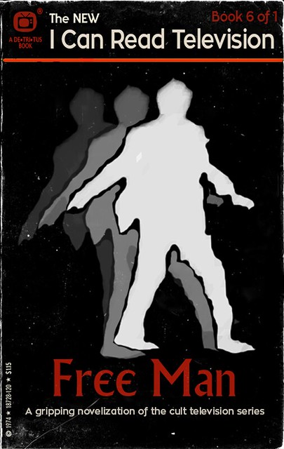
For the second week of ds106zone, the Summer 2013 edition of ds106, we were working in part on design assignments. I had a few ideas of things I wanted to do, but only managed to get one thing done because it took me so long. I decided to take on a difficult assignment, knowingly, because I wanted to force myself to learn about more things in GIMP to do it. That definitely worked–the learning about stuff part. The final product is not quite what I wanted, but it’s pretty close, which I’m happy about.

I thought about doing the “Wait, where’d that guy come from?” assignment, which I thought I could do fairly easily in GIMP, or the “Lyric typography poster,” which would give me a chance to play around with fonts, but decided that what would be most challenging, and therefore would push me most to learn lots of things, is the “I can read movies” book cover assignment. That requires looking at & choosing fonts, as well as adding things into images, and more, so it is a bunch of things I wanted to learn rolled into one. It is also quite difficult to pull off well.

I looked at Spacesick’s original “I can read movies” covers, and most of the ds106 versions on the assignment page, and decided I wanted to go with a black background with a couple of colours. It reminded me of a kind of 60s/early 70s aesthetic that I thought would work for my idea to do a Twilight Zone episode version.

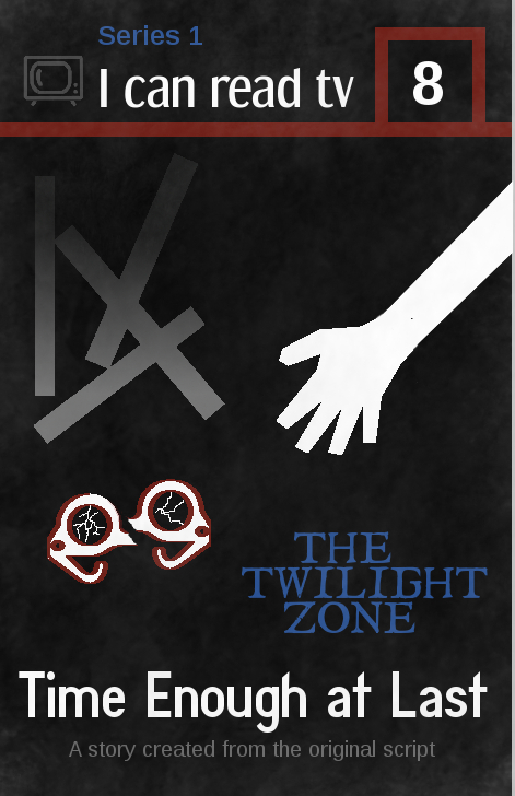
Here’s the finished product.

What I was trying to do:

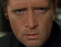
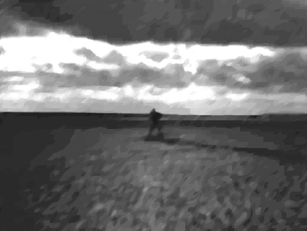
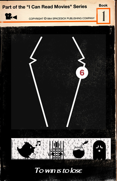
  • I wanted to capture an idea, a feeling, or a scene in 2-3 images, and when I first thought of this assignment what came to mind was the scene where Bemis’ glasses have just fallen off and broken, and he is reaching down to them. He doesn’t yet know they’re broken, and his vision is completely blurred, just like it will be for the rest of this life. It’s the moment just before he finds out, and I find that powerful. I originally created the rectangles to represent rubble–I was thinking of those skeletal remains of buildings you sometimes see in rubble, with just some beams left over. But later, I thought they could also be book spines, perhaps–a jumble of them.
  • I included “Series 1″ and the number “8″ to fit the season/episode.
  • I wanted to include a tv icon on the top left, instead of the movie icon that Spacesick used for the book covers.
  • I wanted to make it look old and worn, and somewhat “paper-y,” as it’s supposed to be a paperback, and one that was printed decades ago.

What I’m happy with

  • The design of the three images–hand, glasses, rubble–turned out almost exactly as I meant it to. It’s what I pictured. Except for some details, as noted below.
  • I like the fonts I found for the “I can read tv” (Dream Orphanage) and the “Time Enough at Last” (Diamante Fresko). I wanted them to look like they’d fit a book from the 60s. I’m not 100% happy with them, but I think they work all right. I tried to find one that fit The Twilight Zone original font, and the closest thing I found was I Still Know. It’s pretty good, but “The Twilight Zone” on the book doesn’t quite look how I wanted (see below).
  • I think I managed to make the book look dusty and a bit worn, which I’m happy with. I wanted to do some other things to make it look more worn, though, as noted below.

What I’m not happy with

There are a number of things I’d like to change, but I just needed to finish this so I could move on to week 3!

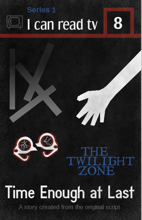
  • The thing I worked hardest at was dealing with the pixelation of the glasses and hand. As you can see, I didn’t end up managing to fix it. The rubble ended up pixelating too, which was weird b/c I drew that myself. Saga on all that below.
  • I’m not happy with the colour of the tv icon at the top left. I struggled with what colour to make it, as I wanted this to have only a couple of colours beyond black/white/grey (given the b/w of the original show). I didn’t want anything really bright, as again, I wanted to stick fairly close to a b/w feeling (that’s why the colours that are there are pretty dark). The problem was I had to colour this thing by hand, as discussed below.
  • I think the font for the “Series 1″ at the top, and the “A story created from the original script” at the bottom (both are Liberation Sans) doesn’t really fit the rest. It’s too modern-looking.
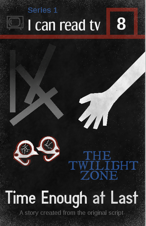
  • I’d like to have more spacing between the lines of “The Twilight Zone,” so the three words are separated a bit more. But when I hit “return” after each word in the “text” tool, the spacing was too large. Beyond putting each word on a separate layer and moving them, I don’t know how to fix this. I decided not to put each on a separate layer and move, but just leave as is.
  • I didn’t manage to make the book look as old and worn as I wanted, nor to look like it was made of paper. I like the look of the one on the assignment page for this assignment, with the light pixels on the edges that makes it look like the top part of the paper is flaking off a bit. See below for how I tried to do this, without a lot of success.

The process

Since this was a complicated process, the discussion will be a bit long. As with my post on selective colourization, mostly I’m documenting this in such detail for my own future reference, and for anyone else who is very new to GIMP like me.

Creating the hand and glasses

I got the hand and glasses from The Noun Project site. They were svg (scalable vector graphics) files, as are all the files on that site. I had watched the presentation on design for ds106zone and learned that svg files are useful because they don’t pixelate when scaled. So I thought: hey, great! I’ll put them in my image and scale them up a bit and they’ll look fine. 

No. I didn’t watch the presentation carefully enough. Tim Owens and Jim Groom noted that when you import svg files into GIMP they get turned into something else (jpegs, I think), and so when you try to scale them up they DO pixelate. Tim suggested we could import them into GIMP as bigger images (you can choose the pixel size when you open them in GIMP) and scale down, and they’d look okay. Which I did, and they did.

But the problem came when I tried to colour the svg files from The Noun Project. They were black to begin with, and I needed them white. It was when I coloured them that they pixelated. I used the “fuzzy select” tool and then the bucket tool to colour them white, and I got weird pixels. I don’t know any way to fix this except to use an svg editor like Inkscape (thanks to Brian Bennett for suggesting that to me via Twitter). But I just didn’t want to try to figure out a new image editor at this point. So I lived with the pixels.

I drew an arm to attach to the hand with the lasso tool and filled it with with with the bucket tool. I then wanted some kind of colour on the glasses, so I tried colouring them entirely red, but I didn’t like the look. So I used “stroke selection” to do an outline on them, Which was also pixelated b/c they were pixelated. I used the pencil tool, I think, to draw in some “cracks” on the glasses lenses.

To break the glasses in half, I selected one half of them and used “cut” and then “paste” to get a floating layer. Then I created a new layer and anchored the floating layer to it (if I remember correctly). Then I could move that half of the glasses separately from the other half. I know Henry Bemis’ glasses didn’t break in half in the episode, but I did this to emphasize their brokenness.

Creating the rubble

I drew rectangles with the rectangle select tool, and filled them in with grey. But they were all vertical, and I wanted them rotated a bit. This turned out to be difficult, because when I used the rotate tool I got white where the bars used to be. I didn’t know what to do, so I started trying to paint black over that white part, which was a pain. I can’t remember exactly where the bars were–I think on the background layer, rather than on their own separate layer. I did an extensive web search to solve the problem, and finally found an answer here. I discovered I could put the rectangles on a floating layer and then move them, either using a combination of key strokes or “cut” then “paste” to create a floating selection. I can’t recall if I could rotate them on the floating selection or whether I had to anchor them to a new layer first.

I originally made the rubble just grey (to fit the b/w show, and grey seems a good colour for rubble), but it looked really flat. So I used the “gradient” tool in GIMP to add a darker/lighter gradient–picking the foreground and background colours and making the gradient go from one to the other.

Creating the top of the image

I just used the rectangle select and bucket fill tools to do the red lines at the top. The tv icon was also from The Noun Project, and was also black to begin with. When I used the fuzzy select tool to try to recolour it, the pixelation was really, really bad. It looked awful. So, I used the lasso tool and selected around each part of it and then used the bucket fill to change the colour. I tested a few colours and decided on grey. It took awhile to hand select and colour in the whole icon, so when I was done and didn’t like the colour I couldn’t bring myself to do it again.

Adding the dust

At first I tried the following. I first downloaded some new brushes, from the Deviant Art site. I downloaded some texture brushes and some “grunge” brushes. Then I created a new layer and coloured it white, lowering the opacity. Then I used the eraser tool and played around with some of the texture and grunge brushes to erase away parts of the white layer. This looked pretty good, except that there was then no “dust” on the white parts of the image. I realized I needed to add grey “dust” to make the white parts look a little old and worn as well.

So I used some of the texture and grunge brushes and painted on a grey colour. I played around with the colours and the opacity, as well as the brush characteristics, including size, spacing, dynamics, and more. Here is a nice tutorial on brushes that I found very helpful.

As noted above, I wanted to try to make the book cover look like parts of the paper were flaking off because it was old. I tried to do this with the “dissolve” mode on various brushes, playing with the colour and opacity, and the best I could do is at left and below. I used white at first, but it just looked weird, so I went with grey. It’s okay, but it looks like grey speckles rather than flaking paper. 

I tried a few different ways of doing the speckles, with different colours and opacities, and here’s one with brighter speckles. I still don’t think it looks like paper flaking off. Not sure what else I could have done.


Well, I think that’s it for process. I’m pretty happy with the way it turned out, but it took me a LONG time because I still don’t know that much about GIMP. But doing this project taught me a whole lot of things I didn’t know before, so I’m very happy about that!


Share this