The Many Shades of Hannibal Lecter: A Venn Diagram

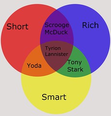
For my final assignment for design week, I chose this one worth 4 stars, which was a task to create a 3 circle Venn Diagram of Popular Culture figures.

This was the hardest of all my assignments this week, mainly to think of what I was going to do for each circle, as I had to think about it for a while. I knew I wanted to do it, though, because I loved the Yoda example that’s shown on the assignment page, and I wanted to make one of my own. First, I thought of Hannibal Lecter, since he’s a well-known popular culture figure, and I one of my favorite TV shows is NBC’s Hannibal, which has sadly been canceled (though you should really check it out). He is a character who is a good cook, rich, and evil, which I thought were good general categories. Then, I easily chose Cruella de Vil when thinking of someone who is both rich and evil, but not necessarily a good cook. For good cook and rich, but not evil, I thought to chose Gordon Ramsay, which was another easy choice. The last option, though, finding an evil chef, was somehow challenging, though with a little googling I recalled the evil chef from Ratatouille, Chef Skinner, for that category! Note that this final form of the Venn Diagram is one of so many previous combinations I’d considered, though this is the only one I found I could fill in every circle. That wasn’t easy to come up with! However, I do enjoy Venn Diagrams and I think it’s fun to group together pop culture figures in these categories that you wouldn’t normally imagine belonging together, like Hannibal Lecter and Gordon Ramsay.

To complete this project, I used the online design tool canva. Once I made an account there I was easily able to go through their list of possible templates and found a Venn Diagram template I liked. From there I was able to add and edit the text as you see there! It was a pretty easy site to use and I’d recommend it to anyone for design, especially if you’re looking for many different templates to chose from.

Venn Superhero Culture

For this assignment, I decided to change it up a little bit by using Superheroes instead of pop culture, so that the assignment would fit the the of the class better.

For my characteristics, I decided to use rich, brave, and inventor. I decided to use these because I wanted Iron Man to be the center of my Venn diagram. I enjoyed doing this assignment because I was able to explore different superheroes and what they did.

The superheroes I used were Iron Man, Spiderman, Green Arrow, and Superman. I decided to use Iron Man first then found out what Superheroes have some characteristics that Iron Man has too. I really enjoyed getting to explore more about superheroes.

Just Keep Swimming!

For this assignment I was to make a venn diagram related to something in current pop culture, so I figured why not use characters from the newest follow up to Finding Nemo. I saw Finding Dory a few weeks ago and it was amazing, it made me cry, and it gave me all the feels. After waiting 13 years for Finding Dory I felt that it was an appropriate pop culture choice for my generation.

The assignment link is here

Steps:

  1. Figuring out what I wanted to base my diagram on was the hardest part, but once I decided on my subject it came easily
  2. Make the venn diagram, I used this program, it makes venn diagrams and let you edit them in a manageable manner
  3. Insert your topics in a way that makes sense

FindingNemo

Primary Characters.

So, for this assignment there were two basic elements that went into completing it. The first, and by far the most difficult was thinking up the content. I had the idea to put Tyrion in the center right from the beginning, but I had some trouble thinking of ways to describe him that let me come up with other characters. In particular, short and rich gave me trouble until I thought of Scrooge and the whole thing came together. I tried at first to keep it to just Game of Thrones characters, but I couldn’t think of any way to get the content. I may do this assignment again in the future if I think of something for it.
The next aspect of the assignment, however, was to design it and put it together. I chose the primary color mix because I felt like the mixtures are familiar and understandable. It took a few methods to get the colors to mix the way I wanted, and in the end, I had to lay other colors over the top in a few spots. I just created the three circles on their own layers and dropped the opacity to 50 percent. I then duplicated each colored ring and put them over but in a different order to blend the colors better. I layered the text of the same font but two different sizes over the top of it all, and tried to position is uniformly. This is the result.

Power, Corruption, and Brains

This assignment (4 stars) really started to make me think. I loved connecting people to certain categories. The wire - Gradient

Avon was in the middle, of course, because everything always comes back to him. Avon’s character is powerful no matter where he is, but he is also corrupt in the way he does things. Avon is extremely strategic and has the brains to run an operation from jail.

Stringer Bell was linked between power and brains. Since Avon has been in jail, Stringer Bell has shown the power he has, most recently, he undermined Avon and allowed the west side to come into the towers. Stringer has been showing how smart he is with all his business talk from class and applying it to life.

Frank is linked between brains and corruption. Frank has absolutely no power in what he is doing due to the Greeks. He is corrupt by allowing Ziggy and Nick to get away with stealing from the docks as well as allowing the Greeks to do what they want. Despite the fact he has no power, Frank did figure out something was not right, and found how the docks were being watched before anyone else.

The police and politicians are linked between power and corruption. The police show their power by doing what they want, throughout the season. Although, they are not solely in control. The corruption within the police and politicians just keep on increasing as the season goes on.


Process

I took a while to think about who to use, so I picked my characters to use, then found something that describes them. This is what took me a while.

After that, I googled for a website to make a Venn diagram, because I did not like the ones in word. I found Lucidchart and signed up for a free trial to make it. I really love this website, because it was so easy to do exactly what I wanted.

I clicked on the Venn diagram tab, and selected the one I wanted. Then I added text to the circles and played around with the colors.

Once it was time to download, I remembered to export it as a JPEG this time! This website was very straightforward, I will definitely use it again.

Dem Venn Boi’s

The ‘Venn Pop Culture’Design assignment offers 4 1/2 stars; I looked at it and said to myself “Well I’m your Huckleberry”! I take an ambitious leap at the opportunity by first pulling up photoshop. I think to myself “Hell to the Naw” I don’t even have the patience for this ..ish tonight. Next I looked at ‘Word’ and began playing with the shapes, I got some nice circles and colors as well but I just wasn’t into following tutorials tonight to grasp enough direction to make my circles translucent. So after looking at examples on the actual assignment I chose to go with gliffy, I got something amateur compared to others but to my satisfaction!

Sure it may be plain but it is a simplistic approach to the Venn Diagram while focusing on some of them hot boi’s from The Wire; goal accomplished. The Good, The Bad, and The Ugly can represent a plethora of The Wire‘s characters but I concentrated on central male characters in episodes 9-11. Frank Sobotka straddles the fence of good and bad and will pay with life altering cost. Stringer Bells intentions are all bad, with pursuing the agenda he will resort to the ugliest methods in which to do so. Jim McNulty may mean to pursue all that is good but his ugly always seems to surface and downplay all the good that he is worthy of achieving. My boi Omar….well lets just say “it is what it is” it is all bad with playing the game that he plays. The only good is that he preys on those most deserving of it but boy does he get UGLY while doing what he does best ‘Stick Up Kid’!

Hamsterdam Venn

I’ve been re-watching into Season 3, and the Hamsterdam episodes are among my favorites mostly because of the concept of a drug-tolerant zone in an inner city. Fascinating concept. The assignment to create a Venn diagram required a lot more thought and playing around on scratch paper than I had anticipated.  I doodled a lot […]

“We Will Understand If They Don’t”

For my final design assignment I decided to do the venn diagram (4.5 stars). At first I had no idea how I was going to do it. I was originally going to use Microsoft office as usual but I figured that wouldn’t work, so when I visited Professor Groom I got help from another student who showed me how to use gimp. I finished creating the circles and putting the information in them using gimp.

One of my favorite things about this class is that I get to show how I feel about characters. So i used three adjectives; stubborn, strategic, and powerful. I chose four characters that I thought would best fit in the inner portions of the circles. That was probably the hardest part because there are so many characters that could be used. I figured that the characters I chose had a big impact on the series and that’s why I went with them. One thing that I recognized while doing this assignment was how much Stringer Bell takes on. He is one of the most dynamic characters in the series. I had fun doing this assignment and I hope you enjoy my work.

WireVenn

Wild 01’s 2013-10-06 10:21:14

venn

Twilight Zone Venn Diagram

venndiagram copy

I really liked the idea of this assignment and thought that it could easily be applied to the episodes of The Twilight Zone that we’ve all been watching.

For some reason I did “The Invaders” instead of “Eye of the Beholder”, but I’m okay with that. I tried to take a more humorous approach rather than a serious analyses of all the contrasts and comparisons.

Surprisingly, it was a little difficult to make a first. I tried GIMP, then Photoshop, before I finally decided that Ink scape was the easiest program to use for this particular assignment. All in all, in didn’t take too terribly long to make, but coming up with the different similarities and differences took a while.