ds 106: Weird Book Room (4 stars)

Far in the future of our world is one completely unrecognizable. The people there are not like us, and all they know of us is that we were responsible for why the world has become the way it is now. They read what’s left of our stories of war, of the Hound, of the Cure, the day it rained light and the sun vanished behind the Ghost. How entire civilizations turned on one another, how the Earth turned on us, how the sky turned on us. They don’t know the full story. They barely know our languages, much less what we may have looked like.

This was created with Grafx2 completely. The trickiest part was far from the story or the design, as I had an idea as soon as I saw the prompt. I was inspired to make something that seemed old but not inherently crazy, like you might stumble across it in an abandoned library. But the context itself is what drives it to be “weird”. In the story of Hollowgrove humans don’t exist, and the people who exist in our place know us like we knew dinosaurs 50 years ago. Barely.

A Bizarre Book Cover

by Thomas Pulsifer

Using Alan’s 4-star prompt, I’ve designed my very own weird book cover. What’s more bizarre than a rat in a helmet getting cheese in outer space? This is actually the cover of a real book I’ve written! It’s a children’s book, so it isn’t anything to write home about, but it’s something I put a lot of effort into and am pretty proud of. This book cover was created on an iPad in the drawing app Procreate.

The story follows a family of rats that are starving, and only cheese will do. But the cows refuse to share their cheese, and jokingly tell the rats to go to the Moon and find some of their own. Being the gullible, hard workers they are, the rats begin devising ways they could possibly reach the Moon. After some planning, they decide to stack themselves in a tower that stretches all the way there. As it turns out, the Moon is actually made of cheese, and the rats have a feast. Once they return home, the rats make sure to share their newfound cheese with the cows, teaching them a valuable lesson about sharing.

I Know What’s Going On My Amazon Wishlist (DesignAssignments605 4 Stars)

Books

This design was fairly easy and flowed very naturally.  Even though the characters don’t have much established lore yet, I found an anchor point in each one I could build off of.  Morlium is a very bland monotone guy, so black and white with a neutral title seemed perfect.  Spooksy, well, is Spooksy (great barbeque though… I wish he would tell me what’s in it. Veal maybe?).  5 I don’t know a whole lot about, except she is a child ghost, but it turns out, that’s enough.  I wanted a bright color for her since she’s a child, plus it contrasts well with the others.  I managed to find a pretty high res picture of a bookshelf by googling “empty wooden bookshelf”, and I got the grill by searching for “grilling outside”, so no real speed bumps there.

Wired Book Room

Lauren brought up the Weird Book Room assignment and I thought it really ought to be called Wired Book Room. So here’s my entry: Accessorizing Your Waterfowl.

I had a few title ideas, like Duck Bling or Pimp My Duck, but I thought they were too slang for that classy necklace. I wanted to make the image more graphic or illustrative or whatever. I duplicated the background layer so I could mess around without messing it up. Then I went into Image->Adjustments->Levels and played around with the sliders to boost the contrast and brighten it up a bit. I duplicated the layer again and tried Filter->Stylize->Find Edges, which made this weird sort of tracing of the image. I didn’t know if I could use it or not, so I clicked the layer visibility button to hide it for now. I went back to my other copy of the layer and tried the Image->Adjustments->Posterize function and changed the levels to 3 or 4. I didn’t like the top of the bar in the picture so blacked it out. I turned on my weird tracing layer and changed the layer blending mode to Darken, and I kind of liked the effect. I needed a better image of the diamond necklace though, so I went back to my original layer, without all the distortions, and carefully selected around the necklace and copied and pasted it. I played with the levels to brighten it and put some sharpening on it, and thought I had a good image to work with.

Accessorizing your waterfowlWith waterfowl in the title, I figured it should be a Penguin Book. They’ve been acquired by Random House, so I used the Random Penguin name. I googled penguin books to find the logos.

I went with a condensed typeface due to the kind of space I had – more of a functional decision than an aesthetic one. I let Stephen L. Miles be the author, playing off that little inside joke from the episode. I thought the cover should have some more copy so I asked my wife what it should say. She was on to the bling thing too.

Accessorizing your waterfowl2

I thought about it some more, and that posterize effect was too busy. I went back and filled the duck outline with white, then I brought the eye back in. I think that’s a little more essence of duck.

“Weird book room”

Image


My dog’s wedding is a detailed book about my dog’s wedding. It is a behind the scenes encounter of everything and every detail that went on at the wedding, and the preperation up to it.

In this assignment, I was supposed to make a very weird book title and book title page to go along with Abebooks weird book room. 

The Noble Radish

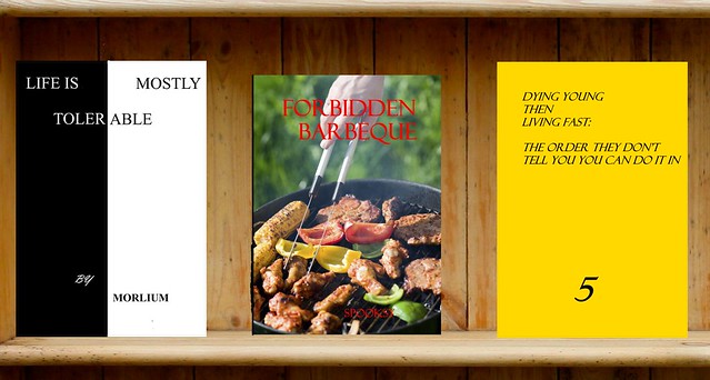
My contribution to the ds106 Weird Book Room. It seemed like the sort of thing someone named “Paisley” would write.

It was a big hit with the botanists

I love book covers. I love them so much, you don’t even understand. There’s that trite old phrase about judgement, sure, but the fact is the cover of a book (or a movie, or an album, or whatever) can make or break a sale. I’ve picked up books more times than I can count for their cover art alone; I actually have a few favorite cover artists, and favorite editions of much-loved books based solely on the cover art. Each one is a little designed story all on its own, which I find fascinating and wonderful.

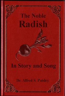
Designing this particular book cover ended up using much less of my eye for art and more of my technical skill. I wish I’d come up with something that stretched my design muscles a little more, but I am damn proud of that radish.

I found the clip art for the radish at Daily Clip Art and the book cover on DeviantArt via an image search. The hardest part of this assignment was getting the radish to look like it was embossed onto the red leather in the same style as the decorations on the cover, instead of a big splot of awkward color that didn’t fit. I tried using Justin Baker’s tutorial on how to make a photo look like a drawing, but but because of the image’s low contrast it just gave me a super-bright outline of the radish with a couple sketchy-looking shadows thrown in. After fiddling with the Gaussian Blur process a bit more, I decided to try the “Emboss” filter to see if it was worthwhile. That turned out much better, and reducing the opacity got me exactly the kind of image I wanted. Sadly the same process didn’t work on the black lettering, but reducing the opacity of the text layers was almost as good.

In terms of design, most of this assignment came down to placing the elements I wanted in logical, aesthetically pleasing locations. The thing about book covers is that we’ve been creating them forever, so there’s a lot that people read into them without even realizing it. A book with a leather cover, embossed decorations and a sparse cover design is older, and probably about a more serious subject. A glossy paperback with a lot of pictures on the cover is probably a how-to book of some kind and is more modern. If the author’s name is the biggest thing on the cover, you’re buying the book for the storyteller, not the story; a dominant title suggests it’s the other way around. I played into that a little by making the title dominant and the author’s name smaller, and the Serif font I chose also suggests a more serious work through its lack of frills.

Weirdly enough, this book is one I’d totally read. Radishes feature in a bunch of legends from around the world, including the iconic Radish Spirit (he’s the big white blobby dude in the front) from Hayao Miyazaki’s epic “Spirited Away.” His character was based on a daikon radish, which is used in a lot of traditional Japanese cooking, and in that way represents the  more traditional elements of Japan’s history.

Weird Book Name

The art of Menuistry : what is really behind those random drawings on a sidewalk menu. This book has all the answers to those deep questions. Honesty, this was just random inspiration. I took a picture from my photo album that with a unusual angle. I used my photo splash app to highlight a random part of the picture. Then, just made a name that would make anyone say “REALLY!?..Why?”

menubook


The Secret Lives of Fry Cooks

It’s design week! And my first design project is (drum roll please)… The Secret Lives of Fry Cooks.

This is for the Weird Book Room design assignment. I brainstormed a number of different ideas for this assignment, most of them pretty lame or simply not weird. But looking at the examples offered by ABE Books, I noticed that a number of them focused on specific demographics and groups of people (or animals). And so I started to think about what groups of people are more obscure or often ignored because their chosen professions are less than glamorous.

Fry cooks. How often do you see a book about fry cooks? (Though they would fit well into recent trends in competitive reality TV shows.) And thus The Secret Lives of Fry Cooks by James T. Patisserie was born.

The image is from the Seattle Municipal Archives via their Creative Commons content on Flickr. I made a 9″ x 6″ canvas in Photoshop, added the picture, painted the background a dark red, and played around with beveling to get the style I wanted. I wanted this to look like an older paperback, the kind that has a slightly textured cover. It’s a pretty subtle effect – you might have to zoom in on the image to see the texture. But once I set the picture as a screen, it had the exact effect I wanted. On a whim I chose a typewriter font. I initially tried Helvetica, then Arial, but neither seemed to fit the overall look. I couldn’t say exactly why, but they just didn’t work. So American Typewriter it is.

I’m still trying to imagine what the table of contents for this book would look like – Ch. 1 The Melee of Culinary School, Ch. 7 Kitchen Cover-Ups, Ch. 15 Grease In Your Ears and Other Health Scandals? Something to think on…

Rare Book Covers

Limited editions of this holistic and cleanly book are available!

This is for a brand new ds106 Design Assignment: Weird Book Room:

The Abebooks Weird Book Room lists a collection of titles so farcical you would think they are made up, but they are not. “Grandma’s Dead: Breaking Bad News With Baby Animals”, “Beyond Leaf Raking “, and “Goats: Homeopathic Remedies” are all actual book titles — “finest source of everything that’s bizarre, odd and downright weird in books.”

Your assignment is to design the cover of a book title so weird that it will look like it will fit right in to the Weird Book Room. Be sure to include a little bit of jacket blurb for your blog post where you include your designed book cover. Go weird!

This all started with the tweet:

And I could not help my curiosity to scan the titles at the Abebooks Weird Book Room

Each of them might be a story unto itself, but I could not help but be happy, Neil. So happy to make this into a ds106 assignment and develop my own book title.

So the premise of Zen and Toilet Cleaning is that the rhythmic and circulations of every day bathroom cleaning are ones the resonate with the holy cycle of spiritual zonoids, as depicted in the A’Alahyak Temple. You can achieve a higher state of wah with a brush in your hand and your minds eye open. Learn these techniques in a simple but aproachable style as writtemn by the author, a leading Flush Master

What book will you put on the shelf?

Weird Book Room

The Abebooks Weird Book Room lists a collection of titles so farcical you would think they are made up, but they are not. “Grandma’s Dead: Breaking Bad News With Baby Animals”, “Beyond Leaf Raking “, and “Goats: Homeopathic Remedies” are all actual book titles — “finest source of everything that’s bizarre, odd and downright weird in books.”

Your assignment is to design the cover of a book title so weird that it will look like it will fit right in to the Weird Book Room. Be sure to include a little bit of jacket blurb for your blog post where you include your designed book cover. Go weird!