Teenage Nostalgia w/ The Boomers

Assignments: On The Cover Of A Teen Mag
gure from politics, education, that you would not expect to be there, on the cover of a teen fan magazine. Bonus points if the cover includes a heart throb of initials JB and a lot of pink color. Re-edit the text as well to blend them into the style of the magazine. Inspired by a tweet by Cathy Finn-Derecki

A lot of the times I create these assignments and I often laugh at how ridiculous I made them. One thing I noticed about myself is that I’m a bit selfish with these assignment, in that, I don’t really care what people who view it think of it or their reactions. If I had fun making it and laughed at it then I think that’s an absolute win for me! This is one of those assignments. I especially think the text I put around Trump and Clinton (who are fangirling over a fictional band) is hilarious. Though, I always have criticisms of my own and in this assignment I have to blame my font…it doesn’t have the ‘ka-pow’ type-of-feel a magazine cover should have, rather it’s bland.

HOW IT WORKS:
1.) I grabbed pictures of Trump, Clinton, And Danny from google images and put them as separate layers on a paint program called medibang (This is not an editing software!)
2.) I then added another layer for the background and the box shapes.
3.) I exported this image as a png and imported to another paint program called Krita (much more useful friendly in terms of editing).
4.) I put the text and drew some doodles here and there
5.) Finally I exported as png and saved to my folder.

On the cover


WOW I never would’ve thought my friend Anna I would be on the cover of XXI. I think they confused us for Baby and Lil Wayne. But man oh man do we look good. For this project I went to face-in-hole and picked a funny magazine photo. I wanted to turn the picture black and white but then it would take away the funny aspect of it and feel. bb5167e02fd148343

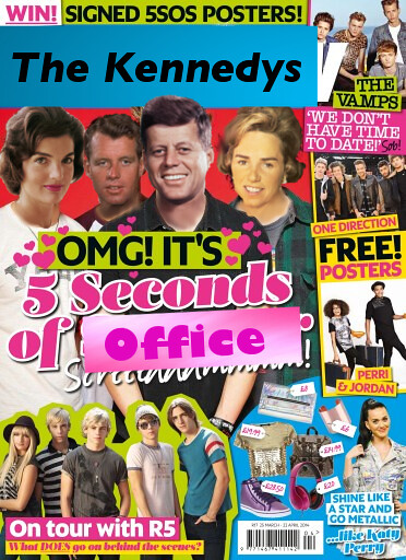
The Kennedys or Five Seconds of Summer?

This design assignment was the hardest one i completed for week 6. Yet again i found myself scrolling through the pages and pages of assignments and saw a picture of Justin Bieber. I wasn’t aware that he was still relevant but that’s a different story. The assignment i chose was “On The Cover of A Teen Mag.” Another assignment where i get to use my mastered cut & copy skills. Since i’ve been doing a lot of pictures and adding texts, i figured i should swap some heads this time. Great, let me show you how it’s done!

Process

Choosing the right magazine cover was the second most important step. I really just googled “teen magazine cover” and scrolled until i found a cover that wasn’t revolved around one celebrity. This cover featured the famous boy band Five Seconds of Summer. If you’re not hip with the current culture like myself, you must do a quick wiki search of them. I thought One Direction was the only boy band of any important at the moment. ANYWAYS, This cover had 4 figures so my next most important step was choosing people to replace them. When i read the directions and aw “political person” my mind went straight to the Kennedys. Don’t get me wrong, i’m well-informed with modern politics but the Obamas weren’t as interesting to me at the time i did this assignment. You might be thinking “Carmela, the Kennedys were always on the covers of magazines.” I’M SORRY. It seriously slipped my mind that this was a normal thing. I just wanted to do the Kennedys so bad. Plus they were the perfect pick for this. Jackie, John, Bobby, and Ethel. The power team. Now that i’ve chosen them, let’s get down to the details of making this masterpiece work.

Cut&Crop:

By looking at my final work, you know those heads aren’t on the right body. DUH. I had to google pictures of each person (Jackie, John, Bobby, and Ethel) that fit the bodies of 5SOS (the boy band) perfectly. So i had to have the cover open and compare a bunch of pictures. I can’t have JFK facing the left when the body is facing forward, you know? After finding the best pictures, i cut the heads out and saved them. If you need help learning how to crop, visit my most valuable blog post here that gives you a tutorial. So i have the heads, not let’s get the bodies.

Background

Before i added the heads to the bodies, i needed to change the headlines to make it appropriate for the Kennedys. I googled a blue background to match the title of the magazine and added text to it saying “The Kennedys.” I tried going to dafont.com and looking for some sort of official text that matched the magazine but i could only find cool themed ones. So i opted for basic ones. After i got the title down, i had to change the caption for the group shot of the bands. It originally said “5 Seconds of Summer” so i wanted to be clever and add something both appropriate and funny. This all comes down to your interpretation of “appropriate” because what i did was a little rough. I found a pink background and added the word “office” to it in a similar pink color as the font. So now the caption read “5 Seconds of Office.” I’m not trying to be too mean but that was just a little too obvious. If i didn’t write that i would have been disappointed in myself! Let’s move on to the heads, shall we?

Heads

With my previous assignments, i just added the head to the body and called it a day. Boo. Show some more effort Carmela! After scaling the heads of each person i fitted them to the bodies perfectly. There was just one problem. The awkward difference in color in the necks. This boy band is well tanned. I decided to do something i’ve never done before. SMUDGE. I didn’t know that the smudging tool worked so well this head replacement. I started with JFK and realized how much better this looked. Since Bobby is hiding behind his brother, i wasn’t too concerned with his Neck. Ethel on the other hand, oh my. Her neck was the most obvious of the bunch. Jackie’s head fit perfectly so no skin was really showing from the body. Yay! The heads are done! This took me a while because i didn’t just want to throw the heads on and leave them unattended. Overall, this turned out great. I know the assignment says 3.5 stars but i seriously deserve 4. Come on!

Before
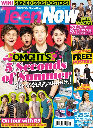
Original mag cover

After

Kennedy Cover


Stars:3.5

The invaders taking over teen magazine.

biebertwilight

I had the invaders take over teen magazine and Justin Bieber’s face.  I edited this magazine cover in GIMP with the lasso tool.

Here is a link to the assignment.


Difficulty: 3 stars

The invaders taking over teen magazine.

biebertwilight

I had the invaders take over teen magazine and Justin Bieber’s face.  I edited this magazine cover in GIMP with the lasso tool.

Here is a link to the assignment.


Difficulty: 3 stars

On The Cover Of A Teen Mag

On The Cover Of A Teen Mag (3stars)

“Take a popular figure from politics, education, that you would not expect to be there, on the cover of a teen fan magazine. Bonus points if the cover includes a heart throb of initials JB and a lot of pink color. Re-edit the text as well to blend them into the style of the magazine.”

Popstar Magazine Cover

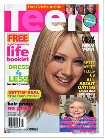
Betty White on the cover of Teen Mag!

I’m not going to lie, sometimes, I make myself laugh. I thought for a while about who would be effective for a questionable figure to put on Teen Mag. Well, it came to me when I Googled Teen Mag images. I saw my opportunity in the corner of one were the magazine said “All about dating!” Who else would be better than a woman who has been dating strong for 80 years? Well, maybe teens might not find her advice very instructive, but imagine all you can learn in 100 pages of Betty White’s reminicing. I used Photoshop to implant Betty’s picture, and I incorperated the magazine’s words with mine. Only struggle was the font color choice began to clash at the bottom, so I did what I could to keep with the design template of the magazine and it’s font colors. I added shadowing around pink and it came out alright.
Betty White Teen

On the Cover of Teen Magazine

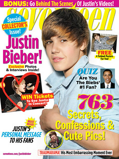
So with the upcoming election and all the idea of a politician to grace the cover with Justin Bieber was a given. I went online and found a suitable background and then a picture of President Obama to overlay on it. Using Pic Monkey, I created a new teen cover magazine. President Obama is Biebs Number 1 fan can you pass his quiz?

On the Cover of Teen Magazine


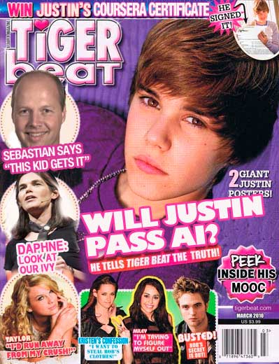
MOOCs a la Tiger Beat

Time after time the road out of a blog funk is sitting down to make some silly ds106 art. So it was later this afternoon, when this tweet form Cathy Finn-Derecki set me in motion:

So challenged to put Sebastian Thrun on the cover of Tiger Beat, I got out the old Photoshop clone brush and went to work.

Now, one thing that gets me growling is when people send out a link via twitter with something like:

This would make a great #ds106 assignment

Which to me is a bit lame- if it would make a good assignment, then go ahead and make it so, damnit. Just tossing a link out there is not #4life to me.

So hence a new ds106 Design Assignment, On The Cover Of A Teen Mag

Take a popular figure from politics, education, that you would not expect to be there, on the cover of a teen fan magazine. Bonus points if the cover includes a heart throb of initials JB and a lot of pink color. Re-edit the text as well to blend them into the style of the magazine.

Now that I’m in motion, time to get some GIFfin going…

On the Cover of a Teen Mag

Take a popular figure from politics, education, that you would not expect to be there, on the cover of a teen fan magazine. Bonus points if the cover includes a heart throb of initials JB and a lot of pink color. Re-edit the text as well to blend them into the style of the magazine. Inspired by a tweet by Cathy Finn-Derecki