MOVIES FROM ANOTHER TIME

For my third design assignment, I created a vintage movie poster using a modern film with actors from an earlier era. I took this concept a step forward and decided to fully blend two movies from two different eras. The modern film I picked was Get Out (2017) and the classic movie I paired it with was Guess Who’s Coming to Dinner (1967). I chose these two films because they both deal with race, specifically interracial relationships, and they also feature a black male lead visiting the house of a white family. I also thought it would be a somewhat comical pairing, considering the fact that one of these films was a romantic comedy-drama meant to be a positive depiction of interracial relationships and the other is an allegorical horror film about the appropriation and fetishization of black culture (among other things).

I decided to commit fully to the look of the Guess Who’s Coming to Dinner poster, so my basis was the original design from 1967. For this assignment, I worked in Photoshop. I used the spot healing brush tool to blend the original text of the poster into the background colors so that it would be as smooth as possible. I used the typeface Caslon because it closely mimicked the look of the serif type used on the original poster. Then it was simply a process of replacing the original text with text from the Get Out poster.

Probably the most entertaining part was creating the lowercase logo for the movie. Originally, as a result of the default spacing of the text, there was a lot of space between the words “get” and “out.” I had to adjust the type a lot before I settled on the staggered layering of the works. I think it works very well because of how the curvature of the lower half of the ‘g’ interacts with the ‘o’ and fits in with the overall vintage feel.

Harry Potter, circa 1940s

hpposter

Ah, Harry Potter. The boy who became a movie classic. Harry Potter was the first thing that came to mind for the Movies From Another Time assignment, and I think it’s really ideal for something like this. I mean, if you compare the movie poster for the first movie to some movie posters from the past, you can see where the style and placement of characters would mirror those of the past. Maybe that’s why it’s one of the first things that came to mind.

Of course, for this assignment, I took some creative liberties with the instructions. For one, I had absolutely no idea where I would find a boy actor playing a wizard in an old movie. Would have loved to, but I am not that knowledgeable in old movies. Plus, how could we even think about replacing Daniel Radcliffe? Just look at that baby face! Remember when they were young and innocent?

I also used more modern fonts for this poster. I figured it would be better to have a Harry Potter font, than to just have some random 40s-style font.

Process:

Like always, everything was done in GIMP….almost.

First, of course, I looked up reference images in the movie posters, and then picked the images for Harry and the Castle. I then spent a lot of time fiddling with those images, cutting them out with the free-hand lasso tool. For Harry, I used the posterize effect, created several different layers, one of which was dramatically blurred, and the others to retain the features (I did a similar thing with the castle). I especially messed with the colors, to give that old-timey feel to them.

Then came the font. The Harry Potter font was easy enough to find, so I installed that (restarted GIMP because I don’t think you can refresh your fonts in GIMP), and typed that up. The harder part was finding the font that’s used for the subtitle in the movie poster/the chapter headers/various other things. Sources say it’s called Able, and it costs about…$70? That’s a lot of money that I am not willing to spend on a font.

Luckily, there’s also Lumos, which is very similar and very free. I didn’t know it was free until just this moment, so the site I looked this up on also has a “Harry Potter font generator” at the bottom of the article, with various fonts from the series. I inserted the text I wanted, copied the generated image, and then rearranged it in GIMP to fit my needs.

After that, more fiddling, choosing a couple of fonts for the other various text on the poster, and voila! But not quite.

I wanted to have folds on my poster, and textures in the negative spaces, so it wouldn’t seem so bland. Easy enough, just found a “paper texture” on google images, placed it under the layer my poster was on, and fiddled with the layer settings until it looked the way I wanted it to.

The Good, the Bad, and the Ugly

poster

I loved that western showdown scene between the police and the FBI. This part had GIF written all over it. I had the idea to put the three of them together, so I was careful to make all of them the same number of frames, with the same timing. Then I thought it would be better to do a rolling animation, like what I ended up with. It took me a while to think about how to do it. I started to write up the process, but the write-up was as tedious as doing it in the first place. If you want the details, let me know.

Once I had the GIF, I had to figure out what to do with it. I went looking for a design assignment and found Movies from Another Time and Animated Movie Posters. My image didn’t really fit either of them. I clicked the Remix It button and this came up:

Jump Shrimp
Find a completed assignment and create it’s oxymoron, something that is contradictory to what was made.

I had been thinking of The Good, the Bad, and the Ugly anyway, what with the western theme, and the contradictory aspect made everything fall into place. Prez is good at some things, but in general he strikes me as a bad cop in the Martin Short sense, i.e. less than competent. Lester, on the other hand is good police. Bunk was born in a three piece suit, (almost) always dressed to the nines, so he could be the opposite of ugly.

For the text, I put together characters from The Wire and characters Leone’s movie, and used some of the behind the scenes names from The Wire. I did all the text in Garamond because it’s on Vignelli’s approved typeface list – actually it’s a versatile classic font.

I should note that my entire process here is pretty much the opposite of good design. Instead of designing something to fit the assignment, I’m trying to bend an assignment to fit my image. But so what.

DESIGN

MOVIE FROM ANOTHER TIME

I love all the new batman movies and i thought it would be cool to see an old batman movie poster, i bet if i can get my hands on this it would be worth alot of green lol

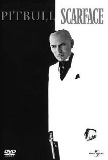
Pitbull as Scarface

Few movie covers are as iconic as that of Scarface. The vertically split cover between black and white, the red Scarface font, and Al Pachino with a gun and his name on the other side. I thought for a while, who is the most iconic hispanic person in pop-culture today with the same gangster style that would fit the Scarface role, and I came up with the rapper Pitbull. Though no one can replace Al Pachino in that role, Pitbull seems to fit too. I Photoshopped Pitbull’s head on Scarface’s body, and changed Al Pachino’s name to Pitbull, and vallah!
Pitbull as Scarface

Movies from Another Time

Design a vintage movie poster from a modern movie using actors/styling from an earlier era. Try to capture the essence of the modern film by choosing the right actors for the different parts and using imagery that is evocative of the past while capturing the film’s meaning.