ds 106: What the font (4 stars)

This project in particular was something I thought would be somewhat simple, and yet it proved to be somewhat frustrating for me. I couldn’t get a solid idea of what I wanted to do for this despite looking through hundreds of pieces done by other people. Eventually I thought it’d be interesting to make antlers out of letters, so I decided to try and draw a deer with various letters and words. I also wanted to use a fancy font as I felt it’d sell the idea behind deer being graceful creatures.

Similarly to other assignments, I used Grafx2 for this completely. It has a feature that lets you type out text in a wide variety of fonts in whatever colors and size you want, and you can also flip and turn them around. Originally I started with trying out letters that may fit to be the antlers, and as I progressed on the deer I felt that it could use a bit more substance to it, so I added the strings of grass along the bottom. In all honesty, I wouldn’t say this assignment went well. Sure I completed it as instructed, but the end result feels bland and forced to me. Maybe one day I’ll retrace my steps back to this and redo it in a way that makes me proud of it.

Horse Text

What the Font-4 Stars

A common exercise in design school, take typographical elements (perhaps even the words of a story) and bring them to life.

I remembered seeing typographic portraits done by people in my high school and always wondered how they did it. This assignment allowed me to gain the knowledge on how to do it.


The Work Itself


HorsesDSCN5123

The Story Behind the Story

At Carova Beach in the Outer Banks, wild horses roam all over the place. It was to my delight that I was able to capture so many photos of these beautiful creatures because they would walk around and eat grass in the backyard of the beach house every day. We are not allowed to approach them, but I kept my distance and was able to get some amazing shots. Although there are many who follow this law there are many more who ignore it and feed these wild animals. As more and more people come to visit this beach, the horses become more and more reliant on humans. It is quite sad.

I chose this photo to turn into typography because I thought that the horses shape would be obvious once all of the details were gone.

Narrating the Process

For this assignment I used Photoshop Elements 11 and followed the step by step instructions of this extremely helpful video. I used the words “horses and beach” to create the image.


I Font that Halloween Spirit!

Pumpkin


“A common exercise in design school, take typographical elements (perhaps even the words of a story) and bring them to life.”

For the “What The Font?” assignment I chose to make a pumpkin out of the phrase “HappyHalloween.” I decided to make a pumpkin for this assignment because Halloween is at the end of this month and I’m getting a costume this weekend for a party so itĀ has been on my mind a lot lately.

The process to make the pumpkin started off with figuring out the design which involved a lot of trial and error. To start on the design process I first opened Microsoft Word and created a large text box to make editing the pumpkin a lot easier. I started off by spelling out the word “Boo” for the stem since the stem has to be kept skinny and “Boo” is a short word. At first I only used one “Boo” for the stem:

Stem1Ā But I later thought that two columns of “Boo” looked better:Ā Stem2

To make the rest of the pumpkin. I spelled out “HappyHalloween” until I thought it was enough. Starting off with only three “HappyHalloween”s and then gradually making the rows longer until I got to the base of the pumpkin where I gradually made the rows smaller, mirroring the top half to give it a circular shape:

BlackPumkin

I then started carving my pumpkin by deleting letters and spacing out sections to give the effect of eyes and did the same for the mouth of the pumpkin:

unfinishedpumpkin

The next thing was to give my pumpkin a little bit of color so I highlighted the stem and clicked the Format tab at the top of the page and directly under “Format” I chose the “Gold Fill” WordArt style to color the stem. For the bulk of the pumpkin, I started off the same by highlighting it and clicking the Format tab. This time, I clicked theĀ third option in the “WordArt Styles” section which gave it the orange color and style I chose. Lastly I decided to make some grass to give it a little bit of a setting to it. I did this by typing two lines of exclamation points and coloring them green in the same style that I used for the stem and bulk of the pumpkin.

Pumpkin

Bite My Shiny Metal Assignment (DesignAssignments9 4 Stars)

Bite My Shiney Metal Assignment

All love letters are ridiculous

Today’s assignment from DS106 is “What the font: take typographical elements (perhaps even the words of a story) and bring them to life.”

After reading a participant’s blog that she used imagechef for this assignment, I decided to give it a try. There were different shapes to chose from (butterfly, sun, raindrop…) When I saw the shape of an envelop, I immediately typed in the text box “All love letters are ridiculous”, which comes from a poem by Fernando Pessoa.

This is the result:

loveletters

Using imagechef.com was pretty easy. If you are not satisfy with the way letters are arranged, you can hit the Rearrange button to try again. Lucky for me, I liked the first version.

loveletterhow


What the Font (4 Stars)

The world can be a tough place. I’ve traveled all across the United States going door to door and selling my soul to get where I am today. All that work leads to great things. I now have a vineyard in sunny California because of those trials and tribulations. I think about what I could have done better sometimes… could have this life turned into something else? To commemorate all the work I’ve put in over the years I have created this word art.

Screen Shot 2015-02-15 at 5.41.49 PM

Let me know what you think in the comments below.

– Harvey Hait

What the Font?

What the Font?

MS

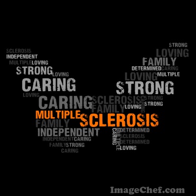
Looking through all the design assignments, and came across this one and immediately clicked on it. This assignment has a ton of meaning to me because my dad has Multiple Sclerosis and has been in a battle with this since 2009. My first tattoo was one of a butterfly, and the body of it was an orange ribbon which symbolizes MS. I had a quote make up the wings which read, “We don’t know how strong we are until being strong is the only choice we have”.

So when I saw the chance to make another picture like the tattoo on my back, I jumped on it immediately. I browsed the web for a good site to complete this and came across Image Chef. This time instead of a single quote, I chose words that describe my dad; if I had kept going, the list would have been a mile long. I chose the butterfly because I was inspired by my tattoo, and it reminds me of how he is “spreading his wings” and overcoming all obstacles sent his way.

Ā I decided to only use two different colors for the words, orange and gray. I didn’t want so much going on but I wanted the words Multiple Sclerosis to be the attention grabber. The reason I chose orange for the color to pop out, and the color of the words Multiple Sclerosis, because that is the color that stands for MS. My dad fights hard day in and day out, and there is never a day he uses the words can’t or won’t. He is such an inspiration to me and has enough determination to share it with the world. This assignment was perfect for me, and I am glad I got the opportunity to complete it.

I Love My Cupcake Browser Theme.

Which web browser do you use? There were several browsers I tried out in the past, but currently I’m sticking to Firefox. According to the stats as of December 2011, Firefox, Google Chrome, and Internet Explorer are the top three popular browsers in the list.

I don’t consider myself as a digital native, although I was introduced to computers in kindergarten at school. We all had to play around with old Apple computers under the guidance of our teacher. Do you remember using “Netscape” in the earlier years of your cyberlife? It’s the green logo, remember? Maybe some of you do remember or know, maybe not. The DS106 assignment I did this time relates to Netscape and the founder of Netscape.
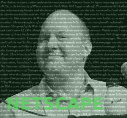
Marc Andreessen :p by JD Lasica / SocialMedia.biz ā€“ CC Licensed via Flickr

The now multi-millionaire software engineer Marc Andereessen was a student and a part-time assistant of NCSA at the University of Illinois when he began his new browser development project. He was one of the second generation of the people who were introduced to WWW which Tim Berners-Lee created. However, at that time, the web browsers like Unix was expensive and they weren’t available for the general public. So Andereessen’s aim was to build a better user-friendly browser that everyone could use. As a result, he and his co-workers produced the Mosaic web browser. It was released to the public in the year 1993. There was a legal problem over the property of the Mosaic browser between the University of Illinois and the company Andereessen co-founded with his business partner. Mosaic had to be renamed to Netscape Navigator soon after its release.

I didn’t know until I read the information on Andereessen and Netscape that Netscape was originally named Mosaic. As you may have recognized, Netscape exists, but it’s no longer a popular browser.Ā Netscape engaged in the Browser war with Microsoft, which became interested in the Internet business and hopped on the bandwagon. Then, as you can see, Internet Explorer won the war and became the dominant browser in the market.

Since we’re doing The Pioneers section, I wanted to continue on working on DS106 assignments with the pioneers theme. I don’t think I’ve seen an Andreessen post yet, and that is why I thought this article will be a good one to do. My design is a portrait unlike the rest of the posts that people have done. I wasn’t so sure how I would interpret the assignment mission, though there’s some typography essence in the image (the word NETSCAPE being blown away).

Now I’ve become slightly more experienced with using the image manipulation application, the time spent for creating the assignment has been reduced than before. I’m also eager to try new things.

( The white caption in the background is taken from the familiar Pioneers page).

What the Font?

_cokwr: A common exercise in design school, take typographical elements (perhaps even the words of a story) and bring them to life., _cpzh4: Design, _cre1l: http://www.timmmmyboy.com/wp-content/uploads/2010/12/5165550358_98f5c72b74_b-448x580.jpg, _chk2m: Tim Owens, _ciyn3: 9, _ckd7g: , _clrrx: , _cztg3:

Cloudy Night Sky

 Assignment: What the Font?
So, let’s take a break from drawing, and have some typography.
I originally wanted to have the moon be filled with the words “Luminescent Moon,” but it’s wasn’t working the way I wanted it to be, so I just let the words “Night Sky” form the shape of the moon, as the words go across the sky.
The clouds are made up of the word “Cloudy” and I added some gradient effects on them to give it a little more depth in the picture.
It’s very simple, yes, but I quite like it.