Great book, I tried to make an old-looking cover. The book cover itself is from a free pattern and the door was manipulated from free clip art. Hope you enjoy!


Here’s my minimalist poster for “The Midnight Sun.”
The snowflake is from “The Noun Project” but everything was drawn or written out.
The typeface is Helvetica and Elektron.
Act like you heard.

![]()

Minimalist Book Cover for Twilight Zon episode “Time Enough at Last”
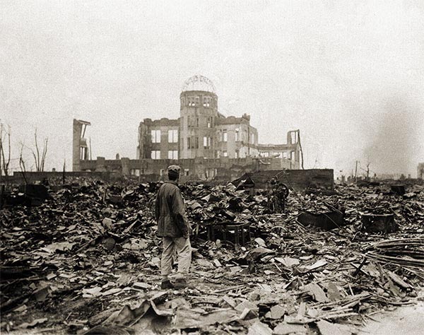
I am really happy with how this one came out, and it was a mashup of things, and let me run you through them quick. I started out thinking about using the iconic symbols in this episode of Twilight Zone, namely the glasses and and the clock, by placing a clock face within each lens.
This was the beginning of the idea. I found the glasses and clock icons on The Noun Project. After that I created a new canvas in Gimp that was roughly 700px high and 490px wide with a transparent background. I imported the two icon SVG files and adjusted there sizes, I made the glasses 300 x 300px and kept the clocks at 100 x 100px. Once i selected and moved each layer aroundI had my design, but I though I needed more, which is when I started searching for rubble as a backdrop. I found this insane image of the aftermath of H-bomb in Hiroshima which is hauntingly similar to both the theme and aesthetic of “TIme Enough at Last,” and I knew I would use it. I added it as a backdrop, put its opacity at 50%, and added the book title text at the top and author name text at the bottom using the Twylyte Zone font, although I think I might even like the Ringbearer font better. After that, I added a new layer with a white background and moved the layer so it was the background for all effects. After that, total awesome–what say you? Does the archival image and iconic glasses work for you? I kind like the serendipitous effect of the glasses sitting neatly on the cupola of the building, so cool!
Credits:
Clock icon by Taylor Medlin
Glasses icon by Yorlmar Campos
Hiroshima rubble image
Stars: 3 1/2 (5 1/2 total)
Minimalist Book Cover for Twilight Zon episode “Time Enough at Last”
I am really happy with how this one came out, and it was a mashup of things, and let me run you through them quick. I started out thinking about using the iconic symbols in this episode of Twilight Zone, namely the glasses and and the clock, by placing a clock face within each lens.
This was the beginning of the idea. I found the glasses and clock icons on The Noun Project. After that I created a new canvas in Gimp that was roughly 700px high and 490px wide with a transparent background. I imported the two icon SVG files and adjusted there sizes, I made the glasses 300 x 300px and kept the clocks at 100 x 100px. Once i selected and moved each layer aroundI had my design, but I though I needed more, which is when I started searching for rubble as a backdrop. I found this insane image of the aftermath of H-bomb in Hiroshima which is hauntingly similar to both the theme and aesthetic of “TIme Enough at Last,” and I knew I would use it. I added it as a backdrop, put its opacity at 50%, and added the book title text at the top and author name text at the bottom using the Twylyte Zone font, although I think I might even like the Ringbearer font better. After that, I added a new layer with a white background and moved the layer so it was the background for all effects. After that, total awesome–what say you? Does the archival image and iconic glasses work for you? I kind like the serendipitous effect of the glasses sitting neatly on the cupola of the building, so cool!
Credits:
Clock icon by Taylor Medlin
Glasses icon by Yorlmar Campos
Hiroshima rubble image
Stars: 3 1/2 (5 1/2 total)
Today I watched probably the most popular episode of the Twilight Zone: The Eye of the Beholder. One of my favorite design assignments is Minimalist Book Cover. I wanted to create a book cover for The Eye of the Beholder. For those of you who aren’t familiar with the episode: A hideously disfigured woman undergoes surgery to make her look normal.

Originally I was thinking about designing a cover around the mirror or bandages, but I felt those are too obvious. Then I stumbled upon a medical icon set. I downloaded them and there was
a great nurse icon. I brought that into illustrator and coverted the PNG to vector art – image trace using 3 colors. I brought that into photoshop as the main design element.
For the book title, I went with the font News Gothic MT. I felt it was a cold, medicinal font that complimented the medical theme I was running with.
Design: 3.5 Stars
 I’m doing a little experiment this evening — pushing myself to see if I can reach 10 stars worth of assignments before midnight for this week’s feature The Twilight Zone episode, The Invaders, – making an attempt to maintain a decent level of quality and also peruse the Assignment Bank for interesting challenges that will fit the subject material. I am going to give myself 5 stars towards The Invaders for GIFs already completed (You Best Clear Offa My Roof, and my poster + mini-GIF for the Episode of the Week This Week on ds106zone: The Invaders) — and I am going to seek out work that will NOT evolve into GIFs for the next couple of hours …
First I’m taking a run at former UMW #ds106 student Nancy Belle’s (@bellekid) Design Assignment 960: Minimalist Book Cover.
In approaching this assignment, I decided on a primary dark cover (the episode is quite dark, taking place at night and with minimal lighting), maintaining clean lines with a simple san serif text, and building the limited images out of existing primary shapes within photoshop, going with shades of grey to complement the black. (The episode was shot in black and white anyway!) . While my original plan was to place the saucer on the roof, and include a silhouette of the giant lady holding her knife through a window in the hut, I decided to simplify things and only show the saucer in the sky, and the hut on the horizon.
To balance out the larger title text at the top, I added an author line and a “based on” reference line at the bottom — keeping the lines of the text long and linear, and thus hopefully low-key. Each was reduced to 40-50% Opacity so as to not stand out in relation to the title and the other two images. I also applied a reduced opacity to the 95% grey rectangle that provides the “sky” — trying to find a shade of grey that suggested a dark sky without being too light.
In hindsight, I might like to see how this would have turned out with a non-primitive constructed hut — something that might more accurately reflect a curved, sloping roof slightly slanted walls — but my timeline is calling for compromise — and I need to keep this minimalist. And as I take a final look at the image before posting, it would be nice to go with a gradient of lighter to darker grey for the sky as you move upwards — suggesting some light in the distance on the horizon, but fading to the dark of space as the eye rises. However, it is time to post.
As I look at the star count for this assignment, I think it’s a bit high – 3 1/2 stars for this, as opposed to only 2 stars for an @iamTalkyTina Twilight Zone animated GIF? I typically spend a lot more time on most animated GIFs than I spent on this.
I’m doing a little experiment this evening — pushing myself to see if I can reach 10 stars worth of assignments before midnight for this week’s feature The Twilight Zone episode, The Invaders, – making an attempt to maintain a decent level of quality and also peruse the Assignment Bank for interesting challenges that will fit the subject material. I am going to give myself 5 stars towards The Invaders for GIFs already completed (You Best Clear Offa My Roof, and my poster + mini-GIF for the Episode of the Week This Week on ds106zone: The Invaders) — and I am going to seek out work that will NOT evolve into GIFs for the next couple of hours …
First I’m taking a run at former UMW #ds106 student Nancy Belle’s (@bellekid) Design Assignment 960: Minimalist Book Cover.
In approaching this assignment, I decided on a primary dark cover (the episode is quite dark, taking place at night and with minimal lighting), maintaining clean lines with a simple san serif text, and building the limited images out of existing primary shapes within photoshop, going with shades of grey to complement the black. (The episode was shot in black and white anyway!) . While my original plan was to place the saucer on the roof, and include a silhouette of the giant lady holding her knife through a window in the hut, I decided to simplify things and only show the saucer in the sky, and the hut on the horizon.
To balance out the larger title text at the top, I added an author line and a “based on” reference line at the bottom — keeping the lines of the text long and linear, and thus hopefully low-key. Each was reduced to 40-50% Opacity so as to not stand out in relation to the title and the other two images. I also applied a reduced opacity to the 95% grey rectangle that provides the “sky” — trying to find a shade of grey that suggested a dark sky without being too light.
In hindsight, I might like to see how this would have turned out with a non-primitive constructed hut — something that might more accurately reflect a curved, sloping roof slightly slanted walls — but my timeline is calling for compromise — and I need to keep this minimalist. And as I take a final look at the image before posting, it would be nice to go with a gradient of lighter to darker grey for the sky as you move upwards — suggesting some light in the distance on the horizon, but fading to the dark of space as the eye rises. However, it is time to post.
As I look at the star count for this assignment, I think it’s a bit high – 3 1/2 stars for this, as opposed to only 2 stars for an @iamTalkyTina Twilight Zone animated GIF? I typically spend a lot more time on most animated GIFs than I spent on this.
Assignment Details: http://assignments.ds106.us/assignments/minimalist-book-covers/
This book cover pays tribute to the twilight zone.


This is my Twilight Zone 50th Anniversary book cover. I decided to make the space background white instead of black to make the picture more plain and minimalistic, but I thought I would add some aliens for the Invaders effect.
I edited this picture in GIMP by placing the text over the star background and cropped the spaceship using the Lasso tool.
Here is a link to the assignment and here is a link to theTwilight Zone episode.
Difficulty: 3 1/2 stars