The Pursuit Of Happyness Broken Down

I decided to break this clip down from the Pursuit of Happyness with Will Smith. I choose this clip because I really enjoyed this movie and I thought it would be fun breaking it down, by first watching it with no Audio, then just Audio and then the entire thing with Audio and Film.

While watching with no Audio, I discovered that there are a lot of close ups during the two minute clip, and also some shot from distance. The shots seem hectic, there is a lot of character movement, and really no still shots, I believe this was done to create that hectic felling, there are also many angles that were shot from a lower angle or behind the character.

Watching this with no Audio, gave me a sense of unrest, hectic play, but I believe that is what this scene was supposed to portray.

Watching the scene with  just Audio gave me an entirely different insight, I did get the hectic feeling, but I also got a feeling of calmness because of the background music, yes it was still a hectic environment in the call center, but for some reason the background music was soothing. This goes to show that, hearing no Audio and hearing just audio can give you entirely different ideas of what is going on.

Now watching the entire clip with sound and the clip, it brought everything together, yes the background music was soothing and yes it was a hectic environment will the all movement of the camera, the camera was constantly moving creating unrest, but the background music created calmness, so it was kind off a weird combination.

All the camera angles were done like this on purpose, the producer wanted to create this felling of being rushed and that is exactly what I portrayed.


5 Girls Who Kick Ass…

For the 3.5 star One Archetype, Five Movies, Five Seconds this week, I chose to focus on the archetype of females who kick ass. I’d worked on this assignment when I was doing the preplanning last week.

My video features snippets from

And music from Truth of the Legend by Kevin McLeod

I downloaded the clips with KeepVid and cut them down into sections of approximately one second each with  MPG Streamclip. I deleted the audio from the clips from Alias and Torchwood, as it was random bits of speech and then I imported the clips into iMovie and put them together. I added the audio track then the opening title card and the credits, using the Eurostyle font in the credits before publishing it to YouTube.

I chose this assignment because I did not actually know what an archetype was. When I found out, I was quick to decide to use the Bad Ass Female archetype, as I have studied and talked about it in some of my Gender Studies classes. Katniss Everdeen was the first character that fit this mold to come to mind, but after some thinking and googling, I came up with the rest of the characters to use and quickly went about finding clips of them.

The only thing that I wish I had done differently was to add sounds to the clips of Sydney Bristow and Gwen Cooper. I was not sure how to do it or how to find the right sounds for the clips, since I actually do not often watch action films or television shows.

Despite the sound issue, I am proud of my work and enjoyed doing the assignment.

Stitching Together a Movie in 4 Icons

When it came time to do my One Story, Four Icons assignment, I’ve realized that I have a bit of an odd taste in movies. I’d much rather see live theatre or go to a concert than watch a film, and the films I do tend to watch tend to be not all that mainstream.

Because of this, and because I was having fun while doing my first one, I decided to give people three films to guess.

To do this assignment, I made a blank canvas in GIMP and imported the four icons I chose from The Noun Project for each movie into the canvas. I scaled some of them up so that they were the right size and added text to the bottom of each before saving them as a gif.

It was my first time using GIMP since I could not get the files to open in Photoshop. I like GIMP but I don’t plan on using it all that much since its font selection process was tricky. I like to be able to see all of my fonts in a list since I have quite a large collection and do not know many by name and GIMP makes you type in your font name.

Leave your guesses in the comments, and I’ll reveal the movie title during my weekly summary

movie1


movie2


  • Peace from the public domain via The Noun Project
  • Farm from the public doman via The Noun project
  • Music designed by Madebyelvis from The Noun Project
  • Marijuana from The Noun Project

movie3


Visual Assignment: Supercut It

This was a pretty cool assignment. The objective take a cliche from film and cut multiple clips into a supercut! I had fun with the overuse of rain in films and cut together some of my favorite examples.

“Create a supercut montage of overused dialogue, themes, motifs, filmmaking techniques, etc. for a particular character, tv show, film, and/or public figure. A supercut is a “fast-paced montage of short video clips that obsessively isolates a single element from its source, usually a word, phrase, or cliche from film and TV. Supercut.org collects every known example of the video remix meme.” For examples and descriptions of supercutsvisit:”-Submitted by: Michael Branson Smith

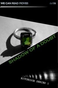
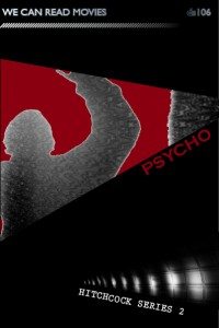
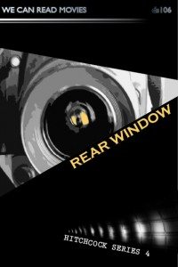
we can read movies – Hitchcock

bookcover bookcover

bookcover bookcover

For this assignment I used Adobe CS InDesign which I’ve had for a while but not used. This gave me a chance to use it. I didn’t need to find any tutorials as it was fairly straightforward to use as I am very familiar with photoshop.

I started by making the basic book design for the we can read movies series. I then tried to establish a feel for the Hitchcock series, which needs a feeling of suspense… I followed some hints from Cheryls blog post about design – using the triangles, the diagonals and the dark background. I used one graphic for the series to pull them together. This was actually a photo of a tube station and I think the diagonal lines of light establish tension too.

It was really hard with Hitchcock to not go with the obvious but what I wanted to do was use my own photos where possible and to add effects in Photoshop to make them more like a graphic. I used the artistic filters cutout in the main and it was interesting playing with that. Very hard not to use birds for The birds and I tried not to but found a photo taken on hols where we a roof was covered. This is probably one of my favourites as I worked the rooftop to align with the triangle edge. I had to use someone else’s photo (thank you baileyclark for using a CC licence)  for Shadow of a doubt as I wanted to use an emerald ring and don’t have one. The ring is central to the story, highlighting the tension between the relationship of Charlie and her uncle and also being a crucial clue to his involvement in the murders. I tried to have one colour in each main photo so that I could colour pick it for the title text.

It took blooming ages but now we are planning a film noir series, possibly a sci fic series, and I would like to do more hitch ones.  It takes alot of time but has stimulated some great conversations in the family about what key image/icon could be used to convey a film and has made me re-discover some of my old images and play around with them…

I love ds106 for this assignment alone. Even though i have fallen behind on the visual and design assignments and have only just started thinking about audio assignments – we will definitely be continuing to work through the whole summer of oblivion.