I am NOT 6!!!

"Many Happy Returns: I am NOT 6," animated GIF by @aforgrave

“Many Happy Returns: I am NOT 6,” animated GIF by @aforgrave

When looking through the Visual Assignment bank, it seemed that the Visual Assignment 1720: Birthdays are the Worst would be most apropos for Number 6 and the episode Many Happy Returns. It asks that you “find a picture of yourself Number 6 where you he look(s) upset and use photo editing software to add a birthday hat and party decorations.”

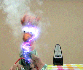
Recalling that Mrs. Butterworth (aka Number 2) brings Number 6 a cake at the end of the episode, I quickly scanned ahead using Quicktime and copied out a single frame (Command-C, thanks, Bill!) and pasted it into Photoshop.  Somewhere along the way  I remember thinking, wouldn’t it be ideal if there were six candles on the cake?

Well, there are! Not a coincidence, I’m sure! And Number 6 doesn’t look particularly happy, either. Perfect!

To highlight that little irony, I used the Magic Wand tool to isolate each flame (one at a time) and then used Layer>New>Layer via Copy to get each flame onto its own layer. I named each of the layers candle1 through candle6 respectively.  Re-selecting just the flame (using Command-click on the thumbnail for a given candle layer, I then switched back to the original photo layer and used Edit>Fill (Use: Content Aware) to get a good start on removing the flame from the original image. A little touching up using both the Spot Healing brush tool and the Clone Stamp tool removed any artifacts so that the candle appeared unlit. After repeating this for each candle flame in the original image, all that remained was to create a series of subsequent frames in the Timeline , each one adding in one additional candle flame layer until all six candles were lit. Two seconds for the initial and final frames, 1/2 second intervals for each candle flame, and a 0 pause 5-frame transition from the end back to the start.

TimeLine

“Using the Timeline in Photoshop to set frame intervals.”

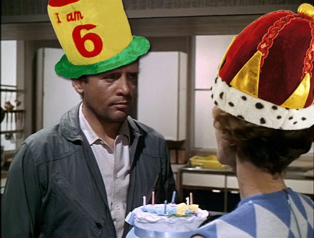
However, along the way (between candles 1, 2, 3, 6 — and then 4, 5) I headed off to the Internet to find a party hat for Number 6. Very quickly the hunt switched from a simple clip art party hat to one that would say “I am 6.”  After all …

A series of photographs of plush party hats caught my eye in Google images. Jumping out to the source website, I found they had hats in stock for ages 18, 21, 30, 40, 50, and 60, (as well as a crown and a traffic cone).

"I am 6, not 60," animated GIF by @aforgrave

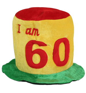
“I am 6, not 60,” animated GIF by @aforgrave

The Clone Stamp tool was used to remove the red 0 from the 60, and then, because the right side of the hat was initially a bit brighter than the left — and now more so with the space left by the removal of the  0 — I used the Colour Replace brush (sampling on the left side of the hat) to tone down the right side by painting over the right side. Voila.

Of course, Number 6 would never agree to wear such a hat in The Village, even on his own birthday, and so he marked it up a bit with some charcoal before putting it on his head.

And then, just at the final moment, I decided that Mrs. Butterworth deserved a party had to celebrate with Number 6, and because she was the reigning Number 2, she got the crown.

It seemed more appropriate selection than the traffic cone. Plus, it fit on her beehive hairdo.

2 Credit Units!

#BeSeeingYou

Anaglyph Tutorial, Part 1: Selecting the Image

Anaglyph-Tutorial-Part-1

Before You Start

You will be well served to have on hand a pair of red/cyan (or red/blue) 3D glasses so that you can view the images in the Tutorial and so you can test your images when they are done. I have also found that it can be quite helpful to actually wear the glasses during various parts of the process. (Throughout the tutorial, you may wish to watch for the “Please Put On Your 3D Glasses Now” notices! ;-))

Unlike traditional stereo photography which makes use a pair of slightly different originals to create the perception of depth in 3D, we will be developing a 3D anaglyph making use of a single source image.  Before we delve into the process too deeply, first a little bit of foundational theory.

The Simple Explanation

Our perception of depth comes from the way our brain integrates two images from our two eyes — each eye seeing from a slightly different angle. We can simulate depth by providing each eye with it’s own discrete image – in this case, one red and one cyan. Without 3D anaglyph glasses we see both images (and so there is a “double image” effect — but with the use of such glasses, one image is filtered out with one lens, and the other image is filtered out by the other, so each eye gets its own discrete image. If the two images have been slightly adjusted in position (and this is emphasized if we do this differently for different layers) then we can be tricked into perceiving depth when the brain combines them.

Selecting An Image to Work With

Not all still images will be ideal for the creation of an anaglyph. The simplest image will have an object in the foreground and then a defined background behind. A more complex image may have a variety of foreground, mid ground, and background elements which can allow for a more interesting anaglyph.

Throughout this tutorial, we will understand the process through the exploration of the following original source images.

Sisyphus, by George Wither

George-Wither-011_TT_Sisyphus_ORIGINAL

“Sisyphus, Illustration 8″ from Emblemes: Illust. by Geo Wither (1635)

While originally drawn/engraved on a flat surface, this image has considerable perspective detail that provides visual cues as to depth — the foreground hill with Sisyphus, the trees (two depths of them — the large ones on the right and the smaller ones behind), the city and mountains in the background, and the distant sky. If we wish to isolate each of these elements, we can emphasize their relative positions along the z-axis (into and out of the image).  As you can see, this image is an ideal candidate for turning into an anaglyph. (See the completed image)

John Gets His 3D Glasses On

John Gets His 3D Glasses

“John Gets His 3D Glasses,” image by @johnjohnston, via Twitter/TwitPic

As a photograph, John’s image provides a good capture of foreground and background elements. John’s hands and face are forward and will provide our front layers, and the seat, door and wall are clearly behind him and will provide our background layer. (See the completed image)

Foreground and Background Elements from "John Gets His 3D Glasses On."

Foreground and Background Elements from “John Gets His 3D Glasses On.”

Your Image

If you start with a photo or image that allows you to perceive elements as belonging to either a foreground or background, then you have a candidate for an anaglyph.

If a focus element in your image is also centred in the foreground of your image then it is a candidate for emphasis. We will be emphasizing John’s hands (and his face, to a lesser degree) after we have isolated them.

Next: Part 2

Next: Part 2 – Separating the Foreground and the Background (link to follow)
Then: Part 3 – Colour Filtering (link to follow)
Then: Part 4 – Positioning the Layers to Simulate Depth (link to follow)
Then: Part 5 - Extending the Technique to make an Anaglyph-a-GIF  (link to follow)


Monster Chiller Horror Theatre 3D Groom

"Monster Chiller Horror Theatre 3D Groom" animated GIF by @aforgrave

“Monster Chiller Horror Theatre 3D Groom” animated GIF by @aforgrave

What a great fortune that I just happened to be watching Jim Groom (@jimgroom) and Paul Bond (pbond ) talking about Mario Bava‘s Kill, Baby, Kill yesterday and had this little moment of Jim fresh in my mind when I read about @iamTalkyTina‘s Animated GIF Assignment: Monster Chiller Horror Theatre 3D GIF challenge.

It’s not really clear what Jim is mumbling about at this point (he may have been making a reference to someone getting pushed, possibly down some stairs), but this definitely counts as a Count Floyd Monster Chiller Horror Theatre 3D moment.

Sum Pauper Ego

“I am a poor man,
I have nothing,
I want for nothing.”

I first encountered this wonderful round during my B.Ed. year at Queens University, Kingston. As part of the Outdoor and Experiential Education course taught by James Raffan, we met once a week for a five hour experience — rock climbing, historical walk, a night hike, a campfire, a tour of a retired Canadian naval icebreaker. Each week a different group was responsible for preparing a meal appropriate to that week’s theme — we shared the food partway through the evening. Such a great part of a wonderful class.

I have fond memories of the “campfire” evening, which actually took place in a classroom at the Faculty of Education building — but which culminated in an after-class sing-along in a wonderfully acoustic stairwell that James led us to. I illustrated the simple lyrics in my journal (James Raffan and journalling — that’s another story), along with a picture of a drinking straw bagpipe that I played as we did Amazing Grace.

Experiential learning, to be sure.

Audio Assignment 1027 Row Row Polyphony for audio week.

Organ created using GarageBand, a couple of G’s played through.
Vocal was sung through once, then duplicated twice and offset by two bars each time to create the 3-part round.

Font is Herculanum.
Paper texture by akinna-stock

Multi Frame GIF Story: Beaker’s Hair

The ds106 Digital Storytelling GIFfest (known as GIFestivus2012 around here) continues, this time with a two-fer. As well as providing another submission for the Animated GIF Assignment 856: Muppet GIF assignment, it’s also going to reflect a new Animated GIF Assignment 880: Multi-Frame GIF Story.

Thanks to Jim Groom for pointing me at the multi-framed GIF story idea. It seems like an excellent way to highlight important themes or details within a longer narrative, like a movie (hint, hint). But it also tells a nice visual story here from this short muppet clip.

I’ve always wondered what Beaker did to get his hair like that.

Beaker1_280 Beaker2_280
Beaker3_280 Beaker4_280
Beaker5_280 Beaker6_280

Some thoughts, just as I finish finagling these six GIFs into a nice table so they can be viewed in tandem.

  1. I didn’t know that you could get electric metronomes. I guess you maybe need them for really, really long songs.
  2. The fifth panel was made using a small number of sporadic frames that existed as the lights shorted out now and then in the original clip. I thought it would be neat to envision how this might look with a longer sequence of darkness. The big plume in the upper left was the result of a little photoshop editing.
  3. I wonder how this might be different if I applied the “less is more” approach, say three or four key frames per GIF. Hmmm. Maybe I’ll revisit this when I’m out of other ideas for GIFestivus2012.

Neat, eh? Now I want to do this with a movie. I wonder which one I’ll try? Hmmmmm.