

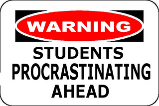
Yeah. It’s pretty self-explanatory.
The assignment to create a warning sign was by far the easiest design assignment from this week, but I also learned a surprising amount getting it done.
Creating the sign was easy enough: I found a simple Hard Hat Area sign, drew over the original text with white and red, respectively, and then slapped some new words on there (and yes, that is Arial. It’s a warning sign, it needs to be readable, not pretty). A few adjustments with the scale tool and voila! One more assignment down.
Like I said though, I learned a lot here. Attempting to fit the word “Procrastinating” on the sign made me realize that not only does a warning sign have to be legible, that legibility depends on what words you’re using. Words that are too long won’t be read, especially on street signs when people are whizzing by in cars. There’s also the ever-important issues of color and placement; if you don’t use colors that stand out in contrast to each other and if your message is cluttered, it’ll also make it impossible to read. On a warning sign, that’s more than essential, it might actually be life-saving.
It made me realize just how much work goes into creating the little design elements we see around us every day and take for granted. Somebody (or a couple of somebodies, or a committee of somebodies) had to sit down and figure out what would be visually striking, clearly readable or understandable (in the case of signs that just use images), and could be easily replicated over and over again. Someone figured all of that out, spent hours or days or weeks designing it, and now it’s become part of our cultural landscape.
How awesome is that??? I think it’s awesome.