Mash Up

This is the “consumer mash up” assignment. You incorporate your favorite product into the logo of the store you purchase it from.

I shop at Aeon. It’s this sort of department store that also sells groceries. They have an imported foods section that sells these frozen Italian pizzas that are the best. Frozen pizza is a must because delivery is too expensive. One pizza from Domino’s in Japan is over 40 dollars. And it’s thinner than what you would get in the states. So a higher end frozen pizza is much preferable.

I took a photo of a crisp cheese pizza and then I incorporated it in to the the logo to make an “O” using the photo editor, Gimp.

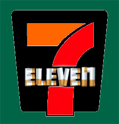
Seven Ciggies

Quickie Sales

The hazards offered at Seven Eleven

Think of anyplace you spend money, and what you most often buy at that place. Then redesign their logo to incorporate your favorite product. Do as many as you want.

The Consumer Mashup made me consider where I spend a majority of my budget.  Initially, I considered incorporating discounted fish from AEON, but realized most of my money is spent on the lung blackening sticks offered at the Seven/Eleven.  To create my alternate logo, I started with the original.

I decided to experiment with different photo editing software, so I used pixlr for this assignment.

A google search of “Cigarettes” gave me many options, so I selected a photo containing a straight cigarette.  Using the magic wand feature, I clicked the cigarette photo and copied its inverse.  After pasting the inverse on the original logo, I erased all of the excess.  The remaining was one straight cigarette which I copied multiple times and rearranged to lay on top of the original logo’s lettering.  After the cigarettes were in place, I switched to the background layer and erased the green ELEVEN to eliminate any visible green.  Here, I changed the white logo background to black to represent the hazards of smoking and make the new lettering easier to read. The red and oranges of the original logo complimented the change nicely by representing the fire from the cherry against the smokey black.

I found pixlr quite easy to use, more so than the overwhelming Photoshop.  I am glad I tried it out, I believe I’ll be using it more in the future.

DS106: Consumer Mashup

This is my third DS106 assignment for this section. It is under the mashup assignments and is named Consumer Mashup. The directions read as;

Think of anyplace you spend money, and what you most often buy at that place. Then redesign their logo to incorporate your favorite product. Do as many as you want.

I had a few ideas of places that I constantly spend money at here in Japan. But I couldn’t think of a single product that I consistently buy. Then it hit me, I have to pay for my train ride to and from school everyday! That will be perfect. My commuter pass is from ????? (Tokyu Kamata Station) to ?????? (Shinjuku-Gyoemmae Station). So I spend about 390? ($4.89) to commute to and from school.

Similar to my last DS106 assignment. I opened some programs… and queued the music!  I took the ????? (Tokyo Metro) since I take both Tokyo Metro and Tokyu Corperation to get to school but, Tokyo Metro is more well known. I then took a picture of the item I use to ride the trains, which is the Pasmo card, and got to brainstorming. After not having any ideas come to my head for about 10 minutes. I finally decided to put the Pasmo Card within the Tokyo Metros “M” logo. This is the end result.

Tokyo Metro Pasmo Mashup

Tokyo Metro and Pasmo Mashup

Hopefully you enjoyed! Shinya Out!

Consumer Mashup

_cokwr: Think of anyplace you spend money, and what you most often buy at that place. Then redesign their logo to incorporate your favorite product. Do as many as you want., _cpzh4: Mashup, _chk2m: ADRE, _ciyn3: 120, _ckd7g: , _clrrx: , _cztg3:

Consumer Mashup

This ds106 assignment is called “Consumer Mashup” and we have to think of a place where we spend money the most and what we spend it on, since I live alone and I don’t know how to cook, I go to McDonalds at least 3 times a week and I get Big Mac and a large size fries, so I took the simple McDonalds logo and added “Big Mac and Fries” on it. I edited the photo using a simple program on the internet, the program is called Picnik and it’s easy to use.

I know it’s not good to eat McDonalds that often and it makes you fat, but it’s fast and tastes good not to mention that it’s right next to my house.

On Pokemon consumers

ds106 assignment on reinterpreting a logo with the inclusion of what one buys most at the place.

And the original 7 & iHoldings logo:
So here’s the rundown: For those of you not in the know convenience stores in Japan are really living up to the name (being convenient, who would’ve thought it!). I go there all the time to buy food, stationery and other miscellaneous stuff but the one thing I go to 7-11 specifically for is Pokemon merchandise; cards, lucky draw prizes etc. simply because the other convenience stores don’t carry that particular item (they’ve got other awesome stuff but that’s for a different post).

Given the above I decided to go in and reinterpret the 7-11 logo with a Pokemon twist and the above image is the result. My considerations this time were about how to balance the iconography of the original logo with the Pokemon reference(s), and what really got me started I guess was the circular “swish” that the 7 & iHoldings version had, which I reappropriated into a pokeball. Other ways of balancing the two elements were by maintaining the original logo colours, and trying to keep each object (the ball vs. the “7″) from becoming too prominent.

Video tutorial of some of the processes to follow (full size here):
Unable to display content. Adobe Flash is required.