Autobiography Cover

I chose to do this design assignment because I really enjoyed the idea of using a picture and titling it to represent my life. It’s hard to come up with a title for your life I soon found out the hard way. However, I finally decided on a title I found to be fitting, “Life… Continue reading →

Alternative Book Cover

In order to create an alternative book cover I had to find a book in which I could alter the meaning. That was the difficult part for me. I couldn’t find a book title where I could insert a different picture to make it appear to be about something different. After hours of searching for… Continue reading →

America runs on DUNKIN


This is my picture with a little caption. I chose to use this picture I took around Christmas of my younger sister. She was exhausted from basketball practice earlier that day, but for some reason she decided she wanted to dress up as santa. This photo was edited with instagram and paint artist to incorporate the caption.

Rings of a feather

Alternate Book Covers DesignAssignment 366  For this assignment I took a picture from my wedding.  Using the image of the rings I decided that The Fellowship of the Ring would work.  By titling it such, it creates a different meaning than the original classic by JRR Tolkien.  2 Stars.

art is the only way to run away without leaving home


Mission Defamiliarize was my favorite assignment! I enjoyed taking everyday items and photographing them in a way that portrays them as unfamiliar items. The first picture is of my kitchen cabinets, taken from an angle underneath them and then I tweaked the coloring by using the night vision option in Picnik.

The second picture is of my dishwasher in my kitchen. I zoomed in extremely close to the grate and tilted the camera trying to create an angle that would add to the mystery of the object. I also changed the exposure of the image on Picnik as well, creating a darker picture.

The third picture is of the stools in my kitchen. This picture was the most effective in terms of the initial photographing. I didn’t have to tweak much because I was so pleased with the way it initially came out.

The fourth picture is probably my favorite one, it’s my coffee pot. I took a picture of the side where the numbers indicating the right amount of water are listed. I then uploaded it to Picnik and changed the coloring.

The fifth picture is the latch on my window in the kitchen. I chose to photograph this particularly because it’s not an object people are usually familiar with so the latch in all it’s simplicity is already half-way to being defamiliarized. That being said I didn’t too much to this photo after I took it.

The sixth picture is a birds-eye view of the light-switches in my kitchen. I thought this was kind of clever because typically people down look down on light-switches. If you’re anything like me, you don’t even look at them, just absentmindedly flick them.

The seventh picture is of the shelf in my dining room. It has a candle holder (with the candle in it), part of a pumpkin decoration, and the rim of a sombrero in the picture. I took it intentionally so the focus of the picture would be the empty shelf in the middle of all these other unidentifiable objects.

The eighth picture is the surface of one of my favorite games, catch phrase. It was sitting in the kitchen so I tried to take an elusive picture. All I did after taking it was change it to black and white.

The ninth picture is of a candle at an angle in a candle holder in the shape of many intertwined hearts. I used the duo-tone option in Picnik to edit this photo but it ended up looking very similar to the sepia option which would have required less effort on my part.

Last but not least the tenth picture is a sleeve of oreos that I uploaded into Picnik and posterized giving it the painted look.

I’m interested to what everybody else thought these pictures were of! I asked my sister prior to composing this post and she couldn’t guess a single one!


Frying up DS106

This is your brain on Ds106!  I fried an egg and added the text to replicate those old brain on drug commercials.

Propaganda posters 3 stars!

Sucked into DS106

This poster represents the digital world in which we are studying and how it sucks up into another world.  I took the original movie poster and changed the words “the computer” to be Ds106.

Movie Poster 3 Stars

sometimes speech isn’t superfluous: the hidden art of spubbles

The most challenging aspect of this assignment was finding a picture that would work well with a speech bubble. Once I had this picture picked out all I could think of was the actual conversation that took place while this picture was being taken so I think that hindered my creativity a little bit. In retrospect I probably would have produced something more intriguing if I had used a photo other than my own. I enjoyed the process of creating a spubble, I used Picnik to insert the speech bubble into this picture.

I sure do love me some movies

I’ve done a couple of design assignments this weekend.  There will be a few more to come, but I was pretty excited about these and wanted to post them now.

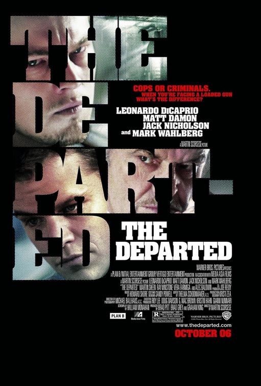
This assignment looked like a lot of fun.  It also seemed somehow familiar.  Long ago, my friends and I renamed “The Departed” with a much more apt title: “Head-Shot: The Movie”.  So I started with this

And ended up with this

Head-shot: The Movie

Not great, but I think it does the job.  By the time I finished, I really wished I had used a different font.  I was unwilling to start over though, because just doing this version took me quite a long time.


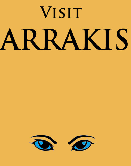
Then there was this one that I honestly chose because it seemed easy enough that I could actually do it. And since I’ve been rereading Dune this week:

Dune travel poster

These were both pretty simple.  I had someone show me some basic photoshop layering for Head-Shot and then had some annoying trial and error adventures.  For the Arrakis travel poster, I just used mspaint.  That one was easy.  Really, simplicity is key.

More design assignments on the way, probably mostly movie related as well.  There will also be more daily creates too.  I know you’re thrilled.

deceptive perceptions


I had fun collecting the items to photograph for this assignment. Everything in this bucket was sitting somewhere in my kitchen. I chose these items because they were brightly colored and I thought they would make for an interesting color twist. I tweaked the color in this photo by using the invert option in Picnik.