Lily Stencil

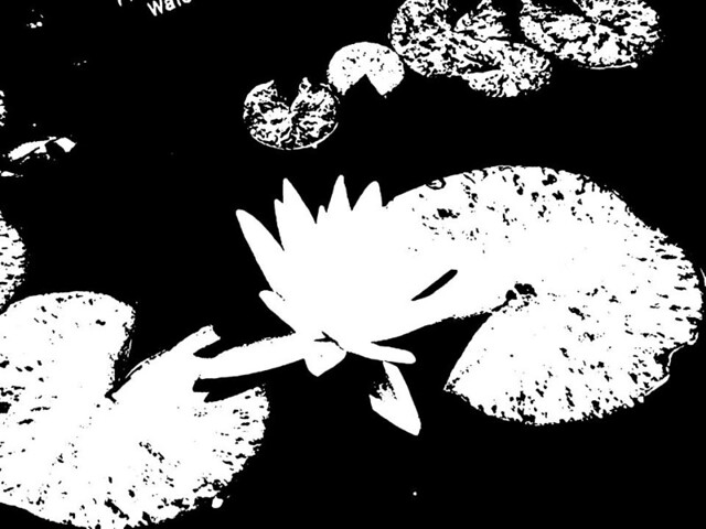
For the Visual Assignment “Back to Basics” I had to find a photo I have taken and remove the color from the photo so that it would look like a stenciled image instead of a photograph. The brightness of the lily and lily pads contrasting with the dark water in this photo was the main reason I chose this image. I really like how the darker spots on the lily pad became splotches on the stencil version of the photo. In order to create this effect, I copied and pasted the original photo into Powerpoint and used Picture Tools, mostly the Color Tone tool, to create the stencil-like version of this photograph. I then uploaded the images to Flickr and embedded them into this post. I always like to play with the colors of photos I have taken to see what they would have looked like in a different light, but I admire how a stenciled image is completely contrasting black and white, to better make out what the focus of the photograph is.

Original Image

Minnesota Water Lily

Stencil Image

Stencil Lily

Assignment Value: 2 stars

Back to the Basics

PicsArt_1422766669253This assignment was to take a picture and change it so that it looks like it was drawn. I chose this picture of Bella, a labrador retriever I bought my brother for graduation. The filter did a very nice job of focusing on her darker features such as her eyes.

http://assignments.ds106.us/assignments/back-to-basics/

2 stars

That’s sketch…

BeFunky_null_269.jpg


The sketch filter always makes the subject almost unrecognizable. The focus suddenly becomes 2-D instead of 3-D and it looses the shadows and highlights of the normal camera.

Back To Basics (With My Dawg)

For my last Visual Assignment of the week, I chose to do the Back To Basics visual assignment. This assignment, is essentially to take any picture you want and edit it to make a stencil style version of the picture. If you would like to check out the assignment for yourself, you can find it here.

Here’s the photo that I originally used, to create my stencil photo of:

IMG_1400

This is a photo of my dog Lobo, and here is my stencil photo of him:

Back To Basics

I think this stencil image turned out very well. It was a little bit difficult, because Lobo is gray and white, it was difficult to manipulate the colors, so that it was neither too dark nor too light. As you can see it really accentuates the part of his face from the eyes up. Where as the nose area is not as defined due to the lack of color on his nose.

To create this stencil image, I used Photoshop Online Free it is almost identical to Photoshop, but online based. To start, I uploaded my photo onto this site, and cropped it to my desired size. Then, I posterized the photo. Next, I changed the threshold on the photo, until I reached a point where I felt the best stencil effect was achieved. I learned these steps by following a few simple steps from Instructables.com, if you would like to check out the tutorial, go here.

I really liked this assignment, it really helped with my skills in Photoshop, but it also helped me notice how stencil images can change the focus of images. For example in my first photo I feel that the focus is on my dog, Lobo, in general. In the stencil version, the focus changes from Lobo overall, to mainly his eyes. The darkness combined with the faint spots of white really help the eyes pop. Overall, this assignment, Back To Basics, was really good, and not too difficult.

This assignment is worth a total of 2 stars.

Upping my total for the week to 8 stars, and finishing my visual assignments for the week. So this post is basically over, I hope you guys enjoyed. Happy Sunday my friends.

Stencil Me Baby…

So folks I am posting my pictures from the assignments I did over the week.  I decided to accumulate the pictures first and then post, if some of you were following my Flickr then you might have already seen them.

The assignment for which I sought out do do first was worth 2 stars initially and it was entitled Back to Basics.   I choose a picture of my son Joshua.   I took the picture with my galaxy note 3 phone and I used the stencil/black  & white effect to drain the color out and to make it look more classy.  He is seven years old but I think that by taking out the color it really focused on his face and it made him look younger even.  Sorry…I know I sound like a sap! But I had fun with this and hopefully this is something Josh can look back on.

My thought process in this was to choose something of sentimental value and to make a picture more emotional.  I don’t get emotional about many things except for my kids so I decided to go out on a limb.  I enjoyed this little app on my phone because it added a nice touch to an already charming picture.

Love you Josh!

-Dad

2014-06-27_14.20.21[1]


Back to basics

Choose a photo of anything that you want to make a stencil out of using Photoshop or some other editing software. Using your software, remove the color and make the image appear to be a stencil instead of an actual photo. Take notice of how this changes the focus of the image.

Back to basics

For this assignment, choose a photo of anything that you want to make a stencil out of using Photoshop or some other editing software. Using your software, remove the color and make the image appear to be a stencil instead of an actual photo. Take notice of how this changes the focus of the image.

stencil sarah

I came up with this assignment because I think it is a good way to demonstrate the simplicity of a photo. Many photos today are all about the color or the details, but this takes away from all the minor details and the color, causing you to only focus on the outline of the image. It provides a different perspective to examine a photograph.

To do this assignment in Photoshop, take a look at this tutorial.