Remix #1 (Visual): Adapt an Artist’s Work / Techy Mona

The hardest part of this assignment was deciding which option to choose in order to complete the task.  Now I really understand how my students feel when I tell them to “be creative” and they look at me as if I am speaking Latin.  So, I settled for remixing the work of a famous artist and the piece of art I settled on was DaVinci’s Mona Lisa.  

I love tech.  There.  I said it (shocker, I know).  However, I do not love editing photos!  I would rather spend hours setting up the perfect shot with a camera, or finding a different way to portray the needed visual aid.  Why?  Patience.  The amount of detail that it takes to use photo editing software surprised me.  One little line to far to the left can ruin what you are trying to accomplish.  Overall, I think the image turned out well.  I like that I portrayed Mona as I feel she would be in today’s society.  AND, I gained a huge amount of respect for graphic artists!

How To:

1.  I used Pixlr as my editing tool.  After loading both images, I began with the image of a Mona Lisa skinned iPad.

2.  I created a white border around the image, to simulate an iPad case with the marquee tool feathered (feather setting) to 40.  After inverting the selection, I was able to color the entire portion outside of Mona Lisa’s iPad covering.

3.  Next, I used the free transform tool to rotate the image slightly so that when it was moved to the final image, it would looked natural in Mona’s hand.

4.  I created a new image with a transparent background and then I copied and pasted  the image of iPad Mona into this transparent background.  To make this happen, I used the inverted wand tool.

5.  I re-sized the transparent iPad Mona so that it was less than half the original size so that the iPad would look normal in Mona’s hand.  This was a lot of trial and edit/undo’s.  I really was just eyeballing the two images side by side in order to have the right size.

6.  I then copied the iPad image into the image of Mona Lisa, which created two layers on the untouched photo.  The next step was to create a third layer of just her hands so that I could sandwich the iPad between the two layers.  Using the wand tool, I carefully selected the hands – this was a pain!  With the hands now a layer, I placed them on top of the iPad image and erased the extra bits I missed with the wand.

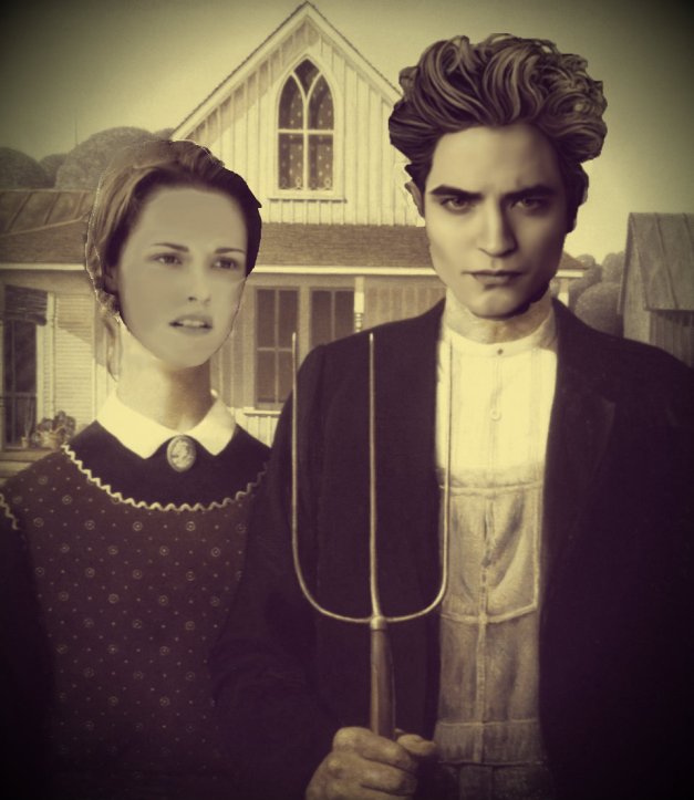
Remix #1 (Visual): Twilight Gothic

Here’s my visual remix. I chose the Adapt an Artist’s Work option, going with Grant Wood’s painting American Gothic.

Some notes:

1. It must be said upfront that I’m not a Twilight fan. But in thinking about possibly remixing this famous painting, this was the couple that sprang to mind. I did a quick Google search and found only a couple parodies along these lines, and I figured I would add to the collection. I considered going with Snooki and The Situation, but I didn’t want to spend that much time thinking about Jersey Shore. Interestingly, though most parodies of his painting seem to depict a husband-and-wife couple, the figures in Wood’s painting are actually father and daughter.

2. I suppose I succeeded in “changing or reinforcing the work’s meaning.” I’ve done some past research into AG parodies, but I don’t think this effort really pushed the critical envelope very much.

3. I’m fairly happy with how this remix turned out, although Bella’s face looks more mask- than life-like. I chose a photo based on her expression and partial profile, and I struggled with adjusting the lighting and washed-out skin tone. She looks like she’s wearing pancake makeup, or like her head is a balloon hovering over her body. There are probably better photos I could have used. I like how Edward turned out; here’s the original.

And here’s my tutorial.

d

Adapt an artist’s work

_cokwr: Adapt a famous artist's work to change or reinforce its possible message., _cpzh4: Visual, _cre1l: http://lisahistoryds106.posterous.com/finishing-the-smoke, _chk2m: Lisa M Lane, _ciyn3: 17, _ckd7g: , _clrrx: , _cztg3:

Visual Assignment: Adapting Klimt’s “Hope”

The Assignment: “Adapt a famous artist’s work to change or reinforce its possible message.”

Here’s how this is going to work for the most dramatic of reveal effects. First, I am going to show you the original. Then, I am going to tell you what I changed and why. Finally, the result.

I chose to modify Gustav Klimt’s masterpiece entitled “Hope, II“. Here is the original:

Hope by Klimt

“Hope, II” by Gustav Klimt

I undertook the manipulation with two goals: To emphasize the golden luminosity that is one of Klimt’s hallmarks, and to darken the main subject’s skin.

Now, I absolutely adore Klimt’s work for his use ofI would have been pleased if I could have made the background literally move, glowing darker and brighter, but modifying the rest of the picture to my standards was long and difficult enough without attempting to make a gif as well.

The choice to darken the woman’s skin was based on my interpretation of the picture. Klimt titled this piece “Hope, II” for a reason. When I saw this picture, I interpreted it as a pregnant (or simply fertile) woman being carried (literally or metaphorically) by her peers/other women. The position of her hand is nearly religious, making me wonder if this is a representation of Mary, pregnant with Jesus. In that case, the women carrying her are carrying the hope of humanity on their backs. They might represent the unique sisterhood women share by simply being women, or perhaps they express the lineage of women that eventually lead to Mary. It makes me think of the famous sentence Isaac Newton penned, “If I have seen further it is only by standing on the shoulders of giants.” Essentially, Mary is standing on the shoulders of her female ancestors.

Now, I recently watched “Children of Men“, an amazing, heavily thematic and thought-provoking film, the premise of which is that women have become infertile, leading to a world of humans without hope for a future. They are, essentially, all just waiting to die. When a young woman named Kee becomes unwittingly pregnant, it throws the world for a loop. There are many religious and spiritual motifs, the most obvious being the Nativity story.

In a bold move, the director Alfonso Cuaron chose to cast Kee as an African, in response to the recent African origin of modern humans hypothesis that suggests that humanity began in Africa and moved across the world from there. I loved this choice, and wanted to “update” Klimt’s “Hope” to reflect this scientific possibility. Mary may not have been African, but as a symbol of humanity’s origins (in a sense), I think this works.

Here is the result:

"Hope, II" Re-Invisioned

“Hope, II” Re-Invisioned

This didn’t take me nearly as long as some other projects I’ve done so far for this class, but I thought I would be cool to make a time-lapse video. It starts out about half-way through the job, and covers about 45 minutes of work in 4 minutes (couldn’t really get it down to anything shorter).

[TO BE ADDED]

if jesus wouldn’t wear it, should you?

*I do not agree with the statement above.

This was not painted by someone famous but I had the urge to break the rules.

… and I just realized I didn’t explain. when I saw the westboro baptist people holding those “colorful”(which is an understatement)((but they do use colorful backgrounds)) signs that really leave you with an awful taste in your mouth, I knew those guyz had it wrong, way wrong. I was wondering what image could possibly change those people’s mindz.   this is what I came up with.