Flashback to Game Boy Programming…

Pixel Scenes?  No Problem.

When I stumbled across a three-and-a-half-star assignment for creating a sixteen-square pixel image of a person, vehicle, or otherwise intricate object, I considered it to be an assignment too far up my alley to ignore.  In Fall 2017, I took Computer Systems and Architecture with Dr. Finlayson.  One major aspect of the course was programming games to run on the Game Boy Advance.  For those who have never written a game for that platform in C99, the coding is terribly tedious, and requires creative debugging, since there is no console to print to on GBA.  In fact, there is no such thing as ‘print’ on GBA; letters can be made as tiny pictures that have to be placed on the screen.

After writing my own version of Pong and building a Mario-like shoot-em-up with a fellow student, I became proficient at working with pixel art.  Using some images of Mario characters and maps to start with, I ‘drew’ the characters and the backgrounds for the game.  I used the PaintX image editor for Mac to get down to the pixel level and fill in the dots, so to speak.  I completed this assignment in the same fashion (keep reading for more details).

The Tale of Cinderfella

Once upon a time, at a mining operation far away, a new mineral was discovered in the heart of Zethustra Minor.  Illuminum, as it was called, was the first mineral known to man to naturally give off light.  With one company, led by the young and ruthless Margery Stone, controlling the supply of this new exotic substance, others in the industry sought to gain information about the mining operation in hopes of cutting in on their competitor’s profits.

Peter was a lad of unmatched misfortune.  After the death of his mother in a mine-collapse, he was forced in to the same profession by his stepfather and two stepbrothers.  Peter never understood how the three people he supported survived in the Zethustran mining town; they found the deep-blue stains that the illuminum left on Peter’s skin and clothing repugnant and, for fear of the stains spreading throughout their four-bedroom shack, barred Peter from the upper floors of the house, quarantining him to his basement bedroom and bath.  When Peter was offered some cash on the side by a well-dressed gentleman for ‘inside reporting’ at the mine, Peter had to accept the job; he liked money as well as staying alive.

After some close calls obtaining samples and a brief run-in with Margery, Peter knew his employment situation could not continue much longer. On the night before Peter’s planned escape from Zethustra, he decided to attend one last company picnic to keep up the appearance of normality.  Peter never imagined the path on which that picnic would lead him…

Instagram Photo

So, above we have Peter sneaking away from the entrance to the mine with a handful of the illuminum crystals while watching the security camera over his shoulder.  I was inspired to create this image after discussing an old story concept that my wife, Meg, had been working on in college.  I thought the ideas of a glowing mineral, espionage, and reverse-gender Cinderella sounded interesting, and the picture practically drew itself once I started clicking the pixels.  The story behind the story took me a little longer, but I think the time spent was worthwhile.

Two Hundred and Fifty-Six Blocks of Beauty

Creating this image was technically very simple.  I opened PaintX, created a new sixteen-by-sixteen pixel image, and used the pencil at the smallest size to fill in the pixels. The real trick here was knowing where to begin: for this I called on the rule of thirds.  Since I wanted to focus on Peter, I started by putting his head upward and to the right of center.  Then, I filled out the rest of his body and gave him the illuminum to hold.  Next, I made the mine entrance and mining cart. As an after-thought, I included the security cam and changed the direction of Peter’s head to be looking back at it.  Lastly, I painted in the different shades of green for shrubbery in the corner and added the blue stains to Peter’s hands and clothing.

After completing this assignment, all I can say is, “Thank God for View> Zoom In. “

Visual Assignments for Week #4

I wanted to go out of my comfort zone with the six starts of visual assignments we had to do this week!

I started by doing the Assignment called “256 Points” where you create a picture using a 16×16 pixel square. I was a little stuck at first about how to create a picture that would just use 16×16 pixels, but then I did some Googling and was all set!

I used the website Pixilart
to create my image. In order to keep with the apocalyptic theme of our class, I wanted to make a picture of a meteor hitting a city skyline. I don’t know that it is the clearest, but I feel like once I say what it is you can tell.

The second post I did was worth another three starts and completed my needed 6. I completed the “Where Did the Soda Go?” assignment where you are supposed to make a gif showing how bad the acting in infomercials are.

I downloaded the 4k video converter from this week’s list of assignments to get the YouTube video I wanted.

I decided to go with the “Dumbest As Seen On TV Items Ever” for the video to take my clip from. I then used the website GIPHY to create my gif to share with the world.

pixeled malevolent melody

Okay so this assignment was very tricky. What mostly got me is how do you even make the image that pixelated size? I used Photoshop again and tried to make the photo 16 by 16 pixels which it wouldn’t let me size it that way…so it was 16 by 11. THEN when I saved it, it was tiny… so I figured why not screenshot it so you can see it.. but I can’t seem to find where the screenshots are going… SO THEN I used Luna Pic, to pixelate it. I’m not really sure how to resize this thing but here is what I came up with:

This is a drawing of what I believe Malevolent Melody would look like.. she has firey pink hair and glasses. I drew this on photoshop with a drawing tablet. I would’ve added her keytar but there aren’t enough pixels for that..


256 Points

I did the 256 Points visual assignment. So above is a picture of my superhero Charlie Sass! This assignment was perfect because she would prefer to keep her identity a secret. The picture itself is only 16 x 16 pixels… making an image this small was definitely challenging. I wanted to keep as much detail in the picture as possible, and I wanted the iconic red hair to show.

Back to your roots, Bob

I really like pixel art, but I’m no pro. I decided to do 256 Points anyway. I used to spend a lot of time editing Pokemon sprites and making Frankenstein’s monster-esque trainers and Pokemon, but I thought I’d stick with today’s theme and go Animal Crossing. So here’s my boy Bob the cat.

Bob 2400x Zoom

  Here he is, but smaller! Embedded via WordPress, since flickr doesn’t seem to be a fan of tiny images.

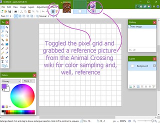
Like my previous project, this was done in paint.net. I pretty much just used the color sampler and the pencil tool for it, given that it’s 16×16. I started by opening up a teeny-tiny canvas and toggling the grid (which makes it so much easier to look at). I grabbed a reference picture of Bob from the Animal Crossing Wikia so I could pull colors and make it look at least a little bit like him.

Steps1

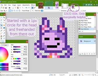
Then I got to drawing. I used the circle tool to make his head and the rest was freehand with the pencil. I pulled another sprite from the AC wikia for reference material, but it was 32×32 and I also just didn’t like it very much. You can see it up in the corner being lonely.

Steps2

As for Bob’s pose – his personality in the game is “lazy,” so a lot of his dialogue is about being sleepy, eating, and living a generally laid-back and slow-paced lifestyle. I thought it was appropriate to have him relaxing with his hands (or paws) behind his head and his eyes closed. Having closed eyes also saved a bit of room on his face for his goofy mouth.

I did end up shifting him one pixel to the right and giving him a left elbow after all was said and done – the single blank column on the righthand side seemed wasteful.

Sleuth Summary 2

Week two!

This week I was very rushed, but actually really enjoyed my time working on these assignments. My favorite by far was making some pixel art and browsing the internet looking for some inspiration. The visual assignment was called 256 Points and had us make our own 16×16 pixel art. Here’s what I came up with:

I got some inspiration from a lot of the video games I play and types of games I like, such as Skyrim and others that incorporate a lot of magic and medieval themes.

Another assignment I did this week was an Animated GIF assignment, which had us make a GIF of a reaction. I chose a little scene from one of my favorite movies ever, Ferris Bueller’s Day Off, where Ferris sneakily goes to pick up his crush, Sloane Peterson, and his buddy Cameron has to hide under the cover. The reaction after the trio pulls off the stunt is an awesome scene and is what I chose to make a GIF of:

This is an awesome reaction because the trio are skipping school and successfully pulled off their stunt without a hitch! Successful sleuthing!

The third assignment was a writing assignment about a song and the feelings it evokes within me. The song I chose was the Intro to Logic’s first album, ‘Under Pressure’. This song just gets to me because it’s a really dramatic and memorable intro to an absolutely awesome album. This is some of the only music that I genuinely want to listen to time and time again and want to hear and dissect each word, each verse and get all of the meaning out of these songs. Some of my favorite music ever follows this intro:

The daily creates were a little more strained for creativity for myself becaue they were pretty tied down in terms of the subject matter. I liked thinking about what I could make out of what I was given, but still found them a little challenging and definitely tough remembering to keep up with throughout the week, instead of all at once. My three daily creates were:

I particularly enjoyed the storyboard daily create because I love YouTube as a platform, and I also love pictures and photography. Seeing a visually pleasing video made into visually pleasing pictures was really awesome. Plus I also looked through my old favorited videos on YouTube which were a lot of fond memories. The mystery machine picture was funny and I tried to kinda recreate the theme of what was wanted, but had multiple ideas of what to do. At one point when I had longer hair and scruffy facial hair, a few friends called me shaggy so that was definitely another idea of mine, but not what I settled on. The third daily create was a long shot for me as I know nothing about philosophy. I tried meshing that theme with the spy theme and had average success, but wasn’t particularly proud of the t-shirt design I came up with. I personally would’ve liked just a spy themed t-shirt and had a great idea for a t-shirt with that theme.

Overall, definitely liking the theme and making my own sleuthy twist. I definitely need to start on this work ahead of time during the week and not tie myself down this late at night. But, I suppose I “thrive” under pressure. I really do enjoy this work and being creative, so that’s definitely incentive to make myself time to make better use of my time so I can create better content.


Visual Assignment – 256 Points

Pixeled Outlaww

The pixel outlaw

I created a pixel image of my outlaw character by creating a 16×16 template in MS Paint. I initially thought I was done and proceeded to upload the extremely small image into my blog before I realized I was going to have to re-size it again. Here’s the 16×16 version:

Pixeled Outlaww

itty bitty outlaw

Clint Pixelwood

Pixelwood

Everyone, meet Clint Pixelwood, a pixel rendition of one of Clint Eastwood’s most famous Western images. I made Mr. Pixelwood during the completion of an assignment that encouraged the making of a pixel image with only a 16×16 resolution. Since I’ve never made pixel art before, this proved to be a bit of a challenge. I don’t know much about shading and colors in such limited space, but I think Pixelwood came out pretty well. I used Paint.Net, which is a free drawing program that allows the use of layers and editing tools, though its brush functions are limited. I had to resize it in MS Paint in order to prevent it from getting fuzzy around the edges of the pixels.

In order to create my image, I referenced this photo of Clint Eastwood:

Eastwood

This photo is iconic to me, and since the assignment prompt encourages you to put as much detail in the limited space as possible, I figured what better way to test the limits of my abilities than to use an actual photo, background and all? Despite not being able to recreate his facial expression, I’m pretty proud of what came out of the assignment. I learned that pixel art has everything to do with colors, less so with shapes and lines.

Clint Eastwood had a big impact on Western film (and on film in general). I admire the work he’s done as an actor and director, and his older films are still incredibly enticing to watch. The image that I attempted to pixelate is from his iconic role in The Good, the Bad, and the Ugly. The image alone speaks volumes of his character and of how Western film is remembered — rugged, rough, dirty, and quiet. The very essence of this image is difficult to describe, but it is certainly fun to rework.

The Red Eagle Knight

As per what I understand is good etiquette for the class, I took the liberty of completing my own created assignment.

Setup is simple. Open up the image editor of your choice (in my case, MS paint), set the properties of the image to be 16 pixels by 16 pixels, zoom in to the image, and use the pencil tool for good measure. I looked at animation sprites for 8-bit videogames, such as early Mario for inspiration.

I looked specifically at people since I knew I wanted to try my hand at a person. What I learned is that the sprites focus on two or three main features, it is alright to have goofy-looking appendages, since any person will understand that they are in fact arms and legs. Prominent in the Mario sprite are the mustache and the suspenders, while the arms and feet are somewhat out of proportion.

My result:

Red knight enlarged

Here, I went for getting a visor, sword, shield featuring a red eagle emblem, and cape. Needless to say, I was surprised at how much detail I could cram into the image. In an ideal world, the eagle could use a few extra pixels, and I could put a little more detail into the sword, but constraints are constraints! I added the cape at the end, because I felt the right hand side of the sprite was a little bare pre-cape, and it suddenly hit me that a cape is appropriate garb for a cartoon character.

Overall, I am quite happy with how it turned out.

256 Points

Today, we have the luxury of fast computers with lots of memory and power. However, that wasn’t always the case, and graphics designers had to make due with very limited capabilities. For this assignment, you are to draw a person, vehicle, or otherwise intricate object. The catch is, your image can only be 16 pixels by 16 pixels! Work to express as much detail as possible in the space allotted. If the size is not constraining, you are not setting your standards high enough! Feel free to enlarge the picture before putting it online, but remember that your resolution must still be that of a 16×16 pixel image.