Greetings! I’m back with something fun for my first assignment. I followed the theme of the 80s by targeting the movie my blog is currently themed around: They Live (1988), by John Carpenter starring Roddy Piper and Meg Foster. The assignment I chose is called “Before and After The End” by Martha. Here is its synopsis: “Take a before/after photo of a person, place, or thing that has survived the apocalpyse. Then use Juxtapose to share a comparison of your two photos. Try not to rely too heavily on Photoshop or other photo editors to show the changes.”
First, let me tell you about my inspiration: They Live. They Live is a science-fiction and action film based in dystopian Los Angeles. Roddy Piper plays the wanderer “Nada,” who overhears someone ‘getting soapbox’ and talking about powerful people and beings that are controlling humanity. Eventually, he recovers a pair of sunglasses that turn his world black-and-white and replace advertisements with words displaying their true intent. Some people are revealed to actually be aliens, and it is up to Nada to survive and reveal the truth as it was shown to him. So while this doesn’t exactly target the zombie-filled apocalypse we know, it targets a dystopia that may as well be an apocalypse to those who discover it. In a way, the fact that it is right under our noses makes it worse, and draws many parallels to the heartless intent of messages in modern society.
If you’re curious, here is the trailer. You can watch it on Hulu if you have an account. (Warning: guns, a muttering Roddy Piper, and repetition of the word ‘THEY’):
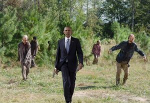
This assignment was rated 3 stars, but I spent a solid few hours working on this one to make the ‘alien’ overlay look natural. The assignment made it seem like one should show the difference more subtly in expression, though it is ‘subtle’ in the movie in that no one can see them. After all, I enjoy image editing, and it was cool to put myself in this dystopian society. First, I took two pictures of myself. Then, I selected this screenshot from the movie to overlay over my face using Pixlr Editor:
It was a little difficult to position correctly over my face, though it was still much easier to match human proportions to each other than that of a cat to a person (check out my attempt at that from today’s daily create!). Since the man’s bangs and clothes made his exposed forehead and neck much shorter, respectively, I had to duplicate them and stretch them out to fit my own. I used a spot-blending tool to cover some of the edges. I also had to color part of my face in black since the lighting on the skeleton face is much different than the room I was in, and it was more effective for me to make the edges of my face into shadows. This black color was also used in my hair, since it was too light compared to the shadows on my face.
Here is a colored GIF of my work, just for kicks:


