1, 2, 3 cats…

For this assignment, I kind of wanted to switch it up a bit. I used an older photo, but I knew I had to use one where all my cats were in the same place. I find it funny how each of my cats have a different expression on their face, so it actually makes it look like they’re different photos.


I started by searching for the photo. I knew what photo I wanted to use, so this was very difficult. I used PicsArt to create my collage, and I simply included the photo 7 times to get the right amount of boxes. After that it was all about cropping the subjects to be in their own squares to see if its the same photo.

This assignment was actually very cute, and I’m glad I chose to do one with my cats rather than taking a photo of pointless things. I feel like when I do these assignments, I really want to capture who I am as a person – what better way then focusing on my animals. Because in reality, my animals are my “Joy of Painting.”

Three stars | You can use this image for any purpose, but, p… | Flickr

This assignment was 3 stars.

Time To FEED Me [???]

This visual assignment challenged me to create TENSION! By far the most fun. In order to create this tension, you needed to take one photo, chop it up, and arrange it in a way that would seem to create a situation of tension.

Here’s what I produced for you guys:

I really enjoyed this assignment. It encouraged both creative expression and FUN! Now, it’s time to feed this cat! But the details of the assignment can be found below:

Irritation


Here I took crops of my friends faces in an order that led up to the tension behind the photo. One friend was left out of the hug and the comic is supposed to show her irritation.


The Desk of Agent Fawn

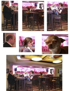
I took on the One Shot assignment that is worth 3 stars. I decided to use this assignment along with my character. The idea of the one shot was to take one image and split it into a comic style to convey something. I decided to tweak that a little, when I was playing around with the photos I was not getting a quality that I liked so I actually took several images of the same subject to get a better quality on particular objects on the desk.

I spent awhile trying to decide how to set up the desk and how to create a desk that reflected the personality of my character Agent Fawn. I imaged her desk being very austere however I decided to clutter it up a bit more to point to items that gave more depth to who she is as a character. Among those items were a notepad with letter on it, a redacted set of files, and a broken key. Those were some of the elements I purposefully set up in the scene along with other office supplies each carefully chosen for the desk.

Here is what my first picture looked like when I originally set the desk up.

desk pre project

I then brought that picture and several other zoom in shots into Photoshop and worked played around with organizing the photos and creating a narrative around the images. Originally I started with a first shot of the desk and progressed through different zoom ins until I go to a final shot of the same desk. However as I worked with it I found the narrative really seemed to be lacking and not strongly coherent. So I scrapped that idea and instead tried to look at the images as a whole and how they could work together better. After I had gotten a organization I was happier with I messed around with color balance layers and the saturation of the overall image to try and give it a more muted effect than the bright original photograph had. I felt a more somber feeling better suited my agent’s personality.

Here is my final completed version.

one-shot-desk


Battle of Morro Bay!

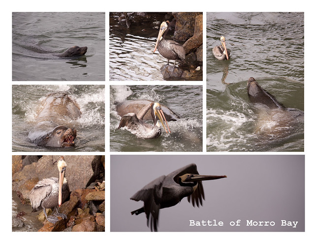
On a photo trip to Morro Bay, California I encountered a seal and a pelican duking it out for domination of the bay. The One Shot assignment for ds106 fits this perfectly. Unfortunately I couldn’t capture the moment in one photo but a few shots created a compelling collage.

Take a single photograph. Chop it up comic book style to create tension and narrative. Checkout this image for an example*. *It may, or may not, be one image- the concept is still sound.

Battle of Morro Bay

I think the images tell a story. The first and second photos create a sense of tension with the two animals staring each other down. The third image sets up the encounter and the escalating aggression of the seal. The seal successfully scared off the pelican who retreated to the shore and eventually took off.

Assembling the collage was a simple photoshop project. A lot of copy-paste-resize steps.

DS106 Assignment A

The day started good

This is my interpretation for the DS106 assignment ‘One Shot’.

Link: http://assignments.ds106.us/assignments/one-shot/

One Shot

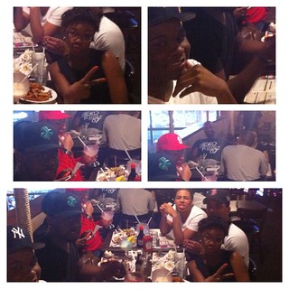
This Photo was taking May 28 of last year(2012) . It was my best friend Tiara Birthday, we all decided to head to BBQ’s on Time Square 42nd . And in this photo shows split personality, of all of my classmates just in this one shot


Different !!

One Shot

_cokwr: Take a single photograph. Chop it up comic book style to create tension and narrative. Checkout this image for an example*. *It may, or may not, be one image- the concept is still sound., _cpzh4: Visual, _cre1l: http://ffffound.com/image/41773f67656c44cfc1064821e59acec5de7aeb29, _chk2m: Tom, _ciyn3: 42, _ckd7g: , _clrrx: , _cztg3:

Design Pick 2 – Comic Photo

This design pick was the one where you use a couple photos to create a something like a comic. Here’s my attempt.

I used pictures of my two dogs chasing each other for a tennis ball.First Mina, the lighter dog, has the ball and Caitey, the darker ball, decides to chasing her, then after chasing into the woods for a second Caitey came charging out in front with the ball.

One Picture Story

moment

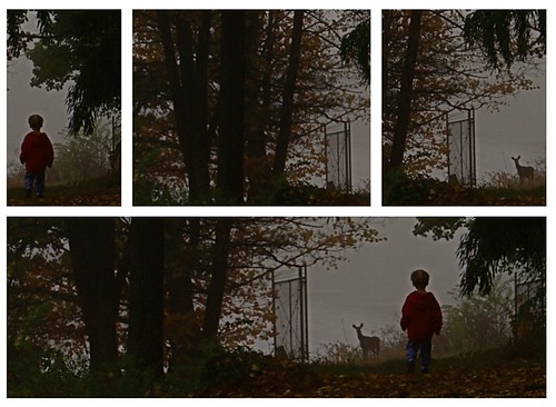
The goal was to take one photo and chop it up to make something that tells a story or creates some kind of tension by breaking the image into pieces. I had the idea for the “assignment” after seeing this shot1 on #FFFFFound.

I’ll rate this one a partial success. It’s not quite what I want. I don’t feel the upper shots are as interesting individually as they should be. I wanted to make it seem like the boy was walking into the woods seeing nothing, then as he traveled deeper he spotted the deer and that moment- when he froze finally seeing the deer is the moment captured in the final pane.


1 Which isn’t a single image but is close enough for me.