For this bad photo, I used an old photo I had that is funny, but had no real use because it is bad quality. I took the photo, added a filter that Canva provided, and used Helvetica*-ish font provided to make it into something useful. Now this can be used as an advertisement or when teaching kids about crossing the street.
Safety Photo for Crossing Guard Training
Step 1: Open Canva on canva.com Step 2: Click on “Create A Design” and scroll down to “Instagram Post”
Instagram post format is best for this type of content to get shared across multiple platforms.
Step 3: Upload photo you want to edit. Photos can be uploaded from Flickr, Google Photos, Instagram, etc. *Intermission music while you find the photo you want to use* Step 4: Click on the image, on the left hand side there is Edit Image, and click on filters. Apply the filter you want. Step 5: Click on text on the left hand side, add the text you want in Helvetica font.
Step 6: Click Share on the top right hand side, and save the image in the format you want or share it to your social medias.
This was fun. No pressure because I didn’t have to find a good photo to work with. I could relax and look for one of my lamest photos, and I found one that is just blobs of plants and a sputtering of water with no context or depth. Bob Ross would never have gone with a finished look like this. He would have been more deliberate in his thinking about what would look balanced in the frame, and maybe pulled back to see the bigger picture. Or he would have taken away most of the greenery and maybe added that frog! As it is, it is all green with no composition, perspective or purpose to it.
The instructions for Visual Assignments65 is to pick a bad photo, apply a vintage effect and write something in Helvetica. To me, vintage means Sepia tone so I applied that to the photo then wrote “The Frog Sat Here!” in Helvetica on the large leaf. I used the photo editor paint.net to create the effects and it was pretty easy except I could not figure out how to insert something like a text box (like I do in Power Point to manipulate the text).
After I set the font and point size for the text, and put the curser to start typing, I was stuck with what I had. I’m sure there’s a way to change and move the text around after it is put on the image but I could not easily find it. I tried to highlight the text, but no joy–it did not go anywhere. The only thing I could do was to delete the layer and start over again.
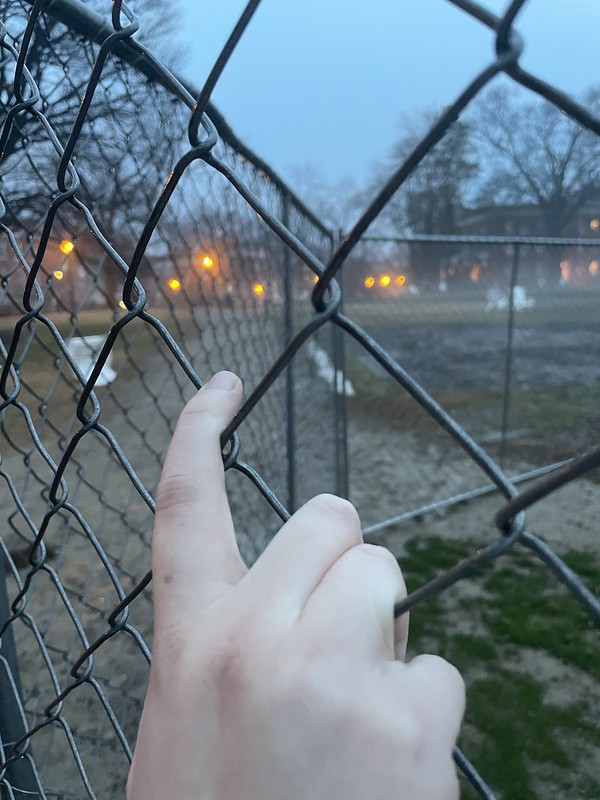
I’m not going to lie, I chose this prompt because it looked easy. Then I realized I would somehow have to take a “bad” photo on purpose. I’m not good at that. I ended up taking this with my hand on the chain link fence on Ball Circle as it was getting dark and the fog was rolling in. I ran out in between showers to take it. It’s definitely cliche and doesn’t serve much of a purpose existing. It’s too serious, you know? Very “I’m Fourteen And This Is Deep.”
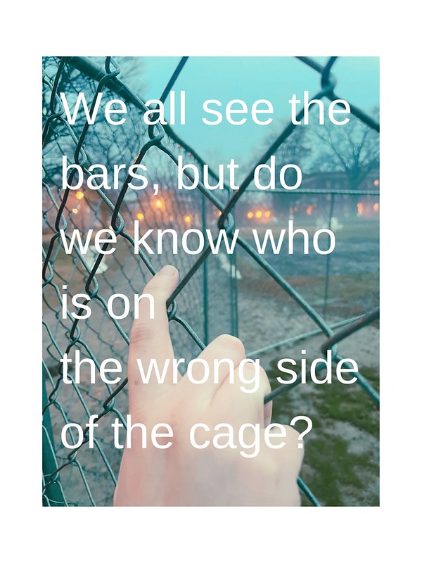
So I kept with that cringey theme. I uploaded the photo to Canva (I may have screwed this part up. Canva didn’t have Helvetica so I was stuck with Helveticish) and added the text and retro filter. I tried to come up with something thirteen-year-old me would think was deep and clever, when really it’s a cringey, pointless thing to say. I also wanted to stick with the theme of the fence. This is what I ended up with.
Cringey? Yes. Edgy? Yes, in the way middle schoolers are. But it answered the prompt, and the rest is my world. I get to make the decisions.
As I scrolled through my camera roll for this visual assignment (2 stars), I found this picture from my landing flight into Akita, Japan after my 3-day weekend trip to Tokyo in late November. It’s a pretty bad picture, but I thought it caught Akita’s rural beauty just right.
I did the best I could on the Photoshop Express app on my phone to make the picture have a vintage effect, but as for what to write in Helvetica, I wanted to do a quote from a famous movie in the 80s. I decided on “Wax on, wax off,” from The Karate Kid (1984).
Why would I choose something that’s so seemingly random and mundane? It’s because of its mundaneness (and the movie’s connection to Japanese culture) that I thought that it would be perfect for this picture.
The quote itself emphasizes the importance of the everyday things we do in our lives that become almost second nature. For Daniel, the mundane task of washing Mr. Miyagi’s car made his learning of karate easier because of the way his muscles had been trained while car washing. Now, I may be stretching this a bit much, but I think this can be somewhat applied to life (or maybe my life) in Akita. Here me out.
Akita is a rural prefecture, and although there is public transportation, the buses and trains–though efficient and punctual–don’t come in 5 minute intervals like people expect from Tokyo. Over time you’ll find that there isn’t much to do, and life in Akita can get pretty routine. Don’t get me wrong, I absolutely loved it there, but there does come a time when Akita loses its novelty. To be very honest, I still found something to do in Akita (mostly because I was so caught up doing my everyday tasks I never had the chance to explore more).
One look at this picture and you can already get an impression that this place lacks excitement, but with those preconceptions, you’d be missing out on Akita’s vibrant culture and warm, affectionate people despite the bitter cold. While my day to day, week to week life in Akita had been fairly the same, my time there changed me. My life in Japan, in Akita, made living a healthier lifestyle, doing mundane chores and shopping, cooking, and walking around everywhere so much easier. It made it easier to do this scary thing called “adulting.” I still have a ways to go, but the mundane shaped me to be a more capable individual.
Maybe I am stretching this analogy a bit much. Oh well, please enjoy picture I edited!
I found a photo on my phone that was not the best quality. I thought it would be a good photo to add a vintage style on it especially with the moon and clouds in it. I put the image in Photo Image Editor Pixelstyle and added a text to it in helvetica. Hope you enjoy this vintage photo!
This assignment was worth 2 stars I had to take a bad picture add a vintage effect on it and write something moody in a bland font. It was pretty easy I went through pictures I had on my computer and found one where I had accidentally taken a picture while on the metro. I liked the idea of making it a moody picture and adding a brooding quote even though it wasn’t a good picture I like how it turned out even if it is a tad bit ridiculous! I used iPhoto to add a vintage effect and I added text by uploading the photo online.
“Pick A Bad Photo, Apply A Vintage Effect And Write Something In Helvetica”
So in order to do this assignment I looked through my phone because I end up with random blurry pictures pretty often. My camera can load kinda slow sometimes so it happens. This wasn’t so much blurry but it wasn’t the best quality. I just wanted to capture the moon which if you’ve taken a picture of it, you know its much better through your eyes than through a camera lens. Once I chose the photo, I then applied a filter on Photoshop and text which stated how I truly felt when I took that picture. That’s basically it.
For another assignment this week I decided to take on the bluntly named Pick a Bad Photo, Apply a Vintage Effect and Write Something in Helvetica. The directions for the assignment was essentially the title chose a random photo give it an effect and add some Helvetica text. (Personally I thought it interesting that Helvetica was the most defined aspect of the project.)
First I went through my photos on my computer and tried to come up with the most random photo I could find. I found this odd photo of an empty room I had taken and decided to use it. Here was the original photo.
From the original photo I put it into Photoshop and first and added a filter layer with a sepia tone. After that I still was not feeling the effect it was darker in color but nothing that interesting so I played around with the image. I played around with different light elements at random till I got a combination I thought gave the picture more visual interest. At that point I had to add the Helvetica font. I tried to come up with the most cliche sort of phrase to stick on there. I contemplated for a bit then made the font larger and finished the image. Here is my exciting conclusion to the assignment.