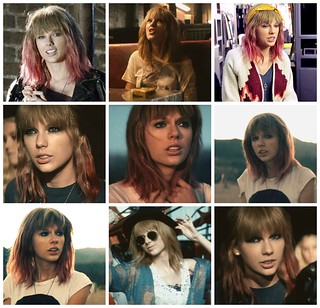
The many faces of a timeless and iconic beauty, now available in four styles. The original “Unedited” option shows this star’s natural allure. Her supple skin radiates in the beautiful California sunshine, if there were a flaw to be found it could not be hidden in these photos. With this style in your possession, it’s as if she is right alongside of you in the room.
For a more striking option, the consumer may prefer to indulge in “Sauna.” Nevertheless beautiful, our star now glows under a slight tint reminiscent of a warm setting sun. Every feature of our famed actress seems to be enhanced in the light, she is almost luminescent herself.
If classic is what you seek, the “Vanilla” option is for you. Unsurprisingly, the iconic model is no less striking when stripped of her color. As the name implies, this black and white version is sweetly simple like vanilla ice cream. Cool, refreshing, uncomplicated.
If the aforementioned selections lack passion and spice, perhaps the “Rouge” option will be more to your liking. This crimson hue shows the fiery nature of the star, giving her a taunting beauty. The actress appears playfully dangerous, her mischievous grin will bring out your own tenacious personality.
The Story Behind the Story-
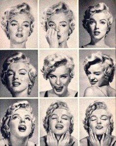
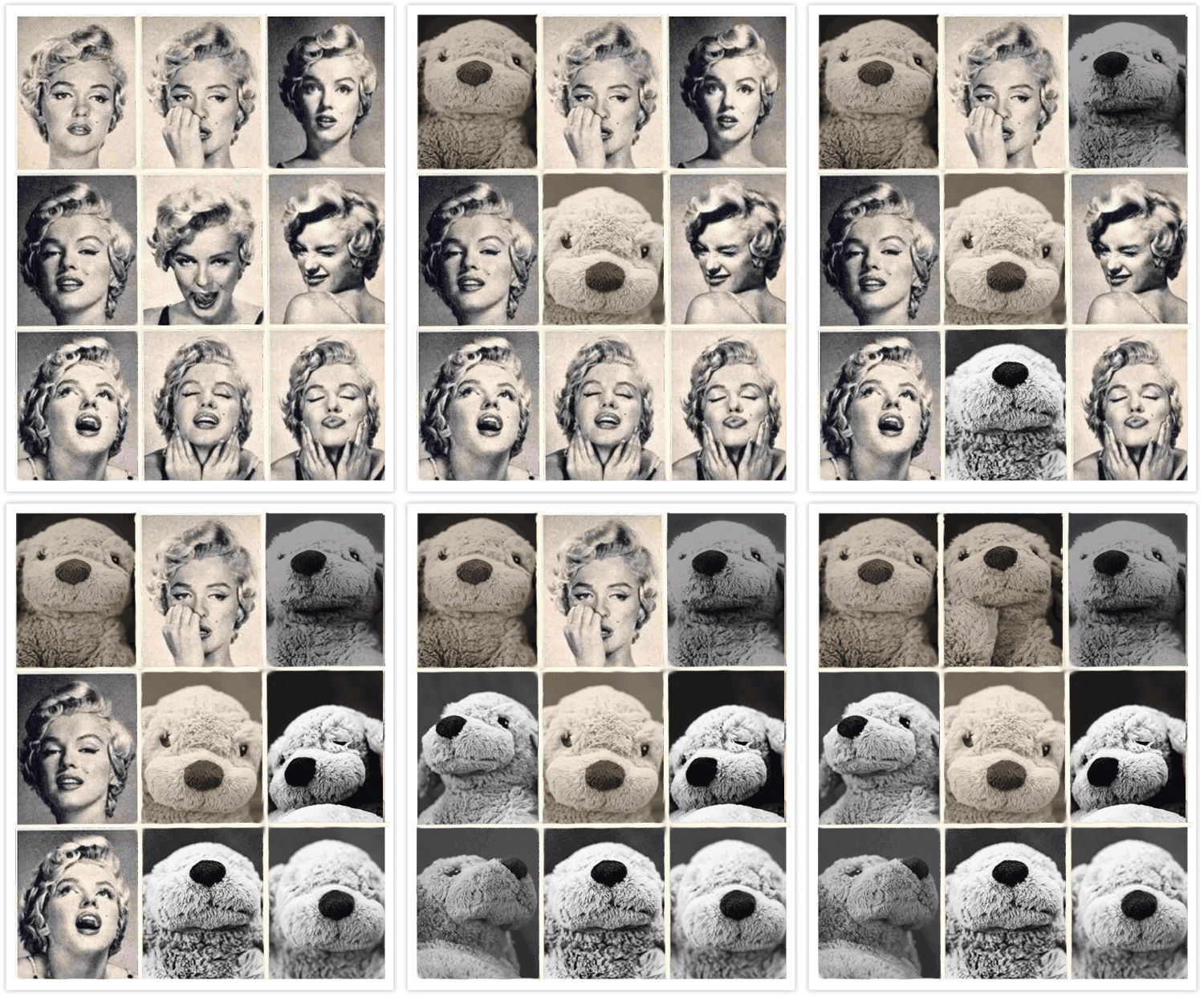
This project was inspierd by the assignment “Not Quite Norma Jeane” (http://assignments.ds106.us/assignments/not-quite-norma-jeane/) and took a slightly different angle than the prompt indicated. The assignment was to recreate the classic Marilyn Monroe “Expressions Sheet” poster:
I enlisted the help of my new friend, Tasha. With her short pixie cut and classic features, I figured that Tasha would be perfect as a stand in for Marilyn. We took the photos in a field full of wildflowers a few hours before sunset, the lighting was ideal for head shots. In fact, the lighting was so good that I felt that it would be a shame to cover up the natural beauty of the unedited photos with a black and white filter that would match the original. So to maintain the integrity of the original photos while still achieving the “look alike” effect, I decided to make several copies of the collage, each with a different tint. I then decided to write a short advertisement promoting each of the four different posters, highlighting the best qualities of the varieties. I was compelled to choose this project, not because I like Marilyn Monroe, but because I’ve always had a bit of disdain for recreation of classic works. I can understand why the emulation of such an iconic work may be compelling to create, but I’ve always felt that the adaptation fails in its goal and I thought it may be interesting to try something I’ve criticized so ardently. I found that, though my final product is reminiscent of the original poster, it does not do it justice. I do feel that my model was a good fit, but despite all of my attempts to recreate particular shadows across her face, the small details of the original photos did not prevail in my version. Decidedly, it is the process of creating the art that is most noteworthy. In generating these photos, I regained an appreciation for the classic and simple, something which is difficult to feign let alone recreate. The title of this blog post is a quote from Marilyn herself.
The Tutorial-
To complete this assignment, I first examined each individual photo of Marilyn in the original poster. I tried to take notice of the angles of her face and the subtlety of her expressions as well as to determine where light fell across her face. I then recruited my friend Tasha and we ventured off in search of adequate lighting. I captured at least five photos for each pose and later sifted through the images, selecting the best nine images. I then used the online photo editing tool “BeFunky” (https://www.befunky.com/create/collage/) to create the collage. After downloading the final image, I added the desired filters using the Windows Photo App, and embedded the final products in this blog post.


