Oh no! Now, what?

Original DS 106 Assignment: Design to Shock (4 stars)

This is after Avery’s audition. She just auditioned with her favorite song She Will Be Loved by Maroon 5. This is the song she would listen as she got ready in the morning for school and whenever she studied or cleaned. This is a song she could play and sing-a-long with her mom and for 4 minutes and 27 seconds all her worries went away. This assignment fits perfect for displaying the climax of the story.

Step 1: Find the photos you want to merge. For this I want to make a panel of what happens to Avery at this point after her audition. She’s center stage and this is the audition to have her break into show business. I started with getting a photo of Avery and a photo of an unknown singing show stage to start. I also got a photo of world-renowned judge Mrs. Potato-Head to be the one delivering the news.
Step 2: Go to canva.com. For the length that I wanted this to be, I wanted it to resemble the page of a manga book, so I decided to search for a blank infographic template that I know would give me that length.

Step 3: Begin building your panels. I use the Elements feature on the left hand side to find shapes such as rectangles, squares and lines to divide up the page.

Step 4: Insert images! This is where creativity is key. I want the panels to feel like scenes from a live audition singing show or pages of a book portraying the same. Here I use multiple forms of editing, cropping, adding texts, and more. This is where you build the story.

Step 5: Export! Mine had some moving parts so I downloaded it as an MP4 video, but if yours does not or you don’t want it to, you can download it as a PNG or JPG. It also gives an option to save as a GIF if your specific.

Shocking Imagery

by Thomas Pulsifer

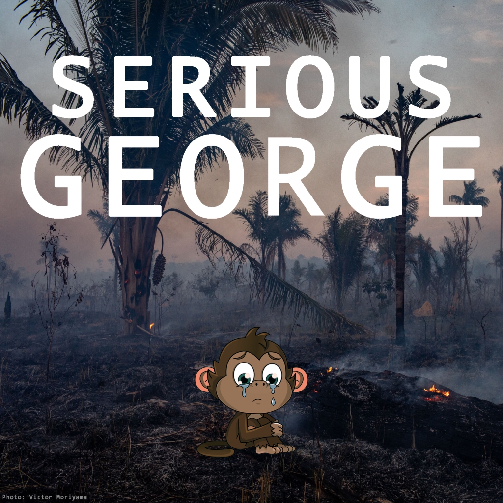
For my second task from the assignment bank this week, I’ve chosen Chloe Smolarski’s 4-star prompt to combine at least two images and create a shocking message. All it took was a single glance at the face mask in front of me to know what I wanted my piece to be about: Monkeys (Yes, my mask has monkeys on it). Monkeys are easily my favorite animal, and it’s fairly well known that their habitats are being decimated by plantations, manmade forest fires, and climate change. Despite the common awareness of this issue, very little is being done about it. It’s unlikely my poster here will accomplish anything in the grand scheme of things, but if it makes even one person consider what they can do to help, then it’s all worth it.

Seeing as the photo used to create this poster is a pre-existing one, there wasn’t exactly much I could in terms of applying my newly-gained photography knowledge. However, one thing I did try to adhere to was ensuring the foreground and background were balanced. The monkey was placed in the foreground because the background was already littered with details like trees, smoke, and clouds. Having the monkey sit on the ground closer to the viewpoint allows for the foreground and background to compliment each other better. Beyond that, I also worked with some lighting to make sure the monkey blended well with the environment. Using photoshop is always fun, and I’m excited to do some more work with it to earn the rest of the stars I need for this week.

RED BULL GIVES WHALES WINGS

I’m actually very proud of this. It turned out exactly how I envisioned it. This is for the “Design to shock” visual assignment.

Design to Shock – 80’s HIV Epidemic

I decided to do the “Design to Shock” visual assignment that task the student to ” combine at least two images (you may also use text) to create a shocking message.” I wanted to tie it to the 80s and thought of the HIV epidemic. I searched for shocking images from the HIV epidemic and decided to use this very famous image of “David Kirby, an American HIV/AIDS activist, photographed age 32 years at his deathbed.” The image is a powerful statement of the dire need to assist those with the disease and prevent its further spread, so I surrounded the image by social media messages about the prevention of HIV and some current statistics.

I do not have photoshop or GIMP, so I used power point to make a layout of the images and then saved the file as a .PNG.

Unsuspecting friends

The final daily creates that I chose was to make a collage of pictures I’ve taken of my friends when they werent paying attention. I liked this assignment because it was easy but also fun and it was funny looking back at memories. It was kind of hard to find pictures because I normally take videos of my friends when theyre not paying attention but I managed to find some of my roommate and boyfriend. I created this with the app “Cute Collage” that I downloaded from the app store.

Star Rating: 2

Colorize It

For my third assignment I chose colorize it which wanted you to take a picture youve already taken and change the colors in it to seem more unrealistic. I used the app “Color Pop” which I downloaded off the apple store on my iPhone. The app was okay, it dd its job but as you’ll be able to tell in the picture it doesnt let you get clean smooth shapes that dont have straight edges. You cant adjust the brush size so I just tried to do my best of not going outside the lines.

Weekly Assignment #2

For this assignment I also wanted to make it 80’s related and at first I was struggling to think of how to incorporate it. The assignment was to make a gif or street are or graffiti or look up a picture of one. Well when I looked up 80’s graffiti I didnt find much except for one picture of Will Smith and I remembered the intro of Fresh Prince of Bel Air so that is what I decided to include as my gif for this assignment.

Star Rating: 3

This is the link to the website where I got the gif from: https://media.giphy.com/media/11vQCWhCWKF5zq/source.gif

Design to Shock

Four Star Assignment

For this assignment we needed to create a shocking image. I am all for wildfire awareness and protecting our National forests. So my response for this one was to make this a little aggressive smoking poster.

WARNING FROM JOE!

For this assignment I needed to add two images together and create a shocking message. I made this about being careful trusting people because they may not be the people you think they are. I thought this was the perfect opportunity to use my secret agent character. I used a caution background behind his picture by using Photoshop to overlay the images and I also used the text to add in the message. I used white text to contrast his dark shirt. I used this specific quote because that is part of Joe’s storyline. His storyline is that he’s a secret agent and no one around him really knows his capabilities and they all think he’s a normal so knowing this hint of information, others would be shock. I liked this assignment because my ideas just flowed and they made sense in why I did it and I think the end product is a nice little poster. I didn’t find any difficulties with this assignment and I enjoyed making it. See my poster below!

journey into noir 2015-04-03 21:14:12


Screen Shot 2015-01-26 at 7.37.16 PMScreen Shot 2015-01-26 at 7.37.16 PMScreen Shot 2015-01-26 at 7.37.16 PMScreen Shot 2015-01-26 at 7.37.16 PM


OLYMPUS DIGITAL CAMERA


Here is a new logo that I made for my and Bev’s new company, Fast Travels, Inc. I’m really excited to get more involved in this venture, and Bev had me focus on creative marketing and design, so I went looking around and decided to use this assignment for inspiration. 

This was some pretty basic text on photo photoshop work, but it took some time to work with different fonts and colors to make sure we had our poster getting our message across clearly. Bev stressed that we create an eerie and mysterious brand. I’m not sure why she was so focused on making our ads ominous — I personally disagreed with this idea, but, you know, Bev’s the boss.