Derry Carnival

I was browsing through the assignment bank and saw the Event Poster assignment. It caught my eye because the example was the Stark Expo and I just recently found my love for the Marvel Universe so I thought it was pretty clever.

I then knew I wanted to do this assignment too for something fictional. I love stories and books so I had plenty of ideas for what to do.

BTW, the purpose of this assignment is pretty self-explanatory. Create a poster for an upcoming event.

After browsing through my mind of what story I could make an event for, I settled on one of my favorites, It.

In the book and the new movie, they start out in the present day with the murder of a character named Adrian at the Derry fair, which then introduces Pennywise the clown.

From what I remember, the fair isn’t a big deal in the book because it just sets the scene for the murder of Adrian. However, in the new movie, there is a scene added where Pennywise preys on another child at the carnival. So, the carnival is pretty important in the most recent movie.

After I got the carnival idea, I went and grabbed a picture of the infamous clown funhouse from the movie. I used Pixlr to edit out the background other funhouse picture and then added a carnival pattern background. I wanted to do something more than a basic poster so I could try my hand at some Photoshop.

I then took my combined picture and posted it on Canva because I am more familiar with how their text works and they have a lot of different fonts to offer. I added the title, activities, and location/dates. The biggest issue with htis part was trying to get the words to show up because the background was so colorful. I changed to color and size a bunch of times, and then added something a little transparent in the background to make the text stand out.

It needs some work, but I’m pretty proud of it. Check it out!

Literal Lyrics

Another fun assignment I found in the bank was the Name that Single assignment. In this one, you use a simple design to describe the name of the song and your readers have to guess what it is! It sounded like it would be entertaining and not too difficult.

I decided to try something new for this design and use Canva because I wanted more color than The Noun Project offers.

I knew that this would be a good assignment to apply the 80’s theme to. Even though I know a lot of 80’s songs already, I always have to go back and look at the Spotify playlists/genres to refresh my mind. As soon as I looked at the playlist, I immediately knew what I wanted to do.

So I got on Canva, chose a basic background (the assignments wants it to be simple so I didn’t go all out with it) and chose the icons that I wanted that would represent the song. Because some of the icons are limited by purchase on Canva, I didn’t have too many options, so I couldn’t get everything to look similiar or be drawn in the same style. But, I think it looks a little fun anyways.

Can you guess the 80’s song?

Four Picture Movie

For my first assignment of the week, I decided to do one of the recommended ones: One Story / Four Icons. This assignment asks you to take a story/movie/whatever and compress the plot into four icons.

I thought that this one sounded like fun and was a good transition into design because of it’s simplicity. This is also one where I could apply the 80’s theme.

I decided to go about it using the recommended The Noun Project where you can search for some icons that other people have made. It was very nifty!

There are a lot of 80’s movies out there, so I decided to go with something that some people would actually be able to guess. So, my choice being a pretty popular movie, I tried to make it different/unique enough to where it would be a little more complicated to guess. I still think it’s pretty easy, but maybe that’s just me.

I took the icons from the website and added them to a PowerPoint to organize them. When choosing the icons, I tried to download the ones that had the same boldness/style so that it would look consistent and organized. Trying to channel my (non-existent) graphic design.

So, can you guess what it is?

P.S. – just had to add that I did this one with a cat on my lap/in my face the whole time. I had to share!

Truthful Movie Poster:

For the truthful movie poster I decided to incorporate our course theme of the 80’s and use one of my favorite 80’s movies The Breakfast Club. The assignment asked me to edit the title of the movie to a more truthful title or more explained title. I changed this one to Detention with Friends because the entire premise for the movie is these students who all got detention and didn’t know/like each other but get closer due to their time together. I used photoshop to edit this picture. I started with the clone stamp tool to cover up the old title, and the text tool to type the new one.

Wedding Invitation Assignment:

For my first design assignment this week I chose the wedding invite option. I chose this one for two reasons. The first being that wedding invitations are very much my aesthetic, and two because I was actually asked to design the facebook invites for family friends who are getting married in the Dominican Republic this May. (They also asked me to do the photography too!!) Their color scheme is different shades of blue because of the tropical location. I could have used illustrator, but am more familiar with Photoshop. I created the flowers in illustrator and then colored and arranged them in photoshop–along with the text and background. There are two different ones because the second skinner one is going to be a Facebook banner photo for the wedding and after party. Which is also why the location and further details are not listed. This was super cool to create because it will actually be used!!

Designer Dash

This week we were tasked with a design blitz, the sequel to the ever popular photo blitz. I luckily went to the grocery store this past weekend, which gave me the perfect material to snap. There were ads, signage in the store and products that all had unique designs and elements that exhibited good design. For the design elements that I couldn’t capture in the grocery store, I used signs from the area or products I’d seen before. Let’s jump right into the analyzation! Note: I consolidated my pictures into one post so you can see the full collection HERE, but I will be posting screenshots of each individual example.

For alignment, I found this ad for positions at Wegmans. I’m a perfectionist and stickler for things being evenly spaced and in line so this sticker design passed my approval test. The text, as well as the graphic, is lined up nicely and with good spacing. I actually like the color scheme as well so that’s what caught my eye originally.

Next up is this sushi sign for hierarchy. When I saw this sign, I was in a car so I made my dad go back around and drive by again because I knew the simple design of this neon sign checked off some boxes of the 8 elements. I chose this sign to demonstrate hierarchy because it’s simple and stresses the SUSHI part so there’s no mistaking what you’re getting there. For those who want to eat sushi, it’ll get your attention and you’ll know you can come in for it right away. I also just love neon signs in general so I had to include it.

Contrast was difficult for me to find but I eventually settled on this sign that I captured in New York. It’s the most basic of contrasts: bright white text on a black background, but it works.

Also on my grocery journey, I found this bag of candy. The design was appealing to me in general so I snapped a picture to look at it more closely later. There are examples of a few elements here but one I zoned in on was repetition. There’s a cohesive theme throughout and even the company’s logo matches the color scheme of the candy name. Everything blends together white and peach colors/images which leaves you with a lasting idea of the candy’s brand.

This sign in the meat section caught my eye because the layout closely resembled the example Adobe used for proximity. It has a lot of the same impact and intention. Different “sections” of the sign give you different information and it’s visually coded so each piece of information is separate but cohesive together. You can understand what deal you’re getting easily by following the visual cues of the design. Bonus: it has that classic yellow and red color scheme of food products to draw you in and make you hungry.

Balance was difficult for me to understand without a visual example but I think this simple wine label manages to accomplish it. The design flows nicely, uses color in an understated way and is not overcrowded. The text fits together and has fonts that don’t clash or overwhelm the each other.

For the element of color, I chose this cute can of Hello Kitty green tea. The first thing I noticed was the correspondence between the product (green tea) and the color (green). Doesn’t get more blatant than that! But there is also a blend of color throughout the whole design. Colors of the company logo like blue, white and red, are bought down into the major image on the can to make a drink that is pleasing to the eye and understandable.

Finally, I found this yogurt that played around with white space. The space is quite literally white but it also contributes to the brand’s tag line of “simple ingredients”. The design is just as simple to imply an almost home grown, trustworthy brand. The white space allows shoppers like me to zone in on where the colors and images are which makes us more interested in the actual product.

I went at this with a marketing centered viewpoint but I think the elements of design can be expanded to any area of work. It all comes down to what you want your design to say and by playing around with focuses on each of the elements, you can achieve any kind of goal for communicating a message.

The Animal of My Eye

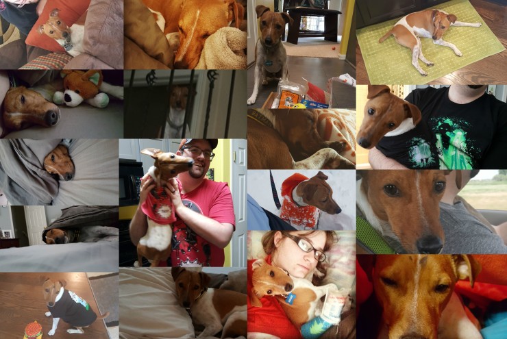
To say that I am obsessed with my dog is probably an understatement. I would take him with me everywhere I went if I could. His first trip was at three months old. He had broken his leg two days before but made the drive to Texas with me. The photo with him sleeping on my face was from that trip. Beans all

This week I got to choose any assignment from the DS106 Assignment bank so I chose this assignment. Not only do I get to show off my adorable Jack Russell, Beans, but I get to talk about my passion for all animals. I thought about doing a collage of giraffes but I felt that this was more true to me and a fun way to explore my passion. I love all animals and I spent months convincing my husband that I needed a puppy. He fought me for a long time until I got his mom on my side and she sent him this picture of me with a tiny puppy on my shoulder. Anyways I brought home this dog with no name and we were all in love with it. I’m not really sure why we named him Beans but it stuck. He has become my hiking buddy even if that means he has to go in a backpack because he doesn’t really know what to do with a leash. By the looks of this collage he really likes to sleep!

All animals deserve to be loved and cared for. As you can see some are spoiled. It doesn’t take much to take care of an animal and treat it humanely. This is what makes me question why people feel the need to do animal testing or neglect a pet outside in the elements. Animals can fend for themselves to some extent but can not if a human has disabled them in some way.  Take the time to think about animals and whether you would want to be treated that way or not.

To create this collage I used Be Funky and added my photos so that it could create a collage of my images. These are photos from my phone mostly and they were taken over the years. Some of the photos I had to rotate after they were placed in the template.

Design Assignment – The Ultimate Merger

This assignment, called the Ultimate Merger, has you combine the logo of two companies together, as if they merged. I tried to think of two logos with a similar theme, rather than think of two companies that are similar. Eventually, I saw the twitter logo, and wanted to use another bird. I remember that NBC’s logo is that peacock, and though it would be pretty cool to mash up the two logos. Below are the logos I used.NBC_logo.svg Twitter_logo_blue

And this is the final result. I did everything in Photoshop, besides finding the font NBC uses, which is Kabel Demi. If you look at the NBC logo, you’ll see that the body of the bird is white, and everything else is one of the colors. I wanted to replicate this effect, even though the twitter logo doesn’t have 6 feathers, so I used the beak and tail. I used the pen tool to trace the path of the feathers, which was slightly difficult because they aren’t clearly defined besides the protrusions. There was a little bit of guesswork, but I think it still looks pretty smooth and sleek. After getting the shape, I filled it in with the right color, and added an interior stroke to get that white border effect. This required some finagling, but I got it right eventually. I also had to change my blog color to have the white show up, but I actually like this theme more anyway.merger logo

Design Assignment – Animated Movie Posters

In this assignment, you’re supposed to pick a movie poster and animate it in some way. I picked this up initially thinking it wouldn’t be too difficult, especially for a 4.5 star assignment, but boy was I wrong. I chose 2001 because it was the last movie I watched, and the movie poster was simple enough to plop some moving footage in. While going through the movie, I realized the movement is so subdued in general, and most of the scenes wouldn’t make a great cover. I ended up going with a short shot that includes HAL and Dave. The gif itself is rather large, so I’m making it required to click it to see it in motion.

2001 poster

The process was a lot harder than I expected. My first problem was cutting the clip out of the 2 hour+ movie file I had. I soon realized there isn’t a good free movie editing software akin to audacity, and I immediately regretted not getting the entire Adobe app collection. What I ended up doing was playing the scene on my computer while recording with OBS, which is one of the best screen capture programs, and also free. I then imported that 5 seconds into photoshop as layers, cropped out the rest of my screen that was included in the recording, and overlaid the cropped portion of the poster onto those layers. With that done, it’s easy enough exporting the layers as a gif, although it was rather large, and I wish I could have exported it as a webm, but you can’t do that through Photoshop, at least not to my knowledge. Anyway, I think it came out fairly decent, though I’d like to try this again once I have better software.

Design Assignment – Word

I’m planning on doing two 4+ assignments this week, so I’m starting with an easy 2 star that would cap it to 10 stars for the week. This assignment, titled Word, wants you to illustrate a word, simply by using text and manipulation of that text, such as location, size, and font. smile

I chose a word that representing something I love doing, which is smiling. First thing I did was search through Photoshop for a font I felt fit. I went with MV Boli Regular, because it wasn’t as goofy as comic sans, but still kept this playful and smooth feeling. Finally, I transformed it within Photoshop, arcing it to form a smile.