Design Assignment – Most Wanted Outlaws DS106 Style

This assignment called for us to create a wanted poster in the style of the wild west for one of the most famous criminals of our choice. After looking through the list, I went with Butch Cassidy, who was a notorious train and bank robber, as well as the leader of the Wild Bunch gang. He had a very distinct face, as well as multiple clear photographs, so I thought I would have the best assets to make a poster with.

wanted poster

The process for creation was fairly straightforward. I googled for a rustic paper background, which I got here. After that, I thought I needed a font which fit the style; I ended up using Serial Publication. I downloaded Cassidy’s photo from Wikipedia, using the Multiply overlay effect to get the photo to “appear” on the paper, and simply typed out the rest in Photoshop.

Tattoos 4 Life

A tattoo is a big deal in life, and the choosing process is also hard. When I was younger I wanted to get a tattoo badly, and so when I turned 18 I went for it. While I loved it at the time sometimes I look back and wonder why I really did get it. So when I decided I wanted to get another one, I wanted to make it really beautiful and a bigger/better meaning. So I sat back and thought about what meant the world to me. I decided to go for Jeremiah 29:11 which is a bible verse.

Maze it up

IMG_1396-2

This is the maze I created, I swear there is a way out. I wanted to do something really confusing but once stared at for a while it would be easy. I like the way it came out, I decided to just go for it and draw it out as much as i can. This maze had a rating of 3 1/2. I would rate it the same because it wasn’t too hard but also not easy. I think it could be as hard and you want it to be.

On the cover


WOW I never would’ve thought my friend Anna I would be on the cover of XXI. I think they confused us for Baby and Lil Wayne. But man oh man do we look good. For this project I went to face-in-hole and picked a funny magazine photo. I wanted to turn the picture black and white but then it would take away the funny aspect of it and feel. bb5167e02fd148343

Most Wanted

WANTED

CLICK ON THE LINK FOR PHOTO

*For this assignment I looked up “killers of the old west” and came across a guy who seemed really interesting. I don’t really have much to work with because I don’t have fancy websites to create the real look of a wanted poster. So I created a plain one, I do think it could be better, if I were to come across this poster randomly, it would not catch my eye to begin with. But I also don’t think its the worse. Pictures are the most important part and I provided a lot. Also the word wanted should be the thing in bold and so I painted it red so it is very seen. Overall I thought the project was really easy and a good way to challenge your creativity

Love at First Flight

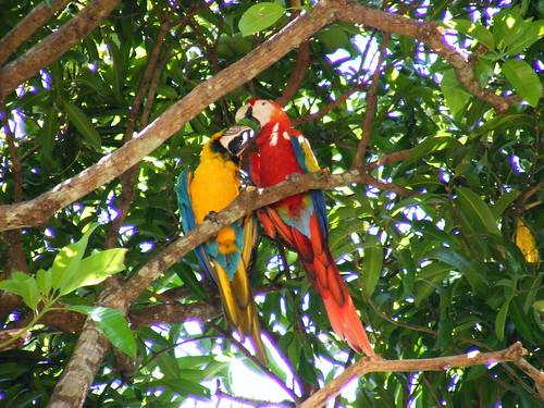
These two macaws have fought long and hard to be together. Neither one’s family approved of the relationship, but the two were so in love! They would go to any length to be together! – It was true love!

For years, the two families quarreled, but not these two. The love birds would sneak away to have some peace without any bickering. The families could not stand each other; the lovers could not wait for the fighting to end.

Then something tragic happened. Scarlet was taken – held captive as a prisoner. Scarlet was lost, sad, and lonely! Blue was worried sick. Both separated from one another! Neither could live like this! Something had to be done.

Once the families realized how love sick Blue was for Scarlet, the families decided to cooperate to get Scarlet back! They concocted a devious plan. This plan was so devious, that it actually was carried out, leaving no trace of who had stolen Scarlet back.

All was as it should be – Scarlet and Blue were once again reunited, and the families were able to set their differences aside, well for the most part. Sometimes, family members still fought, but Blue and Scarlet were able to look past that, and see their love for each other. It was truly love at first sight.


Two Love Birds


This photo was taken during my spring break 2015 trip to Costa Rica.  There were macaws everywhere! It was such an incredible sight to see! And while these two love birds were enjoying each other’s company, there were others that were fighting and squawking like I had never seen before! So just like in the story, Scarlet and Blue only cared for each other, while the rest of the families still occasionally got into a few arguments…


Bon Voyage, Jim!

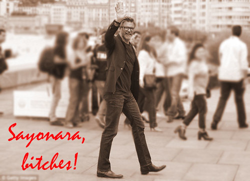
For 4.5 stars this week, I completed the Professor Groom Poster assignment, buuuut I didn’t follow it exactly…  The instructions said to paste Jim’s head into a TV show, or movie, but instead I just made him into a movie star!

I also used Jim’s last words to DTLT, before he left. He didn’t even say goodbye to the DKC! :(

To create this image, I first found both the original image and then an image of Jim, and cropped Jim’s photo so only his head remained.  I then very carefully lined up the faces and presto! Jim’s famous! There was some slight discoloration between the jawline and ear, so I tried to use the burn tool, but after I added the hue to the entire photo, it still looks a bit unnatural in that area.. See if you can find it!

Well Jim, this is what you get for not saying goodbye!


Jim Poster

Put On Your War Paint

You may not realize it, but I am a huge Fall Out Boy fan! I already used one of their songs in the mashup assignment during audio week, and I saw them in concert this summer as well! Fun fact: I used the same song for the mashup AND this assignment! What can I say, besides it’s one of my favorite songs!

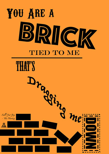
I think that they are great lyricists and really use their words wisely and lyrics to their advantage! For 4 stars this week, I completed the Lyric Typography Poster assignment.

Choose one of your favorite lines from a song and illustrate it using only typography. Consider how the font, color, sizes and placement of the typography can reflect or emphasize the meaning of the words.

To create the lyric poster, I started from scratch using Photoshop. (First time EVER creating something completely new in PS!) I then changed the background color using the paint can, and then added each line of words as a separate text layer. I chose burnt orange as the background color, because I was going for something that was similar to the color of bricks.  I then manipulated each layer until it was to my liking.  I had to play around with creating the lines and boxes, because that was not as easy as I thought it would be… I actually had to copy the first brick and create each additional one in a new layer, because I couldn’t figure out how to copy multiple bricks in one layer!


FOB Lyric Poster v2


I had a really fun time creating this poster and completing this assignment. I think I might do another one, just for funsies!  I might actually get this printed as a poster, I love it that much!

In case you are not familiar with the song “The Phoenix” you need to be educated…

My Friday Nights

For 2 stars this week, I completed the ds106 Post Secret assignment.

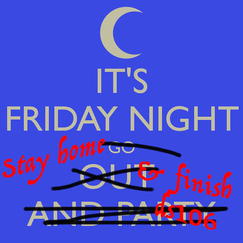
It’s time to get real! Design your own ds106 themed Post Secret postcard. Use photo editing software to experiment with different fonts and layering images.

My life thus far has consisted of Friday nights spent on my computer. Since classes have started, I have not gone out on a Friday or do anything else “fun” until after about 11 pm. Why you ask, do I spend my Fridays doing homework? BECAUSE I HAVE TO FINISH ALL OF THE WORK FOR DS106!! I have no life. I have no free time. What little time I do have is consumed by ds106. I guess my secret is out.. When Friday night rolls around, you’ll know where to find me. With my nose in a computer, finishing that week’s weekly summary post…


Friday Night


In order to create this assignment, I first found the base image on a Google search for “Friday Night”.  I then opened it in Photoshop and used the brush tool and the text tool to create the final product. I will continue to have no life until the semester is over.  DS106, you are a soul-sucking machine.

A Two-for-One Special!

Everyone loves a bargain, right? Well I do too, and that’s exactly what I got with this assignment! Not only does it complete a Daily Create, but it is also an assignment, worth 3 stars! Lucky me, yippee!

Today’s Daily Create:

Combine two of your most favorite store logos and put them together, make them look cohesive.

A Wolf in Sheep’s Clothing Assignment:

Imagine your favorite company whether it be food, clothing, or any other company. Now imagine their enemy or competitor in the business. Your goal for this assignment is to take your favorite company’s trademark image or logo and reinterpret it in a way that reflects the design of its enemy. Look for the elements that make the competitor’s logo what it is.

What better “feud” than between a place that loads up the toppings and serves 5-pound burritos, and a place that wants to seem like a healthier choice, with soups and sandwiches? I think we’ve got some restaurant-ception going on here!


Chipotle - Panera


In order to create this image, I found both Panera and Chipotle’s logos in a Google image search. I then saved the images to my computer and opened them in Photoshop.  I then painted over the Chipotle lettering, and replaced it with the Panera lettering in a similar font.  The logo was a bit more tedious. I had to erase all of the white space that was around the Panera image, so it would look like it belonged.  It wasn’t that difficult, because I’ve worked with Photoshop before, but it was detail-oriented, because it involved a lot of zooming in, and small clicks with the eraser..