bcodelson 2014-05-04 22:22:31

This week I chose to do the video assignment called the Music-less Music video.  The goal: to remove the music in a music video and replace it with other sounds.  I’m totally obsessed with the movie Pitch Perfect so I decided to take the finale scene from the film as my music video.  Here’s the original clip:

http://www.youtube.com/watch?v=cNSx1RdPl04

This is where the Barden Bellas totally crush it to win the Aca-pella (sp?) finals.  If you haven’t seen the movie, it’s pretty awesome.  That’s besides the point.

I downloaded the clip to my machine and loaded it to iMovie.  I trimmed the clip to end at the part where Anna Kendrick’s character raises her arm in the air.  It was a nearly four minute clip so I thought I’d spare my audience a little time.  I then spent about 30 min. playing around with the sounds that are pre-loaded into iMovie.  They have a lot of sounds you can add to projects; songs, booms, foley sounds, digital ‘noises’ — all kinds of things. And, as I’ve mentioned before, iMovie is easy to use, just drag and drop and slide.  I found some sounds that match well with the video, and I found others that had more of a funny effect.  For example, at about 31 sec. I added some digital sounds to the part where one of the girls is beat boxing.  Another example is at about 1:21 I added footsteps to the section where the girls are all stepping in motion.  It was kind of funny here to add foley sounds where foley sounds shouldn’t be.  In the film you’re supposed to be focused on the singing, so any ordinary sounds are completely cancelled out.  Adding those sounds back in felt really wrong.  There are a few other places where I had some fun but I’ll leave it to you to figure out the rest! (Oh and sorry – I couldn’t help myself.  I had to add some music.)

Here’s a screen shot of my work:

Screen shot 2014-05-04 at 10.16.42 PM

And here’s the finished product:

https://www.youtube.com/watch?v=4j-RwiBP6H8&feature=youtu.be (YouTube uploader isn’t working properly – I will update to embed the video later.)

It Was Only Just a Dream

So this week’s assignment was a doozey! Good thing I had a Saturday night free and a good glass of wine!  I won’t belabor the technical/computer issues I encountered because they are completely my own fault but I will give you the high-level overview of how this all went down and all the tools and media I used to complete the assignment.

First, I downloaded the Charlie Chaplin clip.

Next, I perused the foley samples of other DS106ers.  I have to say, my method was give a quick listen and practically choose at random.  My thought: Make the video/audio and decide what the story is when it’s done.

Here are the clips I chose:


Next – putting it all together.  Once my iMovie completed it’s 1hr. of updates (since I never use it) I was ready to go. Well, once I was able to swallow that small lump of panic in my throat that arose when I realized I had NO idea what I was doing.  Thank goodness for YouTube and  other tutorials!  Once I inserted the audio tracks I gave a listen from start to finish.  Not too shabby!  There’s a point in the clip where the Charlie Chaplin character says, ” uh, am I dreaming? ” so I decided to make this into a dream sequence.  Charlie starts out being chased by a pony but once he enters the lion’s cage we hear the dream-like music (I added a track found here) come in and we realize that he’s in some sort of surreal dream state.  He encounters the lion, the tiger, the annoying dog, and the strange girl that wants him to escape. It’s all very confusing.  Since Charlie is in a dream, he doesn’t feel the panic to get out of the cage that a lucid person would feel.  Finally, the lion roars loudly enough to wake him from his dream state and we watch him run off into the distance – supposedly to wake up.

Here’s a screen shot of my work:

Screen shot 2014-05-03 at 11.14.00 PM

And, alas, the finished product:


It’s official, this class is moving WAY to fast

Every week that goes by, I think OMG it’s really been another week and I’ve learned so much.  I think everyone can agree with me that we learn so many skills in this class, I absolutely love it! So week 6 is over.. I think every sunday I’ll be surprise that yet another week has gone by.  This week was filled with 4 daily creates, design safari and the contribution to the assignment page3, and 15 stars worth of design assignments!

Daily Creates

My 4 daily creates for the week are bellow, you can also click the link for more detail, whatever tickles your belly!

Empty

Personal font

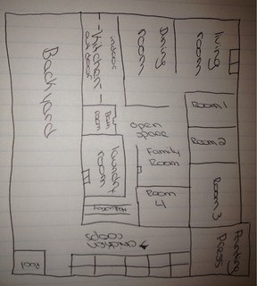
The daily assignments this week really allowed me to get creative.  I loved the assignment about creating a floor plan about the house we grew up in.  This really made me think about my childhood and all of the amazing times I had, and also it reminded me of how amazing my family is, and how far we’ve come from where we lived in Peru to where we are now.

My Design Blitz

Learning about design was new for me.  I did not know that there were so many different components to a picture, or an advertisement or anything.  I guess I never really broke down the picture into individual elements.  I learned the importance of how color sets the mood, of how typography can use words to send a more meaningful message than a picture could, and how dominance and unity can really bring out the beauty in a picture.
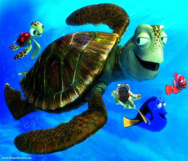
Unity

Unity

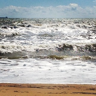
This picture shows unity by combining the different elements that make the ocean into something that is whole.

Dominance

Dominance

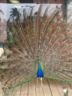
Not only is a male peacock the definition of dominance, but I think that the colors in the picture really dominate the picture, and the bright blue body is really puts all the colors together.

Typography

Typography

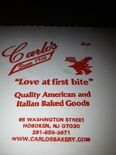
Carlo’s Bakery has a way with words!  The typography they used in the image created such a visual for me.  I really did fall in love with one bite.

Color

Color

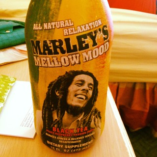
The color used in this bottle totally creates the image of mellowness for me.  I think that the black and white picture really tie everything together.

My pictures can also be found on the assignment documentt.

Design assignments

Assignment 1 / 3 stars

NemoandMEEE

I decided to Photoshop myself into a new poster.  I had to mess around with Photoshop for a while in order to figure out how to actually crop a picture by the figure rather than cropping straight lines across the image.  I thought it was really cool when I saw the end result.

Assignment 2 / 2 stars

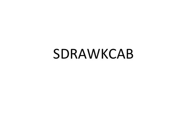
For this assignment we had to use a word that represented the word in a way.  We couldn’t use color or anything but the word.  I decided to write the word backwards, backwards.  I thought it was pretty ironic!

Slide1

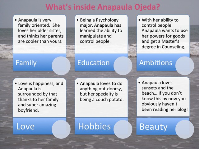
Assignment 3 / 4 stars

This assignment was a lot of hard work.  I decided to do 4 stars in order to challenge myself a little bit.  I wrote elements that represented me and chose a background that also shows my love for the ocean.  It was an interesting assignment because I used both Photoshop and Powerpoint to create this and crop and make different shapes, but it was also challenging to pick things that represent me!

Slide1

Assignment 4 /2 stars.

This is my poster for my radio show.  I used spooky font to go with the theme, and chose a picture of Autumn to show what our show is about.  We are doing a spooky/autumn theme.  I also discuss on my blog my contribution to what I’ll be doing for my show.  I can’t wait until our radio show is done so all of our hard work can show!

radioshow

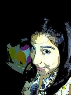
Assignment 5 / 2 stars

I decided to make myself a cartoon!  Photoshop was a great aid in this, but I had to do a lot of work in order to get my end result looking just how I wanted it to look!

Cartoon me

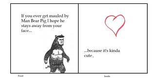
Assignment 6/ 2 stars

This assignment was about creating a Valentines day card.  I love the one I created.  I put a lot of work into it, and I love the quote that goes with the heart!

Slide1

This week I definitely experimented with Photoshop so much more!!  I learned how to do so many things including how to crop a picture and inserted it on another one.  I knew how to do that, but I didn’t know how to crop the picture to the frame I wanted it.  Anytime I tried cropping it drew a little box around the picture and asked me to fit whatever I wanted into the picture  to chop of the rest, but that wasn’t going to work for me.  I had to do a little research and finally figured out how to delete the excess and actually give the picture the frame I wanted.  Also, my iPhone came to the rescue again, maybe it’s time to actually fix my camera or maybe even get a new one.

This week again taught me a lot about photography, art, and anything visual really.  Design is a big part of anything visual and it’s something I had taken for granted.  I really enjoyed this week.  I mention this on EVERY weekly summary but i really enjoy the things I’m learning in this class and every week I look forward to see what new skills I’ll acquire!

Did I Create 6 Weekly Summaries or Only 5?

The answer is 6.  Here is the summary for design week!

Daily Creates

Egg Rolls

Personal Typeface

The void

Imagining of my house

Here was my post summarizing all of the daily creates that I have also posted above in slideshow form.  This post will be heavy on slideshows, just so ya know.

Design Blitz

Unity

Form/Function/Message

Metaphors/Symbols

Typography

Minimalism

Here is the post in which I described the process of design blitzing.  Design blitzing was my least favorite item this week, but I still enjoyed it substantially more than I liked the visual assignments.  It was fun to dissect everything in the environment looking for design strategies.

Week 6 Design Assignments

DS106Poster

updated pill

Updated Curve poster

Cookie monster!

Nate’s Card

Tragic Tale of Mr. Wine

I’m going to post the link to each of the assignments and describe what the purpose of each of them were here:

  • 2 Stars: The Tragic Tale of Mr. Wine.  In which I create an autobiographical cover.  Since it was the first assignment of the week, it was one of the weakest efforts on my part (although there’s another one that will take the cake later).
  • 3 Stars: I choose you!.  Favorite. Faaaaavorite. FAAAAAAVOOOOOORRRRRITE.  I liked this one a lot.  The goal of the assignment was to create a Pokemon card that was based on yourself. Check for yourself how I did.  I’m going to see if anyone else did this assignment after I’m done writing this because I’d like to see some other examples.
  • 3 Stars: Coming Soon.  I also really liked this one.  We were supposed to create a movie poster that was “truthful.”  Nothing is more truthful than the fact that Clint Eastwood has been typecast as a grumpy old man.
  • 2 Stars: MacGuffin-ing it up: I really “MacGuffined” this one up.  The point was to change a line of dialog in a movie/show/scene to change the outcome of the movie.  I made Neo choose the red pill instead of the blue pill, thus negating the whole movie.  This was my weakest effort and I’m kind of disappointed in it.
  • 3 Stars: Well those look delightf… WAIT A MINUTE:  I also really enjoyed this one.  Here, you were supposed to put someone or something in a situation in which they did not belong.  I love cookie monster as you can tell from my avatar.
  • 2 Stars: Here Comes the Radio Show: This served as a joint post, but my final 2 star assignment of creating a poster for the upcoming radio show group project was in here.

Radio Project Summary

Here Comes the Radio Show was also my post in which I summarized my coming contributions to the radio show project.

Looking forward to next week!


One Story / Four Icons

4 picture story

2 votes, average: 3.00 out of 52 votes, average: 3.00 out of 52 votes, average: 3.00 out of 5

Please guess what story these pictures represent!

3 Stars: Coming Soon

This is my favorite thing I’ve ever done.  Let’s just say I’m very proud of the way this turned out.  I decided to do the “Truthful Movie Poster” assignment from the design repository.  Before I go any further, I will say that I genuinely enjoy Clint Eastwood.  I think he’s a very good actor and a good director as well, but man he keeps playing the same character in every new movie he’s done.  So, I remembered that “Trouble with the Curve” came out recently and decided to pick up the poster and try to fiddle around with it.

I started by watching a couple of tutorials on youtube on how to remove text from pictures. It was a longer process than I expected.  First, you zoom in as far as you can into the image and then use the color select dropper (keyboard shortcut O) to pick the color that is closest to the letter you want to cover up.  Then you just use the paint tool to paint over the text (CAREFULLY).  If you look closely at the poster you can still see a few spots where the colors don’t quite match up with the background.  I found this one particularly difficult because the text was portrayed over clouds, which had different colors and consistencies so I couldn’t precisely remove the text.  From there it was just a matter of laying on an extra text layer and bingo!

8/15 Stars down!