DS106 Week 4 – Design: A Sansing Sprint

Inspired by my Slaughterhouse IV bunkmate Chad Sansing, I composed a Design Assignment Sprint. I spent a lot of time in tinkering in Adobe Illustrator and Adobe Photoshop, which always leaves me wishing I could do more than I actually … Continue reading

Gotham City – Minimalist Travel Poster + Tutorial

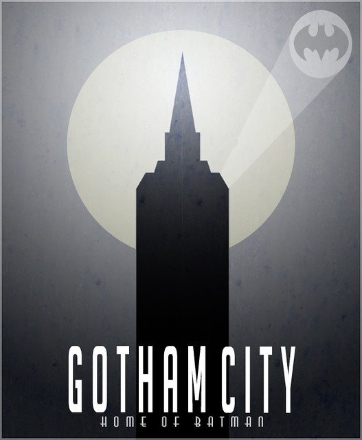
I had to think about this one – which movie location to choose? As I was going through my DVDs I came across The Dark Knight and then thought GOTHAM! It would be an easy one to portray with minimal graphics. So I went on to google gotham city to get some ideas running and the most prominent building I saw was that tower, so I decided I would use the tower in front of a large moon. Well, here’s how it turned out:

Gotham Poster

Using Photoshop CS5 (Tutorial):
To create this I first found a rust background online that would add some texture to the poster. I then applied a gradient layer over the rust layer and turned the opacity of the gradient layer down to make sure the rust would show. That took care of the background of the poster.

I then got the circle shape tool to create the moon and turned the opacity down a bit (again, to have the rust texture show through). Then on top, I created a new layer and I used the polygon lasso tool to outline half of the towers side. I then simply filled the outline I just made with black. I then duplicated that half tower layer and flipped it horizontally and placed it right beside my previous tower layer to create a symmetrical tower. I merged those two half tower layers and turned the opacity down a bit.

For the batman signal, I used the circle tool and then the polygon lasso tool to create the light path. I then applied a batman logo I found online by cropping it out and sizing and positioning it right over the circle.

Finally, I added the text at the bottom, and turned the vertical scale up and the tracking down on the ‘Gotham City’. Then to finish it all off, I created a new layer on top of everything, hit Ctrl+a to select the whole poster, and went to ‘Edit’ > ‘Stroke’ to apply a 3px white stroke and then turned the opacity of the stroke layer down.

Minimlist Travel Posters Based in Movies

_cokwr: Create a minimalistic travel poster for a location in film, TV series, etc. Look at these awesome examples using the various locations in the original Star Wars trilogy: http://screenrant.com/sr-pick-minimalist-star-wars-travel-posters-robf-44551/, _cpzh4: Design, _cre1l: http://cdn.screenrant.com/wp-content/uploads/bespin-cloud-city-travel-poster-570x880.jpg, _chk2m: Jim Groom, _ciyn3: 57, _ckd7g: , _clrrx: , _cztg3: