This Doesn’t Belong Here

4.11 Stars

I decided to make this a re-do of one of my previous assignments: Coming to America

Instead of putting aliens in the poster, I decided to put a tiger (Rajah from Aladdin) which would fit in with the character’s origin story better.

How I did it:

First off I had to find a base for what I was going to use my new image in. I had found the Coming to America poster online as well as the picture of Rajah.

Next, I uploaded both of them into GIMP. In order to make Rajah transparent and movable, you have to first open the image, then open the same image again as layers. Move the bottom image away and move the top one over the checkered area. Then click Layer at the top and go town to transparency and click on “Open Alpha Layer.” Once this is completed use the eraser to get rid of the background.

You can then resize the image by clicking Image at the top and then going to “Scale Image.” Make the image the size you want it and then copy and paste it into the appropriate photo and then move it around.

This Doesn’t Belong Here

I thought it would be fun to put the last Naruto v Sasuke in the background of the train scene from Spirited Away. I really like the juxtaposition of the scenes and I think they go together pretty well. In a Futurama-esque moment of levity I could see this happening in the actual fight. Enjoy !


View this post on Instagram

I’m sorry

A post shared by DIGITAL STORIES DRAKE (@digitalstoriesdrake) on


102 Dalmatians Tutorial


This assignment This Doesn’t belong Here instructs to mash up two iconic movie scenes. This post will help you to do just that. The first thing to do is to pick the two movies scenes that you want to mash-up. I chose the Bandersnatch in Alice in Wonderland and the scene from the 101 Dalmatians.


Next find the images of the character or movie scene and download it to your computer to use for later.


I used PIXLR for editing my photos but any editing program will do just fine. I wanted to use the whole still picture of the 101 Dalmatians and only the Bandersnatch from the other so I had to cut out the Bandersnatch from the picture. I used the tool called lasso which works like any cut tool to remove the character from the background. After that I copied the Bandersnatch.


I uploaded the 101 Dalmatians scene and All I did was pasted the Bandersnatch to the picture and change the size and moved the picture to the spot I wanted.


After doing these steps, the movie mash is completed!


This Doesn’t Belong Here GIMP Cutout Tutorial

This assignment took me back to the Graphic Design week where I got a crash course in GIMP. If you are not familiar with GIMP, it is an open source software. The link to the download is available on our DS106 website. When I first downloaded it, it was all in english… Then when I opened it for this assignment it was all in spanish but luckily I can figure it out with the symbols and my limited spanish. So to start I found the image I wanted to cut out to put on the next layer. Download it to your computer and then import it into GIMP.

screen-shot-2016-11-11-at-4-08-12-pm

Once the photo is imported, you need to create an alpha layer to create a truly invisible layer that will enable you to put only the image you cut out onto another image. To do this right click on the image bar thing on the right hand side of your screen and then go down to where is says create alpha channel. Select that.

screen-shot-2016-11-11-at-4-08-31-pm

After your Alpha channel is created it is time to start cutting out your figure. To do this, zoom in to 400% and use the lasso/create paths tool to outline whatever it is that you are trying to cut out. The icon is selected in the photo below this one if you are looking for what it looks like. Once you have outlined your whole figure you need to connect your first dot and your last dot. Press control and click or command and click of you are on a mac. This will complete the path. YOU MUST PRESS CONTOL OR COMMAND. I could not figure this out at first.

screen-shot-2016-11-11-at-4-17-00-pm

Once you have a completed path, you need to create a selection from the path. Right click again and go to select, and then from path. 

screen-shot-2016-11-11-at-4-20-17-pm

After you have selected your path you need to invert it so that you delete the background and not the subject you were cutting out. Right click, select, then invert.

screen-shot-2016-11-11-at-4-19-18-pm

After you have inverted the picture you press control X on a mac or I believe delete on a PC and you are left with the image ready to be put on another image.

screen-shot-2016-11-11-at-4-20-52-pm

From here you can select another image you have imported into GIMP and then bring this to the front or you can create a new background to put the image on. To bring an image to the front or take one to the back, use the arrows at the bottom of the menu at the right hand side. Once you feel like you have completed your work, merge the images using command + M.

Mashing it up: Change, Graffiti and a great flick

By now you should know that I am not a great rule follower. I let my kids listen to their music with explicit lyrics during class, allow the use of phones, deviate from the crap curriculum that the district has laid out for use of a more creative states (NYC and WA)that hold art to the highest standard. So the same should be expected as I complete another assignment, in my own way, following instructions, kind of.  Sometimes it is hard to really follow the directions explicitly and keep your focus on the topic at hand. My focus is street art/public art and Social Justice, which I hope you have sensed in my previous posts. 

The assignment: 


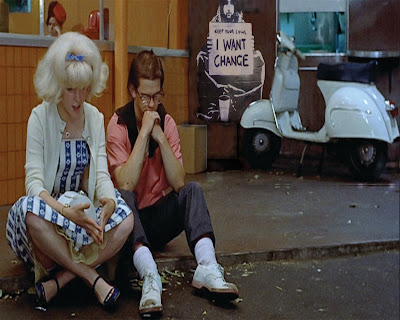
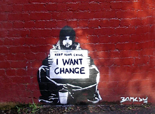
Mash up two iconic movie scenes, aim to be subtle. So here’s a girl that loves vintage cars, the attire, hair and music. Really I should have been my grandmother’s child not my mothers. So there are only a few movies to choose from: Grease( the first one of course), Dazed and Confused, and American Graffiti. Being that one of my focuses is on graffiti, I had to bring one more Brit onto the American scene. The clip is from American Graffiti, and the graffiti is from Banksy. A little play on words I suppose, American Graffiti, British artist, Graffiti in two contexts… You get it, right? 
I suppose I could have follow the directions explicitly, and grabbed some graffiti from West Side Story, but that only came to mind just as I was writing this blog, and that perhaps would have been too subtle or too obvious.  

What you see: 

I used Ps and a film still from American Graffiti, here pictured is Charles Martin Smith “Toad”, and Candy Clark as ‘Debbie’, appropriately they sit and ponder what will come of their relationship as things and time changes as they go off to college. If you are not familiar with the film, it is the perfect stereotypical example of white middle class America set in the 1960’s. 

The original picture had a few things to take out: trash can and the reflection in the window of the trash can, to fit the graffiti in. After multiple layers, cutting and re-imaging a bit of the scene, I could place the graffiti in place, using a new layer and changing the opacity helps to create the ‘realness’, along with a little dodging and burning to re-create highlights and shadows. 

Original Images: 


I picked Banksy’s work specifically because of his normal commentary on current society. The sign being held in the graffiti, ” keep your coins, I want change”.  Even deeper than thinking about departing a relationship, I thought I would throw a little irony in the picture, as that is what they should be thinking about, but of course the actors surrounding removes them from any real cause for deep critical thought on the current progress of society at the time.    

Mashup Assignment – This Doesn’t Belong Here (with Tutorial)

For this assignment, you mash up two distinct movie scenes into one. I chose a scene from 2001: A Space Odyssey, and Godzilla. 2001 has many great shots, so I felt it was a fitting movie to try and find a background to Photoshop something into. Once I picked my scene, I thought of what to add, and the idea of putting a giant monster in the background sounded pretty interesting, so I picked the classic, Godzilla. My two base images are below.

2001.A.Space.Odyssey.1968.1080p.BluRay.x264.anoXmous_.mp4_snapshot_00.17.27_[2016.04.08_15.53.57]
Godzilla in a scene from the film 'Godzilla VS. The Smog Monster', 1971. Toho/Getty Images
And the final product below:
monkey

Instead of vaguely telling you how I did this, I’m going to go step by step, with pictures. First, open up the picture you want to crop out in Photoshop.

2016-04-08_15-55-15
My go-to cropping tool is the pen tool, so I just outline the entire image that. Below is a start to my process.
2016-04-08_15-55-54

And this is the finished product:Photoshop_2016-04-08_20-43-22

Once you have a path around what you want to crop, go to the path menu and right click your path. Then, click make selection.

Photoshop_2016-04-08_20-53-01 Photoshop_2016-04-08_20-43-47

Your path is now a selection, which lets you copy and paste it into the receiving document, like so. You may need to resize your image; The Godzilla below is about 25% size.

2016-04-08_20-46-13

Now move your image into place.

Photoshop_2016-04-08_20-48-47

Now we have to find a way to put him in the background of the image. This is accomplished by selection the foreground objects you want to cover an object up with, and making a mask. First, select the rocks; I used the pen tool again. It’s helpful to lower the opacity of your pasted in image, so that you can see the objects behind him, while still being conscious of its position.

Photoshop_2016-04-08_20-51-51

Do the same process as before to turn the path into a selection. Once you have a selection, and while still on the Godzilla layer, click the mask button at the bottom of the layer panel.

Photoshop_2016-04-08_20-53-25

Click on the mask part of the layer, and invert it.

Photoshop_2016-04-08_20-53-46

You’re mostly done, but if you’re a perfectionist like me, you can use the brush tool on the mask layer to clean up the rocks a bit; as you can see, it wasn’t perfectly cropped.Photoshop_2016-04-08_20-54-16

And voila! Your finished product!

monkey

ET Doesn’t Belong Here

The assignment This Doesn’t Belong Here directs us to mash up two iconic movie scenes. It’s fairly simple.

The first step of the processes is to think of two different movie scenes that are recognizable by most movie goers. I chose Luke on Tattoine in Star Wars and ET in front of the moon.

After the movie scenes are decided upon find still images of them on the internet and download them to your computer. (I’m on a MacOS)

Using Preview I opened the JPG’s I downloaded from the internet and opened the ‘markup toolbar’ within the window of the JPG from which I wanted to copy an image. (I opened the toolbar in my ET JPG.)

Screen Shot 2016-04-08 at 16.23.06

Utilizing the instant alpha tool in the upper left hand corner, I managed to highlight and copy the image of interest, which was ET in my case:

Screen Shot 2016-04-08 at 16.27.34

Pasting the newly copied image into the host image which was the Star Wars image in this case, resize the pasted image to subtly fit into its new home. I pasted the copied ET image into Luke’s Tattoine picture, making sure to resize ET appropriately:

ETLUKE

Your finished product is now ready to be published.


Tutorial for a Mashup assignment

I am going to show you how I made a mashup design for a DS106 assignment called “This Doesn’t Belong Here”, which you can find in the DS106 Assignment bank by clicking on the link above. In this assignment, we had to mash 2 movie scenes together.

I am going to go through each step that I took to make this design! Feel free to comment below with questions.

1

First, I googled “iconic star wars scenes”

2

Then, I googled ‘cheshire cat’

3

I then opened up http://www.canva.com, a website that I have come to love through this class! I use it for alot for design and visual assignments. To the left, there is a tab you can click on called “Uploads”. You can simply drag and drop the image you want to chooe, or you can upload it from your files. Once uploaded, you can insert it into the blank canvas.

4

I then did the same thing for the cheshire cat image. I made it a little smaller, though. It’s really to resize things on Canva.

5

I then double-clicked the chesire cat picture. As you can see, there is a transparency tool you can use to make it more/less transparent.

6

I then used Windows Photo Viewer to rotate my picture. Then, bam, I was done!

I hope this helps!


This Doesn’t Belong Here assignment tutorial

For this assignment all you had to do was take an iconic object from a movie and somehow fit it into another movie photo. So I decided to put the Titanic in the back of a scene from Forrest Gump. So I went onto the internet and I got a screenshot of the Forrest Gump movie and the cut out the titanic ship from another photo and pasted it onto the Forrest Gump photo. That’s pretty much it.

also…you can fix the lighting in the photos so they have the same lighting.

This Doesn’t Belong Here

For this asignment you need to mash up two different iconic movie scenes. However, you should aim to be as subtle as possible. Perhaps a famous prop that simply doesn’t belong or a character that looks a little out of place.