Harry Potter and how old were those kids??

Harry Potter and the Sorcerer’s Stone. Young boy nearly murdered by a man with no nose, is rescued from his abusive foster parents by a giant, only to be taken to a dangerous boarding school, where he and his friends seek to bypass the school’s deadly booby traps and murder a man, in order to obtain a special rock.


I chose this writing assignment for two and a half stars, which is:

“Take an existing movie or television show and change the writing of the synopsis in a way where it’s still factual correct, yet the storyline feels drastically different.”

This was a particularly fun one, that I knew I wanted to do, since I’ve seen TV guide parodies like this, which I always find hilarious; and, let’s face it, we’ve all seen a terrible TV guide summary and laughed at it before. I knew immediately once reading it that I wanted to do it on the first Harry Potter movie, because as a kid, those were my favorite movies. I’ve watched them so many times I’ve lost count of how many, that’s how integral Harry Potter was to my childhood. Then, the other day, I was watching the first movie again when my mom had turned it on, and I couldn’t believe how young those kids were. Literally, they’re out going on crazy adventures getting almost killed by three headed dogs and animated trees and they’re like… 11? It’s something you overlook when you’re younger watching the movies since you relate to them, and it’s funny to think now that they’re just children! So, after reading this prompt, that was my immediate inspiration. s an added bonus, I thought Harry Potter could be a good example of a work that can fit into the theme, since I know, as a kid, it was something I desperately wanted to believe in.

I think prompts like this are really interesting, because they really show the power of words in telling a story; simply by changing the description, you can change the tone of a story or movie. I would definitely recommend this assignment to everyone else! It’s as simple as finding inspiration from one of your favorite movies and having some fun with it!

TV Guide Remix: tutorial (GIMP)

This is a GIMP tutorial on how I created this graphic for the DS106 TV Guide Remix writing assignment: DS106 WritingAssign772 TV Guide Remix

This post will focus on the creation of the visual. You can read more about the writing process here. Although I have been creating eLearning visual designs and some graphics over the last 18 months or so, I am NOT by any means, a graphic or visual designer, and would never describe myself as such. However, I have developed some basic skills and it’s always handy to develop more. Everything I know about using GIMP has pretty much been from online tutorials, so I know the value of them, no matter how basic. This is my attempt to give back.

Image source

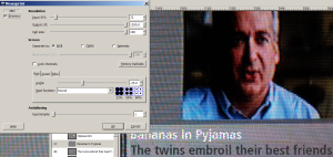
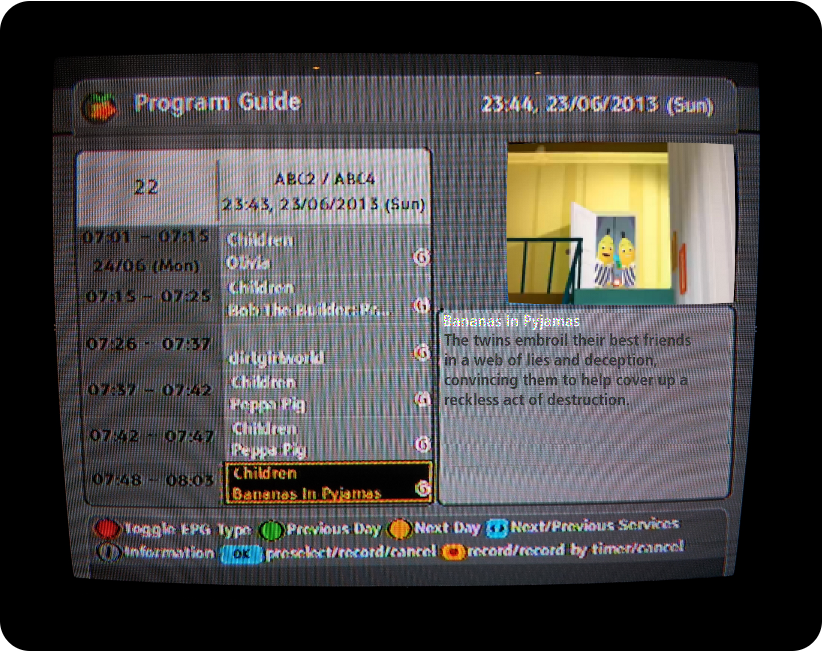
As the assignments previously submitted both used old school paper tv guides, I decided to do it differently – to depict as an on screen tv guide – the way I generally get my program info from. I did a quick search for images I could use as a basis for the design, but couldn’t really find anything suitable. So I just decided to take a photo of my own tv screen. This way, I could also select Bananas in the program guide > less editing, bonus.

Although I wasn’t sure if the image would be high res enough to be usable, it wasn’t too bad:(I’ve scaled it down for this post) OriginalImg_scaled
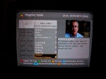
. It was a little crooked, so the first thing I did was to rotate it a bit so it was horizontally level (using rotate tool in Toolbox).

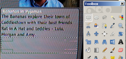
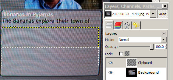
1. Getting rid of existing text

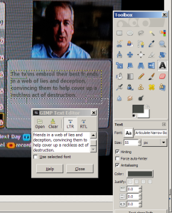
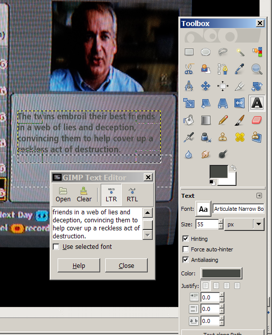
To change the synopsis text, I first had to cover up the existing text. I used the Selection tool (Toolbox) to copy part of the synopsis window background… Use selection tool to copy part of BG

then paste as a new layer and move over the existing text:

Paste as new layer and move to position

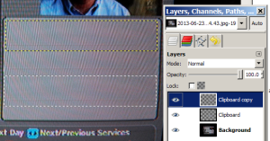
As the portion I copied wasn’t large enough to cover all of the text, I duplicated the first copied layer (so I had two portions of the background) and laid it over to cover all.

Duplicate background copy and position over text

2. Adding new text

Next: I used the Text tool to add my own synopsis text. I had to play around with the font style and font colour to get it to match as closely to the existing image as possible.

Type new text

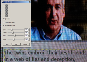
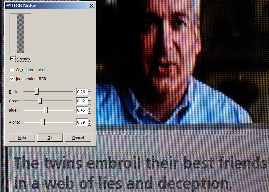
The text was still a little to ‘clean’ looking, so I used played with the filters to add some noise to make it a bit ‘dirtier’, to match the screenshot (via Filters > Noise > RGB Noise & HSV Noise; and also Blur)

TVGuide_tut5

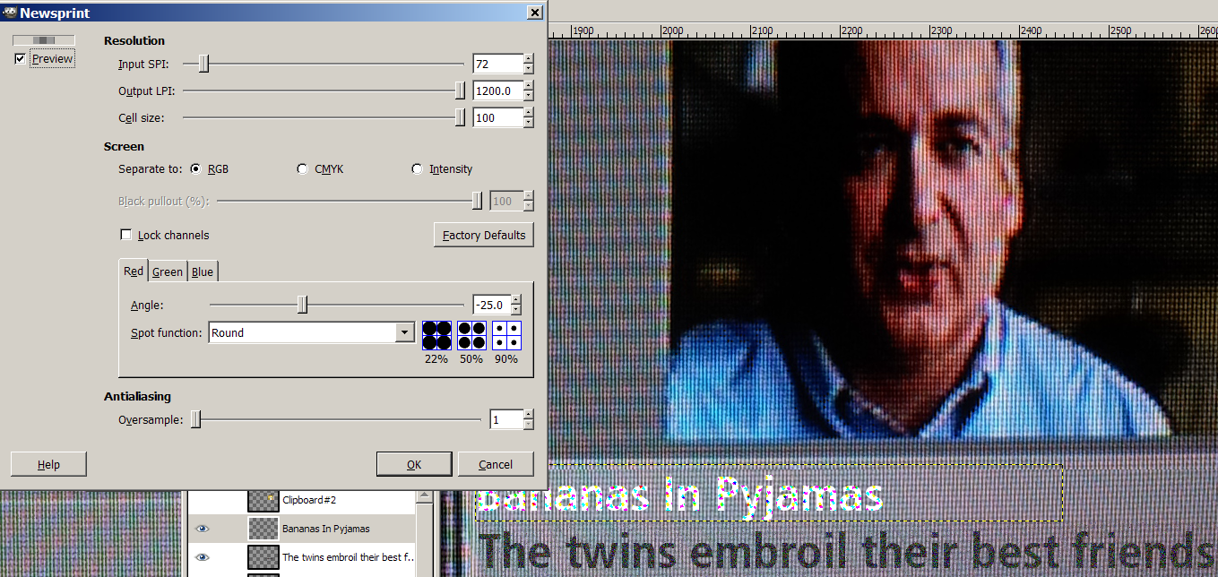
Title text - I initially attempted to add the same noise to the title text, but found it didn’t do much to the white text. So looked around for some other filters and found Newsprint (Filters > Distorts > Newsprint) and added some RGB noise, which worked pretty well.

Add filter to title text

3. Finding a suitable image

Finally just needed to replace image with one from the episode. Unfortunately, when I went to find the episode on the ABC2 website, it seems they no longer had “The Cushion” for online viewing any longer. Which was a little annoying as I wanted to use the image of the stained cushion (which I was hoping could possibly be construed as splattered with dirty blood, in the context of the reworked synopsis…). There was also a scene where the bananas escaped through Bernard’s window to which would also have worked nicely with the synopsis. But alas…after a 20 minute search of the internet, I concluded it was not to be. So I had to settle for a frame from the opening credits, showing the bananas coming down from a room at the top of the stairs. I screenshot it just as they opened the door to make them look a bit secretive and sneaky.

4. Editing the image

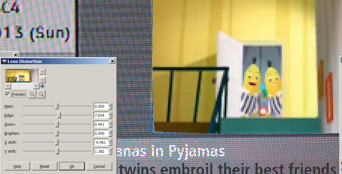
I cropped and scaled it down to the correct size, then added some pixelation (Blur > Pixelise at 5.0) and a slight fisheye distort to match the original screenshot (Yes – we have an old CRT tv! No flatscreen…) (Distorts > Lens distortion > increased Edge to 7.834). I used this tutorial as a guide. (Thanks ‘Like Reading’ and internet!)

Fisheye distort

Finished image

This is what I ended up with at the end of this process (I also just rounded off the corners by doing select rectangle with rounded edge 30, invert select, clear) to depict the tv frame. However, once I scaled it down to a reasonable size, it was a bit unreadable and busy.

Finished image

So ended up undoing the scale-down, cropping to focus on the synopsis, then scaling it down 30% so it fit nicely at full size in a blog post. The final result is the image you see at the top of this post.

The end.

Hope this helps!

TV Guide Makeover

DS106 Assignment

This assignment is two stars for “too” much fun.

Tonight I dipped into the DS106 Assignment Bank to complete my first assignment, in this case Writing Assignment 722, TV Guide Remix. I thought this was respectable low-hanging fruit for The Twilight Zone episodes we are considering this week and I tried each of them on for size. I thought about reality shows, and Extreme Makeover, which seemed like an interesting fit for “The Eye of the Beholder.” I never watched EM so I hoped I could pull enough from my light internet research to make a convincing synopsis.

The next challenge would be finding a vintage TV Guide image to work from or to adapt. I was able to find a suitable image file by Googling “tv guide vintage listings ‘twilight zone’” and I ended up finding a high quality image that was archived because it included a listing of The Sounds of America which was filmed at Disneyland. In any case, it had my TZ listing, so I was golden. On a side note, vintage TV Guide images of TZ were not too hard to find, however, they were at a very low resolution. I pressed on for a high resolution images because I really wanted to enhance it as Tim Owens did in the assignment 772 details for The Wizard of Oz (which is an excellent piece of work and a high standard to emulate). You can see the low-resolution samples I found here and here and the high-resolution image I went with (curated here by vintagedisneylandtickets.blogspot.com/).

Drafting the synopsis was a challenge to keep within the scope of the TZ episode and not overwrite the surprise ending. While it was rare to have images in TV Guide for routine episodes back in the 1960s I wanted to incorporate a visual anyway. I took an image that I thought crossed-over both TV shows: the moment of unveiling. Since I was viewing the original TZ episode in Netflix, I was able to use the Microsoft Windows 7 Snipping Tool to capture the image with a “rectangular snip.” It was dark and moody and I knew I wanted more details to come out so once I imported it into Microsoft Publisher I modified it with +20% brightness and +10% contrast. I set the image aside and then modified the text, font, paragraph spacing and text box margins to approximate the other text of the original image.

I grafted bits of the yellowed TV Guide page to obscure the listing on the top right of the page and then grafted just the first line of the Twilight Zone listing and set it there. The image was tilted, by less than a degree and so I knew I’d have to address that at some point later. Even the little graft of the TZ listing carried a bit of the listing above it (almost imperceptible) due to this tilt and I intended to smudge that out later. I added more grafts of blank page to the area to create a new canvas and corrected and smoothed with still more grafts. I didn’t fuss too much, hoping I could ultimately smooth it all out with another pass of the Snipping Tool.

Composite of Grafts

Clockwise from top left: selecting original listing and copying and relocating it to the top of the page, creating a new canvas with page grafts (shown), and canvas complete; bottom right shows the tiny smudge correction above the channel listings; last two images show the show listing pre- and post-rotation (of 0.5 degrees).

Once I had the synopsis in place, I moved in my photo and enlarged and cropped it to get a good helping of the action. I used the Snipping Tool to take one last capture of the new composite and adding a little highlighting over the TV listing for effect. I imported it into Word and applied the Picture Styles tool to obscure any lines in the page from my grafts and possibly to distort any obvious differences between my font (Calibri) and the original font (unknown). I decided to go with the “Reflected Perspective Right” option to make it jump from the page, like a 3D image. The text faded with this option so I had to tweak with -40% brightness, +20% contrast. Before giving it one last pass with the Snipping Tool, I changed the background of the Word page so as to give it a less sterile appearance overall; I opted for Denim to suggest maybe the armrest of a couch in the background.

Mock listing of THE TWILIGHT ZONE EXTREME MAKEOVER - NON-SURGICAL EDITION “Eye of the Beholder” concludes. Contestant 307 undergoes the last of her experimental injections in hopes of returning to her normal life; however, new opportunities arise, including all-expenses paid travel to an elite northern village and invitation to an exclusive club. Janet Tyler: Maxine Stuart. Rod Serling is host.

What’s good to watch tonight?

Thomas A. Edison is quoted as saying “Genius is one percent inspiration and ninety-nine percent perspiration.” And while I don’t consider this the work of genius, I will say that the conception is but the smallest portion of the time I spent on this work. For those who aim to tackle this Writing Assignment in this manner, expect to spend about 3-4 hours. If you plan to prepare a tutorial for the Assignment Bank, that might take you another 1-2 hours. Still, I enjoyed the heck out of this project and the only thing that could elevate this nostalgia-induced high would be a bona fide Swanson Hungry-Man Turkey Pot Pie because I must have eaten 200 hundred of them from a TV tray on my adolescent trek through the 1970s; a good deal of those meals eaten while watching The Twilight Zone.

Hungry Man Turkey Pie dinner - For the Hearty Appetite circa 1970

Hungry Man Turkey Pie dinner…”for the Hearty Appetite” (Circa 1970).

TV Guide Remix

Take an existing movie or television show and change the writing of the synopsis in a way where it’s still factual correct, yet the storyline feels drastically different.