Minimalist Harry Potter

Minimalist harry potter (1)

3 1/2 stars

So basically, I am a giant nerd and obsessed with all things Harry Potter. I chose to complete the minimalist tv/movie poster assignment, where we were tasked with creating a poster for our favorite story using minimal designs or icons.

I actually own a minimalist Harry Potter poster that focuses on the first book, and I always thought it would be cool to have on for the last one, which was the main reason I chose this assignment. I like the idea of having the beginning and the end hanging on my wall next to me.

Creating this poster was incredibly easy in Photoshop. I used a plain white background and applied a water stain brush that I’ve had forever. To get the ink stained effect I wanted, I set my color to black but turned the opacity down to 40 percent.

To make the Deathly Hallows sign, I literally just drew a triangle, line, and circle and placed them all together. I slapped on words, played with the kerning a little and ta da! It was done. I think it looks really good, and part of me is considering making a similar poster for each of the books and just wall papering my room in my obsession.

Aladdin Movie Poster

I chose to do the “Minimalist TV/Movie Poster” (3.5 stars) assignment in the category of “Design/Re-designing Posters” in this weeks Design Assignments. Unsure of which movie to chose, I decided to stick to Disney movies to simplify my options, and after I found the Genie Lamp by Randall Barriga on the Noun Project website, I knew I wanted to do Aladdin.

To start, I downloaded Gimp, which took about an hour. This was all my fault because I had way too many windows open when I decided to download it, so my computer completely froze and shut down. Arggh! Anyway, once I downloaded it, I was able to finally get confused as I always do anytime I download a new software (incase you haven’t been able to tell from my previous posts). I decided I needed help to make a poster that actually looked nice, so I read some tutorials on what tools to use, how to change the background and foreground colors, etc.

Once I finally sorted the basics out, I made the background color a bit of a evening blue-ish type color. This color definitely seemed appropriate for Aladdin to me, as if I remember correctly, a lot of the key points in the movie happy around night time. After that, I added in the genie lamp icon, tried to put it in the layer in a unique way, rather than just have it small and in the middle of the poster. I added the title of the movie to the bottom, to keep the top open and empty and maybe a bit balanced that way. However, I then decided to mess around with the paint for a bit, and found a cool sparkle tool, and impulsively decided to have that coming out of the lamp. I’m not sure how much I prefer it to how the poster looked without it, but it added more color while still keeping it simple, so I think I’ll stick with it. I exported the file as a .jpg, uploaded to Flickr, and here’s the final product!

movie poster

Breaking Bad Minimalist TV Poster!

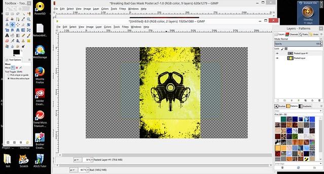
This assignment took me way longer to complete than it probably should have, simply because I was not very familiar with GIMP, the image manipulation software that I used to make this poster.  Once I got a grasp of the software however, making the poster became a breeze!  Breaking Bad is one of my favorite TV series of all time, and I really wanted to create a poster to try and capture some of the essence of the show.  Here’s a step-by-step of what I did:


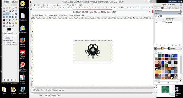
I knew from the start that I wanted a gas mask (like the ones used by the main characters in the show) to be the main focus of the poster.  I searched Google for an image and decided on this gas mask below:

Poster step 1


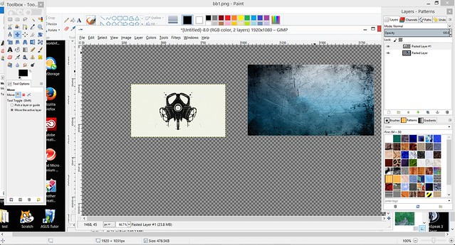
After picking a mask, I searched for a background before finding and settling on this one:

Poster Step 2


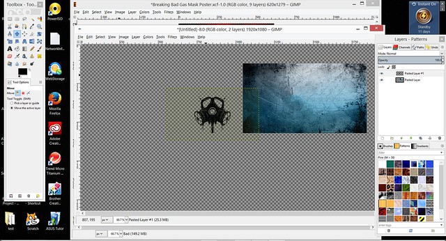
I went ahead and removed the white background from both the mask and the entire photo, making the picture look a lot more clean.

Poster Step 4


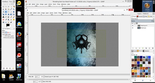
With the white removed, I went ahead and rotated and scaled the images to look more poster-like.

Poster Step 5


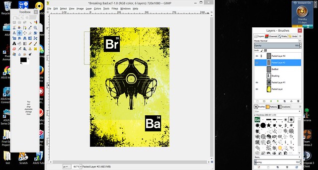
Now that I had the images where I wanted them, I went ahead and toyed with the brightness, saturation, and contrast, creating the bright yellow color that is often seen throughout the show.

Poster Step 6


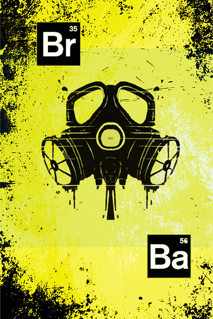
After finally finishing up with the color changing, all that as left to do was add element symbols, which represent the show’s title!


bb7


Here is the finished product:

Breaking Bad


In total, this assignment was worth: H_3 and a Half Stars Wht

Minimalist poster…all 7 in one.

What I have done with this poster is taken all 7 of the Harry Potter movies and combined them into one poster:

Harry Potter and the Sorcerer’s Stone (2001)

Harry Potter and the Chamber of Secrets (2002)

Harry Potter and the Prisoner of Azkaban (2004)

Harry Potter and the Goblet of Fire (2005)

Harry Potter and the Order of the Phoenix (2007)

Harry Potter and the Half-Blood Prince (2009)

Harry Potter and the Deathly Hallows Part 1 (2010)

Harry Potter and the Deathly Hallows Part2 (2011.)

The common theme throughout the movies is Harry vs. Voldemort and who will live to the end. When deciding what to do for this poster I knew I wanted to make it look like Harry vs. Voldemort to give way to the theme of the movies, of the two always battling it out. My hope for the poster is that the viewer gets a clear representation of what will be going on during a Harry Potter movie, and  to introduce the main character Harry, and “bad character” Voldemort.

Screen Shot 2014-10-02 at 4.00.42 PM


Worth 3.5 Stars .


minimalist movie poster.

The truth is out there.

The truth is out there.


For this assignment, I initially thought that I wanted to use a movie. After seeing a previous post re-creating Snow White, I toyed with the idea of using my own favorite Disney/folk tale movie: Sleeping Beauty. Then, I re-considered going with a grittier theme like in my four icons post.

The grittier theme idea lead to a spookier idea, and I was instantly reminded of my favorite television show. I discovered The X-Files at an older age than most (mostly because I was only 1-2 when the show originally began airing) but quickly fell in love with the mythos of the show as a whole as well as the clever, eerie individual episodes. Scully is a personal hero of mine with her intelligence, beauty, strength, and courage, and forget Californication–David Duchovny is only Fox Mulder in my eyes!

Without quick access to Photoshop, I started this piece on the Pixlr editor. I laid down a gray-green background to echo the alien aspect of the TV show, and then I put my own spin on the show’s logo. I emphasized the flying saucer shape to further the alien feel, added bold text in PowerPoint (the Pixlr editor doesn’t allow me to add text, which is apparently a commonly-reported bug), and a vignette effect.

Viola–spooky, 90s minimalism!

The Wire, Minimalist Style

For my third design assignment this week, I did “Minimalist TV/Movie Poster” (3.5 stars). I chose this because I figured it would be easy to do for The Wire, it’s about drugs.

How I did it:

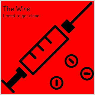
So I went on The Noun Project and searched “drugs” and came up with Drugs by Ed Harrison which I thought looked good. Then I toyed with the idea of putting the Baltimore skyline in the background but that would defeat the whole minimalist thing. So I went with red because red was a big theme in the first season. All I had to do was resize the drugs picture to fit the red. Then I went on dafont.com and downloaded a font called Delius and had to restart GIMP so the font would show up. Then I added the words and resized them until they looked good to me. Then I exported it. Unfortunately I forgot that I needed to make it specific to these three episodes so I put it up on Flickr and Twitter and the Hub via Known. Then I realized that I didn’t make it from these three episodes. So I changed the tagline to what Sobotka said in Episode 11, “I need to get clean.”

Here is the finished product:

The Wire: Minimalist Style #wire106 #designassignments #designassignments43

Minimalism Takes Detail

I love minimalistic designs for basically everything. From posters, to jewelry, minimalism is just really cool to me, so naturally I was drawn to the assignment, Minimalist TV/Movie Poster which is worth 3.5 stars. This assignment presented the perfect opportunity to make my design Wire related and that is exactly what I did. I made my poster a TV poster for the The Wire that draws in an element from Season 2 Episode 9: Stray Rounds.

To make this poster, I used Pixlr, per usual mostly because I don’t want to have to restart my laptop into Windows to use Photoshop or go to the ITCC or Library just for Photoshop. I set my canvas to 768 width 1024 height, which is one of the many presets, just rotated 90 degrees. I knew what I wanted my text to say, “The Wire is spot on.” which is not only a reference to McNulty’s code word the episode, but is also a very simple tagline for the poster. So in order to kind of play on the word spot, I played around a black and dark grey radial gradient in order to create a literal spot on the poster. I also knew I wanted the two lines of text to be diagonal from each other, so that is how I situated where I wanted the gradient spot to be. Next I played around with the text. I ended up using the font “Superclaredon” since I didn’t think a sans serif font would do the intense drama that The Wire is, justice. The color of the text is copper, or #b87333 (according to ColorHexa, which is my favorite site to find color hex codes) because on the The Wire they do a lot of wire tapping, and although i don’t quite know how that works, I do know that old telephone wires (as some today used by the Feds) were made out of Copper. So the text color is an homage to the old telephone wires.

Next, I knew I wanted to add in an audio wave, and make it blue, like it is on the show’s theme song sequence. So I used the drawing tool to make lines freehand and then color in the shape. I then duplicated the layer with my audio wave shape and vertically inverted it to make my audio wave have waves on both the top and bottom. After that, I added a noise filter and a scanlines filter to the whole audio wave to give it some texture. However, some of my audio wasn’t showing up blue after filling it in, so I decided to add a gaussian blur to the whole wave. Lastly, I thought my gradient background needed some texture as well so I added a square pointinize filter to the background since I thought that made the background slightly resemble the caging in the back of police cars.

And that’s how I made the poster! As you can see a lot of detailed work went into making a minimalist poster, and I will admit that I played around with more effects but I didn’t mention which ones since I did not end up sticking with them. I find that personally when I just play around with different tools or filters or effects I end up stumbling upon what I was trying to convey or what I envisioned from the beginning.

twitterredditpinterestlinkedinmail

A Minimalist TV Poster of Sentencing by A Hot Crazy Mess

My poster representing the title of the Season 1 Finale of The Wire

A Minimalist Sentencing by A Hot Crazy Mess

wire poster

Snow White

For my next design assignment, I made a minimalist poster.

g

I decided to create a poster for one of my favorite Disney movies, Snow White.  This is a story of a young girl who had to escape her home because an evil queen wanted to kill her.  She ran into the forest and stumbled upon a small cottage that housed seven dwarves, whom she befriended rather quickly.  When learning that Snow White was still alive, the evil queen disguised herself into an old woman and tricked Snow White into eating a poisonous apple.  The apple put Snow White into a deep sleep and she was rescued by true love’s first kiss.

To do this, I used the program GIMP for the first time, and I may or may not have cried during the long, tedious process.  I first found my background by simply googling “deep purple background”.  After I saved this, I uploaded it to GIMP.
a

Using the Noun Project, I found images of a hand an apple.  I then uploaded the picture of the apple to GIMP.
b

In order to get the apple by itself, I used the lasso tool and carefully traced the picture of the apple.  After copying it to the clipboard, I pasted it onto the purple background then used the scale and move tools to get it the size I wanted and in the spot I wanted it in.
c

Then I did the same thing with the hand picture.
d e

After I got this whole process straightened out, I uploaded this image to Picmonkey so that I could add text.  I didn’t add text on GIMP because I couldn’t figure out how to change the default font, and I was already tired of using GIMP at this point.

Once I got the image uploaded to Picmonkey, I clicked on the text icon and simply added my text and changed the font.

This was my second try at the poster.  I previously created another image for the same movie, but it didn’t look minimal enough.  Maybe i’ll let you be the judge.  Here they are side by side:

g 33