DS106 Logo

This 2 star assignment required me to design a logo for ds106 radio that could go on a shirt or a bumper sticker. Naturally, I went with an 80s theme!

I used Pixlr.com and looked through their 80s category for stock photos. I found this little cassette picture:

I first added the text. I chose a pixel font and added an outline and shadow. I tried to use bright, gaudy colors to match the theme. I put on an effect to make it look aesthetically blurred and colorful. It almost looks 3D. I also cropped it into an oval shape.

I really played with the effects to make it look a believable ds106 logo!

I miscounted on my last post I’m actually up to 14.5 stars now.

The Secret Agent Power Hour Poster Extravaganza! (Assignment Bank #17)

Ds106 Radio (And RadioShow Promo!)

Come up with an aesthetic for ds106 radio. If you were to create a shirt, bumper sticker, poster, etc. what would it look like? See WFMU as an example/inspiration.

______________________________________________________________________________

______________________________________________________________________________

BEHINDS THE SCENES

So! Any good radio show has to have a good poster! My partners have already created some amazing content for our show–I had to try and join in! For this poster I utilized Canva, a graphic design website that I’ve been utilizing for my Graphic Design Internship with the Center of International Education. I felt I was relatively well-versed in the program, and I felt a minimalistic style would be perfect for our radio show. It’s simple, its dynamic, and it draws the eye with its sharp contrasts!

______________________________________________________________________________

STEPS TO SUCCESS

— Log into Canva and begin with a blank poster template

— Apply the circle and the dynamic lines to the canvas

— Find a good picture of James Bond’s silhouette and apply that to the poster.

–Add text and proper fonts

–Download as a PNG and post to my blog

And that’s all there was too it! I love design, and I felt that this was a really cohesive way to bring everything together!

Design DS106

Hey there everyone, today I’m checking in today with another design assignment for week 7. My task for today was to create and design an item that could be used to represent our class. The route that I took was to design a shirt that could be worn by our fellow classmates to represent our radio show. This is the prompt that asked for me to complete this task, for two stars.

I figured that as a class, it would be fun to have something that we could wear as a unit that would allow us to identify each other on sight, without it being overly-obvious to everyone else. Due to the design limitations of the software that I used, I could only add 3 elements to the shirt overall, but I really like what I came up with.

The radio beacon ties into what we’re currently working on as a group, and our course title helps denote what it’s all about.
On the sleeve, I put the term ‘On Air’. I just thought it was a cool to put it on the side that nods to the fact that we will be broadcasting our work soon.

I tried to keep the design minimalist, so that nothing got lost in the overload of visual elements. I like that the font on the front is kind of ‘computer terminal-y’, and it speaks to the obvious digital element of our class.

Would you wear my shirt? Should we get some printed? Let me know down below!

Sexspionage Poster

In this assignment my goal was to create a poster for my group’s ds106 radio show. Our group’s theme is sexpionage. So I created the poster below. It wasn’t very difficult because I used a software called canva that allows you to create graphics very easily. I hope to use this to promote sexspionage the radio show.

Sexspionage


Sexspionage Online Poster Advertisement

For this two-point design assignment, I was instructed to create a poster bumper for my group’s DS106 Radio show on Spy Sexspionage. I decided to create a visual based on online advertising, which often makes use of emoji icons (As was the case for the successful media campaign revolving around the “Deadpool” movie). I took an icon image of guns and lipstick marks, and colored over it in Paint to simplify and pixilate the icons with my own color palette. I then duplicated these images, and used them to frame an online banner visual for our Sexspionage DS106 radio show.

Emoji

Sexspionage Radio


I’d view this assignment as intermediate in difficultly, simply because creating the poster visuals even from a reference image like I did took between 30 minutes and one hour to complete. Check out my visual below!

Get your free Ds106 T-shirt! FOR SALE NOW!!

ds106radio

Purchase it at (embracethegift.com/store) Go get it while you can!

I Hope You Brought More Socks

Prepare to be spooked and have your socks knocked off! I would recommend bringing an extra pair, or two..

Coming in two weeks: Grade-A Gruesome’s Smooth and Spooky Variety Hour! This week’s theme: zombies.

Grade-A Gruesome


To create this promo poster, I started from scratch in Photoshop, and experimented with the different brush types.  I was going for that blood spatter type of look, but I could not find the perfect color! The color I ended up using was a little more purple than I wanted the blood color to be, but it still is reminiscent of blood stains! By changing the size of the brush, I was able to create both blurry and sharp areas of blood spatter.  I then added each line of words as a separate layer, and viola! Grade-A Gruesome’s promo poster. This also sort of fits the description of the ds106 radio assignment, so I also tagged it as that assignment as well! Even though I’m not counting Design stars this week, it is worth 2 stars.

Once You’re In…

…there’s no escape.

I wanted to catch up on assignments for the ds106zone, so I hopped in on this week’s audio work. An easy one to get in was create a radio bumper for the ds106radio channel using a short clip from The Twilight Zone.

I deviated a little from this week’s episodes by watching Five Characters in Search of an Exit, and it struck me as a great parallel for my foray into ds106. I’ve dabbled, I’ve asked questions, and I’ve explored. Now that I’m fully into the fold, I don’t think I can ever leave. The community is fantastic, and even though I haven’t kept up with the “official” class, I feel more creative accomplishment than I have in a long time.

For kicks, I also decided to throw together a very simple Twilight Zone themed radio banner. Maybe I’ll GIF it. Maybe not. If you want to remix it, you can grab the .xcf and have at it.

...there's no getting out.

…there’s no getting out.

Now, I just need to listen to the radio show constantly to see if ScottLo decides to use it…

Team RAD-Tastic!! Radio Poster- 2 Stars!

Radioposter

The link for this assignment is here: http://assignments.ds106.us/assignments/ds106-radio/

I really enjoyed making this poster for our radio group. I feel like it entertains the creepy aspect of our theme and contains some elements that give it an odd feeling, which is what we want to do. I got the original portable radio picture from a Flickr user Hytok. Thanks very much to you, sir!
Radio Sony ICF-S10MK2

The first thing I did after importing this radio picture into Photoshop was that I added an Oil Paint filter to the picture, giving it that grainy look, which I thought was super cool. I messed around with some of the settings that the filter came with, and gave it that swirly look that you see. A lot of cool things can happen when you just simply experiment with different settings, and I encourage everyone to try this sometime. Even if you come up with something completely crappy, you can always try something different, so, it never hurts to try. Next, I wanted to find a cool font and give it a pretty deep red color that resembled blood. I warped my text after I included it in my design. I thought giving it sort of an upper arc look would be cool, and would make it look almost tired. I added the 3 dots at the end of DS106 radio to give it a daunting feel. Lastly, I found this creepy eyeball on Google, and added that to the design a few times, by playing around with some of the layer settings. I basically used the Magnetic Lasso to cut around the eyeball to make it somewhat unclear what was creeping up in the background of the poster, but alluding to some type of danger that will be signified in the upcoming show. Anyways, this is my creativity for Team RAD-Tastic, and I am proud of it! Enjoy!

Better late than… post-apocalypse?

A bit late for a radio...

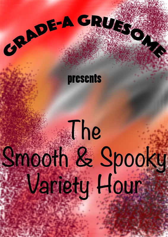
Team RadTASTIC’s radio show poster! Obviously all is not well wherever this DJ is broadcasting from…

It’s the zombie apocalypse, and this is the last radio station you’re bound to pick up for a long, long while.

With that as the theme of our team’s radio drama, I immediately thought of creating an in-context poster for our show instead of an advertisement that could presumably be used to advertise for our show. I wanted to create a beat-up poster that looked distressed and torn, like it’d really been through hell, and it was a blast getting it just right.

First I had to design the original poster. I guess some of the design elements from my Movie Trading Card were still puttering around in my brain, hence the blue-and-gold theme. Not a bad choice, since I had to pick colors that were distinct and easy to read, but that would also clearly show the blood splatters I wanted to put in later. I chose a font that was also really clear and blocky to reflect the top-ten-hits theme of our fictional radio station and added a lightning bolt to the tail of the “R” with the paths tool (something else I had to look up—like the heart monitor line from my first attempt at this assignment, a lightning bolt is a really specific cultural image). Our team came up with the station name “WRTZ” during our second meeting; RTZ stands for “RadTASTIC Zombies,” and the “W” is generally found in front of FM radio station titles. I decided on the band “106.5″ because it reflects the name of our class, and because we have 5 people on our team. DJ Matt and the call-in requests come up in our show’s script and worked excellently as a way to fill up the bottom part of the poster, as well as giving me something to play with symbolically (more on that later). Finally I slapped on a generic radio tagline onto the image in a configuration that mirrored the lightning bolt, stuck a random lens flare filter in to create some contrast, and moved on to messing it up.

Over the summer I downloaded a ton of GIMP brushes from DeviantART in an attempt to incorporate the feel of traditional art mediums into my digital art. The majority of them are worthless, but they do give you some interesting edges if you pick and choose them correctly. I flattened my image, added an Alpha channel to create transparency and stuck a picture of some bricks I’d taken earlier that week behind the poster. Then I chose a brush with funky edges and went about creating a “burned” look for the bottom of the poster. I painted in some dark brown crispy bits, then erased away the rest with my weird brush, making it look like some of the poster was missing. I used a few other wonky brushes to dirty it up a bit, and then added rips in the poster with yet another weird-edged brush. I’m really proud of the rips, actually—I erased the poster layer with a brush that had uneven edges, then created another layer between the bricks and the poster. On that layer I used the same brush to paint in just a little hint of white around the torn edges, the same thing you’d seen on a torn piece of colored paper. I put one of the rips through “HITS” to emphasize the violence of that word, and the second one through Matt’s name. I’ll let you guess why I made that particular design choice; needless to say it’ll all become clear once you listen to the show. ; )

Finally, the blood splatters. I was so relieved to find a simple, straightforward blood splatter tutorial for GIMP, and fiddled with it until I had just a suggestion of serious violence—not enough blood to overwhelm the poster, but enough to clearly indicate that All Is Not Well wherever WRTZ is playing.

Overall, despite how abysmally late this thing is, I don’t think I’ve ever created a piece of visual art I’m more proud of. I LOVE the way it looks and the way it clearly evokes the idea of a post-apocalyptic scenario by playing into well-known cultural tropes. I never like the stuff I’ve made, and while I would absolutely go back to fiddle with it and make it perfect, this is definitely a created thing I’m proud to call mine. : D