Team Rad-tastic Radio on the Rise

This week, my teammates and I met in Dupont Hall on UMW‘s campus to continue working on our radio show.  Haley took the reins for the overall scripting of the show, and Daniel made sure he had the audio recording while all of us together just brainstormed our way through the original format we’d put together last week, and did our best to hammer it out into a comprehensive script to follow.

Each one of us will be creating our own fake commercial for the station, our own bumper, based on our character in the show, we’ll each choose a song and turn it into a short audio clip for use on the show at various times, and of course, we’re each contributing our voices and a character that we will be playing in the overall show.  We’re also all still working on the idea of how to create an efficient bumper that will be no more than 3-5 seconds long, but will signify the passage of time, to allow us more flexibility while creating the show.  Coming soon, the actual recording of the show itself. *dun dun DUN!!!*

We’ll continue to meet together on Tuesday evenings, probably until the project is due.  It’s been nothing but a total blast thus far.

Maybe this is a good place to share my Radio Show poster, eh?

Should they go in????

I made this in GIMP.  It’s not at all what I had pictured in my mind, but then again, this is all pretty new for me, and I’m pleased with what I was able to accomplish at least.  I snapped a shot of a local radio station, edited the van to change its name to our radio station’s name, imposed the positives and negatives of the spot on the roof of the interior of my car, with the big question waiting to be answered just inside the car window.  I got a lot of advice from Alan‘s blog post on using GIMP.

Of course, this takes 2 of my required 15 for the week.

DC DS106 POSTER

Each student must write a blog post outlining his/her planned contributions to the radio show. In addition, each student must design a poster as an advertisement for their group’s show.

I honestly have no idea what I’m going to do.  I haven’t been effectively communicating with my group so there’s a lot I’m unhappy about.  My fault.  My contribution has been assigned to me as talking about road blocks and the security system.  I am neither from Virginia nor a frequent visitor to the City so this is going to be the biggest challenge.  I’m not interested in doing an interview or creating a verbal story, so I’m going to create an audio depicting this with a few introductory words.  I’m going to take more of RadioLab’s approach to the way that they incorporate sounds (layering, a lot of sound effects).

Here is my initial poster for the radioshow:

I got my images here and here and used GIMP to create my product.

(This poster will probably be changing a lot more the more I create sounds for my segment.  I want more layers, I think.)

Radio Show T-shirt (2 stars)

To help promote our radio show this semester, I decided to go ahead and design a tshirt for this part of the assignment. It was worth 2 stars and this is what it looks like…

 Our radio stations, Senioritis106, will be focusing on the activities…troubles…difficult times…Our seniors might have during there last year of school. And since majority of us are seniors, we could relate and thus, would make our radio show even worth listening to.


How I created this picture: I took a picture from online, i.e. the “ignore responsibilities and lie on the floor” image. Then customized my own t-shirt at customink.com.

Radio Show Promotion and Contribution

Our radio show is coming soon, and what better way to promote it! .  For this assignment I chose to create a poster to show the theme of our radio show.   I used Photoshop to change the lighting of the picture and to also add font.  This assigment was worth 2 stars. I used PicMonkey to change the contrast,  brightness, sharpness.  I made the picture darker in order to add a little bit of spookyness since the theme is Autumn/Halloween.

radioshow

My contribution:

For the radio show, our group will be doing an autumn theme, and when we think about autem Halloween comes to mind!  My group will be talking about Halloween as well as sharing funny and scary stories, and a little bit of safety.  As part of my contribution to our group I will talk about the history of Halloween on our radio show.  I will use sounds to go along with the facts of how Halloween started and hopefully sounds to make it spooky too!  I’m really excited about this project.  Another thing I will be contributing for my group is that I will call in on Monday October 22th, to ds106 radio to talk about the our radio show!

Smiling Peanut Anyone?: ds106 radio show

Richard Elzey- Smiling Peanut

Listen to ds106 radio!! This is my poster advertising our radio show. I wanted something kind of quirky and a little disturbing, and I think I got that. I see our radio show as being a little eclectic, kind of weird, but still pretty cool. I love the weird roadside attractions that are all over America and want to feature them somehow in our radio show, and so made a poster expressing that desire.

2 stars

Here Comes the Radio Show!

My poster for the upcoming DS106 Radio Show!

This post will serve to display both my poster for the radio show as well as outlining my planned contributions for the upcoming radio show of #SpiritXpress. (this way I can siphon off more hits, haha!)

First I’d like to discuss the part I will be playing in the coming ds106 radio show.  I will be talking about traditional fall foods, especially my favorite fall comfort foods.  I might even share a recipe or two!  But I’m sure the episode will be heavy on the pumpkin, so be prepared.  I’m also planning on interviewing several friends about their favorite fall foods.

Next: the poster itself.  I’m really into Halloween and jack o’lanterns and the like so I figured it’d be nice for the poster to show how we can turn something spooky into something delicious like pumpkin pie.  I decided to paste them both together in a single poster format and then added individual text boxes and manually aligned them to the left for the top image and then increased the size of the bottom text to kind of draw the attention of the reader.  Then I followed Amber’s post here to help me with filling in the backgrounds to make the text stand out a little more.

Arial may not have been the best choice, and white may not have been the best text color, but I wanted to do something basic and stylish.  I’ve always viewed arial as a classy font ever since I used to use it for headlines when I did layout for my high school newspaper.  But, in practice, it doesn’t work that well with a poster.


Roadtrip Radio Shirt

So for one of this week’s Design Assignments, we had to create a poster/bumper sticker/t-shirt advertising for our show. So I decided to just create a shirt because I figured it would be fun to do!

I googled “design your own t-shirt” and clicked on the first link. I just followed the prompts and made my own shirt. Since part of our radio show involves the car breaking down, I wanted to include that on the shirt somehow. I knew there was a song by J Cole called Breakdown and also one by Jack Johnson with a similar name. I chose lyrics from the first four lines of Jack Johnson’s song “Breakdown” and formatted that onto the back of the shirt.

Roadtrip Radio Shirt Back

I hope this old train (changed it to CAR) breaks down
And I (changed it to WE) can take a walk around
And see what there is to see
Time is just a melody

For the front of the shirt, I just googled an image for “roadtrip” and the perfect picture came up. I really liked this picture of a road that seems to stretch on forever. So I saved the image and uploaded it so that I can put in on the front of the shirt where a pocket would normally go. I think it looks pretty cool!

Roadtrip Radio Shirt Front

2 STARS

TOTAL STARS: 6/15


ds106 Radio Promo

I decided to make a bumper sticker for ds106 Radio

“Come up with an aesthetic for ds106 radio. If you were to create a shirt, bumper sticker, poster, etc.”

I made a bumper stick for DS106 radio. I drew it, cut it out and scanned it in. I don’t have many design applications on my computer, not even paint.. so drawing and scanning works best for me.

I think the minimal use of color and the use of “white space” (which is gray in this case) make it eye catching. I also really enjoy typography, I think this typography is simple and easy to read which is the best for a advertisement on a car bumper thats probably moving.


So much digging we’re gonna hit China!

I FINISHED AN ASSIGNMENT FOR THIS WEEK. I REALLY DID.Except I screwed it up and did a general bumper sticker instead of one for our radio show because I thought you were supposed to do both. Hopefully I can do the second poster and it’ll count as 4 stars overall? Maybe? PLEASE?!?

I CAN DIG IT

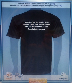
This is my ds106 radio swag. It’s pretty… well, okay. It needs work. But there’s a lot of thought that went into this somewhat lackluster design.

My inspiration for this bumper sticker came from the website itself. Behold:

Inspiration

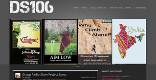
See all that gray and white? The similar font? The fairly minimalist design? I am in love with all of that, and I really wanted to try and incorporate it into an effective sticker.

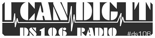
The makeup of the sticker was already pretty clear in my head starting out: I wanted to use the phrase “I CAN DIG IT” in big capital letters (after the iconic intro bumper you hear every time ds106 radio starts up), and I wanted to separate the first and second half of the phrase, and the top and bottom half of the sticker, with something akin to the line on a heart monitor. That symbol is often used to represent a musical “beat,” and it also implies that whatever it’s representing is a life-sustaining force—perfect for ds106, right?

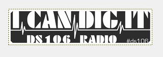
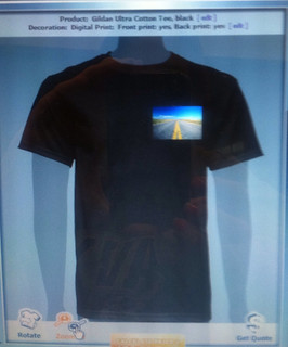
My first challenge was creating a sticker that would look good on a car with a dark or light paint job. You can’t see it on my white-themed blog, but the sticker has a white border around the gray, meaning it’ll show up just fine on any color of car:

Look ma, I've got a border!

The next big challenge was choosing a font. Font is right behind placement in terms of importance when you’re designinganythingwith words on it, so it had to be perfect: easily readable from a distance, interesting and quirky to reflect the course. I went with a font called “EXCESS,” which also mirrors the one used on the website. As I was adjusting the text to fit snugly against the border, I realized I rather liked the way the whole sticker looked when the text was attached to the border at the top. I’m not sure I quite like it anymore the longer I look at it, but it might be an effective design choice for another project someday. If nothing else, I tried it out to see how it would work and learned from that.

Speaking of font, I used a differnt, smaller font for the “#ds106″ phrase because I wanted it to be distinct from the rest of the sticker. It needed to stand on its own as a unique element so people would understand that it signifies something else—a new piece of information that’s related but not the same thing. The goal is getting people to realize that the hash symbol should be used to find more information about ds106 on Twitter. I chose a font that was similar geometrically to the main font I’d used (it takes up space in the same way) if not stylistically so that it wouldn’t be too jarring having both on one sticker.

Finally, the stupid heartbeat monitor symbol. I looked up how to draw straight lines in GIMP and, after trying to freehand the lines from memory, ended up finding a reference for the heartbeat monitor lines as well. Turns out there’s a very specific way a healthy heartbeat looks on an electrocardiogram, and it’s so prevalent that it’s been ingrained into our cultural consciousness; we may not know how to draw the lines from memory, but man is it obvious when they’re wrong! Definitely reinforced the importance of using reference images, even for little details.

Overall, I think I’d like to keep tinkering with this till it’s perfect; for design stuff that’s especially important, since the way you use every pixel of space changes how your message will be viewed. The heartbeat line needs to be a little lower, mostly, and I’d love to come up with a bunch of these with different background colors. For now, onward and upward to other assignments!

… like maybe the one I was actually SUPPOSED to do this week. Bleh.

Radio show poster!

I thought the task of making a radio show poster was going to be daunting but it turned out to be actually a lot of fun to create.  The poster was under a design assignment called Ds106 Radio, worth 2 stars.  The radio show that my group is doing is based on things to do around DC and what horrors tourists can face when visiting DC.  For my poster I used an image of DC in autumn and than found a few monsters to place around the image of DC, to represent the “horrors” of DC.  To create the poster I used gimp and placed the monsters as different layers onto the image of DC.  I then added text to it to catch the audiences attention and then also added a ds106 radio label.

Radio poster

I than saved the image and uploaded it to flickr where I tagged it with the tags: DesignAssignments50, DesignAssignments, ds106, ds106radio, and radioshow.