Lyric Typography Poster

I chose this song because it is not only my favorite song, but gives also gives a really inspiring message. Seeing this song is such a moving moment which is why it means so much to me. I also decided to choose this song because it has a lot of visual elements to it which would be fun to make into a typographical poster. This assignment brought back lots of fun childhood memories because as a kid I would draw lyrics to songs all the time (mainly One Direction and Taylor Swift haha) but it was really cool to get creative with this. I used photoshop and the text tool for all of the font. The colors directly behind the words are just the outer glow effect and the boxes were the shape tool . The other images are clip art I found on the internet. Pairing what colors to use overall depended on the overall aesthetic that I wanted to use for the poster which was happiness and summertime which is what the song means to me. That explains why I used orange, blue, yellow, and purple. Overall, I think it is cute and appealing which is what I was going for.

My Darling;

My favorite song for the longest time now has been On The Wing by Owl City. So, naturally I chose it for my lyric typography poster (4 stars)!

To make this, I first downloaded Pixlr. (I prefer the desktop version to the web app)

I created a new image (I think the ratio I chose was 360×480). Then, I did a gradient background using a sky-blue. I played around with texts and got all my words in place. Finally, I used a cloud paintbrush to give it the cloud effect. And tada! For a first time poster-maker, I think this isn’t too shabby :)

The hardest part was honestly looking through fonts. I’ve played with Photoshop CS2 a lot so the controls in Pixlr were at least familiar to me. But, I chose the font for the majority of the text because it looks similar to Owl City’s own font.

On The Wing


Put On Your War Paint

You may not realize it, but I am a huge Fall Out Boy fan! I already used one of their songs in the mashup assignment during audio week, and I saw them in concert this summer as well! Fun fact: I used the same song for the mashup AND this assignment! What can I say, besides it’s one of my favorite songs!

I think that they are great lyricists and really use their words wisely and lyrics to their advantage! For 4 stars this week, I completed the Lyric Typography Poster assignment.

Choose one of your favorite lines from a song and illustrate it using only typography. Consider how the font, color, sizes and placement of the typography can reflect or emphasize the meaning of the words.

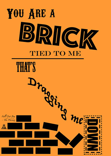
To create the lyric poster, I started from scratch using Photoshop. (First time EVER creating something completely new in PS!) I then changed the background color using the paint can, and then added each line of words as a separate text layer. I chose burnt orange as the background color, because I was going for something that was similar to the color of bricks.  I then manipulated each layer until it was to my liking.  I had to play around with creating the lines and boxes, because that was not as easy as I thought it would be… I actually had to copy the first brick and create each additional one in a new layer, because I couldn’t figure out how to copy multiple bricks in one layer!


FOB Lyric Poster v2


I had a really fun time creating this poster and completing this assignment. I think I might do another one, just for funsies!  I might actually get this printed as a poster, I love it that much!

In case you are not familiar with the song “The Phoenix” you need to be educated…

The LoversThat Went Wrong

bitteroversomeone

I’ll admit it: I have an obsession with this song, “Youth”, by Daughter. I heard it for the first time a little over 24 hours ago, and I must have listened to it at least 50 times by this point. Am I the type of person to listen to a song on repeat when they first hear it? Yes. But there’s something about this song that feel different.

Is it because I heard it connected to a series of pictures related to Gravity Falls? Is it because it’s the style of music that I love guiltily, and it reminds me of something I’d hear in Life is Strange? Is it because this lyric is a feeling that’s been punching me in the chest all week? Probably all of the above.

But when I decided to look for assignments that were worth 4+ stars, and I found the Lyric Typography Poster assignment, I knew I wanted to use this song, and this lyric really stood out to me.

Process:

This was relatively simple. I just went into GIMP, created the gradient background and the breaking heart, typed up the words (after finding some fonts that I thought were appropriate), and changed the colors appropriately. Then I duplicated some things, lowered the opacity on the lower layer, and darkened the colors.

Really, the hardest part of this was finding fonts that I thought would be appropriate.

Icelandic proverbs rock!

Iceland font is public domain. Awesome. This time font kept constant and just playing with other parameters to show meaning. Background is Iceland Sky from Wikimedia. This is such a fun assignment. Design and visual storytelling with words!

A lyrics poster for a great song

So I went to the Assignments Bank to do something for this week on design with a celtic flavour. I loved the image of the woman in the myst and used it as background for the poster. Then the fun started. … Continue reading

The inspiration and the assignment. Sleep. No more information.


From Giphy.com


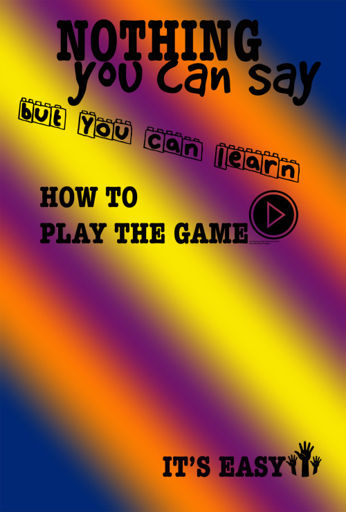
Play icon by Alen Krumenacher from Noun Project

The inspiration and the assignment. Sleep. No more information.

I am feeling a bit lyrical today

While, pictures can capture the attention, words can convey the message. That is the main take away I got from doing this assignment. For this assignment ( worth four stars), we were required to design a poster that illustrates a line from our favorite song. This was hard because I’m one of those people who likes every song known to man and my favorite song changes day to day! But, after eliminating many ideas for what song I should use, I finally came to choose Kacey Musgrave’s song Biscuits because it has strong and positive message.

I came into this assignment thinking this would be easy. Boy did I swallow my tongue soon afterwords. There is a lot more to making typography than just typing words. I found out that the placement of the lyrics, even what color they should be can either complement or ruin the poster. The process was one of the most tedious part of this class so far. I used Pixlr as suggested by this post. In Pixlr, I set up my desired size of the poster, then I decided to use the gradient tool provided to add some more color to the poster. The fun part came in where you can “snazz” up the poster by using different brushes and stamps. I went a little stamp crazy, but overall I think the background turned out really good! Finally, Pixlr also has a text box tool to type in the lyrics, pick a font, and where to place the lyrics on the poster.

Lyrics

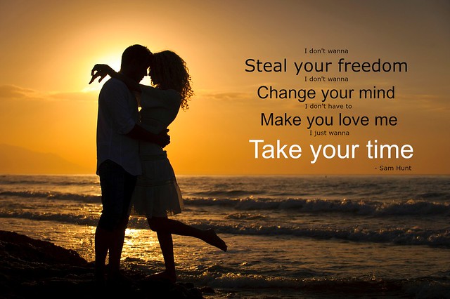
“Take Your Time”

For this Design Assignment, worth 4 stars, we are asked to illustrate song lyrics from a favorite song by typography.  At first, I saw this and thought it would be simple, but my OCD took over, as did looking at it more in a design method.  I began by typing it up in Microsoft Word because that is something I know, so I wanted to try it out.  I was not thrilled with doing it through that, so after googling some, I found a blog post that gave me the idea of using picmonkey.com and having an image in the background.

I chose the song “Take Your Time” by Sam Hunt, because it is one of my favorites, and one that sticks out to me.  The song had a place in my heart before, but after seeing the music video, it is one that always stays with me.  As someone who had volunteered for a battered women’s shelter, the music video has to deal with relationship abuse and domestic violence.  Sam Hunt is clearly against it in the video, so I decided to pair up these lyrics with a sweet image of a couple, what I feel as though may be an ideal relationship for Sam Hunt.

By using picmonkey.com, I uploaded the picture and then added in the lyrics in black at two different fonts for most.  I put the “main lyrics” in a larger font, and points that it seems Sam Hunt is making.  By the use of different font sizes, it brings out the “important” lyrics, and allows for those more “filler” lyrics to let the important ones stand out.  I also changed the color of “Take your time” to white since it is the main lyric, the title, and shows the purity of the song.

Hope you enjoy!! Originally posted to my flickr:

"Take Your Time"

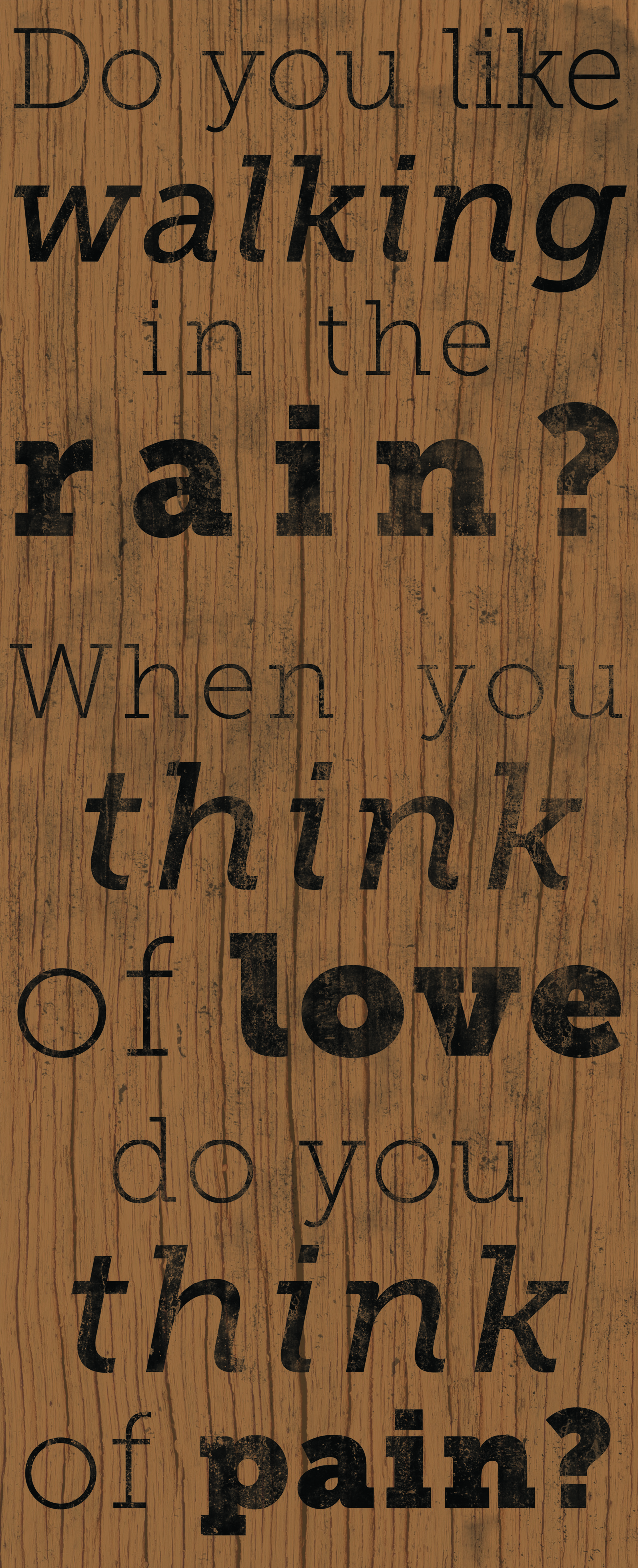
When you think of love


It’s been ages since I browsed through the DS106 Assignment Bank and I was feeling the urge to do something semi-creative as a bit of an escape this evening. I chose the Lyric Typography Poster assignment and found a set of lyrics I liked from a song by Vance Joy called Mess is Mine. Nothing crazy, just played with sizing and weights and then made the whole thing dirty on wood. Still a fun little assignment that made me think about how to convey emotion through text.

Lyric Poster