When you think of love


It’s been ages since I browsed through the DS106 Assignment Bank and I was feeling the urge to do something semi-creative as a bit of an escape this evening. I chose the Lyric Typography Poster assignment and found a set of lyrics I liked from a song by Vance Joy called Mess is Mine. Nothing crazy, just played with sizing and weights and then made the whole thing dirty on wood. Still a fun little assignment that made me think about how to convey emotion through text.

Lyric Poster

Monster

monster text


For this assignment (worth four points), I had to design a lyric typography poster. I chose to use this to express the dynamic between Ami and Sebastian Crane, an assertive and powerful ex-lover. I used Photoshop to combine text and images. Concepts from the Vignelli Canon like using a grid and font recommendations helped me with my final product.

Sebastian’s only got time for one night stands, but Ami’s right there with him. The two had a short but fiery romance, but in the end they are too alike to work. They are both assertive, dominant, and manipulative. Ami usually has the upper hand, and I showed this by using Nicki Minaj’s line in Monster to convey her attitude towards him.


Topographic Lyrics

Untitled

The Four star assignment that I chose for this week was to create a topographic lyric poster. I used a combination of word and paint software to create it. I chose lyrics from Sam Hunt’s “Break up in a small town”. The bolded YOU represents the importance that you are the one that has to move. The first arrow represents you moving, then i made the word “on” small and placed it onto a box. I then chose font for “break” that was kind of cracked or broken. The next arrow represents UP and lastly I decreased the font size of small. This assignment was extremely fun and creative and I would love to do it again. The original assignment can be found at http://assignments.ds106.us/assignments/lyric-typography-poster/.

Typography Poster

Here is the typography poster assignment that is four points.

I wanted to use a lyric from the song Rubik’s Cube by Athlete.

I really like the line that I’m using in the poster but I did have a hard time choosing between a couple lines. I chose to use a couple symbols for the playground and nostalgia. The sky in the last line is depicted in the background. I used the font Follow you into the world in fotoflexer.com. I really liked creating it because I really like the song. Hope you like it too.

openthesky

Lyric Typography Poster

four stars: 3 votes, average: 4.00 out of 53 votes, average: 4.00 out of 53 votes, average: 4.00 out of 53 votes, average: 4.00 out of 53 votes, average: 4.00 out of 5

Illustrate a favorite lyric

Untitled-1

“The thought that life could be better/ is woven indelibly/ into our hearts/ and our brains.” Is my favorite line from a song by Paul Simon called Train in the Distance. I thought also about how so frequently in noir characters are drawn into trouble by the impulse Simon is describing, either stemming from their heart of from their brain; the thought that life could be better, the desire for something more. It’s inescapable, woven indelibly into the human experience.


DeLovely Lyrics and the Story of Zach’s Life.

I greatly enjoyed doing the four-star Lyrics Typography assignment and utilizing the skills I gained this week, but not imposing them as strictly to this design and letting my own preferences and passions shine through much more than in the others. Basically, this time, I just did me, and I think as a result, my design turned out beautifully.

lyrics typography

These are the lyrics from a very beautiful and personally meaningful song to me by a very amazing boy named Zach, some of which I’ve woven throughout other various assignments. I picked a background that was inspired by the movie “UP”, utilized PicMonkey once again (… surprise, surprise!) and was inspired by the thick fonts reminiscent of handwriting and the similar color scheme of bright turquoise-y blue and black that is found on the book that is written all about the story of Zach’s life.

18804105

I followed the rules of scaling and contrasting common to effective graphic and typographic design, yet I also added my own little flairs. For instance, I made each balloon have a different font so it looked as if they had been written on, I purposefully made the words “fly a little higher” inch up the side of the page as if they were doing just that, and the “up” on the highest position balloon is italicized, almost like the letters are alive and yearning to do the same, to fly a little higher.

This poster has a truly whimsical feel that makes my heart fly with happiness and joy and my mind float up into the Clouds, where it admittedly usually is. How beautiful that one is able to create what they truly feel and absolutely are.


Lyrical Typography

Another assignment that I completed was called Lyric Typography Poster worth 4 stars. This assignment asked us to make a typography using our favorite lyrics. I just took some lyrics out of the song I was listening to when I was doing this homework (Me Against the World by 2Pac). I really like doing things like this.

20140128_215538

Breathing’s just a rhythm

one-more-time

flickr really messed up my saturation and it’s making me upset. it’s showing up too uber saturated and i can’t figure out why.

anyway i did the lyric typography poster assignment and did regina sektor’s song ‘one more time with feeling’ because she’s the artist I listen to on repeat when I’m sad, which I kind of was this week. I used this tutorial, this font, and this texture pack. I went for a split complimentary color scheme with pink, yellow and blue.

The first layer I did was the blue word. I put a gradient overlay on it, and then I did an inner shadow. Below is the setting I did for each. And then I put a white stroke outline around it.

2

1

Then I put in a layer below that with a texture overlay.

3

Then I put the pink layer below it with a drop shadow. And then I made the background using the pen tool to make a triangle shape and just rotated it around the center filling it in.

It’s still really bugging me that it messed up my colors. I don’t know why cause the jpeg image looks fine on the computer. The colors are a lot less harsh on my version. This is what it’s supposed to be.

Groom is smart and ‘m an idiot. uploading it as a png worked! but im still confused as to why flickr couldn’t upload the jpeg right

How Many Monstrosities Can I Yell at My Computer for One Assignment?

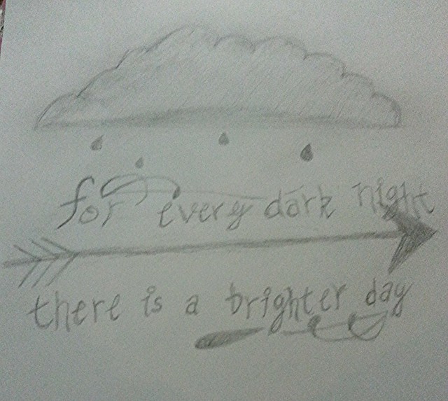
Everyone has a favorite song, or songs. I know if you asked me to pick just one, I couldn’t. This assignment, (worth 4 stars) is entitled Lyric Typography Poster. The task? Choose one of your favorite lines from a song and illustrate it using only typography. Consider how the font, color, sizes and placement of the typography can reflect or emphasize the meaning of the words.

I had a lot of fun with this assignment. I chose to do Monsters, by Timeflies. This is one of my FAVORITE songs, and I’m sure after you listen to it, it will be yours too. It is so emotional, and you really can feel the energy they put into it. This is one of their favorite songs that they have ever written. You can listen to the song on Soundcloud below.

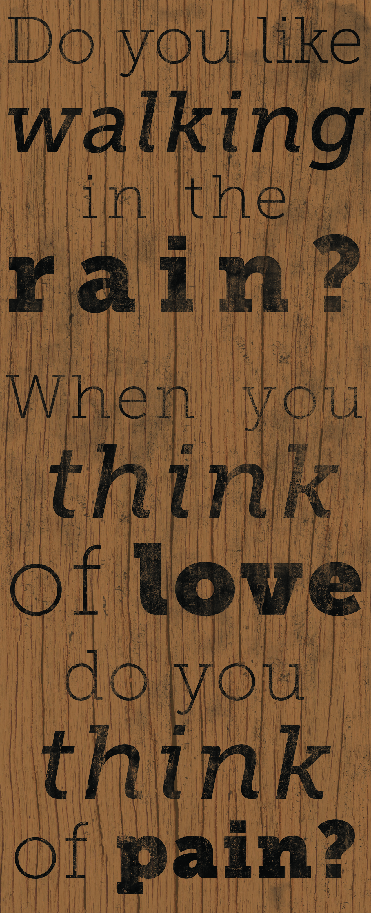
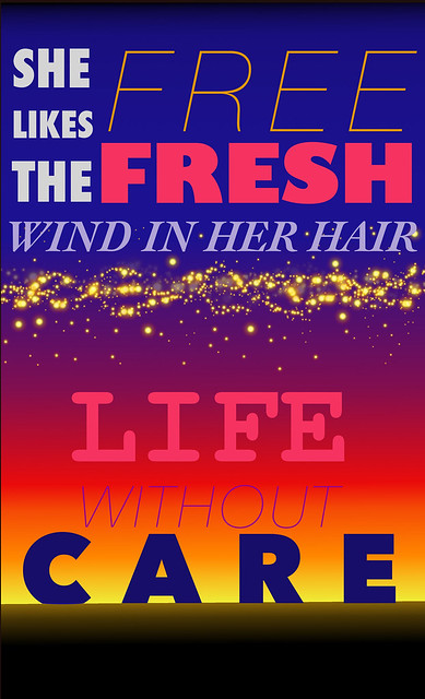
I decided I was going to type up Katie Sky’s part, which is the chorus. It goes “I see your monsters, I see your pain. Tell me your problems, I’ll chase them away. I’ll be your lighthouse, Ill make it okay. When I see your monsters, I’ll stand there so brave and chase them all away“.

This was a lot of words to put on one page, but I managed. I also was able to download SO MANY NEW FONTS!

Here is a list of the fonts I downloaded from dafont.
Disparador Stencil
Always in my Heart
Broken Glass
Scorched Earth
Kraft Nine
Mrs. Monster
Mademoiselle Camille

I really wanted the viewer to feel something when they read the lyric poster. I wanted to convey the feelings I feel whenever I hear the song. Here is the final product, and below you can find my reasoning for the font choices, and placements of words.

Monsters

First off, I stuck with a red and black color scheme, because red and black makes me think of drama, and this song is definitely very dramatic. I know I feel pain when I see the word pain scorched. That font definitely spoke to me when I was searching for something to portray the feeling of pain. For problems, I chose the broken glass font because problems usually make us feel broken in some way. The font I chose for lighthouse also reminded me of a lighthouse. Growing up so close to the Montauk Lighthouse has really made me appreciate everything that lighthouses represent. They help guide, and guiding someone through their problems is definitely a message this song offers. The font I chose for monsters really reminds me of monsters. It is a little eerie, and a bit creepy, but it is also bold. Everyone has their own monsters and they really come in all shapes and sizes, and at different scare levels. The font I used for brave also stuck out to me. I found it in a group designated to army and stencil. People who fight for us are definitely brave, and I think this font really gives the feeling of brave. Lastly, the usage of script was mostly to ease the message. Script and flowy fonts really help to calm us down, and in the sea of huge block letters, they also bring everything together. That is definitely something I take away from this song.

As you can tell, I definitely put a lot of thought into this assignment. I used Word to do all of my editing. As it was worth 4 stars, I wanted to take my time to make sure it was something I was proud of. It took a lot of font editing, as well as size adjusting to make everything flow and fit. It was really annoying to work with at times. Part of the I’ll got cut off at the end, but that’s okay. That is something I need to work on in the future. I forget that the saved edition cuts off the edges of the edition you were working on.

4 stars down this week

What a tramp.

poster

That’s why the lady is a tramp!

For this 4 star assignment, I made a typographic poster of The Lady is a Tramp sung by Frank Sinatra and many others. I had already established that Delia idolized Frank in this post, and I thought that this song would be her favorite as it’s all about being exciting and out of the ordinary. Delia would idolize the woman in this song for being exciting enough to have a song written about her, praising the madcap way she acts. I chose the line “She likes the fresh, free wind in her hair/ Life without care” because I feel that this in particular would resonate with Delia as she doesn’t have the means to wear ermine and pearls or any other silly high-brow things mentioned. (PS- the Tony Bennet/Lady Gaga duet is wonderful)

I did this in GIMP, and it took some work but it was actually pretty simple. I made the background by selecting the blend tool and using Skyline Fill in the menu. From there, I made text boxes for all of the word groups and eyeballed it from there. I tried to have a good balance between the thick and thin fonts, take up available space well, and select fonts that worked well together. I tried to make it look like the word “care” was sitting on the horizon. I spaced out some words, changed fonts and font sizes, and used complementary colors to make sure that everything was clear. I used the Sparks brush in various sizes and opacities in order to get the starlight effect in the middle. Overall, I’m very proud of how this turned out. I would recommend this for anyone who is trying to design with only a trackpad- it doesn’t require a tablet or fancy mouse tricks.