lyric typography poster!

Brand New

For this assignment, I again had a hard time choosing only one song or lyric! I have so many favorite writers and lyricists, so I decided to choose whatever came to mind immediately when I thought of a line that moves me emotionally.

The song “The Boy Who Blocked His Own Shot” by the band Brand New has this lovely lyric toward the end of the piece. The song starts out fairly depressing, discussing the loss of a relationship, but the final verse touches on the narrator’s positive feelings toward their lover that will remain despite their breakup. It speaks to the lasting power of love and is so romantic.

I created this piece in Pixlr editor and added text in PowerPoint. I will put up a tutorial soon!

Down Home American Kids

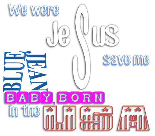
For my final design assignment I did “Lyric Typography Poster” (3.5 stars). I did “American Kids” by Kenny Chesney. In case you haven’t been able to tell by this point, I really like that song. It also has some vivid words that I figured I could find good fonts and could think of cool things to do with the words for.

How I did it:

I actually used Microsoft Word for this, which is my go to in case you haven’t yet figured that out. I used word art. I actually downloaded three new fonts for this project from dafont.com. They were CF Jack Story, USA Flag, and Baby Blocks. I had to mess around with the different text effects until I found ones that looked like what I wanted. For the “Jesus” (supposed to look like a cross) I had to make the middle “S” separate from the rest of the word so that I could make it bigger and stretch it out until it looked like a cross. The blue and jean are supposed to look like a pair of pants and I had to mess with their effects and change the tapering so that it looked similar to pants. The rest of them are just the fonts. But I wanted to put them together in a way so that it flowed and it was fairly condensed and I am pretty happy with how it turned out! :)

American Kids Lyric Poster #designassignments #designassignments529

Lyric Typography Poster

EVERLASTING LIGHT (1)

3 1/2 stars

You never really notice how melodramatic your favorite songs are until you have to take the lyrics out of context.

I had an obnoxiously hard time selecting a song for the lyric typography assignment, because everything I found was either depressing or overly emotional, which is not exactly my vibe. Finally, I settled on my favorite song of all time, “Everlasting Light” by The Black Keys.

The second I figured out the song, I knew I wanted a “light” themed design, and that I would use yellow and white for the color scheme. I pulled the lightbulb from The Noun Project, and got the idea for the font after seeing it on D106-er Amanda’s old blog logo.

I talked in a previous post about how I really like minimal design, and I think this definitely falls under that category. I know I talked a big game about the Scotland post card, but this is hands down my favorite creation yet this week. Part of me wants to print it out and put it on my wall!

I really love graphic design- it’s something I’ve been doing for awhile, and I love getting a chance to stretch my design muscles some more!

Lyric Typography Poster

Lyric Typography Poster

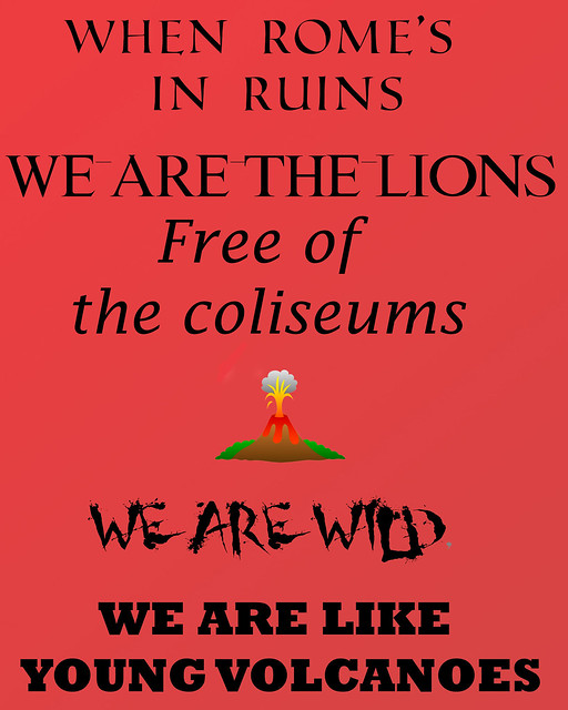
For the Lyric Typography Poster assignment (worth 3.5 stars), I made a lyric poster with lyrics from Fall Out Boy’s “Young Volcanoes.” I used different fonts from Fonts2u.com to portray the different lines, such as a roman font about Rome. I put this all together in photoshop with the different fonts and the volcano clip art.

Cheap Sunglasses

cheapsunglasses

In the Design category, I chose to do the Lyric Typography Poster assignment. The song I picked was “Cheap Sunglasses” feat. Matthew Koma by RAC. You can listen to the song here.

The lyrics I chose are at the end of the chorus and are “You’re cheap sunglasses. And they’ll see right through you.”

To create this poster, I used Adobe Photoshop. I knew I wanted to make the text go around to form sunglasses and so I made freeform lines around the tops and bottoms of two circles that I had inserted to use as guides for my lines. Then I added the text to the curved lines and played around with the anchor points until I was satisfied with how the text was laid out. I do wish I could have made the curves smoother but I really just do not have the patience to work with anchor points for more than a half an hour.
For the fonts I figured a serif font would work for the general words in the two lines that way the words I wanted to highlight would stand out when I made them either sans serif or display fonts. For the words “through” and “you” I knew I wanted them to be somewhat see through so I changed their opacity level to 35% and added a bit of a stroke effect for readability. I added drop shadows to all of the text to make them easier to read as well.

The colors and design of the poster came from the colors of RAC’s album Strangers which is the album that “Cheap Sunglasses” is on.
RAC-Strangers

twitterredditpinterestlinkedinmail

It’s a great day to be alive!

song lyrics

For my first design assignment, I chose the lyric typography poster.  I basically had to design a poster with the song lyrics of my choosing using typography.

This was a lot harder to do than I ever imagined! I didn’t know any program to use to help me do this so I spent some time Googling some editing and design websites. I finally found PicMonkey, which worked perfectly. I think the site is actually for photo editing, but I used the “design” feature and started with a blank canvas and just never added a picture.  There are all kinds of basic editing and design tools to create whatever you want.  I started by changing the canvas color and adding what they call an “overlay”, which is the pinkish colored flower shape.  They have LOTS of different shapes and overlays to choose from.  Overall, I tried to keep with colors that emitted an uplifting vibe because I feel like that’s what the lyrics are all about.  After that, I added the text from one of my favorite songs – “It’s a Great Day to be Alive” by Travis Tritt.  I kept most of the words in a simple, black font. I chose to change the color of the words “alive” and “shining” to add a little more emphasis to them because I felt like they were a couple of the most meaningful and positive words in the lines of the song. I also changed them to a different font and made them bigger than the rest of the words.  All of this can be done when adding the text to your image! There are a lot of other features this site provides – like borders, images, textures, themes, and photo editing. I highly recommend it!

As for my song choice, it took my awhile to finally decide on a song. I am a big country music fan so there were a lot of options! I wanted to use a lyric from a specific song that always stands out to me every time I hear it on the radio, but I couldn’t (and still can’t) for the life of me remember what song it is! So frustrating, but I’ll probably hear the song now that I’m done with this assignment. Anyways, Travis Tritt’s song was a very acceptable second option. You can listen to his song here in case you have never heard it before. I love this song because it’s so positive and sends a message about being grateful just to be alive.  It serves as a reminder to me that things are never as bad as they seem and I should be (and am) grateful for every single day I have.

Let’s get lyrical

(Yes, I actually decided that was a decent blog post title).

This evening I’ve been having a bit of a readathon - looking at the week 6 design assignments, some examples of what other people have created, and reading/watching some of the design resources being shared on the main DS106 blog and on Twitter.

Here’s my first attempt at a lyric typography poster. I’m going to go back to it, as this was the result of 40-odd minutes spent playing with GIMP for the first time and learning where the shortcuts are and how to export JPGs, etc. But I just wanted to get something done and out there, after two fairly quiet weeks, which I’ve been feeling guilty about. Or perhaps this is the fabled DS106 addictiveness kicking in?!

thescientist

My thought process (or rather, ‘let’s have a quick mess about’ process):

  • I tried out a few (very basic) fonts, and caps vs sentence case, with different sizing. I wanted to emphasise the word heart, then realised it contains the word art – and that seemed very appropriate somehow. I wanted the line about science and progress to be in a more rigid, typewriter sort of font than the final line – but I would also like the first two lines to flow together more, if I can think of some kind of device to do that (linking back to how the phrase sounds in the song).
  • I love the colour schemes used by the very talented Music Philosophy (thanks to DS106 for putting me onto their website - I am going to buy one of these amazing posters!). So I had a quick look at some colour wheels. I was thinking blue/teal (I’m not sure why, it’s just a colour that comes to mind when I think of the song), and so tried fuschia/purple as a complementary colour for the text – on the opposite side of the colour wheel.
  • There’s a lot more I could do if I could work out how to insert some icons and typographical symbols – for example, around the words art and progress. But I’ll read up on that and try a second iteration!

I am always reminded at times like this how amazingly skilled designers are…

To Fly

Lyrics

The song Gabriel by Lamb is about a person who is very stable and self-sufficient but still wants more.  This woman has their “angel” Gabriel and wants them.  She doesn’t need Gabriel to get by, but she really wants him in her life.  As the song goes on she realizes that  the necessities that she can provide herself mean less and less while the truly important thing is the man she loves.

I chose this song because it’s a favorite song of mine.  My goal was to try and have the poster mimic the song’s transition.  So at the top of the poster you have the “I Can Fly” stated pretty clearly.  Then you have the fly part starting to fade away.  As you move the poster the emphasis is the “But I want his wings” line.  Looking at the poster from a distance, this second line would be the dominant one.

For this project I used a black canvas, added texts, and a brush to create this image in photoshop.


3 1/2
http://assignments.ds106.us/assignments/lyric-typography-poster/

DS106 Post (A) – Lyric Typography Poster

lyrics

For this assignment, you’re suppose to pick your favorite lyric from a song and use different forms of typography to illustrate it. I chose to use my favorite Mayday Parade lyric, ” And knowing that for someone you’re an angel sent to save…” It’s a lyric that means a lot to me, so I definitely enjoyed designing it. Using the different kinds of fonts was fun and once I figured out how I wanted each set of words to be illustrated, it came together rather quickly. This assignment had many different examples, but no tutorials. That was fine with me though, it gave me a broader approach to the project so that I could be more creative.