Don’t You Dream Impossible Things?

Earlier in the week I did the Lyric Typography poser assignment and ended up changing the assignment around a little bit because I had so much fun with it. Even though it ended up being my favorite thing that I had done this week, I realized that I got a little bit off track and decided to try it again.

I started off by downloading two fonts to do this assignment.  The first was learning curve and the second was Bella K. dings are cool.  I used learning curve for my letters and Bella K. dings are cool for the stars that I added around the words.  

I decided to do the lyric “don’t you dream impossible things?” from the song Starlight by Taylor Swift.  I loved pulling my favorite lyrics out of signs and making different signs and posters out of them (I guess kind of like typography, but with makers and paper instead of computers) and my little sister asked me a couple weeks ago to make her one with this lyric on it.  I hadn’t ever noticed that part of the song before (because Starlight is one of my least favorite songs from her CD) but I LOVED this lyric when my sister pointed it out.

I made this using gimp.  I started off with a plain white background and then added my words to it.  I used the dashed version of learning curve and made the size a little bit bigger to on the word impossible to make it stand out a little bit more.  I then added stars one by one around the outside of the words (I tried to add a couple a the same time but I couldn’t quite get them to fit how I hoped that they would).  Here is why I ended up coming up with the second time I tried this assignment.

typography

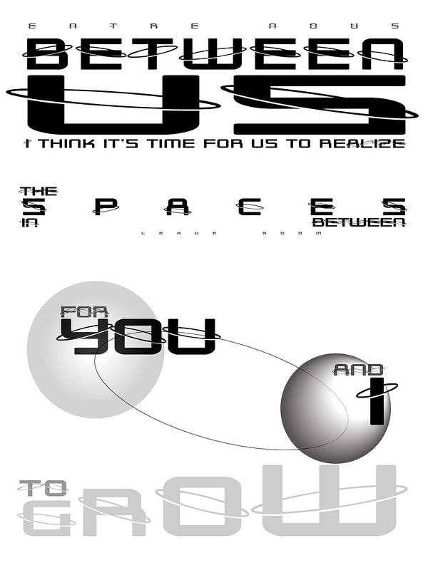
Entre Nous

“Entre Nous” by aforgrave, on Flickr

I decided to use this lyric for the Lyric Typographic Poster design assignment a long, long time ago, as it really seemed to have a lot in it that could be represented in a typographic poster (the concept of spaces between was the clincher, I think). The illustrated text is the second half of the chorus.

When design week came around this time, I decided I would hunker down and do it. Shortly after getting an overview of the week’s preferred assignments, and with the classic Rush song making one infinite loop in my iTunes, I started working on this. Perhaps I should have selected some kind of paper texture or colour for the background, but by the time I stopped working on this that day, I was feeling stuck, and not sure how to proceed. I know it could be better, but I wasn’t feeling how to move forward, so I just put it aside.

Now, a few days later, I look at it, pull the planets back from their hidden status, and decide to push the post button. The white background works for now. Its emptiness supports the sense that there is nothing between, leaving space. Mustn’t fill it in.

There is always another time. The lyric will remain. The inspiration for revisiting this poster will come from within the space between this incarnation, and the next.

Entre Nous

by Rush

From the 1980 album, Permanent Waves

Verse
We are secrets to each other
Each one’s life a novel
No-one else has read.
Even joined in bonds of love,
We’re linked to one another
By such slender threads.Verse
We are planets to each other,
Drifting in our orbits
To a brief eclipse.
Each of us a world apart,
Alone and yet together,
Like two passing ships.
Chorus
Just between us,
I think it’s time for us to recognize
The differences we sometimes fear to show.
Just between us,
I think it’s time for us to realize
The spaces in between
Leave room for you and I to grow.Verse
We are strangers to each other,
Full of sliding panels,
An illusion show.
Acting well-rehearsed routines
Or playing from the heart?
It’s hard for one to know.Chorus (repeat)

“Permanent Waves” album jacket, Rush, 1980

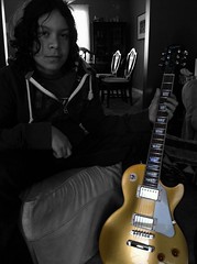
If you watch this video, you will see Alex Lifeson playing a Les Paul Gold Top — which has a nice connection for me, as it was my eldest son’s choice when he purchased his first guitar.

“New Guitar for MrGuitarMan,”
by aforgrave, on Flickr


Hold On To What You Believe

I am finding out that I love design week just like I loved photo week, not as much but it’s getting there!

The next design assignment I did was the Lyric Topography Assignment (**). The task was to take lyrics from a song and illustrate them using only topography. I love topography. I had no idea that this was considered “desgin”, now it makes sense! This is an example of topography:

fba04f40db04ec2724670541049a0ea5

I got this photo here. I had already seen this before this assignment came up, so I wanted to try to create something as cool as this! I played around in GIMP and Powerpoint for a while {seems like a reoccuring theme this week – and I’m not complaining!} and this is my finished product:

typography

The lyrics are from Mumford and Sons – Hold On To What You Believe. This song is so powerful, I knew it would make a good typography. Granted, I’m not pro like the person who created the image that was my inspiration, but I think I did a pretty good job for a “new-bie”! Things that I had to consider were font size, placement of words, what {if any} images I would place around the words in GIMP. The important words are big and bold. Luckily, I had cute font from this website {I use cute fonts when I create a worksheet or activitiy for a practicum classroom :)}.

Never Grow Up

I had planned to stop working on my ds106 stuff about an hour ago but I decided I wanted to “try out” one more before calling it a night.  Turns out “try out” means play with gimp continuously until I make it look exactly how I want it to.   At least I did two more stars right?

So the assignment that I ended up doing next was called Lyric Typography Poster.  As I was skimming though this I was right away intrigued by the sample on the assignment page:

example

I found this so stinking cool and began trying to recreate this myself.  After about twenty minutes of playing around with gimp, I realized that I didn’t know how to recreate this and that everything I was making turned out to be a boring looking version of this.  So I started playing around and ended up changing the assignment a little bit.

The direction for this assignment were to “Choose one of your favorite lines from a song and illustrate it using only typography. Consider how the font, color, sizes and placement of the typography can reflect or emphasize the meaning of the words” and I almost followed all of them. While I was playing around I ended up putting this simple picture of a little girl as my background. I had decided to do the song Never Grow Up by Taylor Swift so I found that picture to capture the song really well.  I then started to add in the words.  At first I just was trying to lay them on the picture, but I then decided I wanted to mount them on something first.  I decided to use notebook paper as that mount. I opened the notebook paper into a new page and cropped it to be the size and shape that I wanted and then just copied it in over by background. I did this for each set of words that I had on my background.  I then added my words using the text tool.  I played around a lot with the angles, fonts and size of everything before finding something that I really liked.  I am pretty thrilled with how this came out (which I probably should be since I changed the assignment a bit).

Hope you enjoy this!

nevergrowup

Eight stars to go!

Lyric Typography…2 Stars

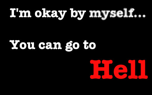
I chose to do the lyrics from Go Radio’s song Go to Hell for my Lyric Typography poster.. It’s a song I frequently listen to after a hard break up. It empowers me to move on from hard times. I chose to keep it simple because the song is very straight forward. The poster itself is on a black background with white letters to accentuate the red of ‘hell’. I also chose to blur the word ‘myself’ because the song might show empowerment after a break up but the singer is still broken, faded, lost. I might actually print this out and hang it on my wall. It is a really great song.

Goradio

Feelings & Liberation

Typographic Song Lyrics

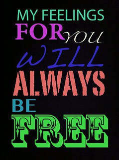
I don’t know if I did this assignment the correct way, but I think this turned out pretty cool looking. Typography is a branch of design that I haven’t really explored before until this week. It is pretty interesting, and there is actually a whole science behind what fonts, styles, etc. marketers use in advertising. Crazy.

I don’t listen to Avicii, but this song is good and I was listening to my grooveshark, and that song popped up randomly. So, I chose to use those lyrics. To achieve this look, I took a picture of blackness on my iPhone, and emailed it to myself. And then used the different fonts & colors in Picasa to write out the lyrics with. It looks pretty chic (and maybe a bit “high school”) but I dig it. Looking at it now, I don’t like the spacing of the words as much as I thought I did, but it’s probably as good as it’s going to get. Pretty simple. Worth 2 stars.

Falling short

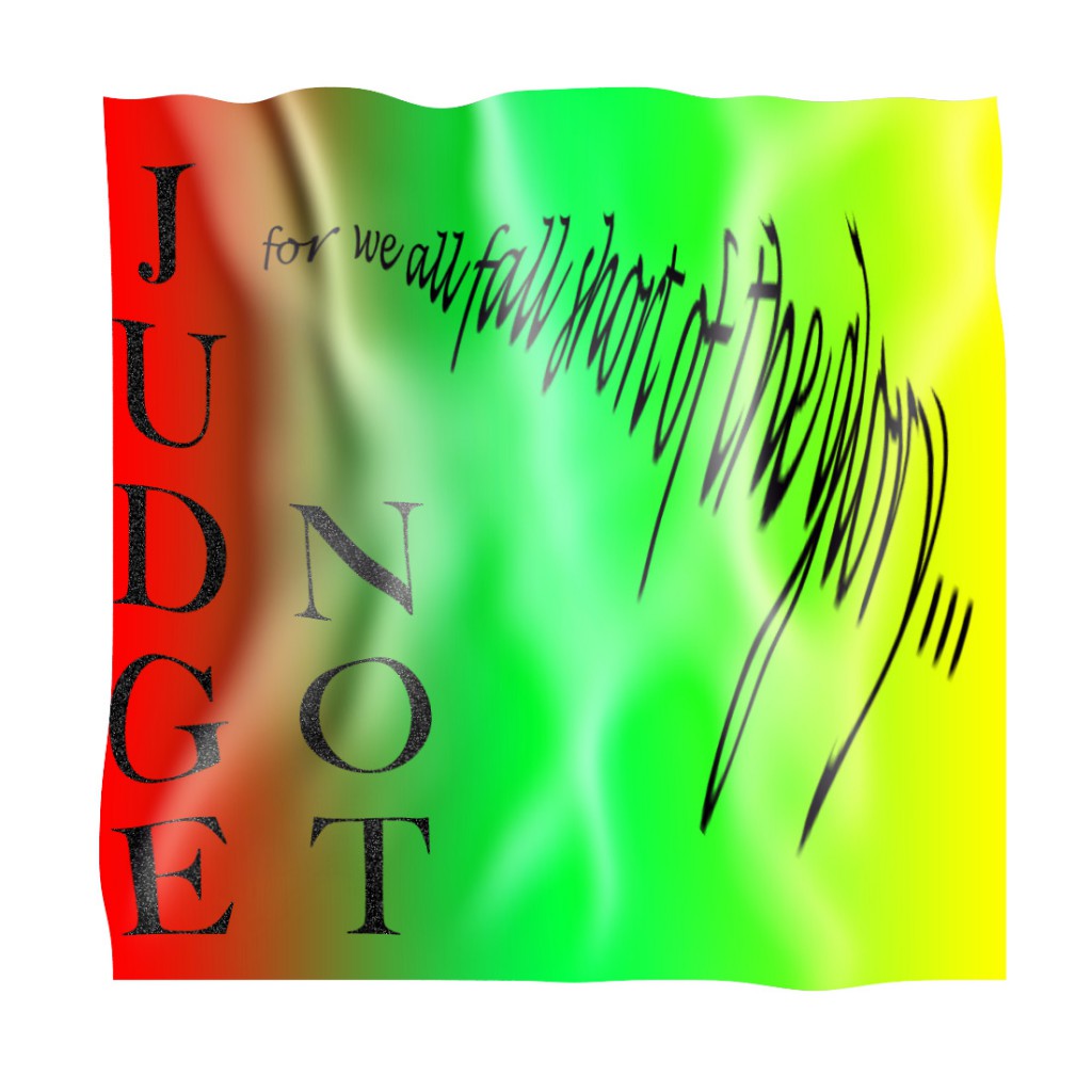
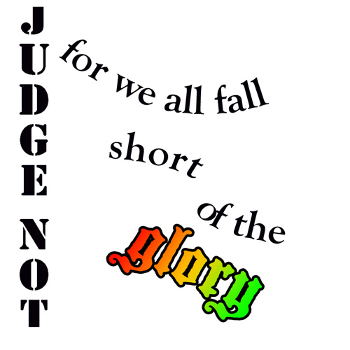
After last week’s excitement, I have fallen a little short of my own expectations this week. I’ve not been near minecraft, didn’t even get started on the Design Safari. I manage one Design Assignment, the creative commons one and then tried the Lyric Typography Poster.. I saw a couple of great results (and this looks like something professional) for this and though it didn’t look too hard. I cranked through iTunes until I remembered one of my favourite song Judge Not, there are a few different reggae songs with this title but the one I like is by Dennis Brown:

The phrase I like is Judge Not, for we all fall short of the glory of Jah. I’ve taken Jah out of the quote as I am not religious. I like the idea of trying and falling short more than Judge not lest you be judged (Matt. 7:1).

I started thinking about this, googling King James font, I saw a reference to calson, so decided to go with Big Calson which seems to be on my mac. I was hoping to get a sort of old looking text and spent a couple of hours failing to get anything like my imagination. I did consider the old english type of font. I was also thinking for some reason about flags and decided on a flag background; red gold and green seemed obvious. Many tutorials and tests later I ended up with this:


This falls very short of the target: Choose one of your favorite lines from a song and illustrate it using only typography. Consider how the font, color, sizes and placement of the typography can reflect or emphasize the meaning of the words.

Nevertheless I have now spent a deal of time playing with photoshop and trying out various tutorials, hopefully this will help.
Here are a few of the tutorials I read through:

So I had another go:
I do not think I have much natural design sense. I have enjoyed and learned from other ds10ers design assignments this week.

My week 4 flickr daily creates:

And a soundcloud one:


Two DS106 design assignments

Figured it was time I got some DS106 work up here, convincing myself and others that I’m not just at Camp Magic MacGuffin to play about building a British Embassy in Minecraft. Although fundamentally that is a large part of it…

First up: Lyric Typographic Poster (design assignment 529). I knew it had to be Eels, and I chose the opening lines from “Friendly Ghost” on Souljacker. People peg the Eels as a depressing band, but I think not.  The background texture is one of a load I downloaded for something else ages ago.
Lyrics

Next: Design an Invoice (design assignment 58) – described as “Create an invoice for a transaction that has happened in a film, TV series, etc”. I chose an invoice from Local Hero, one of those utterly wonderful early 80s Bill Forsyth films and quite possibly my favourite film of all time, ever*. It’s something I find myself coming back to again and again, especially at times when life seems less delightful. I’ve added some handwritten notes to preserve two lines of dialogue that need to be preserved, and I had to hand-create the logo in PowerPoint so have uploaded it as a PNG in case anyone else in the world needs to print out a Knox Industries logo and answer the phone with “Thank you for calling Knox Oil and Gas“.

Knox invoice.pdf
Download this file
Knox_industries
Anyway, happy ds106 everyone. #4life

* seriously, watch it some time. Here’s the first bit on youtube.


Mission: ds106 – lyric typography poster design assignment

Inspired by several campers’ lyric typography posters (2 stars), I decided to go back to this assignment. I passed over it during my design sprint because the first few ideas I tried didn’t work – I wanted to do something purely typographical with the background color being the only non-textual adornment. I couldn’t pull it off by myself. I didn’t really get the examples, which looked good, but didn’t always marry the lyrics and designs in ways I could grok.

My subconscious kicked around a few ideas – I wanted to do something with Radiohead; I played our Florence + the Machine CD on today’s drive to Grammy and Poppy’s.

Here’s what I came up with while working entirely in Acorn.

Florence + the Machine

Florence + the Machine

First, I tackled this Florence + the Machine poster. I had originally thought about using inverted carrots to make teeth for the dog days, but then I decided to try coding some impact into the poster. I used a bold Rockwell font to lend weight and vibrancy to happiness and a few other bits of text. I threw in a bracket and a wide-stanced Bank Gothic font for the hit. I used Cracked (always stop at 3 fonts, Chad!) for “bullet” and rotated some forward and backward slashes to suggest a spider-web of stress fractures from a bullet hole in the middle of the “b”. I also left “bullet” in all lower case to contrast it against the other lines of text which are all capital. Finally, I kerned the last line to -12 (I go past the absolute value of 11) so I could have the text wind back on itself and fit the bottom of the page. I also split it into “in the b” and “ack” so I could make it wind back in a less predictable way. I like the gap. I think it helps punctuate a kind of hard return and possibility of escape up or down the page in the recursive loop that the last line creates. Maybe that’s where the happiness-bullet hole is.

I also worked on a Radiohead poster combining the colors and sans-serif-ness of the In Rainbows album typography (I used a bold Euphemia UCAS font) with lyrics from “Fake Plastic Trees.”

I decided to repeat the line about the town getting rid of itself, omitting one word per iteration so that the quote would get rid of itself. I put the text in a box that takes up most of the page, sized the text to fill the box, and let the line breaks take care of themselves to approximate the random aesthetic common to many pieces of Radiohead art and web design. I love the way the last line doubles itself while disappearing itself. The last bar of background is white to complete the vanishing and create some ambiguity about whether or not there is anything there in an invisible, white font.

Here’s the poster:

Radiohead

Radiohead

I’m very glad I found a way back into this assignment. Thanks, ds106 campers! Learning in community!

In gratitude, let me share this wicked pair of multi-layer stencils of Thom Yorke that a student did as a learning project this year.

Thom Yorke stencil art from a learning project

Thom Yorke stencil art from a learning project

Simple Gifts

For my next design assignment, I decided to do the Lyric Typography Poster. However, I did go a bit beyond just using text, and added a very basic vector graphic. I was really inspired by the examples at Music Philosophy — Especially when I saw how adding just a very simple graphic could be so effective. 

The lyric I picked was from the traditional Shaker song Simple Gifts. It’s a particularly meaningful song for me because it was one of the songs that was played and sung at our wedding (10 years ago this summer!). The song is really meant to be a simple dance, and the last lines of the song (which I didn’t use) is, “To turn, to turn will be our delight,/ Till by turning, turning we come ‘round right.” I wanted to evoke that sense of movement a bit in the poster. 

It actually is a song that encompasses what I strive to make more of my personal philosophy: looking for the simple, coming back to where we were, finding the gifts in the things we already have. Really, very beautiful, yes? I’m not sure my poster is beautiful enough to capture this sentiment, but I had fun doing it and thinking about this song again. 

Note: The original image came from The Noun Project (a fantastic source of free, CC licensed simple vector graphics) and was created by David Goodger. It is shared with a CC Attribution license.