Caribucks Coffee


redo


As I sat around this weekend trying to figure out how to do this logo merge assignment (4 1/2 stars), I stared at my cup of starbucks coffee and I remembered talking to my sister earlier in the weekend about how Central Park used to have a Caribou Coffee. With that, I decided that they needed to merge (mostly, because it would help with my severe addiction and constant need for coffee). And this is what I got.


To start out, I got together the two main logos for Caribou and Starbucks. Below:

caribou10_vert_large_cmyk starbucks-logo-vector1


From there, I opened photoshop and took away the animal that I think is a Caribou (is that an actual animal title? I don’t even know). Then I just plugged in the Starbucks logo and renamed the brand. I tried to pick a simple sans serif font that resembles Starbucks a little bit, so I went with this fun font I have called Libby, After that, I just saved the image and uploaded it here. I am having this weird problem with Photoshop where whenever I save something It makes the image lighter, so if anyone has any advice on that, please please please let me know! I tried reseting my photoshop settings and it still fails to help!


Intergalactic Gasoline

The Ultimate Merger assignment (4.5 pts) seemed pretty easy at first because all you had to do was combine two famous logos. However, I found that it was difficult to choose two logos from the millions out there. Many other people chose two companies that directly compete with each other, which is pretty cool, but I decided to create a combination that nobody would think of. I looked up famous logos, and they were categorized by food, gas, clothing, etc. so I chose one from the gas category (the Mobil lettering). I know Mobil already merged with Exxon, but they keep different logos still, so I figured it was ok to forget about Exxon for now. There were also lists of iconic logos, so I chose the NASA logo to combine with Mobil. Although this would never happen in real life, the gas company partnered with NASA would make an interesting combination. Here is the logo they would use if they combined their own logos:

nasa mobilI thought about keeping the blue and red lettering for “Mobil,” but it blended too much with the background, so I changed the letters to white. The hard part about making this logo was that the letters are partially covered by the red and white lines. To do this, I had to take the NASA logo, put the white Mobil letters on top, and then add in more red and white lines from the NASA logo on top of the words. The hardest part was getting the new lines just right so there wouldn’t be multiple red lines when there should only be two. While it was a lot of work, I think it paid off, because it looks like the words belong there.

This new company would research aeronautics and be able to fill up your spaceship from anywhere in the universe to keep you mobile. You might say its the best of both worlds ;) Now for a name. This company would be called the Mobil Aeronautics and Space Administration (MASA). It would project US power even further (not that the US needs it) by being the first intergalactic gas company under the authority of the US government (although it might take decades to get your stranded ship some gas if all operations are based on Earth). As the company expends, I’m sure they would have gas stations all over the galaxy for your convenience.

“Thanks, MASA!”


Welcome to Tarmart


The Ultimate Merger (4 1/2 Stars)

For this assignment I chose to combine the logos for the two popular stores, Walmart and Target. They actually both have very similar logos at the moment. I think it was added fun that they are rivals. I am always torn between where I should shop because Walmart is usually cheaper, but the stuff at Target is so nice.

walmart logo target logo

It ended up not being too difficult to combine the logos because of their similarities. I used Photoshop to adjust the sizes of the target logo so that the little circle fit inside the yellow flower shape of the Walmart logo. In the same way I had to enlarge the size of the outer circle so that it would fit on the outside of the flower shape. I then covered the “Wal” with “TAR” to create a new brand, “Tarmart”, where you get higher quality products for cheaper prices. What more could you want? I think Target and Walmart should learn from this assignment that they would be better off not competing with each other. I think this assignment wasn’t too bad, but it would have been farm more difficult if I didn’t have Photoshop though.

tarmart logo final

The Ultimate Merger

This assignment (4 and 1/2 points) was asked me to combine a famous logos to create a new logo. I chose Starbucks Coffee logo and just stared it for long time to figure out which another logo should I use for.

starbucks logo

And I just searched tons of logos but could not decide my mind because I had no idea to put together. The first logo I wanted to combine was Dunkin Donut or Krispy Kreme Donut because I thought that coffee and donut are extremely good combination. So I looked these together and tried to figure out how should I put it. But I had no idea to put these logo together and I searched for another logo. And finally I came up with Seven-Eleven Logo.

7-Eleven-Logo7-eleven-brand.svg


I set up the Starbucks logo as background and cut symbol of seven from the above image and letters eleven from the bottom picture. Before I put it together, I filled letters Starbucks with same color of green from the background.

The final product came out right this.

starbucks logo


I satisfy with the product I made. It was really interesting assignment and I enjoyed doing it.


The Ultimate Merger

http://assignments.ds106.us/assignments/the-ultimate-merger/

(Four and a half Stars)

Ronald McDonald doesn’t belong here!

wrong wendys

4.5 stars of FUN

So I decided to get the assignment over 4 stars out of the way first this week (this one is worth 4.5 if you couldn’t tell from my title).  I chose The Ultimate Merger assignment because it looked fun and I wanted to experiment more with photo editing programs.  The object of this assignment was to combine two well-known business logos into one.  I chose the logos from Harley Davison and Dick’s Sporting Goods.  I chose these two because I love motorcycles and I work at Dick’s Sporting Goods.  Here are the original logos.

Harley Davidson

DSG

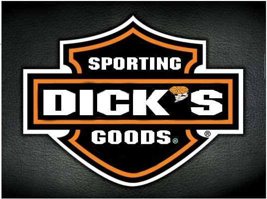
and here is the final product of my creation muahahahaha :)

Logo Merger

I think it looks pretty cool.  Plus if these two companies merged, I think the store would be awesome :D

This assignment was pretty time consuming to do because I first had to find the images I wanted to use then I had to decide which logo I wanted to be the background and which one I wanted to use the words from.  I used a photo editing program called pixlr (which I have used before it’s almost exactly the same as photoshop but free).  The most time consuming part of this assignment though was going around the outline of the Dick’s Sporting Goods letters to get rid of all the green.  I simply placed the words in their place then cut out the extra green that I didn’t need and that is what it resulted in.  Yay design assignments!

Peet’s Star Coffee

Peet’s and Starbucks are some of the fiercest competitors in any market. What would happen is they merged?

Design Assignment: The Ultimate Merger(4 and a 1/2)- “Staroid”

brand

Staroid: Give us a call when you need a cup of strength- boosting coffee.

This was a very fun assignment to do! I looked up famous logos online and first saw Starbucks as something I could potentially use. Figuring out what to combine it with was a little tricky since I wanted the name pairing to make sense together. Initially I thought I could pair it with Disney, but I didn’t want to take away from the crown already used in the Starbucks logo. When I saw the Android bot, I noticed that both this logo and Starbucks are a shade of green and that I could use that to my advantage. I decided first to give the Starbucks queen a weight to lift that would have two bots as the weights. To get more involved, I placed one bot in her crown and added star symbols to the “weight-bots.” Lastly, I wanted to have the brand name written in the white space that could be seen as her dress. “Staroid” combines both names and takes parts of the product they each sell to create one strange item: a coffee delivery service that makes strength- building coffee. It is a play on  the word “steroid” since those are obviously the drug that gives strength to anyone that would take them, but this is a healthy product that merely provides more energy to the drinker and allows them to have more strength in the process.

The Ultimate Merger, Microsoft + Sony = MicroSony!

Original Assignment (3.5 Stars)

Screen Shot 2014-10-05 at 5.21.32 PM

For this assignment, I decided to do a pretty impossible, but awesome idea of merging Microsoft AND Sony. These two companies are the top dogs of entertainment and electronic media, most notably for their Xbox and Playstation gaming consoles, respectively for Microsoft and Sony. I used google drawings for this simple edit, and I cropped out the “soft” part of “Microsoft” and then tried my best to incorporated the “SONY” text to connect with the “Micro” text.

I tried to make it colorful and although Microsoft does have it’s vibrant “Windows” logo, Sony doesn’t really have that many logos I could use to combine well enough that so, hence how simple my above image looks.

I can’t imagine what the gaming console community is going to be like when a merge like this actually happens. However, I think it would be awesome since most of the gaming community would be united under one system and the amount of people in that would be remarkable. I could say the same thing with a new computer and better TV’s as well, as their products might be substantially better.

The Ultimate Merger: SubHut!

For my Ultimate Merger, I decided to combine two of America’s most prominent fast food franchises: Subway and Pizza Hut!  SubHut would function similar to Subway now…except they would deliver!  Customers could build their sandwiches online, and have them delivered to their front door in 30 minutes or less.  Pizza lovers should not fear, as SubHut will still deliver pizza as well!


To start off, I found the logos for both Subway and Pizza Hut, and pasted them into GIMP

subhut1

With the images in GIMP, I went ahead and removed the white backgrounds from both pictures, before replacing the “Pizza” in the Pizza Hut logo with the “Sub” from Subway’s logo.

subhut2

To make the logo seem a little more original, I went ahead and recolored the the red roof as well as the yellow swish, giving them the green and yellow colors of Subway.  I also added a white background to the image.

subhut3

Here is a close up of the final logo:

SubHut Visual Assignment


We can only hope that made-to-order subs delivered to our front doors will become a thing of the future!  In total, this assignment was worth

H_3 and a Half Stars Wht