Celtics and Lakers Ultimate Merger! (3.5 Stars)

This Ultimate Merger assignment was really fun and interesting. We were suppose to take two businesses and merged them together to create one logo. The process to create this logo was not too challenging, I found a colorless logo and took that image and put it in the Color Splash app. From there I was able to color in the image with the any colors that I wanted. This process was very enjoyable, I felt like I was a young child coloring again.

When I saw this assignment, for me it was a very easy to decide on what I wanted to use. From many of the other assignments you can tell I am a Boston Celtics fan until I die, I bleed green. The Boston Celtics are the best organization in the NBA. Anyone who knows basketball, knows that the Boston Celtics and Los Angles Lakers are the biggest rivalry in the NBA and one of the biggest rivalries in all of sports. The Celtics and Lakers ruled the 80s in the NBA, and that was one of the most heated times in the rivalry. I became a fan of the Celtics when I was really young, watching the old games from the 80s. That was the first time I saw Larry Bird play, and became a huge fan of his and the Boston Celtics.

larry bird


So I decided to combine the logos of both organizations. I took the Celtics logo and added the colors of the Lakers to it. As a fan, it was very difficult for me to color the gold and purple onto the Boston logo. But I did it for the class, I feel that it is the ultimate merger of two organizations and teams that really hate each other.

lb

BL logo

PJ & SB Goods

I did the assignment The Ultimate Merger, worth 3.5 stars. I wanted to make this Wire related since Proposition Joe and Stringer Bell are in a deal with each other now. So what I came up with is a “package” logo, featuring both of them. I found a package icon on The Noun Project, and I found pictures of Proposition Joe and Stringer Bell. I made the package icon cardboard color on Pixlr, and ran both the Proposition Joe and Stringer Bell pictures through a black and white filter on Pixlr. Then, I cut out Proposition Joe and Stringer Bell’s heads and free transformed them as well as free distorted them to make them go in the direction of the sides of the box. Then I added the text to the box. I wanted to keep their logo somewhat vague since that’s how they talk about their products. In a way Proposition Joe and Stringer Bell are the ultimate merger since they are both very powerful drug dealers in Baltimore with many connections to all kinds of people.

Image Citations:

Package designed by Mahmoud Bachir from the Noun Project

Stringer Bell by HBO en.wikipedia.org/wiki/File:The_Wire_Stringer_Bell.jpg

Proposition Joe redright88.com/2013/01/18/rip-proposition-joe/

twitterredditpinterestlinkedinmail

Walma!!!

A combination of Walmart and Target. I choose Walmart and Target, because I wanted two well known corporations that people would recognize. I created it using GIMP  a free photo editing software. I overlapped the target symbol and put it on the end of the Walmart, creation a new name Walma, as well as made the red target yellow.

Untitled


Worth 3.5 stars.

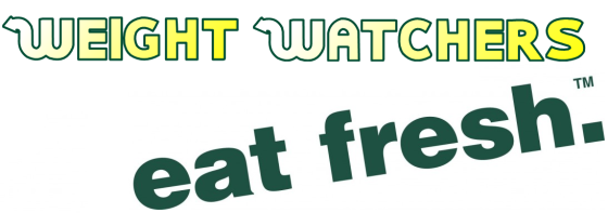
Weight Watchers, Eat Fresh.

The Ultimate Merger

WW Eat Fresh

Another Design Assignment for the week is The Ultimate Merger. All of the design assignments seemed pretty interesting, but this was the first to catch my eye and I loved the idea of having to combine to companies logos together into one. Well deciding on the two logos to merge was THE hardest part. I obviously ended up using Weight Watchers and Subway. I initially copied the entire subway logo into MS Paint and cut out the “Subway Part” of it. In order to get the Weight Watchers words in the Subway font, I had to download their font from a website called 1001 Fonts. From there I saved it and downloaded the zip file to my computer and then imported it into all of my applications.

In MS PowerPoint, I used WordArt and wrote out Weight Watchers. I edited the words, to have a gradient effect from which the words would fade from white to yellow, left to right. After I had completed that, I outlined the words in the same dark green as the words “Eat Fresh.” are written in. I saved that artwork in PowerPoint and uploaded it in MS Paint. I arranged the words in the same effect that Subway originally had theirs. That is how I came up with this logo!

Reasons for choosing the two of these companies? First and foremost, I absolutely love Subway and not sure why anyone wouldn’t? Once I thought of that, I then thought of something that would work well with their slogan, and what is nothing better than a weight loss company? I mean, we all know Jarrod went to Subway to lose weight! The reasons may be a little cheesy, but I thought they worked perfectly together, and who knows, maybe they will one day team up together to help more people lose weight!


3.5 stars

FireChrome

I am loving these design assignments! For this one I chose to do The Ultimate Merger, where you have to combine two logos from different companies into one, as if the two merged together to form the ultimate company. The hardest part about this assignment was probably just picking the two companies I wanted to merge together because there is just so many to choose from. I wanted something a little more logical like the two companies had to be from the same industry. After doing some googling of logos I noticed multiple internet browser logos were popping up. I said hey since this is a blog on the internet for the internet I might as well make this assignment about the internet. Since the only two internet browser that I think are worth anyone’s time are both Chrome and Firefox I decided to merge the two companies together. Thus I introduce to you….

firechrome

First I just have to say I was able to get access to Photoshop on my own computer. I know it’s awesome, right? Also I didn’t have spend hundreds of dollars to do so either. I found out that if you are a student or teacher you can get the software for up to 60% off! There is thing called Adobe Creative Cloud, which is a subscription cloud based software application. As a student or teacher you can access to Photoshop for just $9.99/month, which is well worth the price if you ask me.

The creation process was rather simple and much like my other assignments I have completed and I can always revert back to my original Photoshop Selection Tutorial. There is no coloring involved in this process, but the selection process is just the same as in the video. However, here is another screencast for the process:

“The Ultimate Merger”

Picture 64


I did the assignment titled The Ultimate Merger under the design section of the assignment bank. In this assignment we were to create a logo that merges two like companies or two ironic companies. I decided to merge the logos of the two leading coffee companies, Starbucks and Dunkin Donuts.

Assigment difficulty: 3.5 stars

Total Design Stars this week: 6.5 stars

“The Ultimate Merger”

In this assignment, I was told to create a logo that merges two different business logos. The guy said the funnier the better, so that is what I tried. In this photo, I tried merging the logo for Gold’s Gym and the logo for Mcdonalds. Golds gym promotes healthy active lifestyles while Mcdonalds serves fast food that is greasy and tons of calories. How Ironic. Image

Just Google It

JUSTGOOGLEFIN


This is my Ultimate Merger assignment where I have combined Nike and Google’s catch phrase and logo to send DS106ers a message to “Just google your ds106 questions.”  I put these together in GIMP by cropping, rotating and resizing these logos.

This is the link to the assignment.

Difficulty: 3 1/2 stars

Smartest PCs and best news

dell as ibm


This here is what a logo of Dell and IBM could possibly look like if they had a merger. This is for the Ultimate Merger assignment from the DS106 Assignment Bank. To do this I actually used one of the tools found on this awesome website named Font Meme. They actually have a good set of generated fonts from popular logos all not free though. For good fun I did another one which as you can see would be what CNN and NBC would look like. I’m still working on the ABC-CBS logo.

NBC cnn style

The Ultimate Merger

The ultimate merger assignment was to create a logo that combines to famous logos. I thought that I should merge the two most predominant logos that we see everyday as DS106′ers, twitter and flickr. The assignment was pretty simple to complete, and was also very enjoyable. I used pixlr to create the logo. I then used the color matching tool to get the correct colors, and then shuffled through some fonts to find the text that most closely resembles Flickr’s logo. Here is the result:

flickr-logo-5221212

+

twitter_logo

=

flickrTwitter