Remix An Album Cover

I love the beatles and my favorite album cover is Abbey Road. So when i saw the assignement Remix An Album Cover I knew exactly which album cover i wanted to do but how would i remix it was what took me the most time coming up with. I came up with a couple ideas but the one i went with was writing “which way was the studio” on the top and adding DS106 in the street. Here is what it looked like.

beatles album cover remix

Remix Album Cover

The second assignment  that I decided to complete for my Mashup Assignments was the Remix an album cover, which was worth 3 stars. The assignment required taking an album cover and making it represent something completely different. For this assignment I thought that I would take a crazy album cover and have it seem as if it was the “Christmas Version”, but obviously not as appealing. I listen to all different types of music so it wasn’t very difficult for me to think of an album cover that was insane looking. I decided that I would pick one of my favorite artists Rihanna. She has a few intriguing album covers … I needed to narrow it down a bit so I decided to pic the album cover for her “Talk That Talk” album. I picked this album cover because she looks absolutely insane and it’s not very appealing to someone that would want to listen to a Christmas album. After picking the album I simply saved the picture onto my iPhone. Then I used the app that I got for free on the app store called “Captions Free” … It’s a pretty nifty app for pictures and I’ve used it for various other things as well. I then found some cool Christmas related pictures to attach to the album cover and make it look like it was about Christmas. I then added the caption “Xmas Style” in order to make it clear, but also represent something that Rihanna would name her album as well. This album cover obviously doesn’t represent Christmas …. or the idea of what Christmas is, but I made it work because I thought it would add a little humor as well. I then uploaded it onto my flickr account and here’s my finished product :

Rihanna Xmas Cover

 
2 votes, average: 3.00 out of 52 votes, average: 3.00 out of 52 votes, average: 3.00 out of 52 votes, average: 3.00 out of 52 votes, average: 3.00 out of 5
Total= 7/7 Stars! 

Remixed Album Cover

Rihanna is my favorite artist(if you all haven’t noticed by now) and I know every single one of her songs. When I saw the album cover assignment, I knew exactly what to do. Rihanna has a song called “S&M” which in reference to sexual acts. It stands for Sadism and Masochism-The practice of using pain as a sexual stimulant. That is NOT the reason why I chose this cover. But on the “S&M” cover, she appears to be eating something, so I changed the “S&M” to Spaghetti and Meatballs.

Remixed Album Cover

This was very easy to do. Here are the steps

1. Went to Google

2. Typed in “S&M” album cover

3. Downloaded it to my cell phone

4. Opened up “PicsArt” (or whatever photo editor you have)

5. Imported the picture to PicsArt”

6. Selected “ADD TEXT”

7. Typed in what I wanted, dragged and dropped it on the picture.

It only took me about 15/20 minutes, but that was without WIFI, so it should be easier.. I hope you like my new creation.. and if you want to here the “S&M” song.. ->Click Here. –>S&M -Rihanna<<–

For More. Click Here. –>>[Remix an Album Cover]<<–

The New Wave

A tribute remix of Yaz(oo)’s (1982) “Upstairs at Eric’s”.   Remixed album cover DS106 assignment #211 (by my brother from another mother, Jim Groom). Homage to Bunkhouse X, the new wave of campers–freedom fighters, truth tellers, and lovers. Tell me Bunkhouse X, “Didn’t I bring your love down? All night?”

Bunkhouse X is located in CAMP MAGIC MACGUFFIN, our very own hostile, zombie ridden, summer camp run by Imperialist Squirrels. You should visit. Bring marshmallows. Zombies hate marshmallows.

[Technical bit: I used the free version of plixr photo editor to sloppily manipulate the original album art.]

I Wish I Had a Carpenter

Walking around NYC this afternoon I saw the IFC Cinemetal t-shirts (scroll down that page—what a terrible website the IFC center has) at their theater off West 4th Street and I really, really wanted the Carpenter t-shirt. These t-shirts are heavy metal t-shirts/album covers mashed up with film diirectors. For example, The Carpenters album Lovelines is mashed up with John Carpenter’s They Live.

And there are many more that have been around since 2008, where have I been?

I did the Ranier Werner Fassbinder mashed up with Metallica, save the fact I hate Metallica:

And there’s Werner Herzog with Danzig:

And that’s just a few of them…but the enw Carpenter is the one I have eyes for :) What”s more, this is right in line with a ds106 mashup assignment “Remix an Album Cover,” and what I like about this series is the focus on two specific groups that make ti easier: independent, hardcore film directors and Heavy metal bands. There may be something to such focused pairings to produce an inspired series.

Mashup – Remix of an Album Cover

I did the DS 106 Mashup assignment. It was to create a remix of an album cover. I choose to do the album cover of 30 Seconds to Mars – This Is War. I personally love the album and the songs on it.

Iconoclast.

Let’s Remix an Album Cover!

“Remix an Album Cover” is a Mashup assignment which you will find an album cover and remix it to represent something else. What you alter can be anything – it can be a play on the title, the image, the aesthetic, genre, etc.

This is my second mashup assignment and it deals with music again following my previous ds106 post. Since we got the chance to listen to an interesting presentation on open source last week by our fellow classmate, I thought I’d do a piece that pays a bit of hommage to him.

Before starting on the assignment, I had to choose between two to work on and they are both cool records. As you can see, I picked Symphony X’s Iconoclast (2011) over the other album Origin of Symmetry by Muse. One of the song from Origin of Symmetry is featured in my post on Alexander’s lecture. The reason for choosing Iconoclast is because the album is themed on what we humanity is concerned with – dehumanization and the power of technology in society.

To me, this piece is simplistic, but a serious mashup. The composition of the work is suppose to be similar to the cover art for the single Symphony of Destruction with the hand scraping on a surface of algorithm. I used Pixler this time to manipulate the images. None of the images are used directly in the piece without any effects. The image of algorithm was originally just a bunch of zeroes and ones, but I think the use of kaleidoscopic effect transformed the uninteresting arrangement to a nice base for the cover.

I personally want people to think deeply about the meaning of the word and the album title IconoclastBeing a rebel and thinking outside the box seems to always open up a road to the future. I was wondering if iconoclasm can be applied to the present higher education. Will something change in our future by rejecting the ordinary template we are provided?

Mashin up Album covers

In This mashup assignment you were supposed to remix an iconic Album cover to mean something else.  Instead I sort of went in a different direction and combined two album covers from 2 of my favorite bands Mogwai and Boards of Canada.  I used Mogwai’s EP+6 cover and  BOC’s (Boards Of Canada’s) Music has the right to children.  Both bands draw from an ambient sound but approach music in different ways.  Mogwai is mostly instrumental Post-rock using mainly traditional rock instruments Guitar, Bass and Drums but run their sound through boards and boards of effect pedals to get very interesting results.  BOC is a duo who are primarily Electronica and IDM (Intelligent Dance Music).  They use a lot of scratchy analog samples based around 1960s educational videos from The National Film Board of Canada.  It’s strange that both groups just happen to be based out of Scotland.  The Image that came out is rather nostalgic feeling image filled with graininess.  The process was rather simple, you just layer one image on top of another how ever you want then adjust the opacity and fill on the images to get the desired translucency.

Boys Like Beatles and…


I can’t lie. My music library has not changed since high school. I happily listen to the album, Dark was the Night on repeat for hours.  Yet, when I saw this assignment, I knew I wanted to poke fun at famous Beatles’ album cover, 1. Maybe it’s because I don’t get, or maybe it’s because they seem a little egotistical. Nevertheless, I called back to my high school days when Boys Like Girls ruled the hallways and music diehards wore the ’1′ album like a badge.

This is what the original albums looked like:

In Gimp I edited the two albums together. Good-bye  weird dripping rainbow and hello bleeding Beatles.

This just feels right.


15. never mind the **** (ds106 #6)

During this new section of Cyberspace and Society, we’ve been prompted to try to do each DS106 assignments from a different category because some student – aka me – have a tendency of just sticking to one category – aka my beloved design category. So, I spent a bit of time throughly browsing all the options (and there’s seriously so much to choose from, it’s amazing!) and a few stood out to me as things I really want to do. Amongst others one is a fanfiction assignment (the Un-Scene Scene), to appease the part of me that’s still in junior high school (yeah I totally did write fanfiction back then. Dreadful ones as that) and, then there’s this one that I’ve done here: Remix an Album Cover from the Mashup category. The assignment itself was pretty straight forward, and there’s a lot of fun to be had with it!

Find an iconic album cover and remix it to represent a something different. It can be a play on the title, the image, the aesthetic, genre, etc

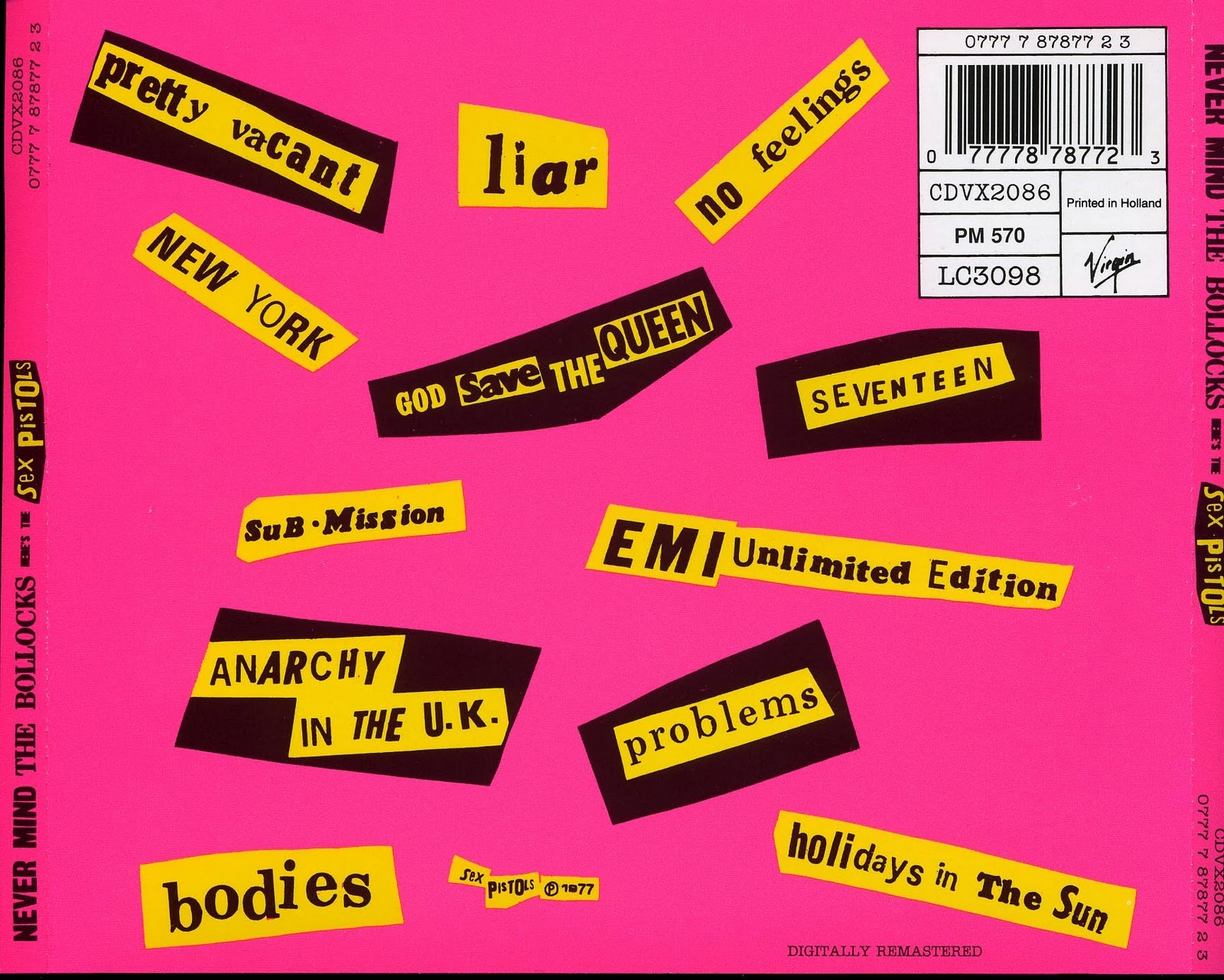
Now, the quality of my taste in music is debatable, and as much as I’m quite pleased with what I listen too, there’s very little in terms of cover art that’s iconic like some of the classics that you’ll see on a Rolling Stones list. So I decided to give one of my favorite groups, Korean 9-member group Girls’ Generation, a make-over in the style of easily one of the most recognizable album covers ever: Never Mind the Bollocks Here’s the Sex Pistols.

The Process:

I wanted to retain a very close resemblance to the original album, so I searched up a duplicate of the iconic Sex Pistols font from dafont.com, and used it throughout. I wasn’t quite sure what font had been used for the The Bollocks part though so I think I just ended up using Times New Roman or some standard font like that. Anyway, I knew the new covers had to pink, which is the group’s representative color (we could get into a whole essay here about Korean pop groups, fanclubs and colors but I am going to cut it here for your sanity). Also, I decided to go with the girls’ Korean group name So Nyeo Shi Dae (thus SNSD) on the front, to have it start with the same S as the Sex Pistols, and to go along with that I used the title of their 3rd album, The Boys to replace to The Bollocks to keep the same B. Yes I put too much thought into this.

Anyway, making the cover was actually really easy: opened up a new image layer in a set size (700x700px), wrote out the text and drew a white box for the So Nyeo Shi Dae part, added two layers of texture by Clawsandfangs set in Softlight to give it a more realistic look, and a thin black gradient set in Softlight on the left side to give it some dimension. Holy run on sentence. If it didn’t make sense let me know and I’ll upload the .psd file.

But yeah, so I thought it was quite simple to do, and because I had already but some thought into figuring the basic process out – I decided to replicate the back cover as well.

This was kind of almost more fun to do, haha. Since I could just use the same color layer, textures and gradient as the front cover, I got to play around a lot more with the font (the letters look different depending if you write it out in caps or not) and also racking my brain for ways to draw those annoying box shapes! Looking at it now I realize I made a mistake with two of the song titles (Top Secret and Mr. Taxi) where I should have turned some of the text white. Might go back and fix that. Or you know, be really punk and leave it. Uhm. Anyway, I decided to also include that little record label sticker at the top as well, and so if you click on the cover and look at it in full-size you can see that I changed the “Printed in” from Holland to Korea, changed the Virgin logo to the logo of S.M. Entertainment (the group’s company) and I changed the codes to include nine 9′s. Which would make sense if you’re a fellow sone maybe? :p


So yeah, if anything in this process description doesn’t make sense, let me know. I know I have a tendency to ramble.