I got my first spam comment from a porn blog today, y’all. I was holding off on making a spubble because I just didn’t know what I would caption, but holy moly, this was nasty. The bot wasn’t even trying to hide it. It literally had “pornblog” in the URL. I got online and saw that Akismet had blocked its first spam comment and I thought, “oh, I’ll check to see what it is, maybe it’s a real person’s comment that got blocked for some reason!” Nope.
My spubble is gonna be under the continue reading link, because the picture is extremely goofy looking.

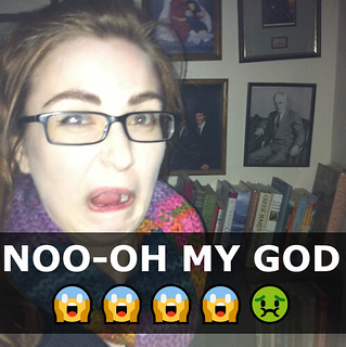
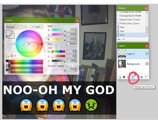
There are many pictures of me looking disgusted, since I’m a generally grumpy person, but this one from 2015 was the only one that could really get the job done. It’s not a particularly good picture for sure. The flash is on but there was something in front of the light, so it looks hazy. I’m in front of a bunch of family pictures and for some reason I’m wearing a winter coat and scarf indoors. I also just look weird as heck. But you know what’s also weird? Getting a freaking link to a porn blog on my post about pixel art. Come on, man. Bot. Botman! The spubble was 100% made in response to seeing the blocked spam comment. There are NSFW bots that follow me on other social media (I have no idea why or how) but this one really got to me, I guess since this is school-related. It’s like two worlds have collided and one of those worlds is really, really weird.
As for the Spubble itself, I went for more of a Snapchat-style caption with the translucent line for the text. So it’s less of a Spubble and more of a… Spline. A spine. I did crop the original photo, but only to take out some baby pictures of myself on the wall. There’s more than enough of my mug in this picture.
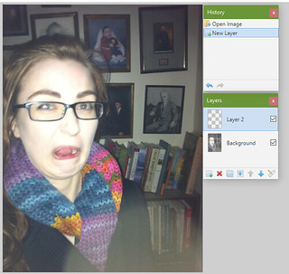
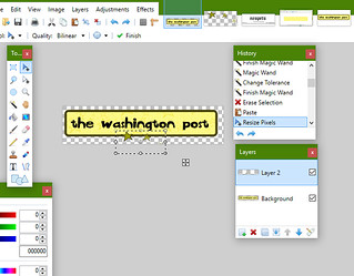
As with most of the stuff I’ve made so far, I did this in paint.net. My first step (as always, since I’m prone to mistakes) was to add a new layer to put the snapchat-esque text onto.

I’m very sorry that you had to see that face again. The next step was adding the translucent black line (which would go into Layer 2, the selected layer).

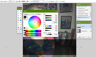
In the history box you can see that I’ve cropped the photo to its current resolution, then got started on the line. I also covered my dumb face with the color window! Nice!!! For the line, I set the opacity (in the color window, the very bottom right level) to 174. The number was pretty arbitrary, I just wanted something that was dark enough to frame some text but translucent enough to still show the photo beneath it. I knew wanted to make two lines of large text, so I made the line pretty big (175px brush width). Next is the text!

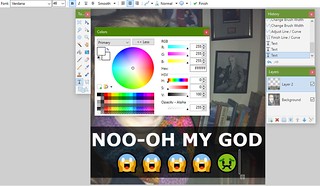
This was just plain old 46pt Verdana, bold, centered. The emojis I thought lent to the Snapchat feel.

After that I just merged the two layers and saved. The bot is still out there botting, but at least I got to react in a way that was meaningful to me and hopefully a little bit funny.
Looking back on it now I wonder if going so intensely in the Snapchat direction was a good creative choice – I DEFINITELY hope nobody ever uses this picture for anything ever, but this format isn’t as widely understood or beloved as your classic lolcat “top text/bottom text.” Is it relatable, or does it still seem too much like something you’d only send your best friend when they tell you they stepped in dog poop?


