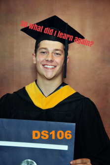
I started off thinking I would take a darker take on this Digital Storytelling class assignment, a visual assignment called the “Make Your Own Spubble”. I took an old photo of myself, taken by my friend Dil a couple years ago (during which she had an obsession with so-called “emo” culture), which she had turned into greyscale for dramatic effect. As you may have noticed, I love black and white photography for this very reason.

However, I was in a great mood, so I decided to do a different take and follow the suggestion to make the “spubble” (a portmanteau of “speech” and “bubble” in this case, not the Urban Dictionary definition) add humor to the photo, which was obviously especially challenging in this case. I first decided a splash of color would help lift the aesthetic mood, so I selected an intense red outline for the spubble, then overlayed one of the rather limited options for spubbles available on Google Drawings. I thought the curly edges, usually indicative of thought, made sense in this case since the photo shows me not speaking.
I didn’t like the way it looked with a solid white background, but a transparent bubble wouldn’t look right either, for the letters would not have been visible in black or white against the many greys of the background…I learned that this is an advantage of black and white when words need to be superimposed on an image. I resolved this issue by making the bubble semi-transparent white, just light enough to see the black letters.
Overall I think it went surprisingly well. I may recreate this photo later, but with greater attention to detail than in the original, and with consideration of the photography tips we’re currently learning. In particular, I may want to do this photo from a different angle, giving more power to the perspective, as recommended by David duChemin, or use Jason Eskenazi’s photography in WONDERLAND: A Fairy Tale of the Soviet Monolith and analysis in Storytelling and Visual Literacy as inspiration for a more geometric composition of the figure.


